Line25 is reader supported. At no cost to you a commission from sponsors may be earned when a purchase is made via links on the site. Learn more
After the dominance of flat colors in web design, we’ve noticed a new web design trend of gradient use beginning to emerge. Gradients are nothing new in web design, but the CSS property of linear-gradient now allows designers to add vibrant spectrums of color directly to their code, rather than the traditional method of creating a gradient image in Photoshop.
One advantage of the CSS approach is the gradient can be scaled to any size, which makes it great for screen filling gradient backgrounds.
Today’s showcase features 25 examples of these super gradients used as backgrounds, headers, and overlays.
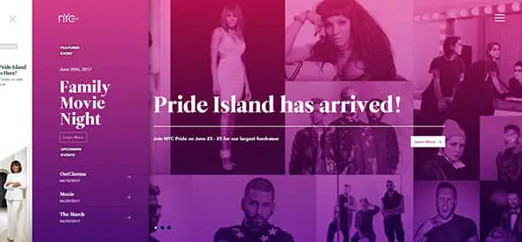
NYC Pride
Gradients don’t have to be used just on backgrounds, you can use them overlaid on photographs as well. This is a great example of this technique.
Loubsol
Ditch the boring white background and try a neon colored gradient instead! If you add some effects and transitions, like in this case, it’s even better!
Niek Dekker
This is a portfolio website for an interactive designer. It has a beautiful colored gradient as the background.
Leen Heyne
Combining geometry with gradients may result in amazing 3D effects, just like in this case!
symodd
Gradients can really make your website design look beautiful and stand out, if used properly, take this as an example!
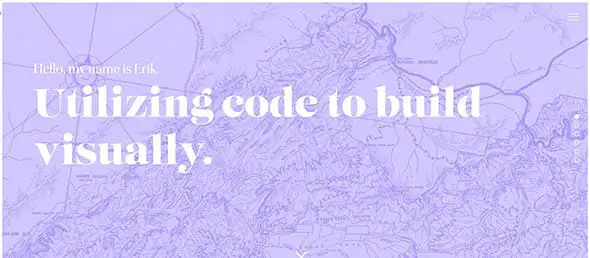
Erik Zuuring
Here’s another portfolio website that uses gradients as a background. The gradients change with time and so does the animated text.
Pixel Palace
This website uses a photo with a gradient as a fullscreen website background. It looks very interesting and has some really subtle effects.
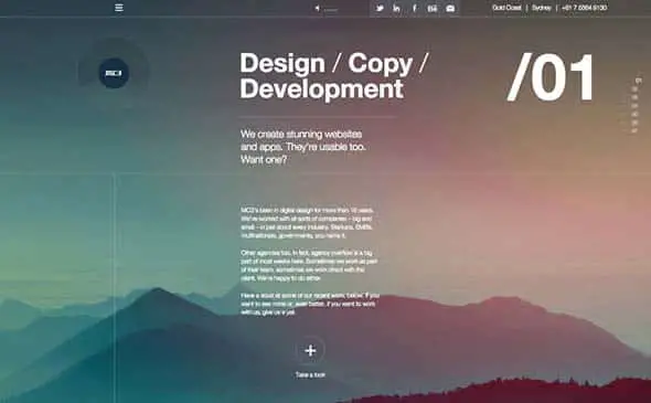
MC3 Design
This is such a beautiful gradient with a cooler and warmer shade. It looks dramatic and creates a nice atmosphere.
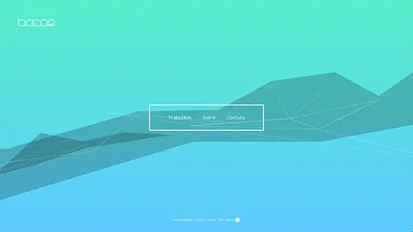
Bacae
This subtle blue gradient blends perfectly with the geometric shape in the background. The website looks modern and eye-catching.
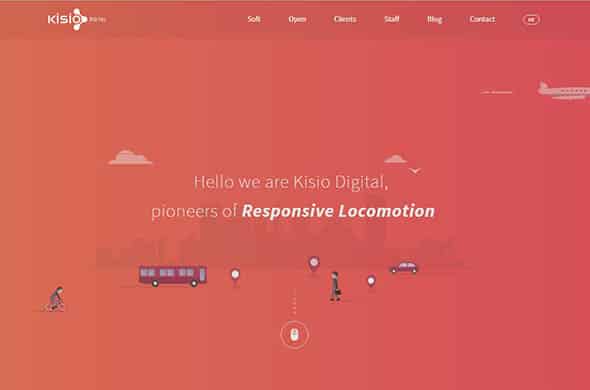
Kisio
This company decided to add a bright red gradient as their background. The illustrations are a nice touch.
Names for Change
Gradients and polygon backgrounds look great together. Here’s a great example of how to apply gradient filters over textures and photos.
Oscar Barber
This is another great example of how to apply gradients over images to create large hero images on a website.
Coup de Coeur francophone
This website has a wonderful design but the neon pink gradient is what makes it truly unique.
Final
This is a simple yet beautiful website design with a pastel colored gradient, ranging from blue to pink.
The Snippet App
This is another great example of how to apply a gradient overlay on a photo and create an eye-catching image for a website.
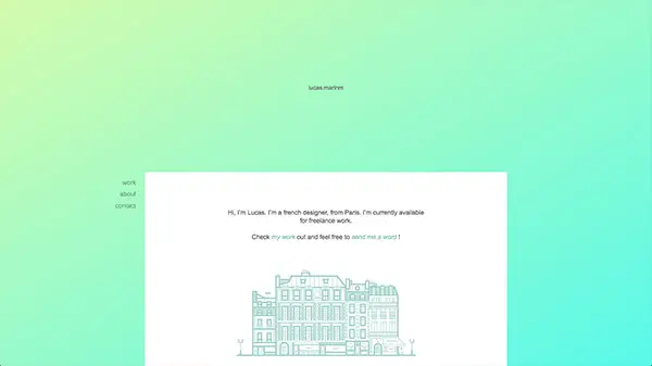
lucas.marinm
This portfolio website design is minimalist and simple. The gradient background makes it stand out.
Chunk Creative Agency
This outstanding design uses a bright colored gradient to make it stand out. It is overlaid on a black and white portrait image.
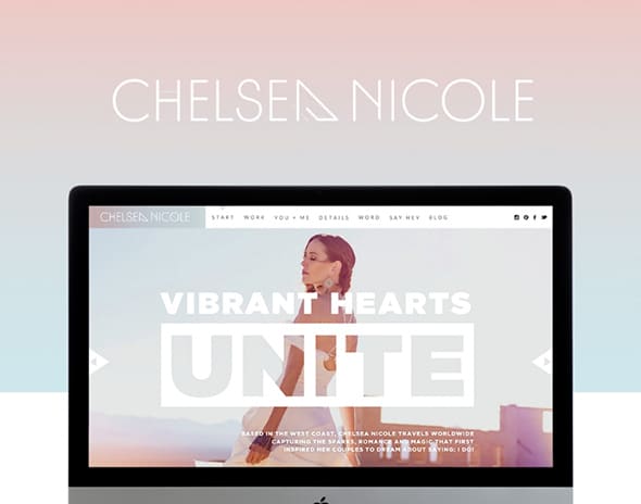
CHELSEA NICOLE
This template contains a beautifully designed pastel colored gradient that looks exceptional for a feminine-styled website!
Pushh
The gradient color overlay is quite popular among app landing pages and presentation websites. This is the perfect example for that.

Seymour Powell
This is a creative website with a video background, parallax effect, and a dark green gradient overlaid all over the content.
Electric Mainline
This pastel orange background overlay works perfectly with the bold, white text on the homepage of this website.

Airnauts
This is a creative one-page website which has a unique layout and an angled, gradient photo overlay which adds dynamism to the design.
TouchstoneJS
This magenta-red gradient makes the mockup on this website really stand out. Check it out and notice the design details of this page.
NBSP
As mentioned above, gradients work best with polygonal backgrounds. Here is a great, modern example of how to use them both in a website project.















Wow!! It was nice,
I hear you, but I also feel like these gradients are no different than the super shaded out backgrounds.
Keep Up the good Work
Thanks for this.
Thanks for this awesome gradiant
I just love the cool touch these all designs can give to a site. Thanks
You have shared great examples of CSS gradient.The main benefit is that we can reduce bandwidth,page loading time, and Hyper text transfer protocol requests so we can say it is seo friendly….
Really Nice collection of gradients, i liked 3Minute and Electric Mainline. Thanks
Thanks for sharing…it definitely makes me want to play with some gradient backgrounds on my next project.
Great ideas and great design. Loved the way you have designed each template
Bacae Design is awesome. Gonna use something similar in my project, thanks for sharing
Really Nice collection of gradients, i liked 3Minute and Electric Mainline. Thanks
it definitely makes me want to play with some gradient backgrounds on my next project.
Thanks for sharing the latest trend of super gradients
it definitely makes me want to play with some gradient backgrounds on my next project.
Thanks For sharing super designs
awesome theme in w3..love it
I Like W3, its cool
This post on gradients is awesome! It covers a large variety of web design techniques making it obvious that the one making the post specializes in web designs.
Great collection!
I’m using linear gradient in my website too! Have a look! :)
Really Nice Collection.Thanks For Sharing It.
Great collection!
Thanks For Sharing It With Us… :D
Thanks For Sharing With Us.
Thanks For Sharing…Good Works
Superb collection. few are pretty good like 3Minute and Electric Mainline
tnx a lot. i like your site
Thanks for sharing the latest trend of super gradients
Great collection! Lots of inspiration for the web designers in this list..
Thanks for sharing such a nice article with us. All of them are very good but I liked TouchstoneJS & NBSP.
Really great to have a look at such a wonderful collection of designs.
Oh I love these gradients.. so soothing and the fonts are easy to see.
Thanks for sharing these awesome inspirations, very cool! I was starting to think gradients weren’t in anymore, but the simple gradients actually are as backgrounds and such. It really gives a design that professional look, and its easy on the eyes.
I will also add minimalistic with that gradient :)
Thanks for sharing!
Gradient colors take the appearance of a web page to an altogether another level.Quite an improvement from flat colors.
really love this new trend of super Gradients!! thankss for share
this are just awesome
Coline is cooler one
thanks for the share
Very simple yet fascinating and attractive gradients to go through. First and last choice of website owners to gain excellent web presence.
There is a bug on the ATOM site on the new build of Chrome 35, there gradient design effect is not showing and is displaying this as a solid colour. Anyone else having this problem?
You have shared great examples of CSS gradient.The main benefit is that we can reduce bandwidth,page loading time, and HTTP requests so we can say it is seo friendly.
It is more accessible and flexible to front end designers.
sorry to spoil the fun, but Coline is not css, its an image … was just wondering on how they accomplished so advanced gradients through css
your website is very informative. tnx a lot
Thanks for sharing
All are awesome designs
Superb collection. Keep posting…
I hear you, but I also feel like these gradients are no different than the super blurred out backgrounds that are being used a lot these days. As long as the colors work and its clean, I don’t fear it becoming too dated.
I’ve been noticing this trend for a while and I think they’re simply gorgeous. They’re much softer colors and transitions than the gradients of just a few years ago.
Of all the things on the web that have a potential to look dated in a few years, I feel like these gradients will look SUPER dated. Just a prediction.
They look awesome right now though
I hear you, but I also feel like these gradients are no different than the super blurred out backgrounds that are being used a lot these days. As long as the colors work and its clean, I don’t fear it becoming too dated.
I have to agree with Andrew, it works well and is a nice trend for the time being but I don’t know if it will translate so well for the future. Who knows though? It’ll be interesting to see how/if it develops further as a trend in the next few years.
Thanks for sharing. Good woks.
Thanks for this awesome showcase
Beautiful examples. I’ve always had a strange obsession with gradients. Thank you for sharing.
Those gradients are so easy to the eyes.
Thanks for sharing…it definitely makes me want to play with some gradient backgrounds on my next project.
Hi Chris, All are awesome designs as I found here always thanks for sharing it, I want to share this post on my facebook page.