Line25 is reader supported. At no cost to you a commission from sponsors may be earned when a purchase is made via links on the site. Learn more
The use of horizontal bands in website design has been a growing trend over the last few years with results of a fantastic looking website layout. Not only does the use of these horizontal strips provide specific containers for each page area, but it also spans right the way across the user’s monitor.
This is especially handy when taking into consideration those with an exceptionally large monitor, helping prevent the main site content being lost in a sea of flat color.
Check out this collection of excellent websites that use horizontal bands or horizontal layouts to feature their content, and follow through to a quick walkthrough of how to create the effect yourself.
AndrewBradshaw.com
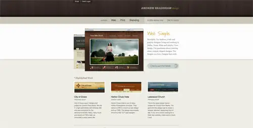
This site presents a web and graphic designer’s passion for creating clean and elegant designs. You will find projects, some pieces of advice and many tips and tricks.
akita.co.uk
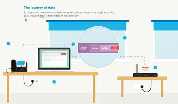
akita.co.uk is a nice example of a horizontal website that presents a vision about how internet data travels.
MailChimp.com

MailChimp.com comes in handy when you are trying to grow your business. Their presentation website makes use of the large, full screen, horizontal layouts trend.
CampaignMonitor.com
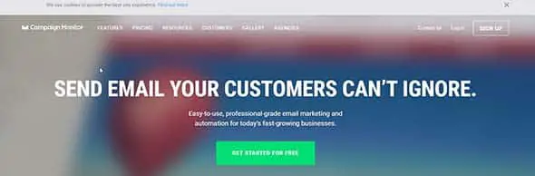
CampaignMonitor.com presents a professional-grade email marketing for growing businesses. They have a fullscreen presentation website with a mostly horizontal layout.
daydreamdesigns.co.uk
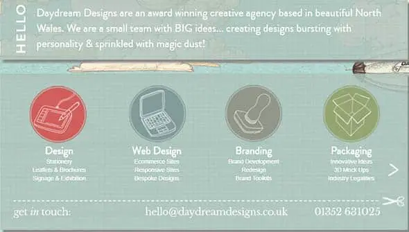
Daydream Designs is formed of a small team with great ideas and always keen on creating innovative designs. Check out their horizontal slider band in which they showcase their services.
EthixStudios.com
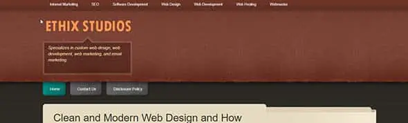
EthixStudios is the perfect example of how a horizontal band can be used in a website design. Check it out!
MediaTemple.net

MediaTemple.net design focuses on delivering its info through a horizontal slider and layout. The site also has beautiful transitions and effect.
Inhouse Designs
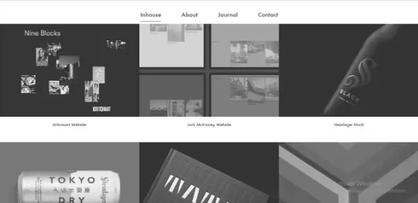
Inhouse Design is an online consulting service agency for graphic designs. Their website has used dark shades and horizontal bands in their layout.
MacaMontreal.com

MacaMontreal.com is the presentation website of a company formed of specialists who completed Apple training programs. The site’s design is simple and uses a horizontal layout.
UzairUsman.com
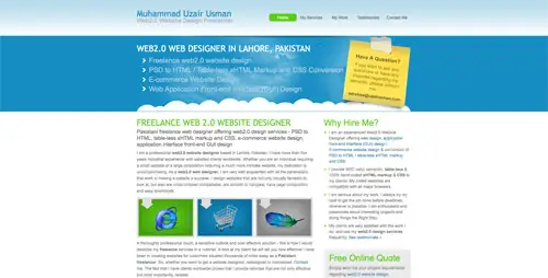
On this website, you’ll find options for web design services – PSD to HTML, PSD to WordPress and e-commerce. It uses an illustrated horizontal band on the homepage.
siscottstudio.com

This is the website of a tattoo artist who is looking forward to where his next inspiration will come from. It has a dark color palette and a horizontal navigation.
Wemakegames.co
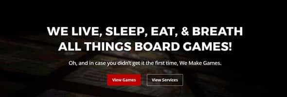
This website belongs to a team of excellent game makers and their aim is to be the coolest board game designers ever! They use a dark, horizontal layout with a simple CTA on their homepage.
giellesse.it
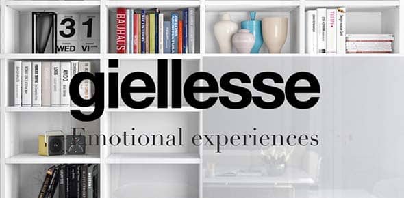
Giellesse is the website of an Italian leader in manufacturing furniture for over 90 years. They use both large typography and high-quality images combined with a horizontal layout.
rezo-zero.com

Rezo Zero is a creative studio focused on brand identity design and helping businesses evolve.
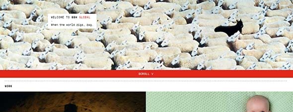
assets.wwf.org.uk
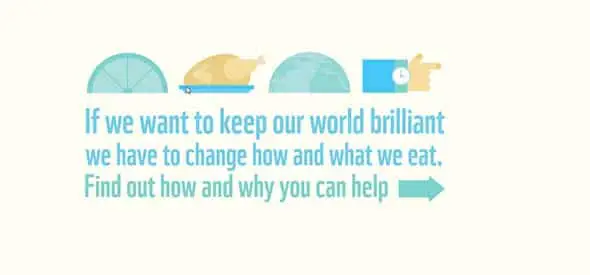
This is an organization whose aim is to raise awareness of what we eat and how we could help our planet. They use a smart horizontal navigation with a slideshow feature, on their homepage.
JunoWebdesign.com
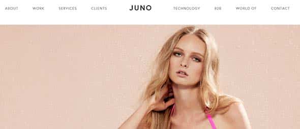
Juno is a business strategy and automation company focused on e-commerce platforms, brands and more. Their website design is mostly horizontally-focused.
Orangebus.co.uk
Orangebus has a simple website design with a horizontal layout and some cool transitions and effects. Check out how the content is displayed here.
outline2design.com
![]()
This is another web design agency’s website, this time with a black and white color palette and bright, yellow accents. It has a fullscreen layout and the content is displayed horizontally.
Ekklesia360.com

This website’s displays its content into blocks. It has a dark blue color palette and a nice combination of fonts.
Branded07.com
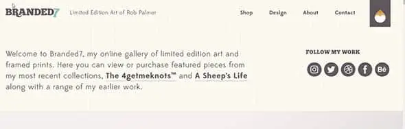
Branded7 is an artists’ online gallery of limited edition art. This website is both a good example of web design and a place where you can view or purchase featured art pieces.
TwiggleGraphics.com
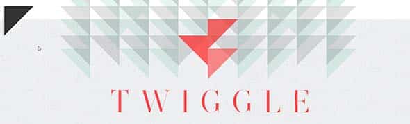
TwiggleGraphics specializes in design, branding and other creative activities. Their website combines catchy geometric elements with large typography, on a horizontal layout.
OnWired.com

This is another great example of a website layout that has the content divided into horizontal strips, starting from the slideshow.
25-years-of-the-internet

25-years-of-the-internet is a horizontal scrolling website that shares the story of the internet from the moment is was created to nowadays.
SureFireMedia.com

Having a horizontal layout on the homepage, especially in the above the fold section, alongside a catchy CTA is a popular trend nowadays. This is a great example of this technique.
WakeInteractive.com

WakeInteractive is a web design agency focused on creating modern designs. They use a fullscreen image with a blue overlay and a simple CTA button.
bartleboglehegarty.com
Here’s the website of a creative agency which provides good digital solutions for their clients. The content is divided into horizontal strips and content blocks.
hasrimy.com

hasrimy.com is a web design agency which specializes in web development and e-commercem and this is their presentation website.
Gridonic.ch

Gridonic is a company focused on creating beautiful and user-friendly solutions for the web. Check out their horizontal layout!
Norgram
Archidirectors
Buildinamsterdam

Studionewwork
Create Your Own Horizontal Bands
Let’s take a look at how to create and implement such design styles into your own website designs. We’ll be producing the initial graphics in Adobe Photoshop, exporting the relevant imagery then adding some simple CSS coding to bring the effect to life. This technique can be used not only on the page body but also on container divs and other elements.
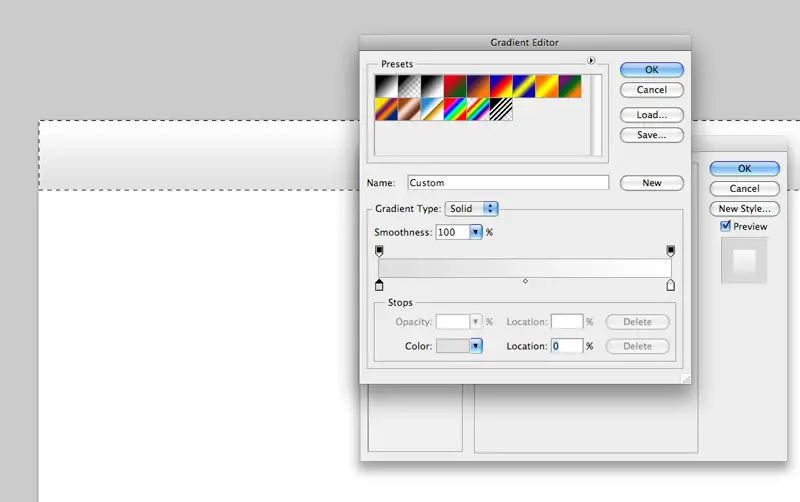
Create a new document in Adobe Photoshop, I tend to work at a resolution of 1680×1050 to give a good indication of the overall appearance of the website on an average sized widescreen monitor.
Create a selection across the width of the document, fill with white on a new layer and double click to access the layer styling properties. Click the Gradient Overlay tab and select two swatches to create a vertical linear gradient.
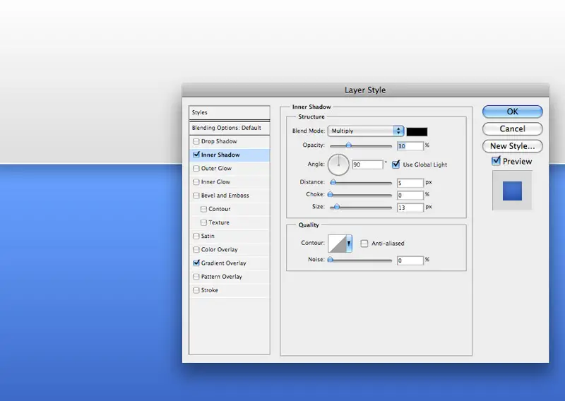
Repeat the process on a new layer, this time creating a larger blue gradient. To add an extra element of detail leave a 1px gap between the panels to provide the illusion of a highlight, also add a subtle Inner Shadow to the panel to give an impression of depth to the layout.
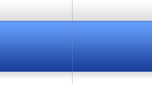
With the visual concept complete, draw a thin one to two-pixel selection vertically across each band of color. Go to Edit > Copy Merged and paste the thin strip into a new document
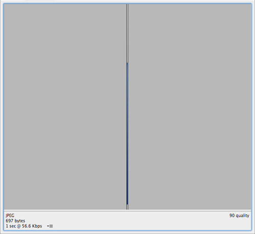
Go to File > Save for Web to export the strip, choose a suitable filetype and compression. Notice the considerably small file size of the graphic, making it an excellent technique which not only visually enhances the page but keeps overall weight to a minimum.
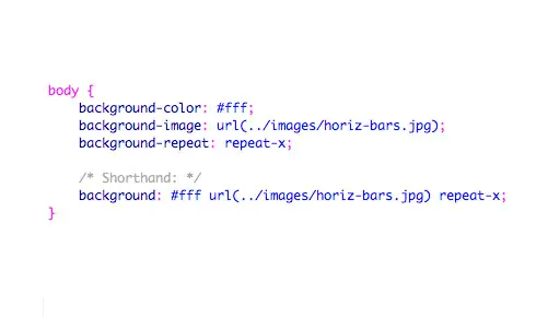
Add the CSS coding to style the web page. Here the image is being applied to the body tag and set to repeat horizontally using the repeat-x command. The CSS can also be condensed down to a single line by writing out the rule in shorthand.
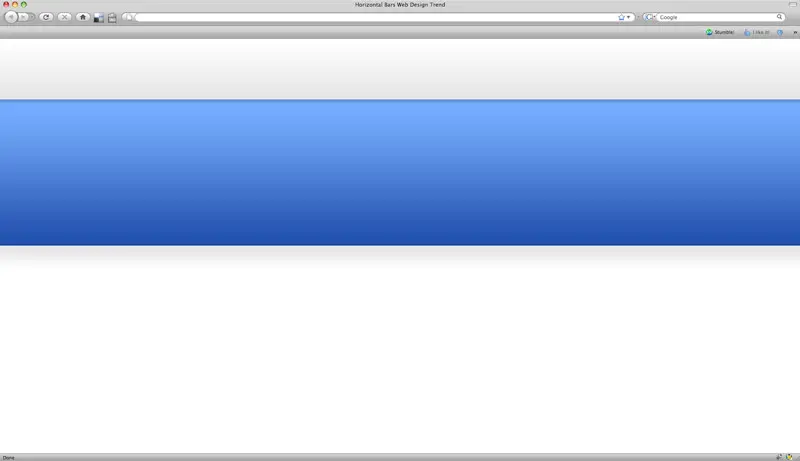
With numerous instances of the image butted together it gives the impression of a continuous graphic when viewed in the browser. In this particular technique, we have used a single graphic to provide two panels of a specific height, to take the example further each colored strip could be attached to an individual div along with a background colour sampled from the image, this will allow the section to continuously expand depending on the length of the content.
Comments are closed.