Line25 is reader supported. At no cost to you a commission from sponsors may be earned when a purchase is made via links on the site. Learn more
Whenever it comes to design work for a restaurant or a café, the most significant part of it is the menu design. The menu should reflect the restaurant’s or the café’s presentation style and ambiance. Moreover, it has to talk about all the kinds of foods served at the restaurant or café under consideration.
For designing a menu, as a designer, you should have an understanding of how and what fonts may or may not work. You should look for fonts that make your potential customer hungry. Such fonts should be a perfect mix of legibility and style that you can use in your menu. The fonts in your logo may or may not match the fonts in the menu. It would be best if you always made sure that the fonts invoke the thought of food in the customers’ minds.
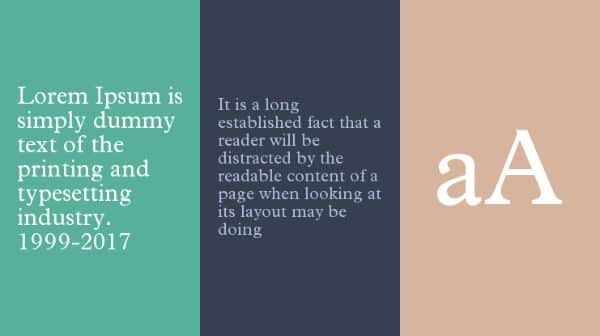
This blog talks about 18 of the top food fonts you can use for various designs when working in the food industry. When it comes to food, you need the best font for menu design and labels on food packets, food jars, and more. Let us take a look at the fonts that we can use in the food industry.
Rigatoni
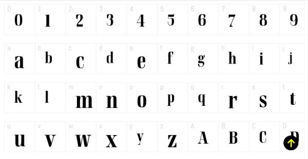
Rigatoni is one of the best food fonts you can use in the menu design and anything related to food. It belongs to the didone display family that offers a lot of readability. Alejandro Paul designed these fonts inspired by the German mid-century lettering specimen given by Nerdinger. Alejandro extended the font family that includes five weights, italics, and a two-weight stencil. These fonts offer nobility in big letters with its tall letterforms and strong serifs. When used with lower case, its large x-height and big curves give it a welcoming elegance. You can use these fonts with identities, labels, headlines, and titles with the use of swash characters. It would be best if you used smaller ascenders for aesthetic purposes when the text is tightly stashed across each other. You can download the fonts for free from the link given here.
Original Burger Font
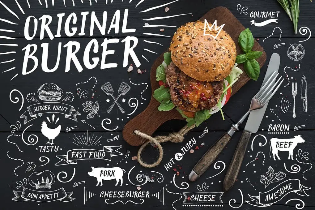
Original Burger is a handmade font that consists of all uppercase English letters A-Z, numerals 0-9, and common punctuations. It also features vector files of graphic doodles. Reminiscent of burger house chalkboards Original Burger is a classic solution to accompany your logo design or food products. They are a good choice to grab the attention of your target audience. It’s also a fun font for menus, signage, posters, merchandise, and culinary applications.
Giaza Pro
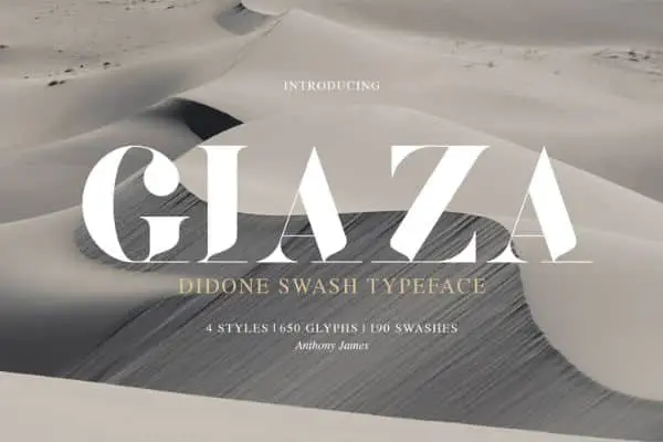
Giaza Pro is another font with a didone typeface that can suit your requirements in a lot of ways. It is a display font and is best suitable for creating displays with these fonts. The designer has created this font without compromising on the legibility factor. It has smooth curves and subtle indentations that make the font stylish, elegant, and suitable for luxury restaurant logos and menu designs. The open type of this font consists of 190 decadent swashes. It also includes inverted/everted alternatives of the font. You can use these fonts to design a menu for luxurious restaurants or five-star restaurants and cafes. When you want to target a fine dining experience, you should use Giaza Pro.
Quizine – Culinary Brush Font
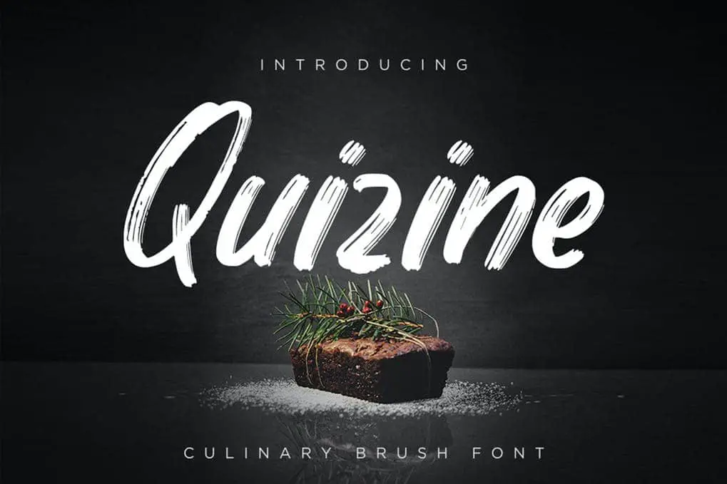
Quizine is a script brush font. It features all uppercase and lowercase letters (A-Z), numerals 0-9, and common punctuations. Quizine is inspired by the traditional brush strokes used in Japanese restaurant menus. Created with culinary and cuisine in mind, Quizine is ideal for restaurant logos, branding, menus, packaging, and signage. When used creatively by professional desingers, these fonts will help to enhance the unique look of your food menus.
Timberline

When we are talking about fonts, it is impossible to forget about handwritten fonts. Handwritten fonts are the font that resembles the real handwriting of a person and hence offers a personal touch to whatever design it’s used in. Timberline is one such handwritten font that uses textured lines and elegant strokes. It is a casual handwritten font face that gives you an excellent design and appearance. Timberline includes stylish alternates and an extensive set of ligatures that creates a realistic impression in the fonts. Since these are premium fonts, you can buy these fonts from the link given here. It also supports various languages from Western Europe, Central/Eastern Europe, Turkey, and Romania. These fonts can fit any food point, including a café that serves a burger or vegetarian cafes.
Xincpinc – Asian Cuisine Inspired Fonts
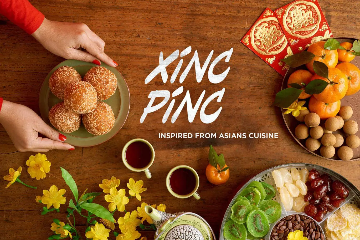
Xinc Pinc is a modern brush font, inspired by the brushstrokes used in Asian cuisine and restaurants. It features all uppercase English letters A-Z, numerals 0-9, and common punctuations. Borrowing from Asian culinary culture, Xinc Pinc is an excellent choice for restaurants, modern culinary concepts, logos, branding, signage, and labels. They also work well on food trucks and poster boards due to their unique visual appeal.
Thirsty Soft
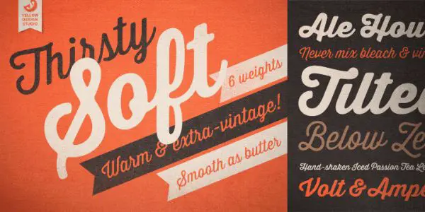
Thirsty Soft has originated from Yellow Design Studio, where the characters are rounded, warm, and slanted. These fonts are a vintage version of Thirsty Script. The fonts from Thirsty Script look caffeinated from the bold and sharp edges and pointy strokes. The font family includes six weights from light to dark bold and old-style figures, support to multiple languages, with ligature and stylish alternates. If you want smoother results, you can set the anti-aliasing setting to “smooth.” This font is ideal for cafes, ice cream points, and beverage serving places. It is warm and friendly in appearance, which offers a “chilled-out place” impression of the area.
Montclar Handwritten Font
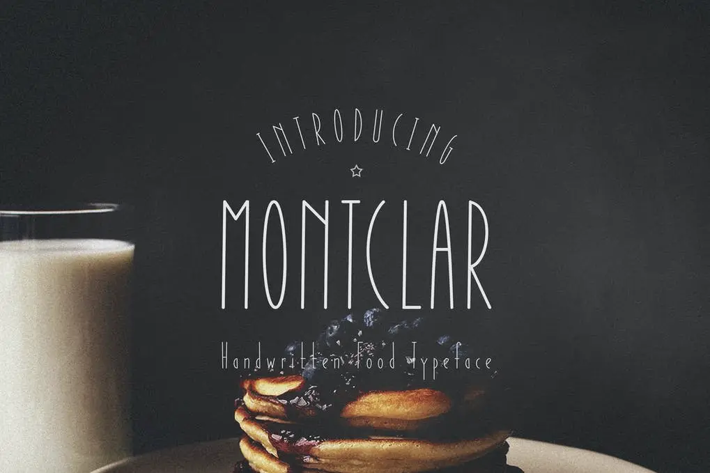
Montclar is a modern, thin, condensed, handwriting font. It features all uppercase and lowercase English and Cyrillic letters, numerals 0-9, and common punctuations. Optimized as a handwritten food typeface, Montclar is legible and perfect for restaurants, headers, menus, signage, logos, body content, and branding.
Dealers
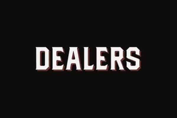
Dealers is a font face that is available for free download. It is an old-fashioned font style that sits on a wooden signage board. It has solid blocked shapes with modern serifs and condensed characters that are all capital. These fonts can be used in cafes, stores, restaurants, labels, and logos to create an impression. Dealers make an impression of being classic and harmonious to whichever project it is applied. Hence, if you want to create an impression of a food joint that is vintage or old-fashioned, you should use Dealers fonts. It has bold characters with a very strict-looking typeface. Dealers can also be used to create the menu board that is laid outside of a roadside restaurant to attract customers.
LaChalk Typeface + Extras
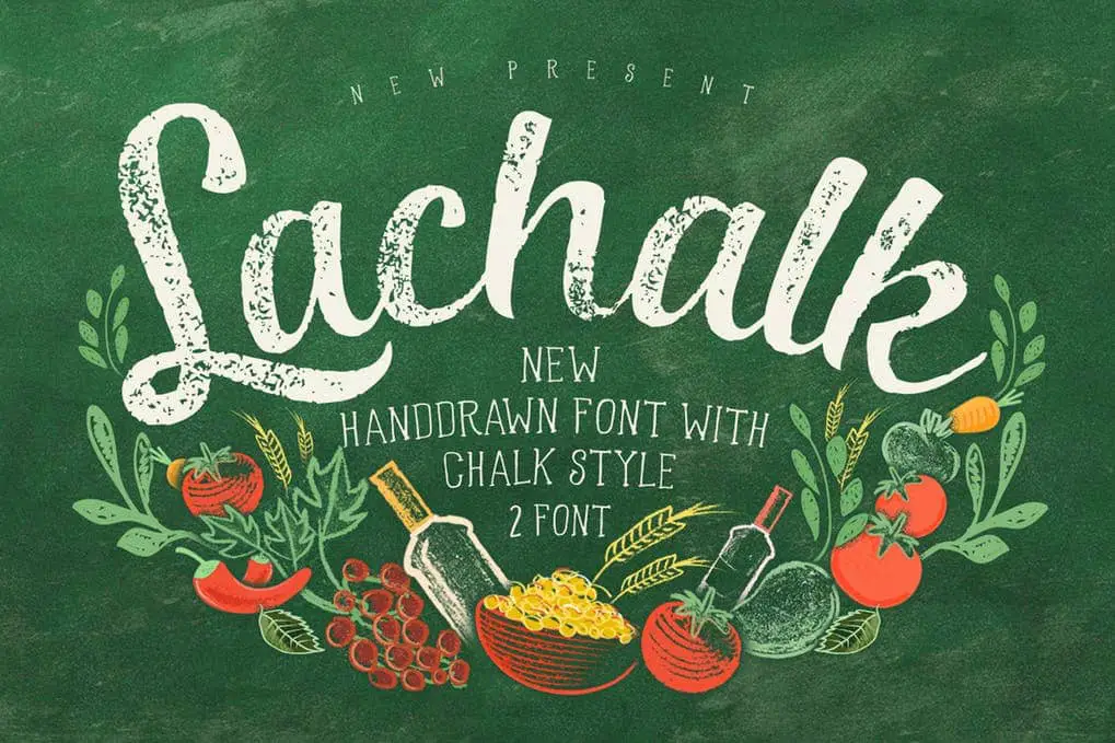
LaChalk is a distressed, chalk style, hand-drawn font. It features all uppercase and lowercase English letters A-Z, and additional visual extras like lines and flowing banners. Inspired by cafe menu boards and chalkboard signage, LaChalk is ideal for lettering, posters, cafe menus, coffee shops and chalkboard concepts.
Didot
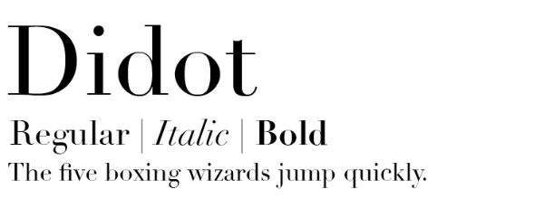
Didot is a famous typeface, a group of typefaces that received its name after a French family Didot who was recognized for French printing. The classification of the font is called Didone. These fonts appear elegant and rational with their fine strokes and are quick to catch the reader’s attention. Didot can compel the reader to pay attention to what it is displaying on the board. These fonts look sturdy and robust with thick stems. Didot is termed as the most expensive-looking font; hence this font should be used in luxury hotels. You can use these fonts to highlight the complicated dishes your restaurant serves. Please take a look at these fonts from the link that we have provided here.
Baskerville
Baskerville is a serif typeface that was designed by John Baskerville based in England. It is a transitional typeface that has strong and tapered characters. These fonts have rounded shapes with classic symbols of the font. Baskerville fonts look like they are from an old era and hence look vintage and old-fashioned. It has more x-height, expansive counters with less contrast that lets you work with any screen with small-sized characters. These fonts can be used with a lot of applications like a book cover or menu design for a casual dining experience. Baskerville can work correctly for a fine dining restaurant menu design or a casual cocktail point establishment that gives it a retro vibe. Additionally, these are the perfect font for your business cards and for product packaging.
Plantin
Plantin is a serif typeface that is transitional, which originated in around 1913. Similar to Baskerville font face and Plantin is the font type that inspired Times New Roman typeface. It consists of 4 fonts in the form of italic, regular, bold, and bold-italic. Plantin is an accommodating typeface and is legible, classic, elegant in its way. The firm strokes and serifs make the font appearance stronger than other fonts generally are. It possesses a compact structure, which makes it an economic font face. Plantin can be used in book and magazine publishing, periodicals, and more. As far as the menu design is concerned, you can choose this font if you want a straightforward menu design with a no-nonsense attitude.
Open Sans

Open Sans is a humanist type of font which belongs to the sans serif category. It has been designed by Steve Matteson and contains 890 character set. The font type consists of standard ISO Latin 1, Latin CE, Greek, and Cyrillic character sets. This makes it a font that can be used for multiple languages. Open Sans was designed with a straight, open form, and a neutral but amicable appearance. It offers a lot of legibility when it is used in printing, publishing, and other formats. If these fonts are used in menu design, it states that the place is warm and welcoming. It also communicates to the diners that the site offers a lot of quality dishes with elegance spelled correctly. You can gain access to the fonts from the link provided here.
Helvetica

Helvetica’s origin dates back to 1957, and Max Miedinger designed it for Hass Type Foundry based in Switzerland. The original name of the font was Neue Haas Grotesk. Walter Cunz changed the title when the fonts were reframed and redesigned in minor aspects. A company in New York adopted the fonts, and since then, it gained a lot of popularity in the world. Because of this, Helvetica replaced Futura fonts. Helvetica has a healthy character series that has condensed forms that extend broadly. Later, weights were added to the fonts that suited Linotype limitations and marketing campaigns. You cannot go wrong when you use Helvetica to design the restaurant menu. This font is minimal and neutral in its form, which creates a no-nonsense attitude in the reader and catches the attention immediately.
Pink Lemonade
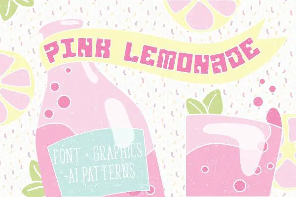
Pink Lemonade fonts were inspired by the pop culture that dates back to the ’50s and ’70s. The roots of these fonts go back to the art deco form. It has thick strokes and stems that offer a bold yet commanding way to the text. But the font form is suitable when you want to create a menu for summer parties. When you buy the pack, it consists of OTF and TTF font, with vector clip art, and AI CC files with swatches. These fonts look good when designing the drinks menu, a bar menu, or anything that concerns beverages. They’re a great choice to design the menu for the coffee shop that exclusively serves coffee. The fonts give an impression of a chilled out and lazy attitude. Hence, you can use the fonts when you want your customer to relax and unwind.
Jonesy
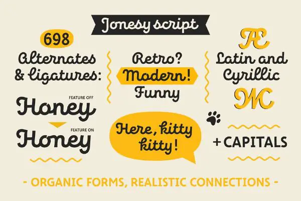
Jonesy is a modern-looking font that also gives an appearance of a vintage font style. It bases its form on calligraphy and looks like it is someone’s handwriting. Jonesy consists of around 700 alternates and ligatures, which makes it supportive of a lot of languages around the world. The fonts have organic formations and create real connections. Moreover, it includes scripts and capital OTF fonts that you can use according to your requirements. You can use Jonesy for menu design, packaging, posters, logos, and lettering. These fonts look funny, and you can use this font if you are a café owner that is set in the open. It brings about an air of retro feel and a very laid-off appearance perfect to establish your brand identity.
The Simply Sweet Duo
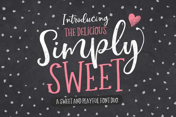
The name of the font itself suggests something really stunning and visually appealing. While being curvaceous and striking, the font includes a massive range of alternate characters. These characters have a natural form of righteousness, which provides the look of authenticity to the fonts. If you want custom lettering and being decorative, then the merely sweet duo is the right font. You can customize the swashes, ending strokes, letters, alternate letters, and ligatures. Perfect choice for greeting card design, branding, prints, invites, crafting, and quotes, these fonts are perfect even for menu card designs. Since it has so many letters and characters, it supports a lot of different languages from around the world.
Conclusion
The above-given fonts are perfect for use when you have to design a restaurant menu, a menu board, or a packaged food item. All the fonts are given to suit the food industry well, and they are perfect when you want to grab the attention of the customer. Each font discussed here offers a different kind of impression. Hence, you should select the font according to the type of belief you want to create in your customer. These fonts can also be used to create the text beneath the café or hotel’s logo. You should include these fonts when you want to create an eye-catching menu that promises to satisfy hunger. You can always take a look at this blog when, as a designer, you have to design the menu of a restaurant or a café. Your café or a restaurant can have any ambiance or vibe that you like, but the fonts should match the place’s vibes.