Line25 is reader supported. At no cost to you a commission from sponsors may be earned when a purchase is made via links on the site. Learn more
Today, we selected 20 websites with creative drop-down menu designs and cool layouts. You won’t see how the drop down menu designs look like from all the previews, so head straight to the websites and check out the whole design!
We also selected some prototype drop-down menu designs created by some very talented Dribbble designers. You can find five of them at the end of this list.
If you want to learn how to code drop down menus yourself, you should know that this is usually done with the help of jQuery. The first step is building the concept in Photoshop, then laying out the basic HTML elements, styling everything up in CSS, and lastly tying it all together with a few lines of jQuery to create a semantic, accessible and degradable menu design.
You’ll surely get inspired by our selections and create awesome menus yourself. Some of these drop-down menu designs are very simple and clean, while others have unique elements and are more complex.
Which ones do you like most and why? Let us know in the comment section below.
P.S. If you need more web navigation design inspiration, check out these Web Designs Featuring Pop Out Navigation Menus and Website Designs With Unusual Navigation Menus.
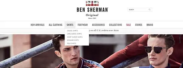
Ben Sherman
Ben Sherman’s menu bar will definitely inspire you, especially if you’re into minimalist design. This is a great example of simple and clean drop-down menu which can be integrated into all sorts of web projects.
American Eagle
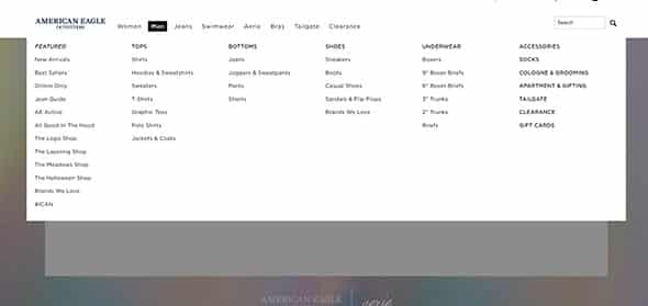
American Eagle’s drop-down menu also follows a minimalist design but it’s much more complex than the previous example because it opens up to more categories. This example can be used for shops and it can be very useful because all the products are divided into smaller categories, which makes it easier for the buyers to find what they’re looking for.
Mayflower Brewing
This is a red drop-down menu bar. The Mayflower Brewing has a simple menu with 6 categories. If you’ll hover your mouse on each, you’ll notice that the sub-categories have a darker shade of red and a similar design which uses the same typeface as the menu.
Hampton Bays
This is yet another example of a complex yet neat menu bar. This drop-down menu also uses angled graphics which makes it unique and eye-catching to visitors. Everything is well organized in the menu bar which makes it easier to surf and find what you need.
Redbrickhealth
This is a neat and clean drop-down menu which can be integrated into all sorts of web projects. You can easily surf and find what you need with this menu.
Carreras con Futuro
This is a colorful drop-down menu bar. Each category has its own flat-icon and the background turns pink as you hover through each category. This is a very creative example of a menu bar.
Callaway Golf
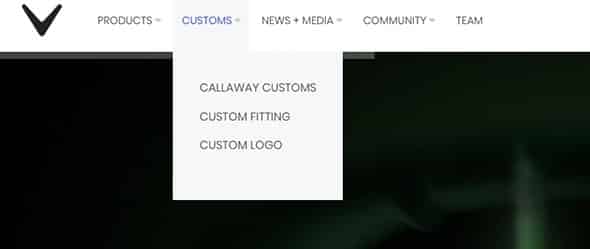
Gallaway Golf website has an elegant drop-down menu bar. It follows a simple and clean design and it is positioned right next to the logo. Would look great on clean, minimalist designs.
Bon Look
Bon Look is another great example of a website with a creative drop-down menu. Check it out and see that each sub-category also has a preview image which helps the buyer find exactly what they need. It is also a great way to promote your products indirectly.
Converse
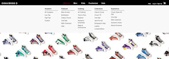
Converse has a very colorful slideshow of their products. The menu bar appears as a simple and thin black horizontal band with white typography. Each parent-category has several sub-categories which are quite useful in e-commerce websites.
Guernsey Water
This is yet another creative example of a drop-down menu bar. A thin horizontal band with icons for each category and a simple grey drop-down menu with plenty subcategories.
Kualoa Field School
Kualoa Field School’s menu is also neat and has a modern design. This website uses a large horizontal image in its header, with large typography and logo, followed by a drop-down menu bar.
Puma
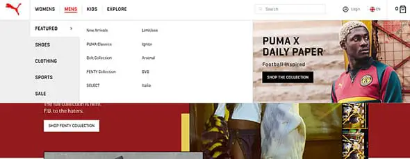
Puma is yet another example of a well-organized website that has a cool drop-down menu bar. It appears as a horizontal band that presents each subcategory such as featured, new arrivals etc., but also adds something that makes this example different than the previous ones, linked images to different collections, sales, and special offers. It’s a really interesting drop down menu design perfect for larger websites activating in the fashion niche.
Reaching Quiet
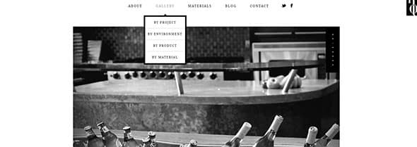
Reaching Quiet has a minimalist design all the way from the top drop-down menu bar to the footer of the page. Each subcategory is presented on white rows with black frames which nicely continue this website’s design concept. Everything is elegantly designed and might give you the impression that this website has a black and white layout but you’ll discover that it is actually quite colorful.
Helmy-Bern
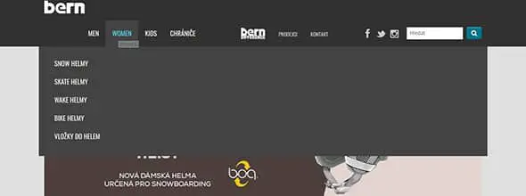
Helmy-Bern website has a dark yet neat drop-down menu which might be exactly what you were looking for. It has a modern and functional design that can easily be integrated into all sorts of web projects. This menu is very well developed and designed and it can be a great starting point for other awesome designs. Let it be your inspiration for dark, drop down menus!
Santa Cruz
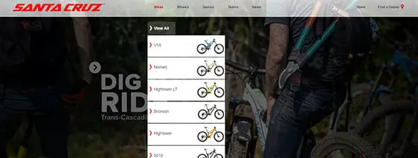
Santa Cruz’s drop-down menu is also quite creative and gives the visitors a small insight on what they’re about to see in this shop. Perfect for large and small online shops alike.

This drop-down menu has a unique design based on angled graphics and a blue palette. Each category of the submenu uses a gradient background with white typography. All in all, this example looks great and it is very creative.
Choose your Final Galactic Destination
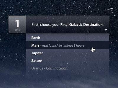 This drop-down menu is yet another creative example. This menu is much more transparent than the previous examples because the background plays a great role in this case. Would look great on both websites and apps.
BH Winery
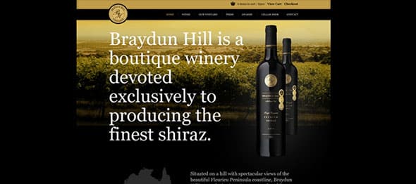
BH is an elegant drop down menu and it is the perfect one for a wine shop. If you’re working on a similar project then this example might come in really handy.
Equip
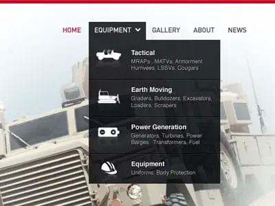
This drop-down menu also has a transparency. It has a dark background, uses white typography and large icons. It could work very well on an online shop website.
Shopping Cart Menu
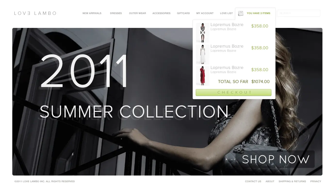
This drop-down menu was designed for a fashion e-commerce website. The Shopping Cart Menu is what makes this example interesting and worth following in future projects. You can always check the products you’ve added to your cart without leaving the page. Each product has its own thumbnail photo, name and price.








Nice work, love it
Love the look of most but I have compatibility issues on my samsung browser for the Paramore Digital site
Cool!