Line25 is reader supported. At no cost to you a commission from sponsors may be earned when a purchase is made via links on the site. Learn more
As more and more people use the Internet today, data is something that will expand even more. How we visualize and present information is a crucial element to a great UX. Infographics and other instruments are great at displaying data in a fun yet educative way.
They give the topic a new perspective. Its influence is vast and plays a huge part in marketing and business. But, there are rights and wrongs when using infographics. And, the lack of knowledge can be detrimental to your success.
Fortunately, we’re here to help. Now, data visualization won’t be so scary and daunting.
What is meant by data visualization?
To work with data visualization, you first have to know what it is. Said, data visualization is how you present extensive data in a visual format. It is a process in which you make complex information easy to comprehend. But at the same time, it has to be visually attractive. How data looks is an essential tool in keeping your audience interested.
Why is data visualization necessary?
It is crucial to have your data visualized correctly. With this, you can give a visual summary. You don’t have to search hundreds to thousands of rows and columns on spreadsheets. You can place them in patterns and trends. That way, it will be easier for anyone to understand. And it won’t be time-consuming at all.
How is data visualization used?
You can use data visualization for almost anything. There are different types of data visualization. All of which you can use for various reasons. But sometimes, you might be stuck when choosing what kind of data visualization format to use. These sites offer all types of inspiration you can draw from. You can interpret data in any visual way.
Vintage

The vintage agency is an impressive company. It has an exceptional portfolio and even more excellent products. You can see this company has experience in data visualization. Their starts are smoothly and skillfully incorporated on the website. Not only that but the overall look, the aesthetic is breathtaking as well.
Storytelling with Data
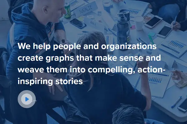
Data visualization is a great tool to tell the brand’s story. Data is and should be closely tied with storytelling. One great example of this is Cole Nussbaumer Knaflic’s book. You can read her book to get more in-depth with approaches to data visualization.
You can see her techniques implemented on the website as well. What makes her stand out is that she creates an exciting challenge her followers have to do once a month. Not only that, but she also has posted tutorials on how to master data visualization like a pro.
Corning Glass Class
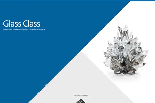
Corning Glass Class offers another approach to data visualization. They make this tool interesting, informative, and aesthetically pleasing. This type of visualization resembles 2012 graphics, giving it an old, nostalgic feel to it.
Every Satellite Orbiting Earth
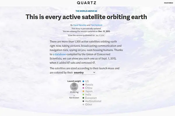
This is an interactive graph. It is built by only using a database from the Union of Concerned Scientists. More than thirteen thousand satellites and their trajectories are displayed by it.
You can see that a round icon characterizes each satellite. Not only that, but the color of the country also codes it. It is also sized proportionally to the launch mass. When you open this sire, you can scroll down to see what we’re talking about.
Visualizing Data
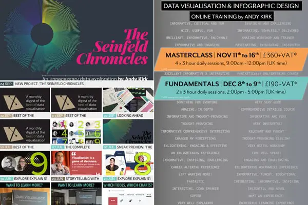
This is an encyclopedia for data visualization. It is founded and managed by Andy Kirk. It is supplied with many examples, resources, forums, and a community of business experts. The data visualization is carried out on the website as well. The homepage features a bubble display that highlights essential news.
Codex Atlanticus
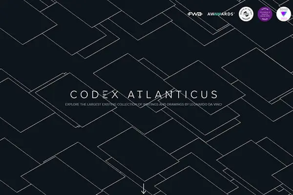
This is another data visualization agency. It comes from Italy and has created a
The Visual Agency is an Italian data visualization company who has created a beautiful digital library of Leonardo Da Vinci’s notebooks as well as journals. It’s the most extensive digitized collection of Da Vinci’s work.
Plastic Profusion
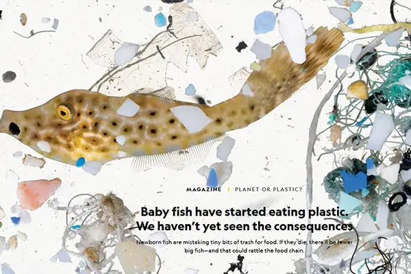
This data visualization example was made by National Geographic and showed all plastic waste into the oceans. An average rate of about nine million tons of plastic is thrown in the oceans a year. Some elements, such as wind and waves, eventually break down ocean plastic to bits. The graphic shows how critical the situation is in some parts of the oceans.
The Pudding
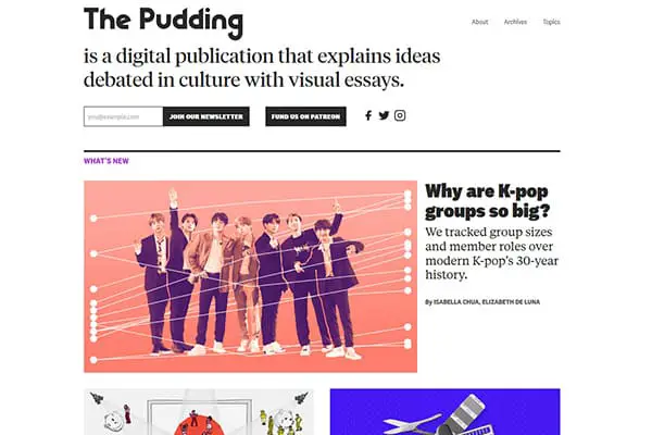
This is an agency that makes interactive visual essays. It mixes a little bit of journalism and web engineering to get a unique approach to show data. It experiments with various tools and methods to bring cultures to life. You can see how this website plays around with data and how it stretches limits.
Game of Canada
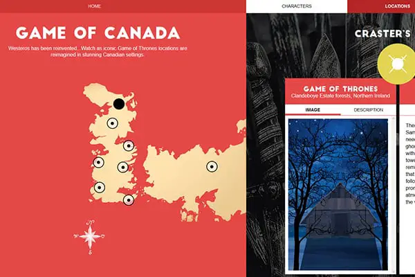
Websites with maps can be fun too, and Game of Canada is the proof for that. This is similar to The Pudding. The map makes the whole adventure even better. The location is established on a flat site. The entire project closely resembles the Games of Thrones. In the means of the area in Canadian settings.
Selfie City
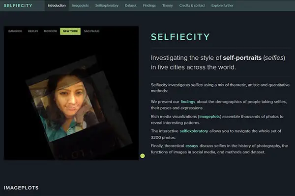
Here you can explore over 3000 selfies from only five cities in the world. It offers a multi-component visual journey. You can see the demographics and trends. The company that created this used images from Instagram mainly. You can experience this pleasant adventure with your web browser only. You can also see and feel the cultural twist to each selfie.
Information is Beautiful
Data doesn’t have to be boring. David McCandless creates a platform where new events and adventures are showcased through various creative data visualization projects.
FlowingData
Nathan Yau searches through our fundamental knowledge of how data works and is used. Nathan gives us an excellent visualization language.
Tips for implementing Data visualization in web designs
There are several things you can ass to your data visualization to make it more interactive and fun.
Focus On Infographics
If you want to make your data more visually appealing, you can never go wrong with infographics. They are the main component of the overall design. This is the best way to present data without making it boring. The whole concept can be explained in a matter of minutes rather than hours.
Use the Right Graph Style for Your Data
You have to pay attention to the style of the graph too. You want to use the right type of chart/graph to present your information. The whole purpose should be to transfer the information into a story. To make it simple and easy to comprehend.
Optimize Data Visualization For Mobile Use
As smartphones are getting their spotlight, many users now access websites from these small devices. Rather than using laptops or other big desktops, users are proven to prefer smaller and more portable screens. That is why you should make your content in a mobile-friendly version.
The whole interface should be accessed by all kinds of devices. Create flexible graphics that are compatible with many gadgets.
Use Color Effectively Within Limitation
We all know how color plays into the design world. From the unlimited number of colors that are available, use a simple color scheme. That way you can never go wrong. Colorful websites might look great in certain cases, but make sure you don’t overdo with your creativity. To know which colors to use, think first of the emotion you’re trying to get from people.
Think about the story you’re telling and how you can bring it to life with colors. Modern website design isn’t just about colorful graphics, it’s also about function.
Use data patterns smartly.
The data pattern is a simple term is to compare two pieces of data. To portray this comparison, you can use similar sharts and colors. That way the difference will be noted.
But that is not all. Data patterns are helpful when showing disorders in the data. That way you can attract attention. These examples show how much you can be creative when it comes to data visualization.
You can use this principle to convince people, to communicate, to reveal trends. Data visualization is also used for telling stories. It gives steps and instructions. When you visualize data, you bring that information to life.
Not only that but, data visualization makes the whole experience interactive. It makes it unique to every individual and fun to encounter.