Line25 is reader supported. At no cost to you a commission from sponsors may be earned when a purchase is made via links on the site. Learn more
Drop caps have been around for years in the print industry, but they are still pretty rare in the web world despite the :first-letter selector having been around for a fair few years. Let’s take a look at how we can create a cool drop cap for our web designs and spice it up with some stylish CSS3 text-shadow effects.
The design we’ll be creating features a large drop cap at the start of a block of text. The actual drop cap effect will be created with the :first-letter selector, while the extra effects are added with the help of CSS text-shadow.
The HTML structure
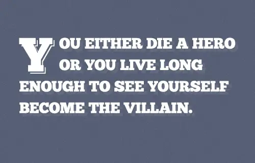
<!DOCTYPE html>
<html>
<head>
<meta charset="utf-8" />
<title>CSS Drop Shadow</title>

<link href="style.css" rel="stylesheet" />

</head>

<body>

<div>
	<p>You either die a hero or You live long enough to see yourself become the villain.</p>
</div>

</body>
</html>
Every web project begins with the basic HTML structure. For this demo file the HTML page is made up of the usual Doctype and Head elements before the quote is laid out as a basic paragraph element. We’ll be using CSS selectors to create our drop cap so no special IDs or classes are required.
The CSS styling
body, div, h1, h2, h3, h4, h5, h6, p, ul, ol, li, dl, dt, dd, img, form, fieldset, input, textarea, blockquote {
	margin: 0; padding: 0; border: 0;
}

body {
	font-family: "Chunk", Sans-Serif; color: #fff;
	background: #566074 url(bg.png);
}

@font-face {
	font-family: Chunk;
	src: url("Chunk.ttf") format("truetype");
}

div {
	width: 730px; margin: 150px auto;
}
The CSS demo file begins with a reset to remove any default browser styling, then the main font styling is added to the body. You’ll notice the use of the “Chunk” font; this custom font is being added with the help of @font-face.
p {
	font-size: 50px; line-height: 80px;
	text-transform: uppercase;
	text-shadow: 10px 10px 0 rgba(255,255,255,0.07);
}
Now the slab-serif font is in place the size and line-height of the typography can be set. The text-transform property ensures all the text appears in caps despite how it is written in the HTML file, then the text-shadow property is used along with RGBa colour values to add a subtle ghost effect to the text.
p:first-child:first-letter {
	font-size: 160px; float: left; margin: 20px 20px 0 0; line-height: 0.8;
}
Now the main text is in place we can finally get around to styling up the drop cap. The first letter is targeted with the handy :first-letter selector, but to avoid having drop caps on every paragraph on our page we also need to use the :first-child selector to target only the first letter of the first paragraph.
Just four CSS declarations are needed to correctly style up the drop cap. First the letter is increased in size so it’s large enough to span across two lines of the paragraph, then it is floated left to allow it to break out of the paragraph’s flow. A touch of margin on the top and right help tweak the drop cap into place and add some space between this first letter and the remainder of the sentence. Everything looks fine in Firefox so far, but if we test it out in WebKit browsers (Safari & Chrome) they both seem to place the drop cap higher than Firefox. We can easily fix this with an extra line-height declaration. This makes no difference to the Firefox version while lining everything up in Safari and Chrome.
p:first-child:first-letter {
	font-size: 160px; float: left; margin: 20px 20px 0 0; line-height: 0.8;;
	text-shadow: 4px 4px 0 #566074, 7px 7px 0 #fff;
}
The basic drop cap is complete, but traditionally drop caps come along in all kinds of fancy styling. We can add some cool effects of our own with the help of the CSS3 text-shadow property. A duplicate of the text is created and offset by 4px, then a second duplicate is created at 7px. When the first duplicate is set to the same colour as the background it creates a cool retro style effect. For more drop cap effects check out my old text-shadow effects post.
The final drop cap effect
Comments are closed.