Line25 is reader supported. At no cost to you a commission from sponsors may be earned when a purchase is made via links on the site. Learn more
Follow this step by step walkthrough of the making of a sleek, grid-based website design for an eyewear brand in HTML5 and CSS3. We’ll build the HTML structure with the latest elements then style up the appearance of the site with CSS3 affects to match the original Photoshop concept with minimal use of background images.
The design concept
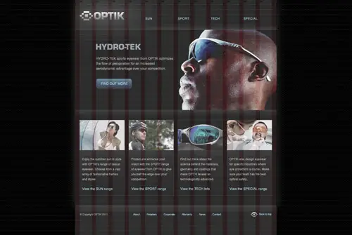
The design we’ll be coding up is for a fictional eyewear brand named OPTIK. If you’re interested in seeing how the design concept was created in Photoshop, head over to Blog.SpoonGraphics so see part one of the tutorial. Essentially the page is based on an underlying grid and features a few key focal elements to direct the user towards the various ranges of eyewear.
View the Photoshop design tutorial
Exporting the images
I know I mentioned we’d build the website with minimal background images, but there’s still a few graphics that need pulling out of the Photoshop concept that just can’t be recreated in HTML or CSS (…yet!). The first of those graphics is the patterned background. Copy and export a selection so that the pattern will repeat seamlessly when tiled.
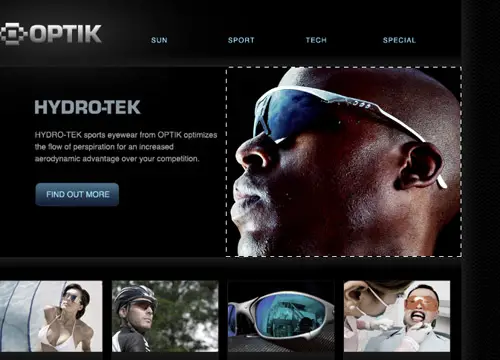
We’ll create the gradients used on the feature area with CSS3, but we’ll need to export the actual photograph. Draw a tight selection around the character and save for web as a JPEG.
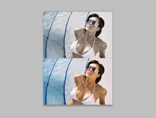
In the original concept we saved two versions of the range graphics. Copy both into a new document to create mini sprite images then export as JPEGs.
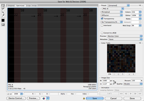
This design was created according to columns and a baseline grid. Export a copy of the grid image from Photoshop. We’ll add this as a temporary background image so we can easily line up the elements with CSS to replicate the grid based layout.
The HTML structure
<!DOCTYPE html>
<html>
<head>
<meta charset="utf-8" />
<title>OPTIK</title>

<link href="style.css" rel="stylesheet" />

</head>

<body>

</body>
</html>
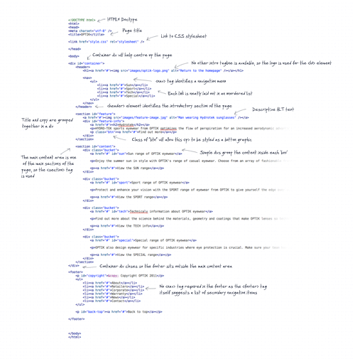
The HTML file begins with a typical document structure of Doctype, page title, link to CSS stylesheet and the opening & closing body tags. The simple HTML5 Doctype really looks great when compared to the long versions of HTML4 and XHTML.
<div id="container">
	<header>
		<h1><a href="#"><img src="images/optik-logo.png" alt="Return to the homepage" /></a></h1>

		<nav>
			<ul>
				<li><a href="#">Sun</a></li>
				<li><a href="#">Sport</a></li>
				<li><a href="#">Tech</a></li>
				<li><a href="#">Special</a></li>
			</ul>
		</nav>
	</header>
A typical container div is added to ‘contain’ the elements to help centre everything up, then we can get stuck in to some fancy HTML5 tags/elements with <header>. As the name suggests, <header> is used to outline an introduction or group of navigation elements and is used in place of the traditional <div id="header"> code we usually use.
<nav> is another new element we can make use of, which identifies a section of navigation. Inside this element a normal unordered list lays out the four navigation links.
	<section id="feature">
		<a href="#"><img src="images/feature-image.jpg" alt="Man wearing Hydrotek sunglasses" /></a>
		<div id="feature-info">
			<a href="#"><h2>Hydrotek</h2></a>
			<p>HYDRO-TEK sports eyewear from OPTIK optimizes the flow of perspiration for an increased aerodynamic advantage over your competition.</p>
			<p class="btn"><a href="#">Find out more</a></p>
		</div>
	</section>
Where we would previously use divs to create major structural areas of a webpage, in HTML5 we can use the <section> tag. <section> is used along with an ID to identify a clear ‘section’ of the document, such as the feature area at the top of the page. The photo of the guy wearing sunglasses could be added as a background image, but I expect users to naturally try to click it, so adding it as an <img> inside an anchor will allow us to link it up to its relative content.
A <h2> and <p> elements semtantically lay out the few lines of content, with a class of ‘btn’ allowing us to style up that particular link as a button graphic later. All these elements will need floating next to the image, so a simple div helps group them all together.
	<section id="content">
		<div class="bucket">
			<a href="#" id="sun">Sun range of OPTIK eyewear</a>

			<p>Enjoy the summer sun in style with OPTIK's range of casual eyewear. Choose from an array of fashionable frames and styles.</p>

			<p><a href="#">View the SUN range</a></p>
		</div>

		<div class="bucket">
			<a href="#" id="sport">Sport range of OPTIK eyewear</a>

			<p>Protect and enhance your vision with the SPORT range of eyewear from OPTIK to give yourself the edge over your competition.</p>

			<p><a href="#">View the SPORT range</a></p>
		</div>

		<div class="bucket">
			<a href="#" id="tech">Technicaly information about OPTIK eyewear</a>

			<p>Find out more about the science behind the materials, geometry and coatings that make OPTIK lenses so technologically advanced.</p>

			<p><a href="#">View the TECH info</a></p>
		</div>

		<div class="bucket">
			<a href="#" id="special">Special range of OPTIK eyewear</a>

			<p>OPTIK also design eyewear for specific industries where eye protection is crucial. Make sure your team has the best optical safety.</p>

			<p><a href="#">View the SPECIAL range</a></p>
		</div>
	</section>
Another <section> tag outlines the main content area, followed by four separate divs with a class of ‘bucket’ to lay out the four boxes seen on the design concept. Inside each of these boxes the images will need adding with CSS to allow the sprite hover effects to work, so they are created in HTML as simple anchors with a descriptive anchor text introducing the section.
</div> <footer> <p id="copyright">© Copyright OPTIK 2011</p> <ul> <li><a href="#">About</a></li> <li><a href="#">Retailers</a></li> <li><a href="#">Corporate</a></li> <li><a href="#">Warranty</a></li> <li><a href="#">News</a></li> <li><a href="#">Contact</a></li> </ul> <p id="back-top"><a href="#">Back to top</a></p> </footer> </body> </html>
The footer appears below the main content panel in the concept so the container div is closed before the <footer> tag opens. Just like <header>, <footer> is a new structural tag that replaces the old method of <div id="footer">.
The <ul> in the footer isn’t enclosed in a <nav> element because of guidelines in the HTML5 spec:
It is common for footers to have a short list of links to various pages of a site, such as the terms of service, the home page, and a copyright page. The footer element alone is sufficient for such cases.
The complete HTML
The CSS styling
body, div, h1, h2, h3, h4, h5, h6, p, ul, ol, li, dl, dt, dd, img, form, fieldset, input, textarea, blockquote {
	margin: 0; padding: 0; border: 0;
}

body {
	font: 14px Helvetica, Sans-Serif; line-height: 24px; color: #a6a6a6;
	background: #000 url(images/bg-pattern.png);
}

#container {
	width: 960px; margin: 0 auto 24px auto; background: #000; /*background: url(images/grid.png) center top no-repeat;*/
	box-shadow: 0px 5px 45px #343434;
	-moz-box-shadow: 0px 5px 45px #343434;
	-webkit-box-shadow: 0px 5px 45px #343434;
}

a {
	color: #abe2ff; text-decoration: none;
}
	a:hover {
		color: #5db5e3;
	}
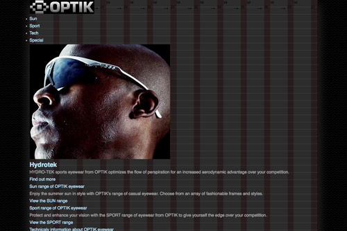
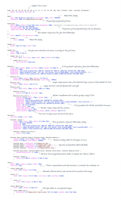
Onto the CSS! First we clean things up with a simple reset and declarations to the body to set the global styling. Then the container div is centered up and given the outer glow styling from the Photoshop concept with CSS3 box-shadow. Remember that grid used in Photoshop? We can add that as a temporary background image to allow us to align all the page elements exactly into place.
header h1 {
	margin: 54px 0 0 21px; float: left;
}

header nav {
	float: left;
	margin: 79px 0 17px 0;
}
	header nav ul li {
		float: left; list-style: none;
		width: 58px; margin: 0 0 0 98px;
	}
		header nav ul li a {
			text-transform: uppercase;
		}
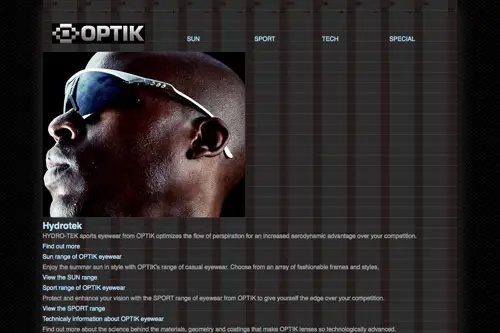
Next up the header items are moved into place according to the grid with simple margins. This is where the Firebug plugin for Firefox comes in handy so you can edit the figures live in order to achieve pixel perfection.
#feature {
	clear: both; height: 431px; overflow: hidden; margin: 0 0 48px 0;
	background: #000;
	background: -moz-linear-gradient(top, #000 0%, #191919 5%, #000 5%, #000 94%, #191919 94%, #000 100%);
	background: -webkit-gradient(linear, left top, left bottom, color-stop(0%,#000), color-stop(5%,#191919), color-stop(5%,#000), color-stop(94%,#000), color-stop(94%,#191919), color-stop(100%,#000));
	background: -webkit-linear-gradient(top, #000 0%,#191919 5%,#000 5%,#000 94%,#191919 94%,#000 100%);
	/*opacity: 0.5;*/
}
	#feature h2 {
		width: 216px; height: 30px; margin: 0 0 31px 0;
		background: url(images/hydrotek.png); text-indent: -9999px;
	}
	#feature img {
		float: right; margin: 22px 0 0 0;
	}
	#feature-info {
		float: left; width: 370px; margin: 89px 0 0 100px;
	}
		#feature-info p {
			margin: 0 0 34px 0; font-size: 16px;
		}
		#feature-info p.btn a {
			display: block; width: 170px; height: 35px;
			background: #497389;
			background: -moz-linear-gradient(top, #497389 0%, #151e36 100%);
			background: -webkit-gradient(linear, left top, left bottom, color-stop(0%,#497389), color-stop(100%,#151e36), color-stop(100%,#000));
			background: -webkit-linear-gradient(top, #497389 0%,#151e36 100%);
			border: 1px solid #313e52;
			border-radius: 10px;
			-moz-border-radius: 10px;
			-webkit-border-radius: 10px;
			text-transform: uppercase; text-align: center; padding: 12px 0 0 0;
		}

We can really start going to town with CSS3 styling on the feature section. In the concept there’s a gradient glow above and below the feature area. We could replicate this in CSS3 with box-shadow or CSS gradients. Here I’ve gone for the gradient approach with the help of the handy CSS Gradient Generator tool, which makes it easy to match the format from Photoshop.
The <h2> uses a non-web font so a simple CSS image replacement technique switches the default H2 text for an image. The text content and image is moved into place, then the “btn” class is given some styling to convert it into a button style graphic. display:block; converts it into a block element so a width and height can be added, then another CSS gradient is generated to flow from dark to light blue. border-radius then rounds off the corners and the text is set to uppercase and bumped into position vertically using a touch of padding.
Tip: Use opacity: 0.5; as a temporary declaration on the feature section so you can see the underlying grid lines.
#content {
	overflow: hidden; clear: both;
}
	#content .bucket {
		width: 212px; float: left; margin: 0 0 48px 20px;
		border: 1px solid #262626;
		background: #000;
		background: -moz-linear-gradient(top, #000 0%, #000 39%, #191919 39%, #000 100%);
		background: -webkit-gradient(linear, left top, left bottom, color-stop(0%,#000), color-stop(39%,#000), color-stop(39%,#191919), color-stop(100%,#000));
		background: -webkit-linear-gradient(top, #000 0%,#000 39%,#191919 39%,#000 100%);
	}
		#content .bucket:first-child {
			margin: 0 0 0 22px;
		}

	#content #sun, #content #sport, #content #tech, #content #special {
		display: block; width: 212px; height: 143px;
		margin: 0 0 32px 0; text-indent: -9999px;
	}
		#content #sun { background: url(images/sun.jpg); }
		#content #sport { background: url(images/sport.jpg); }
		#content #tech { background: url(images/tech.jpg); }
		#content #special { background: url(images/special.jpg); }

		#content #sun:hover, #content #sport:hover, #content #tech:hover, #content #special:hover {
			background-position: 0 -143px;
		}

		#content .bucket p {
			margin: 0 0 24px 0; padding: 0 13px 0 13px;
		}
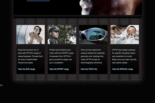
The four buckets in the content area can then be styled up with a specific width and margin and floated side by side. A simple border and another background gradient help replicate the shadow underneath the header images in the concept. To match the layout to the grid the first bucket’s margin is adjusted using the first-child selector.
All the header images can be grouped together for some general CSS such as the width, height and margin. text-indent: -9999px; shifts the default text off screen, then the specific background image for each link is added. These images has a hover state included in the basic sprite, so all anchors are set to move the background position on hover.
footer {
	width: 960px; margin: 0 auto; height: 80px;
	font-size: 12px;
}
	footer #copyright {
		float: left; margin: 0 0 0 22px;
	}

	footer ul {
		float: left; margin: 0 0 0 134px; list-style: none; overflow: hidden;

	}
		footer li {
			float: left; margin: 0 10px 0 10px;
		}

	footer #back-top {
		float: right; margin: 0 22px 0 0;
	}
		footer #back-top a {
			background: url(images/optik-logo-sm.png) left no-repeat; padding: 5px 0 5px 40px;
		}
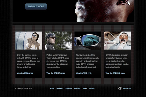
Finally the footer area can be styled to finish off the page. Because it’s outside the container div it first needs moving into position with the 960px width and margin: 0 auto; declarations. Then each of the three elements can be floated side by side and moved into place with margins.
The complete CSS
Patching up IE
Needless to say, Internet Explorer doesn’t support these fancy new HTML5 and CSS3 goodies. Our CSS will simply degrade back to non CSS3 styling, so there will be no gradients or round corners. The HTML5 tags on the other hand won’t be recognised at all, which will bork the layout altogether. Luckily there’s a snippet of code you can add to the head of your page to render the tags as normal elements:
<!--[if IE]>
<script>
  document.createElement('header');
  document.createElement('footer');
  document.createElement('section');
  document.createElement('nav');
</script>
<![endif]-->
Then you can simply create a conditional stylesheet to fix up the mess IE makes of your standard CSS. With this tutorial being a HTML5/CSS3 demonstration, I’ll leave those exciting fixes for another time…
The final website design
Our final coded website matches the original Photoshop concept identically with the help of a few CSS3 features and looks cool under the hood with the new HTML5 tags. Check out the demo in the latest Firefox, Safari or Chrome browsers.


the works in this post sounds great. was able to understand easily.thanks for the wonderful post…..
Thanks Chris, I love these web tutorials, they're great!
Thanks Dude……….
Thanks for posting this wonderful site..this could easily be a template for a new project thanks….
Thanks! I LOVE the layout of HTML5, so straight forward and easy to follow, and dont get me started on that doctype :)
Great tutorial i just love when you add JQuery in the end to animate top page link, photos links etc…
Cool design! I'm going to muck around with this when I have a bit of time.
The design is beautiful, and on all browsers behave exceptionally. Imagine if it even IE does not protested about the design… Thanks a lot for quality articles.
Excellent tutorial! Thanks for your easy-to-understand writing style!
I'm using blogger platform.. Yess! my template Valid HTML5 To.. Thanks again line25..
Check here validator w3 dot org
Overall, pretty good, but I'd make a couple of recommendations to your HTML markup.
You don't actually need the ul/li markup for the nav piece. You can just use the <a> inside the nav and it will work just fine. One less thing to code, less markup.
Those divs that are class="bucket" should actually be articles. The spec for the article tag is for any piece of content that could be republished on its own. So, in essence, each of those buckets are pieces of content (articles) that could be published/syndicated by themselves. This has two advantages: you're making use of a semantic html element and you can just target articles in your CSS instead of creating an additional custom class.
Finally, in your footer, that ul/li should actually be a nav in the footer as these are navigation links. Nice thing about HTML5 is that you can multiple navs. Additionally, instead of making a custom class, you can target footer nav in your CSS.
Simpler approach, better use of HTML5 and something with real meaning.
All that being said, it's great to see people making use of HTML5. So, while there are a few things that could be improved (aren't there always?), this is a great jumpstart for moving to HTML5.
I agree with Todd with all his recommendations apart from the the first part about just using a tags in the top navigation. The navigation is, a list of links. If you are going to pull people up on using semantic coding practices you have to make sure you're right. You can't just decide to use a tags only because it less code.
Your post is awesome as you! Keep up the good work! I'm always reading ;)
html5shim really helps me with patching up old IE to recognize and style html5 element
Yup, been using html5 shiv for about 9 months now and lovin it.
Im using html5shiv
Do you need a list (ul tag) in the nav tag for nav links? You could style the anchor tags with display:block and avoid the list. Thoughts?
It is a list of links. Lists use list dom elements.
Such as, tabular data use a table.
That's not necessary any more. The nav element gives them semantic meaning, so you don't need the extra markup for the nav elements. That's just creating additional dom for dom's sake.
That's interesting and makes sense.
Thanks :)
Hi,
Web design is my favorite job in internet, this is simply awesome. i am impressed with this tutorial. Great Thank you..
Another amazin tutorial by the great Chris spooner! Thank you! It has cleared some stuff up, you make it so easy. Again thanks for this great tut!
i need to start using these grid, tnx for the tutorial
"Copy both into a new document to create mini sprite images then export as JPEGs."
Did you mean PNG for sprite images?
Great concept and design, but the finished website is showing up a bit funky in my FireFox — the bottom buckets are not aligned, and the black background of the body doesn't show. It's better in IE, but the white shadow around the container doesn't appear.
Just wanted to give you a friendly heads up. :)
Got the same problem in Safari.
Nice post, but your example looks out of place.
Hi Chris,
nice tut, especially love your IE-snippet to degrade back to non CSS3 styling!
Thanks for sharing, Cheers & Ciao ..
great Tutorial !
but: I think Google (or other Searchengines) doesn't like "text-indent: -9999px;" – so u probably use another technique
thank you for this post! i'm add to bookmarks!
Great tutorial Chris! Really well written and explained :) Thanks!