Line25 is reader supported. At no cost to you a commission from sponsors may be earned when a purchase is made via links on the site. Learn more
The flat trend in web design has recently gained a lot of popularity and we started noticing lots of website and interface designs springing up with this design style. We’ve seen the use of solid colors increase through the adoption of the flat design trend, but these hues are becoming increasingly vibrant following the release of new iOS and new iPhone. Dazzling RGB colors are becoming more popular in the latest website designs, with saturation levels at an all-time high.
Flat design is a label the community has adopted for designs leaving behind drop shadows, subtle textures, and gradients in favor of solid colors, clean layouts and sharp typography.
This post rounds up a collection of over 20 great examples of the growing flat trend of supersaturated background colors in web design. Check out these beautiful flat websites, in the list below.
Want more? Check out these flat design freebies you can download!
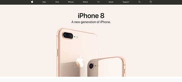
Apple
Apple is truly an inspiration when it comes to design and they excel in web design as well! Their presentation website for the new iPhone 9 is impeccable and makes use of the flat design trend perfectly.
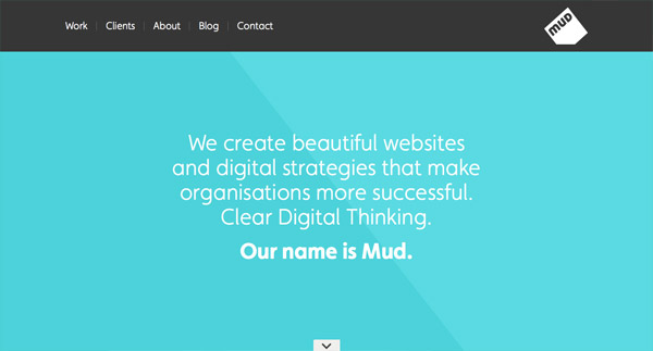
Mud
Check out this great example that uses flat colors in its design. Typography is accentuated due to the use of a plain blue background with minimal details. The website navigation is also simple and user-friendly.
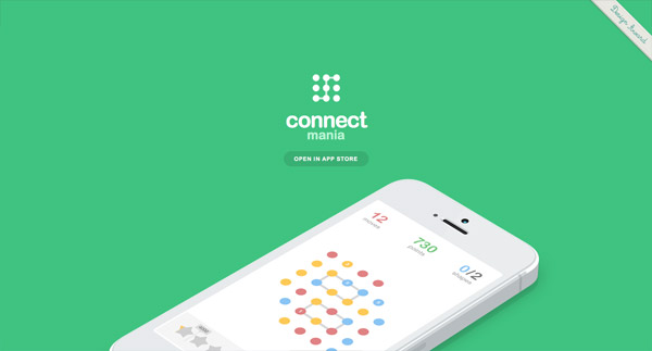
Connect Mania
Connect Mania has a friendly interface design that uses flat colors and flat graphic elements in an eye-catching way. It combines flat colors with 3D mockups, such as the smartphone on the homepage which is displayed in an isometric perspective. This design has a dynamic layout and cool details worth checking out.
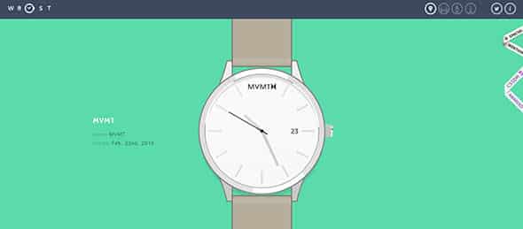
Wrist
And if you liked the previous example you will definitely love this one. Check out this website’s flat design with simple and clean flat drawings instead of using photos of the real products.
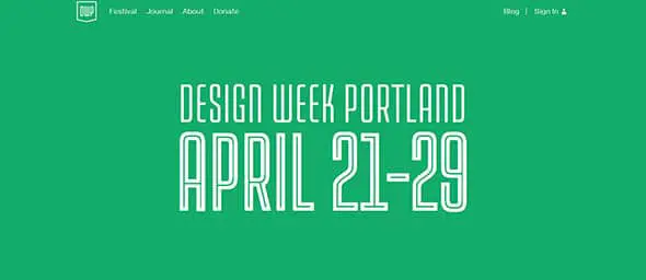
Design Week Portland
This website focuses on presenting an event which takes place in Portland every year through a flat and minimalist design. Typography is the center of attention here in this example.
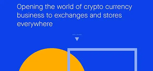
BitLocation
If you like using shapes and mixing bold colors in flat design then you might want to analyze this website. It has an unusual color palette with vibrant, almost neon colors, but it does the trick of catching the readers’ attention!
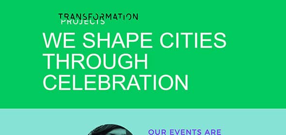
Transformation Projects
This is yet another good example of a website that uses flat design in a creative way. It mixes colors and typography to create a modern and functional web design.
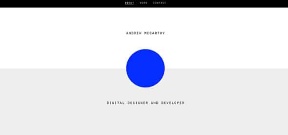
Andrew McCarthy
If you are looking for a nice way to mix flat design with minimalism, this website might be a great source of inspiration for you. It is very simple and has an inspiring navigation system.
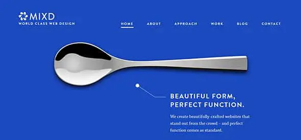
Mixd
Let’s continue the series of good flat design in websites with MIXD. This company focuses on building beautiful websites and their’s proves their vast experience in this line of work.
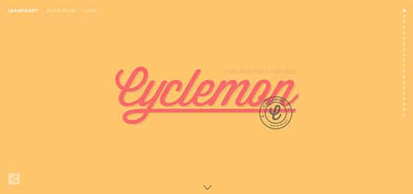
Cyclemon
Cyclemon’s store featuring unique art on various products across art prints, tech accessories, apparels, and home decor goods. Cyclemon’s website uses flat colors in its web design layout.
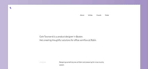
TWNSND CO
Cole Townsend is a product designer who builds things using HTML/CSS, ReactJS, and several animation tools. This is yet another good example of mixing flat colors with minimalist design worth mentioning in this list.
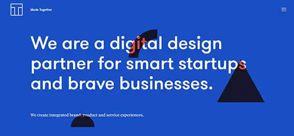
Made Together
Here’s another good example that can be a great source of inspiration for future projects. It has a simple flat color as a background, a neutral typeface which presents some content about the company and mixes some simple shapes in its design.
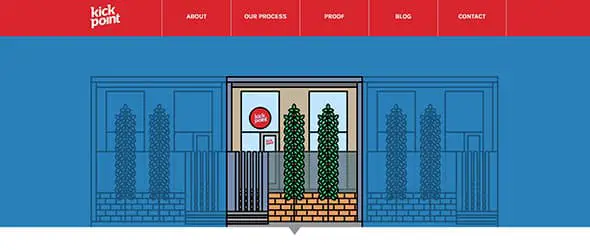
Kick Point
This is a much more detailed example of flat design. You might also want to check out the graphic elements it uses and that cool menu bar.
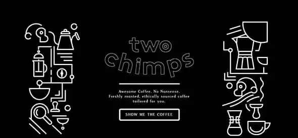
Freshly Roasted Coffee
Fresh Roasted Coffee offers 70+ varieties of gourmet coffee from around the world, selling a selection of sustainable specialty coffees. If you are a fan of coffee or you are simply looking for a good source of flat design inspiration, this might be the example you have been looking for.
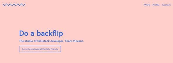
Do a backflip
This website’s design mixes flat colors in different ways. The combination between indigo blue and baby pink may be unusual, but it surely is effective in catching our attention!
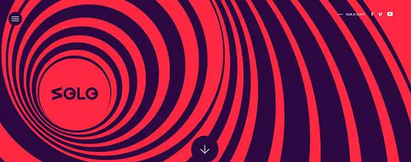
SOLO
This example uses flat colors in a creative and animated way. It also has a cool preloader and awesome transitins throughout the website.
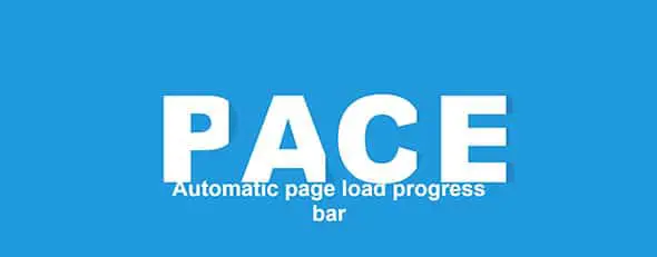
PACE
PACE website design combines graphic elements such as the huge typography in its header with simple, plain colored backgrounds. The fonts also have some subtle details that will surely be noticed by typography lovers.
HEIKOPAIKO
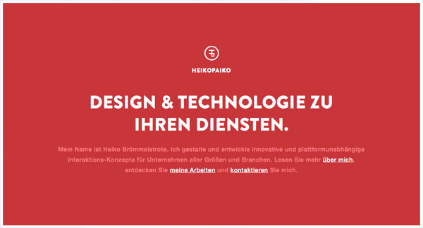
Heikopaiko is a gorgeous responsive one page portfolio for the German designer Heiko Brömmelstrote. It uses a simple background that might seem dull in some cases but when you combine it with the right graphic elements and fonts, it becomes really attractive!
Fhoke Studio
Fhoke Studio is a small-sized team of young, creative professionals based out of India. F This example mixes colors, typography and graphic elements and manages to make an eye-catching design.
Octave & Octave
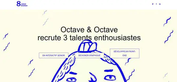
If you are looking for some more creative ideas of using flat design, then have a look at this example. See how this website mixes doodles with flat design successfully!
Bark PR
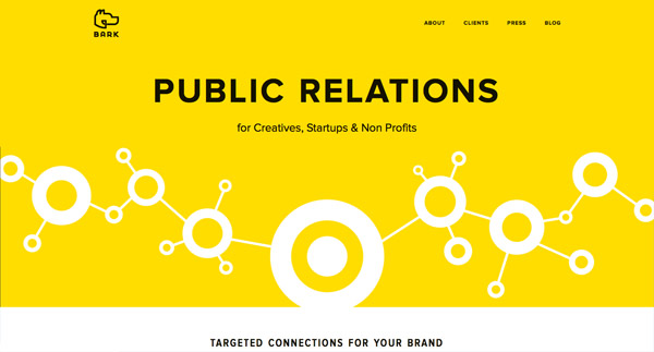
Bark PR is an independent public relations house working with creatives, startups and nonprofits based in San Antonio, TX. The website uses yellow as the main background color and it is the first thing a visitor sees when accessing the page. It also has so cut-out shapes that make you think about connections, relations etc.
Flat WordPress Theme
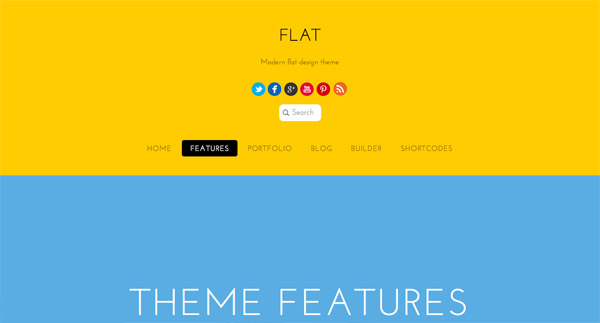
This example has a friendly web design layout that mixes different flat colors in its design. This is actually a theme created with the help of the Themify Builder which provides an easy to use user interface for arranging the content blocks on the frontend by dragging and dropping.
Petra Sell
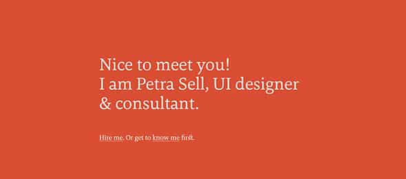
This is Petra Sell’s portfolio website, a UI designer and consultant. It uses flat colors in its design and a perfect combination of white and bright red.
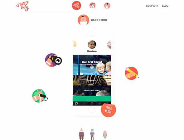
Hell’o Baby
This is an interactive cross-platform baby album with additional services such as measurements, stickers, video stories, printed albums, postcards. They use a dynamic, flat design on their website, which we love!
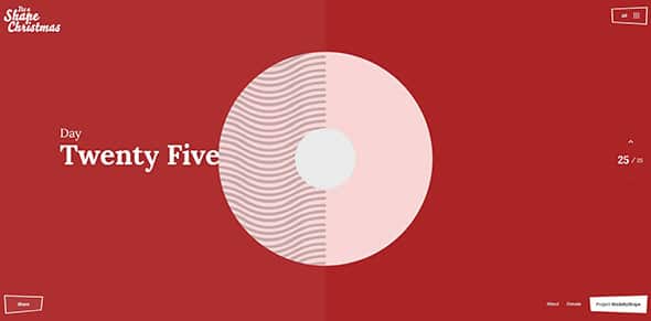
It’s a Shape Christmas
Shape Christmas is an Interactive Advent Calendar themed raising money for charity. They use a dynamic flat style design for their website, with lots of subtle animations and transitions.
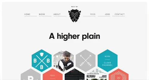
Buffalo
Buffalo is a small web design & development agency based in Brighton, UK. They use flat design elements on their website and a beautiful color palette.
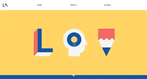
Lorenzo Verzini
Lorenzo Verzini is an Italian designer & art director living in London, working in the field for more than 9 years and this is his portfolio website.
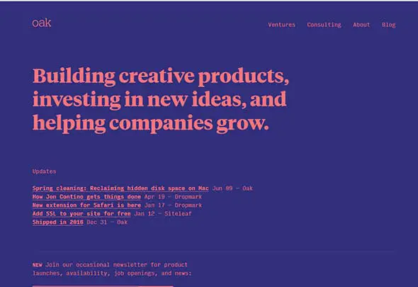
oak.is
This is a studio that helps to build creative products, investing in new ideas, and helping companies grow. They use a bold color palette, nice typography effects, and almost no images!
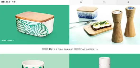
Helbak Ceramics
This is the combined brand site and web shop for the Danish ceramist Malene Helbak. Bold, flat colors blend beautifully with high-quality images in this website design.
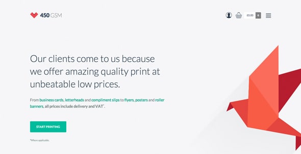
450 GSM
This website helps you print online 450gsm business cards, flyers, leaflets, greeting cards, stickers, postcards, pull-up banners, and posters. It is a perfect example of how flat style can be used in web design.
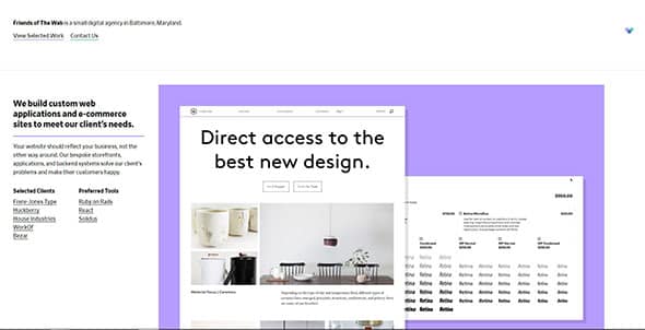
Friends of the Web
Friends of The Web designs and develops custom web and mobile applications with Ruby on Rails, React, Solidus, and Swift. They use a simple, clean, minimalist flat design for their website.
Dropbox Guide
This website helps you learn how to sync, share, and manage your files with Dropbox Business. It uses a simple but effective flat design with beautiful illustrations.

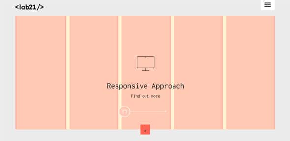
Lab21
This website has a simple, responsive design with lots of flat design elements added to it.
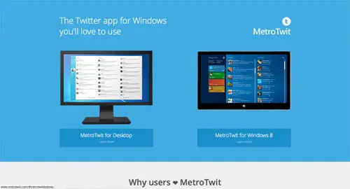
MetroTwit
This is a made-for-Windows software to access Twitter with simple Metro-style design and features. While the software itself is no longer available, the website can still be used as flat design inspiration.
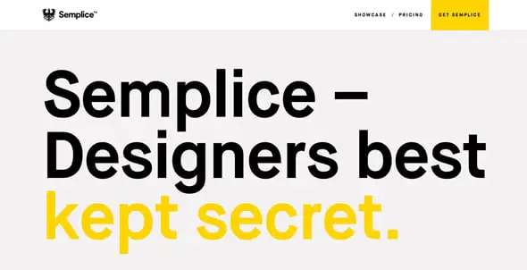
Semplicelabs
This website design combines large typography with flat colors and flat design elements. Check it out!
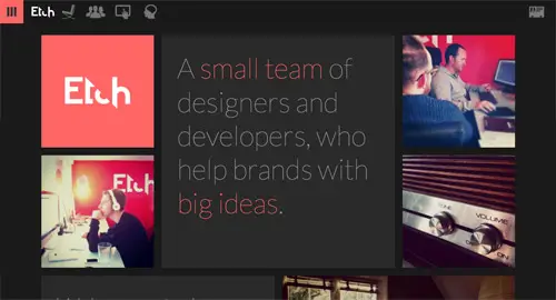
Etch
This is the website of a small team of Designers and Developers who help startups build new products.
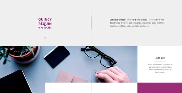
Quincy Réquin & Associates, lawyers
This is the presentation website of an independent lawyers office based in Lyon and Paris.


Great collection.
oak.is being our favorite pick of the bunch…
;-)
Good read, and really they are trends. Literally, simpleness is the future.
Really nice trend, bright, rustic sometimes. Love it.
Really impressed by this type of design.
Nice collection of sites.
To us flat design embraces getting back to basics. This is also reflected in the choice of colours with many designers choosing to use a smaller number of contrasting colours.
I’m really loving this look
I tihnk its safe to say that Microsoft has done a lot to inspire this through its Metro interface, but at the same time it reinforces that simple design can be the most beautiful.
Or you could call this trend "Surface Trend", because thats what flat trends remind me of, especially with tiles!
I think this appeals to the designer's eye. But when it comes to most clients (or a boss) its all about impact and detail – which means gradients and texture! Cool showcase though!
This trend in website design has always stood out for me. I just hope that we'd get to see more of it in the coming years!
I've always been a fan of keeping things clean and simple so I'm really loving this look. Nice collection :)
Looking forward to this becoming mainstream where your average Joe client wants something workable with no frills (flying logo intro be gone!!!)
All these website are starting to look like this because of twitter's bootstrap, and it's ease of use. If you don't already know what bootstrap is, look it up.
How is Bootstrap "flat"? It's gradiented all the way everywhere.
One of the best examples I've seen of this is https://lowdi.com/
Lovely site. They sell bluetooth speakers.
Great! I've been told that my designs are "too flat"… I always thought they are just clean & minimalist but now I can example with this article and tell them it's a trend.
I do really like this look. So simple and easy to navigate. Thanks to Windows 8 for really bringing this to the forefront.
As always, great read Mr. Spooner.
love the flat trend, i love it so much I was using it last year on my own site :)
Definitely a design trend im moving towards myself, so much cleaner and powerful. Nice collection of examples!
nice collection Chris!