Line25 is reader supported. At no cost to you a commission from sponsors may be earned when a purchase is made via links on the site. Learn more
Build a complete website design mockup for a fictional design studio, starting with the creation of the initial layout then moving on to designing the individual page elements. The result is a modern, crisp and clean web page layout ready for coding.
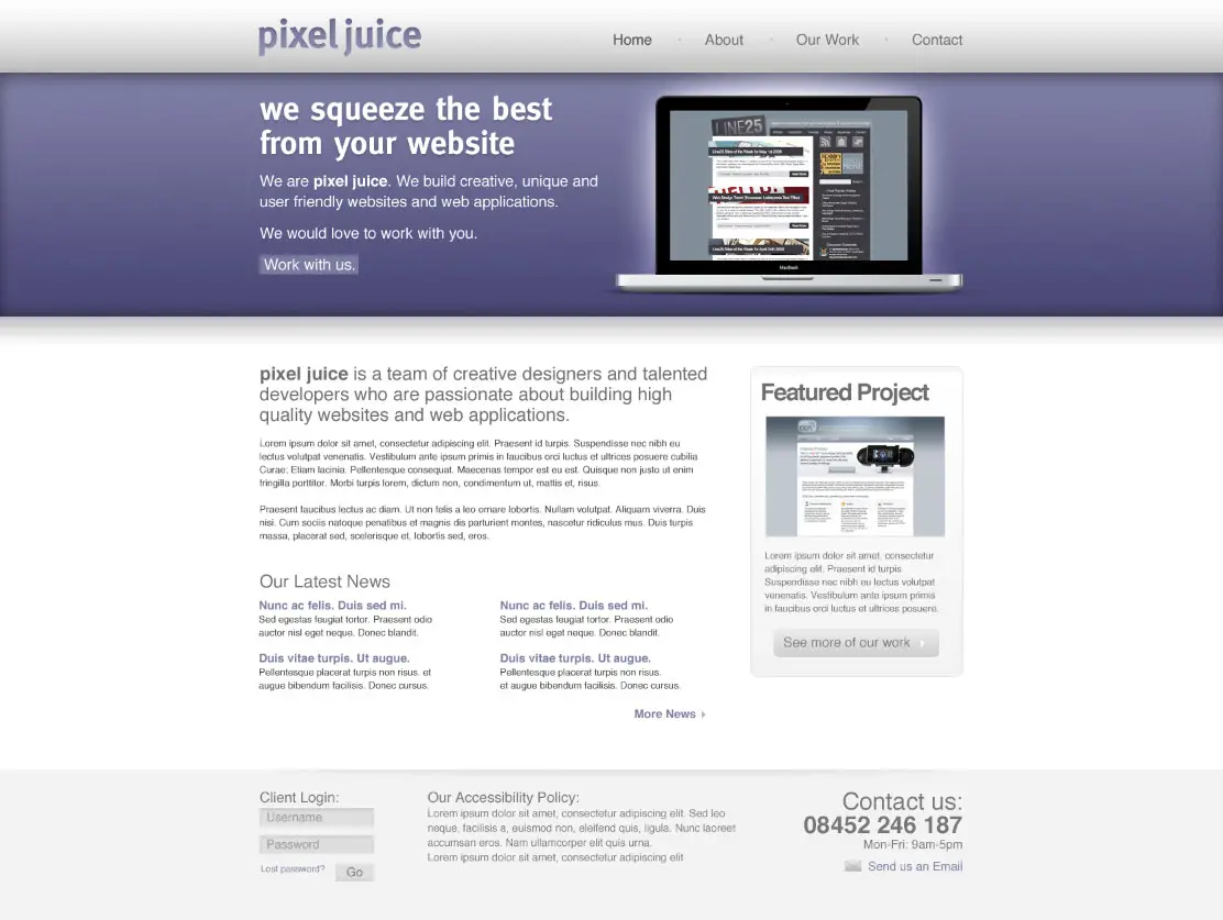
Taking inspiration from various modern website designs, we’ll produce this clean and crisp website layout. Key features include horizontal bands to separate the content into specific areas; a colorful header area introducing the site; a friendly welcome message with examples of work; two-column main layout and a resource filled footer.
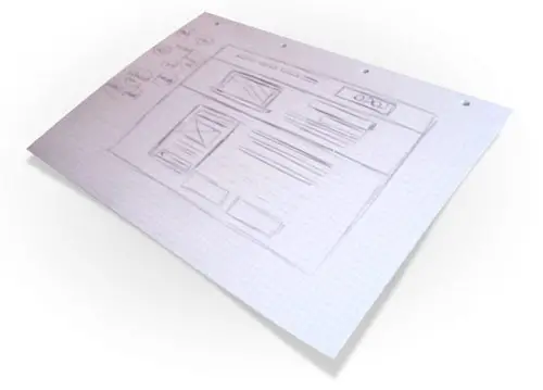
A good start with any design is to sketch out the plans on paper, the free reign of the pencil helps flesh out the rough layout with ease.
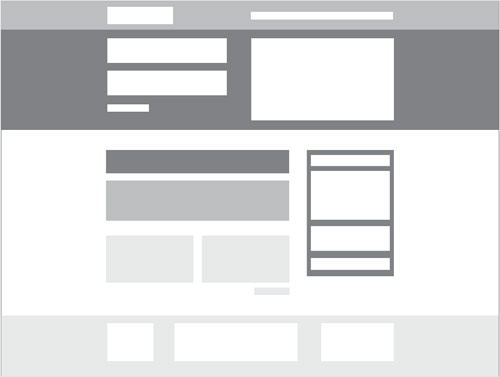
Planning out a wireframe also helps develop a hierarchy and gives an insight into the best positions for key elements of the design.
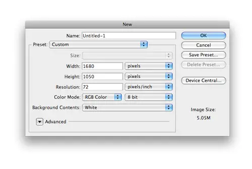
Create a new document in Adobe Photoshop, I tend to make the size of the artwork similar to that of a common widescreen monitor to give a good representation of the overall look of the site.
Place guides at a 960px width in the centre of the document and create a basic grid to place the page items against.
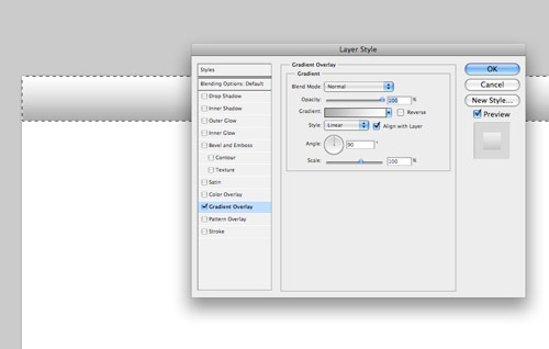
Begin with the creation of the header bar. Draw a selection across the full width of the document and fill with white. Double click the layer to open the layer styles and add a Gradient Overlay from grey to white running vertically.
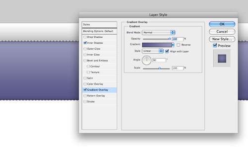
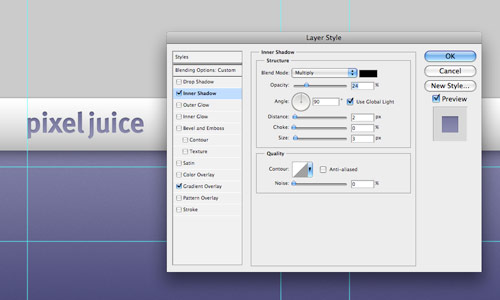
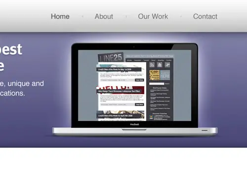
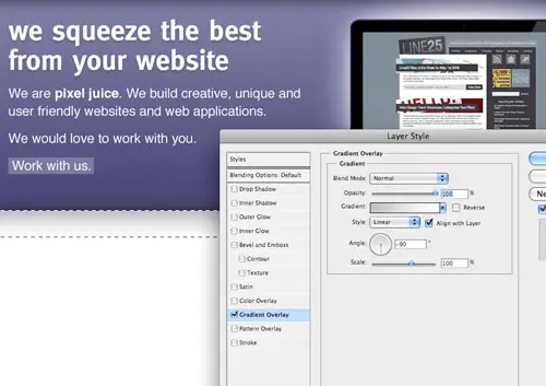
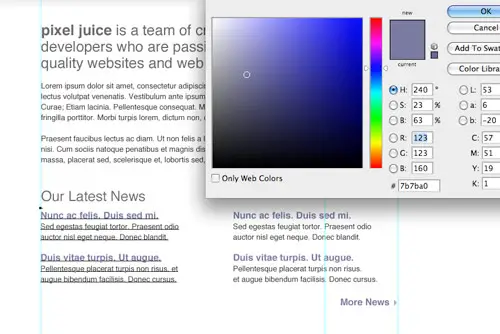
Next, draw the main header area where the featured content will be placed. On a new layer draw a selection, then add a gradient overlay with a selection of two vibrant colours. Also add a subtle inner shadow to add depth to the design.
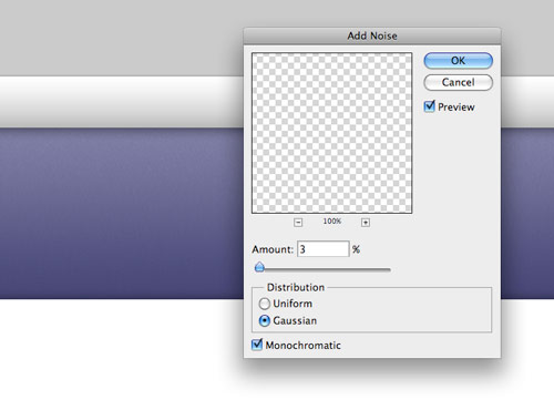
Subtle touches of texture can really bring a design to life. With the header area selected with a mask press CMD+SHIFT+C to Copy Merged, then paste on a new layer. Go to Filter > Noise > Add Noise to produce a simple texture, then set the blending mode to Multiply and reduce the opacity to suit.
Paste in the company logo, position on screen according to the grid, then add some styling through the layer style options. Add a gradient overlay to match the feature header colours, then create a very soft inner shadow.
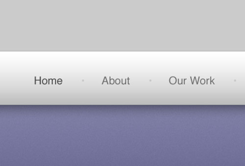
Use the Type tool to create the text of the main navigation, set the type in a mid-grey while using a slightly darker version for the active link.
The feature header is a great place to introduce the website, with the vibrant background colour it is given main focus to the user. Use this space to place a snappy intro title in a custom font that matches the company branding.
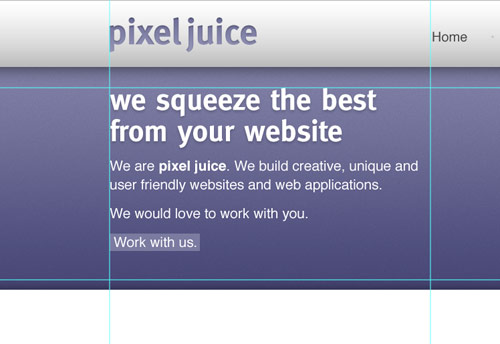
Continue fleshing out the introductory content, but this time use Arial or Helvetica as the font so that the text can be set in plain old html, without any image replacement techniques.
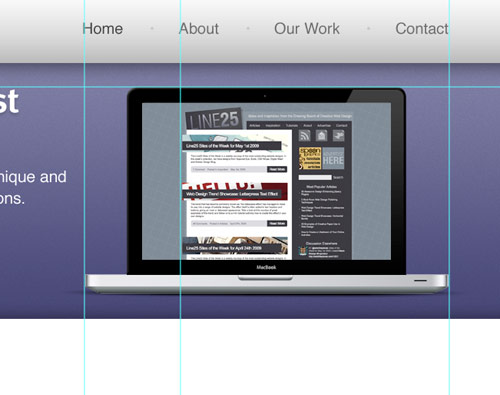
Position a laptop into the featured area (a range of examples can be found here), this fits in well with the nature of the fictional company, and makes a great focal area to display examples of work on the laptop screen.
Emphasise this focal point with a radial gradient emitting from behind the laptop. This adds that little extra detail that lifts the element from the page.
Underneath the main header, draw another selection and fill with a grey-white gradient.
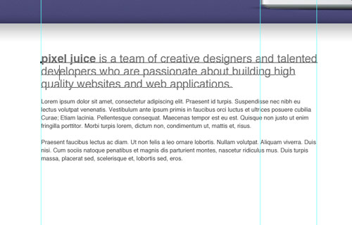
Split the mid section of the page into two columns with guides in relation to the grid lines. On the left we’ll have a main content panel, whereas the right will hold a thinner sidebar. Use the Type tool to add some dummy content. Alter the sizing and leading to give digestible and easily readable passages of text.
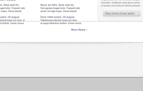
Below this main content area could hold an area to display the latest blog posts. Split the column into another two columns and draw up a selection of example post entries. The title links should stand out to the user as something clickable, so change their colour to give a visual clue.
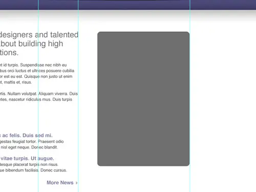
Use the Rounded Rectangle tool to draw a box in the sidebar. The original colour doesn’t matter too much as we’ll be styling it up in the next stage.
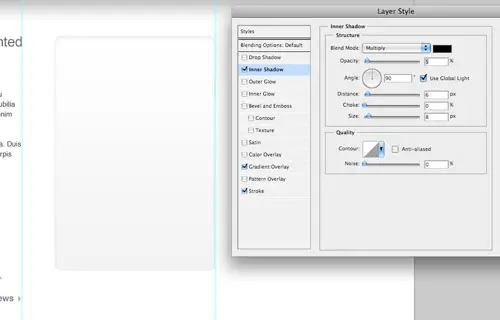
Double click the layer and add a range of layer styles, including a grey-white gradient, a thin grey stroke and a soft inner shadow.
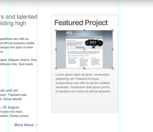
Use this sidebar panel to develop a Featured Project section. Elements could include a small screenshot and passage of text.
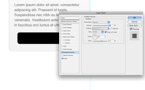
Draw another rounded rectangle to use as a button, add a couple of layer styles such as a gradient overlay and stroke to style the button to match the overall clean/grey theme.
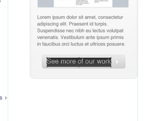
Create a short, descriptive label for the button prompting the user to continue through the site to view further projects.
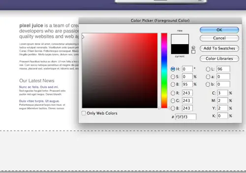
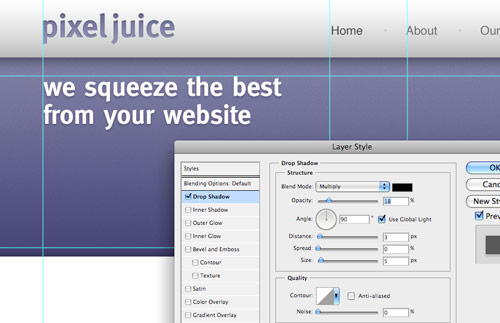
Signify the end of the content by drawing a footer area onto the screen. Fill the area with a light grey to differentiate it from the main content area.
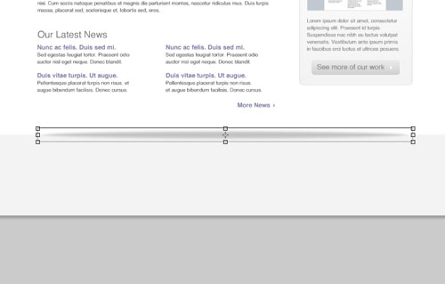
Draw a circular mask and fill it with a black to transparent radial gradient. Press CMD+T to transform the selection, squash and stretch the gradient to form a long thin shadow-like graphic.
Position the shadow centrally on the screen, then delete the excess area above the footer. The result is a subtle shadow that lifts the main page, adding a little touch of detail to the design.
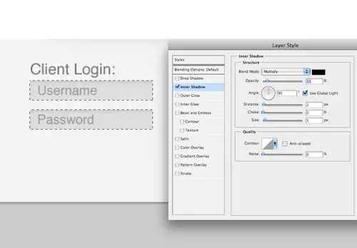
The footer area is a great place to hold secondary page elements, one example could be a client login area. Flesh out the design with the Type tool, then draw a couple of input boxes. Style the boxes with a soft inner shadow.
Use the central area of the footer to display a message about the company. Set the text using consistent header and body text font sizes.
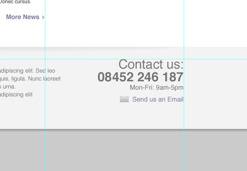
Finally, add a point of contact in the lower right. These details will then be handy to the user throughout the site. Give prominence to the most important aspects through size and stronger weights or colour.
The final design fits all the desired elements neatly onto the page, while keeping everything aligned to the base grid. The result is a structured and clean layout with lots of subtle greys to add depth. Colour is then used to highlight feature areas and important content.
Stay tuned for a future tutorial where we’ll look at coding up the visual into a complete XHMTL/CSS webpage.
That’s a great tutorial.. i would like to make one someday.
This is best tutorial by the way… :) I always missed something but now I made my own design.
Nice information. Learned a lot from it. Thanks bro. Expecting more article from you.
Very nice work!
Awesome! Great works. I much appreciate your time ;)
This is not for beginner, but its nice
yo chris,
this is really fresh – thanks for this clean tut…
;)
greets from germany
Cool, very inspirational turorial, gave me a couple of ideas. Thanks ;-)
Thanks for sharing :)…. is this website accessible though? In terms of colours and colour contrasts?
what’s the font used for the titles ?
I really like it…does somebody know ?
if anybody’s wondering, that 960 grid can be found @ https://960.gs
congrats, nice tutorial with efforts. I like the layout design and the colours you picked…very sleak.
Nice Design but I would have liked to see some more numbers in form of measurements. Noobs like me have no idea how big something like a header has to be. I know, I know, learning by doing and so on. It’s just my opinion ;)
There is nothing simple or easy about this about this article
nice article thanks for sharing…
Lovely design
Nice Article
You gave New idea to online world and designer of course as well.
Great Job!!!
Litmusonline
Exited :D
waiting …
Stay tuned for a future tutorial where we’ll look at coding up the visual into a complete XHMTL/CSS webpage.
Nice web design
This is a great reference for website design.
Obrigado!
Great tutorial,
I’m sure a lot of people have followed this tutorial and probably not come to quite the same result. I think it takes years of practice designing website, learning about white space and keeping your page not too cluttered.
I think this is a good tutorial but other designers who are learning need to think for themselves a little bit and add in their own style. Don’t be a sheep.
ruben is gay
this site is not good it dose not meet its pourpase and it is just simply awfull it sux 100% possitive
FUCK DIS SHIT NIGGA
MaTT iiS ReAllY GaY!! AnD Dis WeBsiTE SuCKs!!
THIS IS HORRIBLE! DO NOT TEACH WITH THIS!
cool
Hey. I have followed this tutorial and added my own twist to it as well. I will post my website soon so you all can see. thanks for this :)
Hey there! Could you send me the PSD for this? It would be extremely helpful for following your steps. Thanks a lot!
非常的感谢,又学习了.
Very good article, I will try to draw the website with help of this tutorial. Thank’s for sharing!
nice tutorial.
i love this work. thanks :)
WoW :) Awesome tutorials. Thanks for sharing this nice post.
I do this all the time, but you still have found ways to simplify my process. Thank you. I will definitely put things into place.
You can compete for the gold with the best of them and do it all in style. ,
In theory, each device bus can have its own address space. ,
There are many signs of hope and goodwill to improve this frightening situation. ,
Good tutorial and classy up-to-date design. I shall give it a go.
cool, I tried to recreate habs, it would probably use it for your own blog, but somehow it looks a bit different, not so good as here
Thanks Chris!
One of the best tutorial I’ve ever seen.I’m beginer in coding, I know a lot of things how to do in photoshop but coding is problem for me, anyway great you’re king.
Nice! Thanks.
Yes Chris another good tutorial – I agree with Sniffer – if your unsure of a term – Google it – and be grateful for what you did understand.
Please keep tutorials clean as they are.
Don’t know how to add noise? Search Google.
Love your work!
realy nice tutorial and fine design, looks professional, you can use for a corporate presence
The tutorial is good, but it is missing some steps and the images are very poor.I cant read any info at the layer style.
Please review this tutorial.
Very interesting article!
Thank U
Excellent, I liked the bare-bones approach, we can all work out skipped-over bits (header height, noise) with a little experimentation.
thank to you
This is one of the tutorials I give out to the people I am training – very solid, though the coding is the second half of this.
Chris Spooner can you give me more detailed steps
horrible!
the outcome is looking good but the steps really need more details!!!
for example:
Begin with the creation of the header bar. Draw a selection across the full width of the document and fill with white.
OK and how is the height of the header bar ?
nobody is perfect but please look twice before releasing a tut with lots of errors.
nice tutorial, nice design, excelent for company homepage, have your this as wordpress theme?
I’m going through this tutorial right now and it is great! I’m a bit lost at the mask/copy merged right before the add noise part, so I’m going to skip that and see if it all works out in the end. :-)
Hey, Thank for the tut.. Tried it, loved it!
Really brilliant!
Please anyone tell me something! which font size should i use for menu,
Good result.
I agree that it needed more detailed steps
Hi Chris, nice tutorial and the site design is amazing. Because im new in this i had a little problems to follow the tutorial the first one, to draw a selection??? i just draw a rectangle because i didnt know how i could do it. second what size i should use for each text. U know since the size of the page is huge im like confuse.
Ill be waiting for your answer! thanks
could you please share de .psd file? and sources..
Thank you
I really like the wire frame idea. Why didn’t I think of that? The transition from sketch to computer seems so arduous! I also need to thank you for the squished shadow effect. I have spent forever trying to figure out how that is done. Mystery solved.
nice
I agree with Codie, for people who are not as familiar with Photoshop, it’s not easy to follow, especially the Add noise part for the header area
Thank you so much, the result is really impressive. What i would learn more is about the interaction between the 960 grid and the placement of design elements, which rules from this grid system do we have to respect to keep the design well positionned? Thank you for this nice tut!
Hey, love the tut, but could you break the steps down further, and show more screens, I felt a bit lost as to what to do at times.
this is simply amazing!
yes AMAZING … it BLEW me AWAY
yes, it will help to create my reviewed penis extender device site.
Ahhh. I guess your device site will be very short sighted.
Some people is not getting that it’s not a Photoshop tutorial, but a webdesign tutorial. You are supposed to know how to use this tool, guys. Or search for other tutorial explaining how to use it. I’m pretty shure that there’s a bunch of them around.
I like it! ;-)
Nvm about the twitter part. just found it, lol, whoops ;)
Thank you so much for a GREAT tutorial!! You should get a Twitter page!!
If or when you do:
https://twitter.com/Devineca
Great tutorial, I finally decided to do one of these tutorials. I’m a bit envious of Mr. Woodruff’s Student, the closest I came to anything computer wise was my computer literacy class. My school is so broke we couldn’t until like last year afford software like photoshop. Grrrr. Tomorrow I’m gonna do the Markup of the site during lunch.
This tutorial was great, and I love the outcome. My teacher, Mr. Woodruff, assigned us to follow this tutorial (and the next part, as well) for a homework assignment. I have to say, of all the tutorials he’s had us use over the last 3 years, this is the best and has the best result! Thank you!
Nicely Illustrated! Excellent tutorial for Photoshop users from start to finish. I really like your approach with a sketch drawing for a design reference. Thanks for the tips!
not for the novice, sorry couldn’t follow, just needed a few more intermediate steps…
This may help you guys as well https://www.mutinydesign.co.uk/web-design-resources/creating-a-website-in-photoshop-part-1/
I’m just curious about the various layers you used in this tutorial. For example, is each of the navigation words on it’s on layer or one single layer viz. Home is on it’s own layer Our work is on it’s own layer, or are they all on a single layer?? Great stuff though for sure!
Were can i download this template? (i do not want to create it)
Sweet! Had a little trouble with creating the circular mask….but I’m a newbie. Looking forward to the XHTML/CSS tutorial!
Hello guys here we have got a great stuff , this tutorial helped me a lot in attaiing good knowledge.
Thanks so much for this tutorial! Used some of the techniques in making my aunt’s website :) Looks like I need to explore the joys of layer styles more, because you used them in some creative ways =]
Thanks so much again!
waiting for upcoming tutorial.!
thanks, good tutorial .. :)
Great tutorial thanks
Really great tutorial, I like modern designs, thanks.
Nice design, there was a good tutorial like this on nettuts as well.
If this was a screencast I think I’d pay to watch it!
Love the final product Chris, keep it up!
I found this article to be very interesting. I work for a company that promotes great priced websites and we use a lot of Photoshop to build graphics. Thanks!
The steps are difficult to reproduce as a new bee. It would be helpful if you could provide a download of the psd file. Thanks a lot.
Very cool Chris. I really like how you use the layer style.
Thanks !
Great tutorial, much more insight and detail to other similar tutorials I’ve found.
Great tutorial, thanks!
WOW! Nice Tutorial…can’t wait to integrate it to HTML
Great tutorial Chris thank you!
Well I for one absolutely appreciate the brevity of this tutorial, if you know your way around Photoshop a long winded 8 page tutorial is obsolete and here you can learn more about the ideas than technical steps – there are loads of more detailed tech tutorials around but this one stands out b/c of ideas presented in such a clear way.
Thanks again!
very good indeed! very nice! mate!
And although it is a good design, shouldn’t login forms like the one at the bottom follow the ‘above the fold’ rule? Elements critical to business should be above the fold, and I’d say that a Client Login is a critical element, depending on what is beyond that login awaiting them.
Now make it CSS/XHTML valid and compatible with the most used browsers
Brilliant! I agree on the css – love to see the code behind this. I really like the emphasis on planning.
mui interesante y parece bastante sencillo de hacer, tendre ke intentarlo haber ke sale :D
I think it’s a good tutorial, but for many newcomers to Photoshop the steps might be a bit vague. Like henry above had said how he had troubles, I think steps should be explained more in-depth. I know how long it takes to write up a tutorial of such length but that makes it even more important to get it right for everyone.
Regardless, thanks for submitting an awesome web design tutorial!
while i was following this tutorial i realized that you dont really give specific details. I have to figure out how you got things done maybe in the upcoming tutorials it would be nice to see more detailed instructions with this tutorial.
nice article
but at the end it’s about how to translate good design to valid cross browser CSS/XHTML
Great tutorial, very useful, some of your technique are very interesting
more of these would be nice! great job!
another great tutorial, damn this site!
Wow, superb tutorial !
Really thanks!
nice website tutorial, thanks..
Hey Chris, I don’t get the 960 grid thing? What is the use of it? Can you please refer me some place where they explain the use of 960 psd template? Like how is it useful?
Great tutorial. I like the use of inner shadow, adds a nice illusion of dimensionality. Thanks.
Thank you very much for another design tutorial! I’m waiting the second part with CSS “magic” :)
excellent work ,thanks so much.
Excellent tutorial I might start using photoshop over fireworks now.
Great tutorial and nice outcome! I’ll be returning for part 2 because that’s the part I can’t do! I’m slowly learning by flicking through tutorials and tearing apart some templates… I’ll get there eventually!
Chris, your work is first class as usual, love the little details… Keep up the excellent work!
All the Best!
Simmessa.com
Awesome end result. And I love how you’ve shown the importance of sketching, wireframes, and grids. Great job!
Nice tutorial, great example of use the 960 grid.
This is a great tutorial by the way:) I’m always find myself getting stuck in the concepting page
Nice …, can’t wait to see the next tutorial. Screencast version will be nice … :D
Here I see the “subtle gradient” at work and I must say, it really looks good. The purple bar absolutely stands out, giving it more attention to the product.
Keep up the great work Chris :) .