Line25 is reader supported. At no cost to you a commission from sponsors may be earned when a purchase is made via links on the site. Learn more
With many websites online today, you would think that the possibility of coming across a website that looks attractive, functions properly and contains useful elements is high, but the reality is different. Many websites are online today, but not all have the modern website design that you want to learn from or be inspired by. Such sites push boundaries to stand out in the market, and many organizations make it a point to highlight their modern websites.
The design aesthetic, interactivity, sound design, usability, and value a site provides should be the best irrespective of the industry it’s built for. Along with all this, the site should be able to boost conversions. We have gathered a list of 20 modern website designs you can learn from to create your own unique and modern website:
1. Feed:
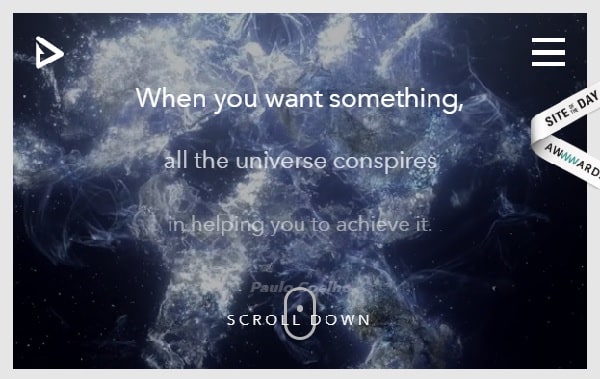
Feed is a platform for property right and payment that allows users to gain true ownership of their data and IP. The site is well-built and has an interesting concept for scroll function. The website provides a rich user interface. The site has a stunning execution that breaks traditional website design rules. They have created a great mix of animation, video, and graphics to make their site engaging. They have smartly placed their call to action button at the end of the homepage along with great effects. The visual impact of the site is unique.
2. Mikiya:
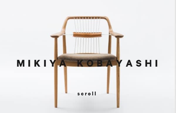
Mikiya Kobayashi is a furniture designer from Japan. His site displays his projects in a minimalistic way. The site is clean and organized. The navigation bar is on the left and right side of the homepage, which is quite unusual. The left one consists of more of his personal information while the right one is designed for business purposes. The site is aesthetically pleasing with his simple product photographs placed in an organized manner. The site is created in Japanese; however, it can be translated into English, showing international scalability.
3. Woven:
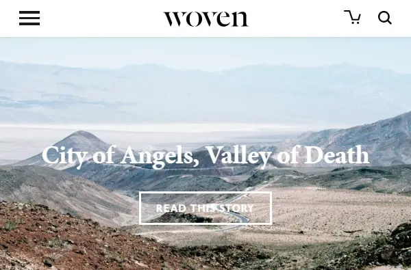
Woven is a publication that encourages artists to showcase their work on this platform. They have used a white background and easy-to-read fonts, making the site look organized. The site is free of distractions such as pop-up ads. They have made good use of negative space on their website and highlighted the content. They have hidden all necessary action buttons in the navigation bar. The homepage is aesthetically pleasing, and the footer includes all the details about the site. They have used high-quality images on their website, which enhances the look of the site.
4. Virgin America:
They have placed their call-to-action button in the header, which makes it easily accessible. This shows they care about the time of their visitors and want to provide service right away without wasting any time. Along with this, they have also mentioned their special offers on the welcome page for attracting customers. As you scroll down the homepage, you will find other services that they offer one by one. They have placed their contact details at the end of the welcome page, making it easier for visitors to contact them.
5. J. Hornig:
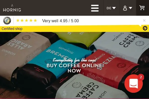
They made good use of a double navigation bar providing maximum usability. The first navigation bar has everything related to purchasing products, while the second one is created for visitors to get more details about the company. The site also has an option to change the language, which is excellent for targeting worldwide audiences. They have also used a chat function on the homepage making it easier for the visitors to solve their queries. They have displayed their products on the homepage along with original photography based around their coffee products.
6. Studio Schurk:
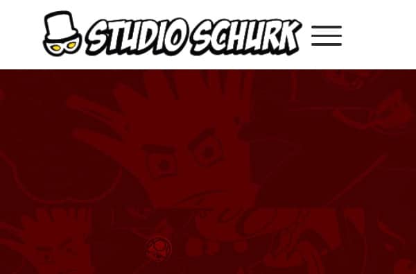
They have made good use of animations in their header image. The site is built around a cartoon theme, including a fun video on the homepage. On the homepage, they have given a brief description of their company and who they want to work with. Just like other websites, they have added their contact information in the footer. Visitors can also learn about their projects in detail on the website. The navigation bar is kept simple with displaying just a button to explore more. They have focused on user engagement while designing their website.
7. Werkstatt:
They have designed a minimalistic site making good use of neutral colors in the theme of the website. The site looks classy because of the way graphics are used. They have created a homepage to provide details about their projects. The footer has all the necessary information like contact number, email address, and social handles. The navigation bar only appears on request while utilizing all the space to display their work. The site is available in English and French allowing them to target more people. They have found the perfect balance of aesthetics and functionality in their site.
8. Swiss:
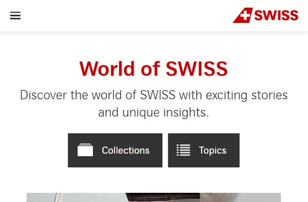
The welcome page offers a bunch of interesting, informative videos to keep their visitors engaged. As you scroll through their homepage, you will find more information about their culture. At the end of the homepage, you will find information about their services. The navigation bar is hidden under three lines on the top left corner giving more space for other elements on the homepage. They have designed the site to translate in 9 major languages making it easy for people around the world to access their site. They have placed two elements on the welcome page that provide unique insights about their brand.
9. The Teachers Guide:
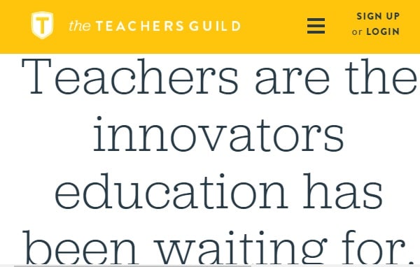
They have tactfully placed their call-to-action button in the center of the welcome page. This attracts the attention of the visitors. When you scroll further down on the homepage, you will find more information about their goal. They have also mentioned their ongoing events on the homepage of the website. They have utilized original photographs to make the site look familiar and approachable. The color scheme of the website includes a yellow color that is a symbol of happiness. They have kindly mentioned details about their supporters.
10. Lounge Lizard:
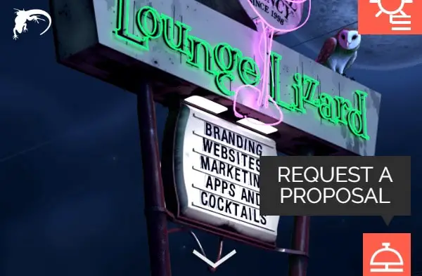
They have designed an innovative header image that describes their area of work. The call-to-action buttons are highlighted using contrasting colors. The animation added on the welcome page is fascinating and makes the visitors more interested in browsing through the site. They have explained every service in brief on the homepage itself. They have also included the list of their clients that helps users’ trust their brand. They have made it a point to mention addresses of each location along with their respective numbers so that users can find a location near them.
11. Simply Chocolate:
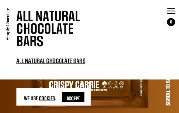
As the name suggests the theme of the site is based on chocolate as they have used brown color primarily in the site. They have uniquely used graphics and scroll functions to display their range of different flavors of chocolate. The background of every theme highlights the ingredients used in that specific chocolate. This helps users make an informed decision. Also, the footer is designed big enough to fit all the contact information in detail. However, the navigation bar is hard to read as the text is aligned to the right.
12. Femme Fatale:
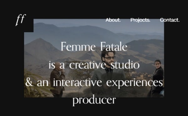
They have used a fantastic welcome video to attract users’ attention along with a one-line introduction. The navigation bar is simple and contains necessary actions. The theme of the site is classic as the color scheme is black and white. As you scroll through the homepage, you understand more about the brand and its services. They have used high-quality images to display their aesthetic. The homepage also consists of the clients they have worked with. In the footer, they have mentioned their address and email id.
13. Minimums:
They take a bold approach while displaying their content. The website is divided into grids featuring different inspirational personalities. The color scheme of the website includes green, black, and white, which makes the website look simple. The website seems interactive and fascinating with large-high-quality images. They have a box at the end of the website where visitors can provide their emails to get regular updates. The navigation bar is missing on the top; it is placed in the footer of the website. Not many sites use this approach.
14. Patrick David:
He has used the black and white color scheme in the site with bits of bright colors. He has designed the website is a unique way. The navigation bar is placed on the right, and the text is aligned to the right as well. The site looks like a computer with typography in digital fonts. He has made good use of bright colored images to break the monotonicity of the site. The site has displayed text with strikethrough making the site stand out. He has designed the site to encourage visitors to stay and explore on his site.
15. MovieMark:
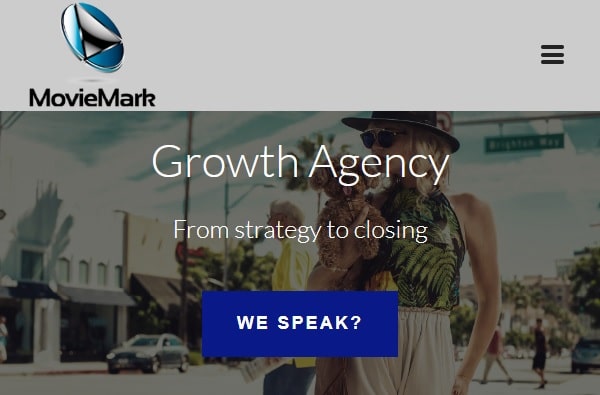
The welcome page on the site has a fun original video showcasing their work in video marketing. The call-to-action button is placed in the center of the website in a bright color to emphasize on it. The navigation bar is simple; however, it includes all the necessary sections. The site is mobile-responsive, which allows them to increase their reach. The homepage consists of lots of information about their customers, services, and approach. They have shown statistics on their website so that people know their credibility in their niche.
16. Stereo:
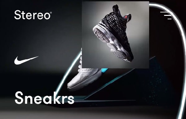
They have interestingly used high-quality photos on the welcome page to attract visitor’s attention. The navigation is designed to be accessed on users’ requests. Hence, space is fully utilized for showcasing their products and features on the webpage. The homepage consists of a series of exciting sections keeping the visitors engaged. At the end of the page, they have placed their call-to-action button, which is not the most converting place on a webpage. They have used green as an accent color in the theme of their website.
17. Guillaume Tomasi:
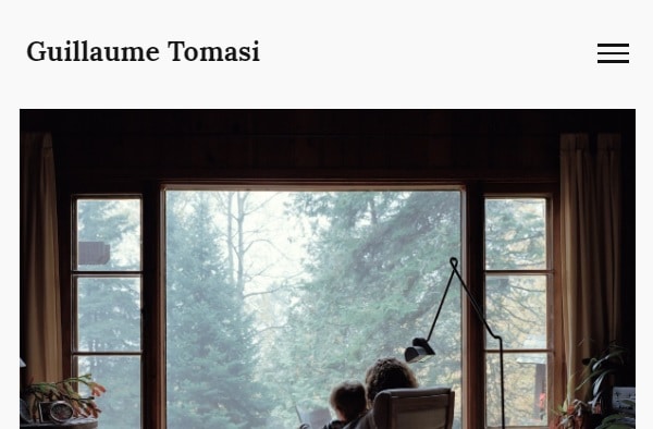
He has built this site to showcase his fantastic photography. The site has a minimalistic approach with lots of negative space to keep the main content highlighted. The site does not have much functionality; however, the photographs are enough to build the aesthetic of the site. The navigation bar is placed on the right side of the display, making it accessible to the visitors. Once you select one of the displayed photographs, the site will take you to the main content page that has a series of related images and text. If you want to know more about him, you can select the “about” section placed on the navigation bar.
18. Stevin Mengin:
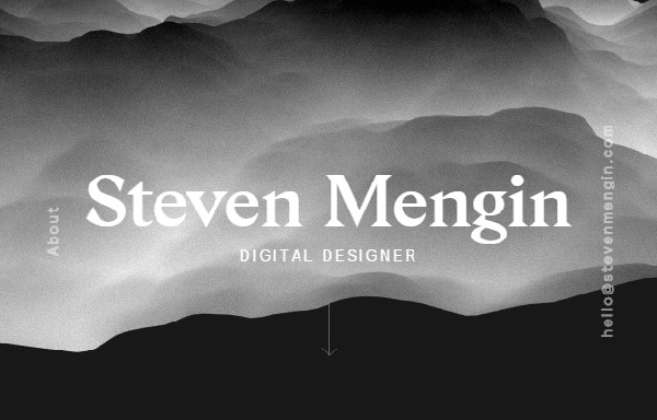
He has created a dark theme for his website, along with a welcome page that consists of interesting graphics. He has used the homepage to display highlights of his work. There are a total of 7 slides, each showing different projects. The design of the website is minimalistic. He hasn’t included many elements just his work, email id and about section aligned to the right. The site could certainly use more elements to improve the functionality of the website; however, the design is quite out of the box.
19. Amanda Martocchio Architecture:
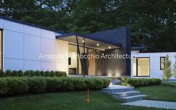
The site has a series of amazing high-quality images showcasing their work on the homepage. The “view project” option is placed at the bottom left so that people can know more about their work. You can even look at images related to the project if you click on the right or left arrow. The site has a classic white background to make pictures the point of attraction. The site does not contain any unnecessary elements making it easy to use. The contact details can be found by clicking on the lines placed at the top right corner.
These modern website designs are perfect for inspiring you to build your unique website. However, you should not try to copy other people’s designs. You should get motivated by these examples and create unique color schemes, graphics, animation, navigation bar, etc. It’s also a good idea to check the speed of your website and make it mobile friendly as well. Follow some simple web designing rules and add your creativity where possible to give your site a fantastic and modern user experience.