Line25 is reader supported. At no cost to you a commission from sponsors may be earned when a purchase is made via links on the site. Learn more
The flat design style is still going strong! We originally showcased a range of web designs with solid background colors, but there have been so many new designs launched since then we thought it was worth creating a whole new roundup.
Check out this collection of website designs with bright flat color backgrounds. These designs ditch textures, gradients and patterns in favor of vibrant bold solid colors.
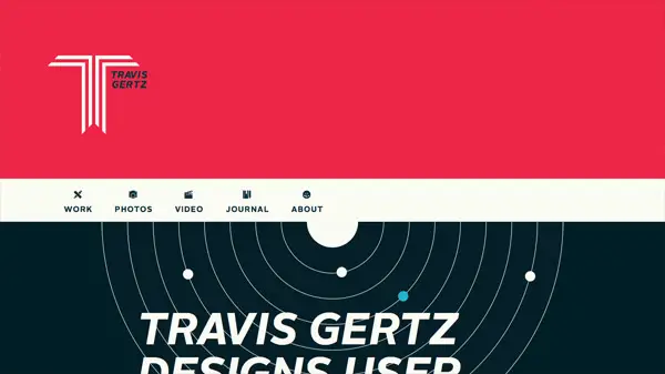
Travis Gertz
Travis Gertz designs user interfaces. This is his portfolio website on which he showcases his work, journal, and more.
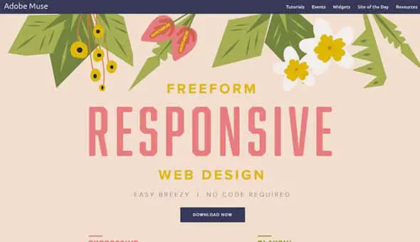
Adobe Muse CC
Adobe Muse lets you create and publish professional websites that look great on desktop and mobile browsers, all just by using a free-form canvas and layout tools.
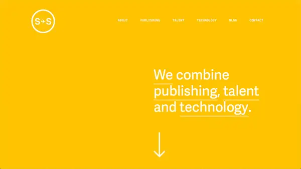
Sydney Stockholm
This website uses a flat yellow color background combine with bold, white typography that stands out.
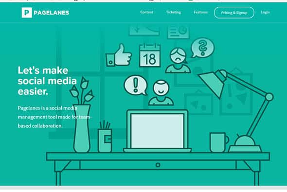
PageLanes
Pagelanes is a social media management tool made for team-based collaboration. They use flat, outlined illustrations combine with a beautiful teal flat background.
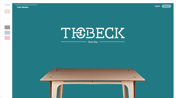
Thobeck
This is a simple, minimalist, flat website design of a furniture manufacturing company. The flat background is a great fit combined with the high-quality realistic images.
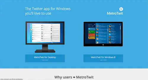
MetroTwit
This is a made-for-Windows software to access Twitter with simple Metro-style design and features. It uses a blue flat color as the background.
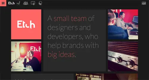
Etch
This is the website of a small team of Designers and Developers who help startups build new products. They have a dark-themed flat design website.
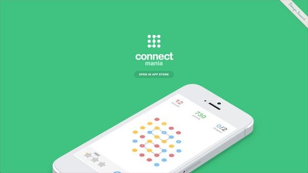
Connect Mania
Connect Mania is a simple game about connecting dots of the same color. The game has a flat design so the website matches the overall style.
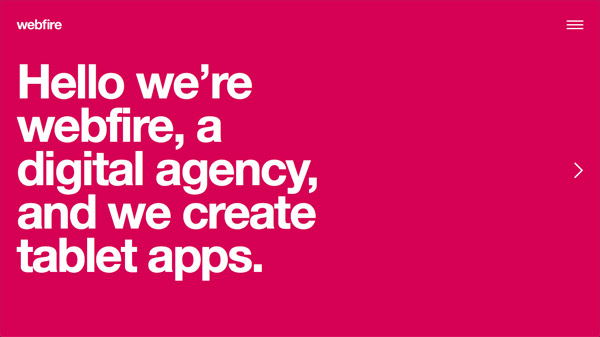
webfire
This is a presentation website for an agency which specializes in the design and building websites, web apps, mobile apps, and tablet apps for a wide range of clients.
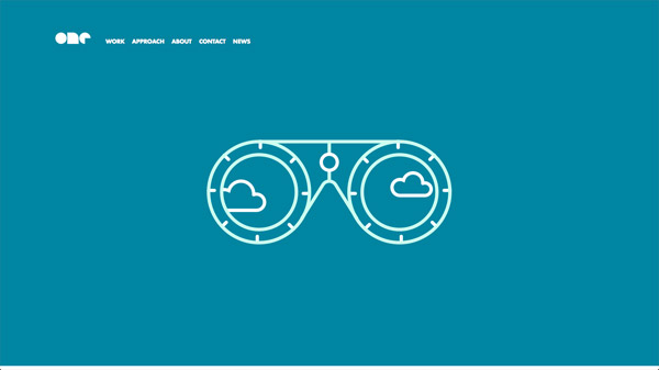
One Design Company
This is the presentation design of a company that transforms research and insight into memorable web design, development and brand strategy.
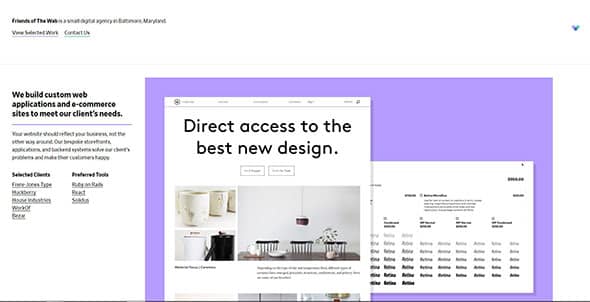
Friends of the Web
Friends of The Web designs and develops custom web and mobile applications. They have a simple, flat design for their website.
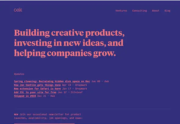
oak.is
This is a studio that helps to build creative products. They use a bold, flat color palette, nice typography effects, and almost no images.
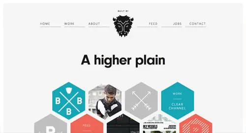
Buffalo
Buffalo is a small web design & development agency. They use flat design elements on their website and a beautiful color palette.
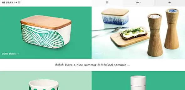
Helbak Ceramics
This is the site of the Danish ceramist Malene Helbak, on which flat colors blend beautifully with high-quality images.
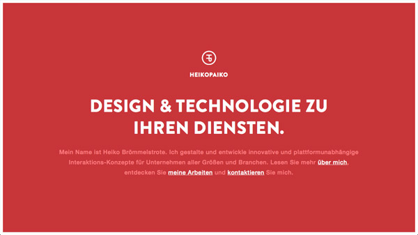
HEIKOPAIKO
This is a gorgeous responsive one page portfolio for German designer Heiko Brömmelstrote. It uses a deep red, flat color as the background.
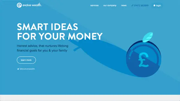
evolve wealth
Evolve Wealth is a select team of financial professionals, with a wealth of experience & knowledge. Their presentation website takes advantage of the flat design trend, using great illustrations and flat colors.
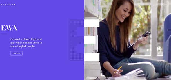
Cuberto Agency
This is the portfolio website of a digital agency focused on UI/UX design and development of mobile apps and websites.
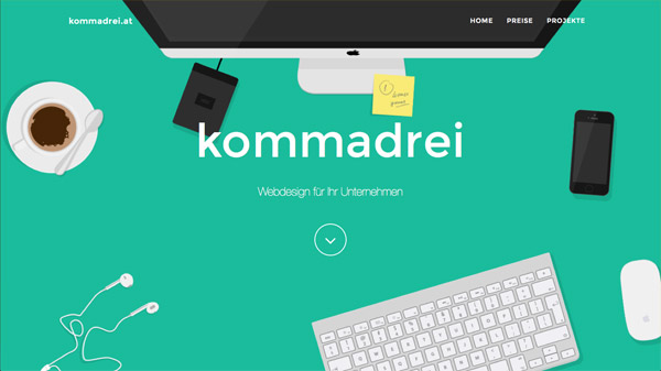
kommadrei
This website design combines flat colors with great flat illustrations and flat objects. It looks great and it’s also responsive and user-friendly.
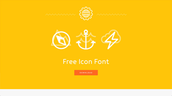
Icon-Works
This is the website of a free font family by Icon Works you can actually download and install.
Brand Aid
Brand Aid is a creative agency focused on creating unique promotional products. They use a lot of red in their design, combined with outlined flat icons and graphic elements.
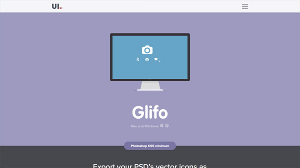
Glifo
This website design is the perfect example of how flat backgrounds and flat design should look like.
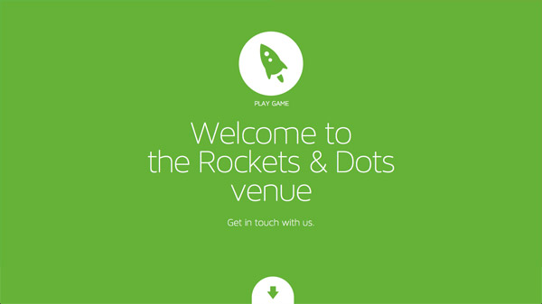
Rockets & Dots
This is another presentation website, this time for an agency that helps clients create and refine digital products.
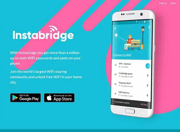
Instabridge
This is an app presentation website for an app that lets you get more than a million up-to-date WiFi passwords and spots on your phone.
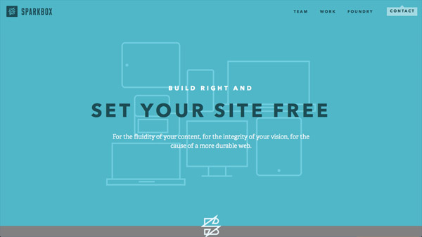
Sparkbox
Sparkbox is a team of web designers and developers based in the Midwest. They have a simple, user-friendly and responsive website design that follows the flat design trend.
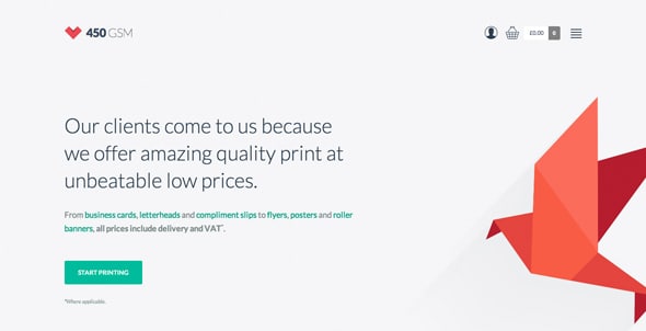
450 GSM
This website helps you print online 450gsm business cards, flyers, leaflets, and more. It is a great example of how flat trend can be used in web design.
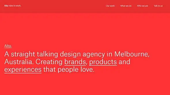
Studio Alto Flat web Backgrounds
This is a bold, vibrant website design for a branding & design studio in Melbourne specializing in Brand & Visual identity, App & Web Design, Print & Packaging Design.
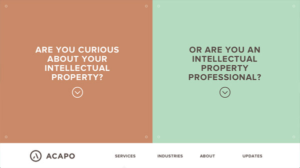
Acapo
This website design perfectly combines two popular web design trends, the split screen and flat design.
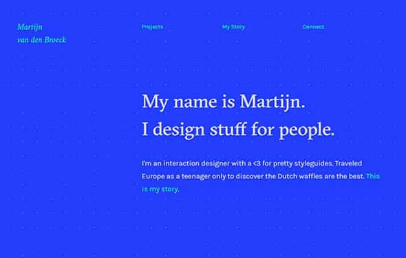
Martijn van den Broeck
This is a simple, portfolio website for an interaction designer with a passion for pretty style guides. Typography is the focus on this flat style web design.
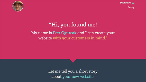
Petr Ogurcak
This is a simple portfolio website of a North West London web designer who can create straightforward, customer-oriented websites.
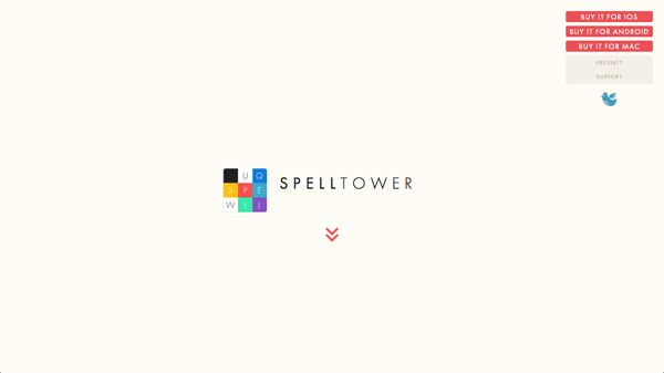
SpellTower
SpellTower is a puzzle video game in which the player creates words from a jumble of letter tiles. This is the presentation website.


Just came across this, it’s still very relevant in 2016!
I have a feeling the flat metro style has a bit of life left in it yet.
your webdesign is nice and articles are useful good luck
Thanks for more inspiration
I visit your website, Your website is most popular and informative really you are in the nice field and we are also working in the same field welcome you to visit our website. Thanks You…….
Awesome collection! Website background color plays an important roll in every website because it attracts your visitors and gives professional look to it. Choosing the right background color is really hard for any designer. Thanks for sharing such nice examples of flat web design.
Flat design is really superb and they are currently trending as well.Nice share.
Thanks for the inspiration.
Some great websites here, indeed using the flat design which is very much the latest trend at the moment.
Just wondering how long it will last though? – minimalism is great for loading times on sites but I do miss the creative content especially with hi-res displays making a leap forward.
Thanks for sharing these “30 web designs with bright flat color backgrounds”, I love these designs, simple and give us comfortable feeling.
Hi Chris,
Thanks for sharing the great collection of Web Design. All designs are looking nice and attractive. Love the Travis Gertz design :)
Great collection Chris.
The designs are really exquisite and these type of UI attracts the customers and clients, thanks for the new ideas.
This is a great list, Glifo is my personal favourite. Thanks for the inspiration.
Great collection, thanks.
As a web designer I’m thankfully finding more and more clients receptive to the flat way of thinking – I shan’t miss gradients and drop shadows!
Big ups to kommadrei and instabridge I like how they push the boundries as far as what is actually “FLAT” still providing depth and perspective.. very cool!
Great Collection. Choosing the right background color for your website or web pages is a very important because background color of your website affects your web site visitors deeply and places a positive image of your brand in your website visitor’s mind.
Well, there went my afternoon! :D
Thanks for the awesome distraction. Picked up a bunch of cool ideas from this batch!
Flat design is trending right now. And your collection of this website designs is amazing .
Would definitely be using some in my upcoming project . Thanks for sharing .