Line25 is reader supported. At no cost to you a commission from sponsors may be earned when a purchase is made via links on the site. Learn more
Knowing the key basics of design will help you to create better, more aesthetically pleasing works of art. When creating a design, there are both elements and principles to pay attention to. Knowing both pieces of the puzzle and how to successfully incorporate them into your designs will help you to create more beautiful pieces.
If you have a new design project and you just don’t know what color palette to create, you’re now in the right place. We have selected 30 flat design color palettes that just work.
Flat has run the gambit for a couple of years now, and it’s not going away anytime soon. It is both aesthetically pleasing and quick to load, making it extremely user-friendly.
These beautiful color combinations can be used for various projects and were all inspired by real, natural photos, which makes them even better! These color palettes can be found in nature, so they will definitely work on your design.
Just choose the vibe you want to transmit, the predominant color and select a flat design color palette you like most.
What do you think? Do you like these flat color palettes? Let us know in the comment section below.
P.S. Also try these color palette generators. They will save you a great deal of time when designing.
Beach Tones
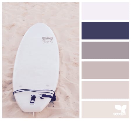
This is a great pastel-colored palette which can be perfect for a flat design. The colors are inspired by the beach and nude tones and they are accompanied by a dark blue tone.
Boating Hues
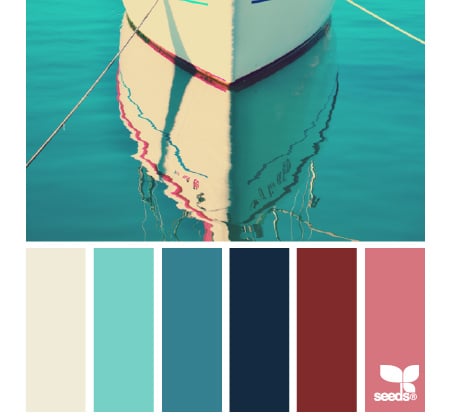
Design elements are the different pieces that you use to create a design. These elements are the building blocks of every design, and you probably already use them in your work! But knowing how to use them in an effective way will change the way that you use them dramatically. This also applies in the case of the color element of a design which can make or break a project. Get inspired by this great mix of colors!
Horizon Hues
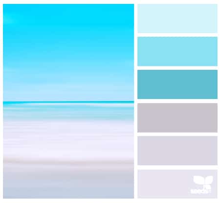
If you want more palettes inspired by beach colors then you might want to see this example, Horizon Hues, as it might be exactly what you had in mind. It evokes peace and serenity.
A Door Hues
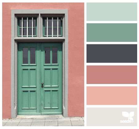
This is a great mix of colors which can definitely be used to make an amazing flat design and not only. The colors work perfectly with one another and will definitely make your project stand out.
Architectural Tones
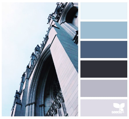
If you are a fan of blue tones then you will definitely love this example! Check out this amazing mix and use it in your next project. It evokes the feelings of order and stability.
Color Soar
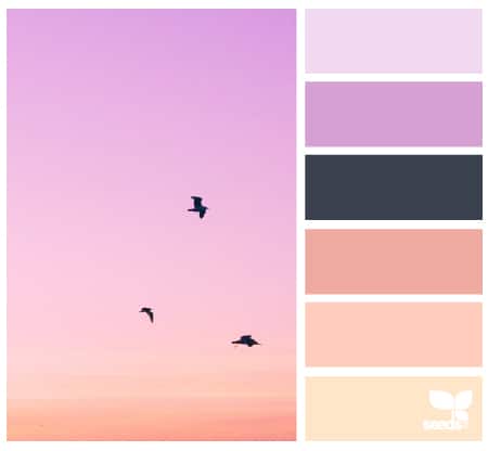
Color Soar color palette has a great choice of colors which will add a joyful touch to your design project.
Flora Tones
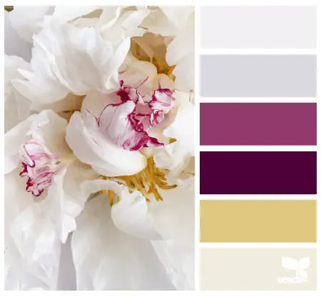
This is yet another cool example of a color palette. The mix is great, it has nude colors, light grey tones and purple tones which will give a feminine touch to your design.
Flora Hues
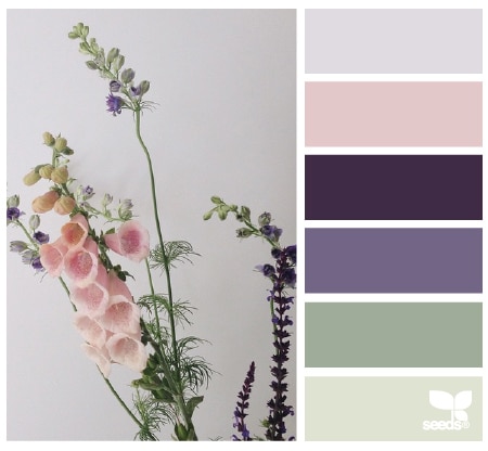
This color palette is very elegant and it has its inspiration in floral colors such as the ones in the preview photo. Not only can you use this color palette with confidence but you might also find some inspiration in these elegant colors.
Cut Tones
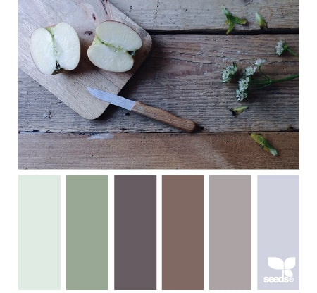
Although it is not a necessary element of design – black and white design can be very effective – color can play a large role in creating a pleasing design. Having a strong command of the color wheel, various color schemes, and attributes can greatly impact your design. This is a really nice color palette called Cut Tones and you can use to make really creative projects.
Wreath Hues
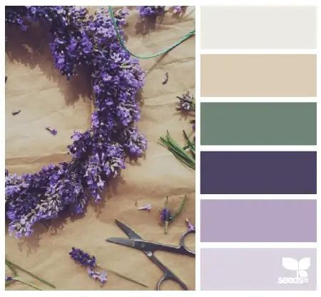
Color can add emphasis, or create an overall cohesion of a piece. This color palette is also perfect for flat design and you can use it with confidence. The results will definitely be great!
Flora Palette
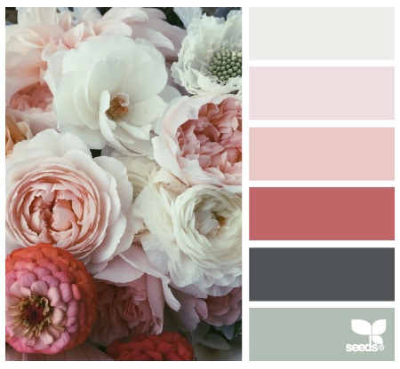
Imagine the photo above being in black and white – it certainly wouldn’t have the same pop as it does in color. This is why businesses use color in their marketing and advertising. This is yet another cool color palette which gets its inspiration from flowers. It also has some grey-green tones which are the perfect addition in this case.
Color Perched
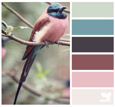
This is yet another great color palette for flat design and it will make your creative projects look great. This example mixes both warm and cold tones.
Color Arranged
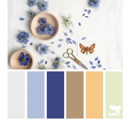
Color draws the eye to the design! Blue and orange tones can make the perfect color palette for flat design.
Nature Tones
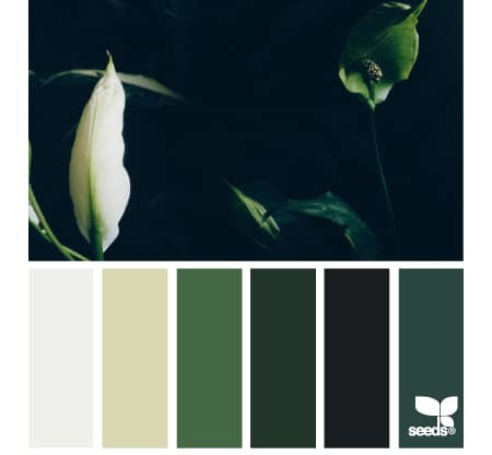
If you’re a fan of green tones this might be the perfect color palette for you. Use it in your flat design to achieve amazing results.
Color Surf
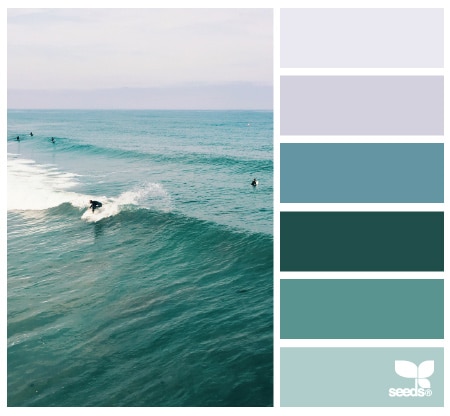
And if you liked the previous example then you will most likely adore this one. This palette mixes cold tones of turquoise to make an amazing palette.
Still Hues
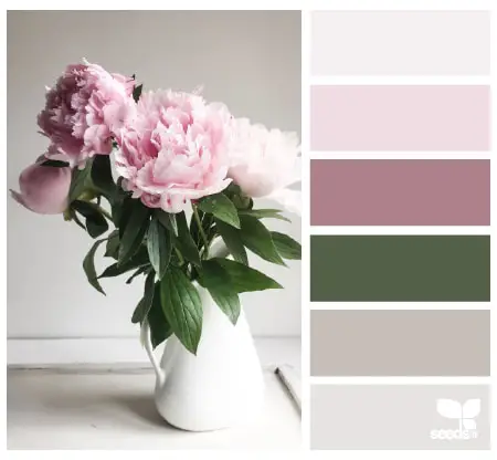
And if pastel colors are more your thing, check out the Still Hues color palette and use it in your projects to make a really nice flat design.
Summer Spark
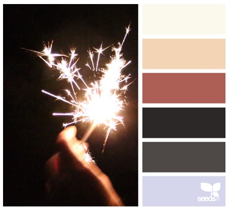
Summer Spark might be just the color palette you have been searching for! It mixes some really nice warm and grey tones and it can be a perfect palette for a flat design project.
Setting Hues
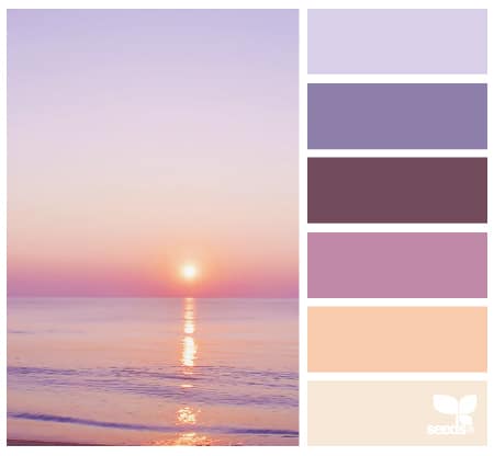
Setting Hues is yet another awesome and warm color palette which can make your creative projects even greater. Find out if this is the one you have been searching for all this time!
Sky Tones
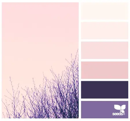
This palette mixes some really nice and warm pink sky colors and it can be used to make an amazing flat design.
Underwater Hues
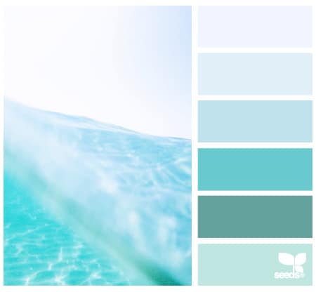
If you’re up for some more blue color palettes, here’s another one we liked. Underwater Hues is exactly what you need to make an amazing flat design based on light blues.
Confetti Hues
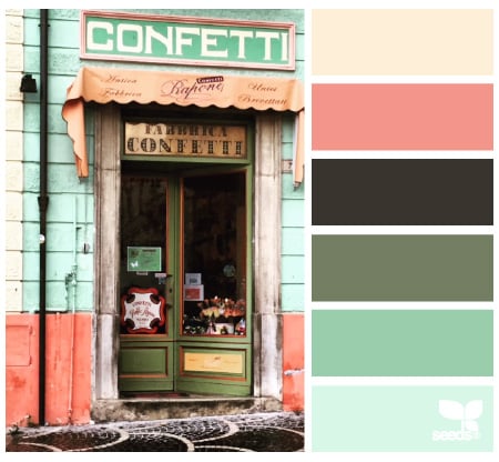
Color can bring a design to life. Imagine a monochromatic design with a splash of another color. You’re likely to look first at the color that doesn’t match the rest. This will bring emphasis to the element of the design.
Color Set
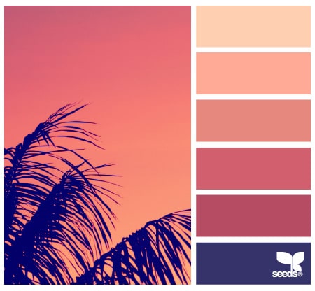
Color Set is a really nice color palette that mixes warm pink tones and a darker purple color. It is a great mix of colors which will look great in flat design projects.
Color Terrain
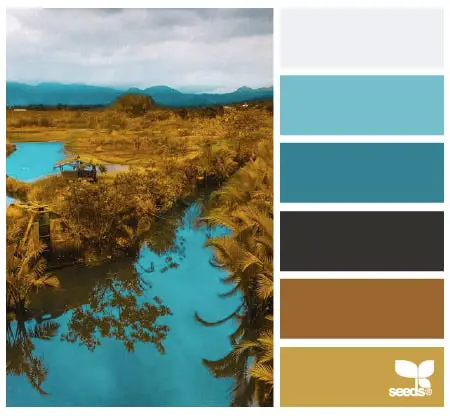
Value contrasts are another way to create emphasis in a design. This is a more subtle approach but just as effective. The gradual change will draw the viewer’s attention to the areas with the most contrast. Color Terrain might be exactly the color palette for you and your project. This example mixes some really nice blue and earthy tones.
Setting Tones
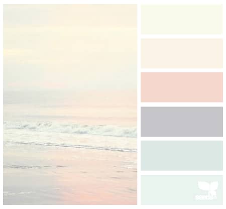
Finally, similarity and contrast can create a striking emphasis. When the majority of a design is similar – such as a pattern or color scheme – and there is an element that breaks the mold, the viewer’s attention is drawn to this contrast. Check this color palette for example!
Creature Color
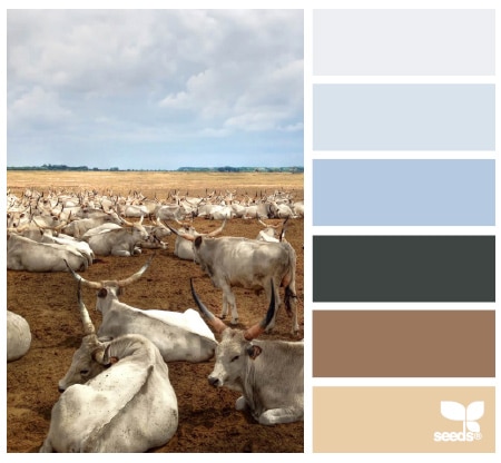
Balance in a design is important so that you don’t overwhelm or underwhelm the viewer. Creature Color mixes pastel colors, this time with both light blue and earthy tones.
Color Resort
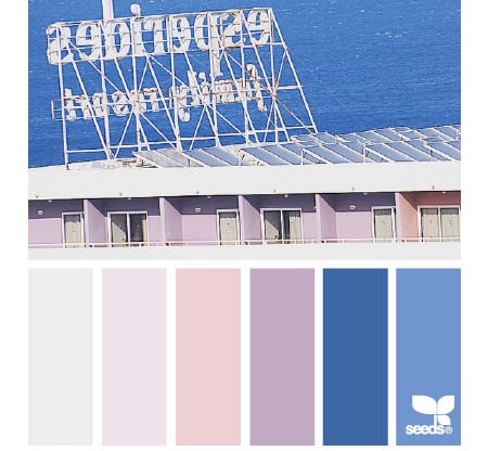
Color Resort might make the perfect color palette for your current flat design project. We love the pastel colors in this image!
Color Seed
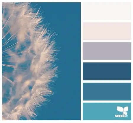
Color Seed is yet another great color palette to use in your flat design projects.
Succulent Hues
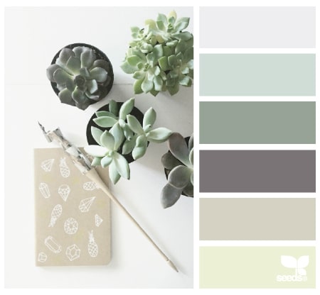
Succulents are quite trendy nowadays and this color palette has its inspiration in their beautiful green tones.
Color Sea
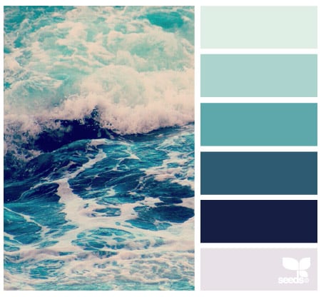
This is yet another awesome color palette which has its inspiration in sea colors. It can make a perfect palette for a flat design project.
Cloud Candy
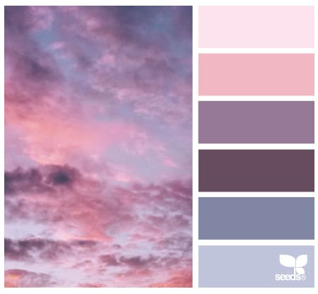
Last but not least, Cloud Candy mixes pastel sky colors and can be used to make an outstanding flat design.

WOW beautiful color codes
So far I see this as very good. I love the soft colors and do not make eye sore
very nice color pallets.
thanks for this article.
These are amazing color palettes. I think the Underwater hues attract more people to my Website.
To see the color codes, click on the palette’s name (e.g., “Beach Tones”) which will take you to the Design Seeds website. The hex codes are in the links on the color squares to the right, beneath “see similar colors”.
Very nice design’s. TKS for the post.
Are the color codes available?
Colorzilla