Line25 is reader supported. At no cost to you a commission from sponsors may be earned when a purchase is made via links on the site. Learn more
The video background trend in web design is definitely still hot. We first featured roundups of website designs using full-screen video backgrounds and video headers back in Spring, but we’ve stumbled across loads more designs that deserve to be featured here.
This post rounds up 20 more fresh examples of websites that have adopted stunning video backgrounds to introduce the site with motion pictures. Check them out!
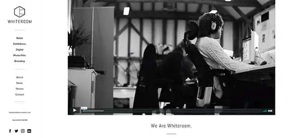
Whiteroom
This website has a monochrome color palette and a large VIMEO hosted video on the homepage.
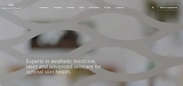
Project Skin
ProjectSkin MD offers aesthetic dermatology, laser medicine and advanced skincare in a state-of-the-art facility. This is their presentation website which features a large, high-quality video background.
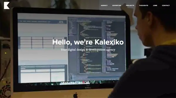
Kalexiko
Birmingham based Kalexiko company is a professional web design & SEO agency. This is their portfolio and presentation website, with a large, video background on the homepage.
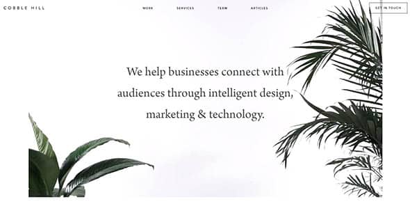
Cobble Hill
This is another presentation website which has a vacation-like atmosphere, due to the homepage video of palm trees.
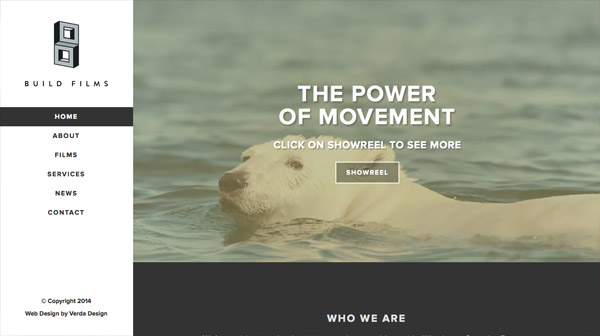
Build Films
This is a simple but beautiful presentation website for a film-making company. They showcase one of their video projects right on the homepage.
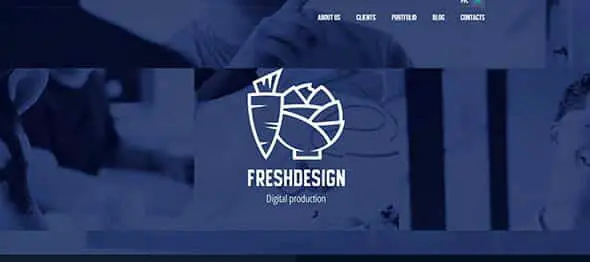
Fresh Design Studio
This is the portfolio of a digital production company. It has some interesting videos playing in the background, all of them with a dark blue color overlay.
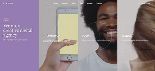
BWWLD
Divided into four sections, this creative digital agency’s website is truly unique! Each section has a video content, plus some text and shapes overlays.
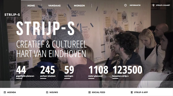
Strijp-S
This is the presentation website of a creative studio located in Eindhoven. There’s a video playing in the background and has some text overlays on it.
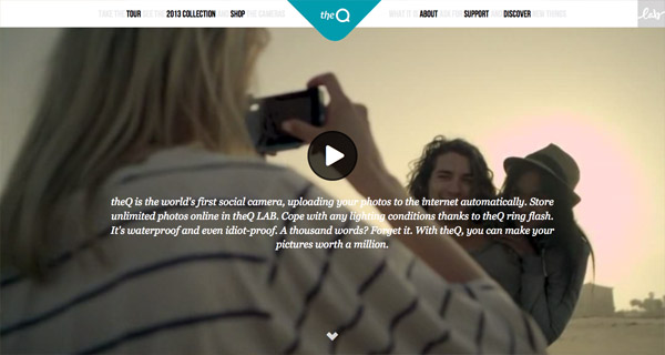
theQ camera
This is the presentation website of a camera which lets you instantly share your photos across social networks. You have to hit the play button in order to see the homepage video.
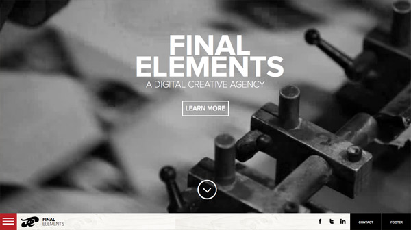
Final Elements
Another digital creative agency decided to feature a large, full screen video background on the homepage to catch the visitors’ attention. It works!
Septime Création
This website pairs the interesting video background with some energetic music. Check it out!
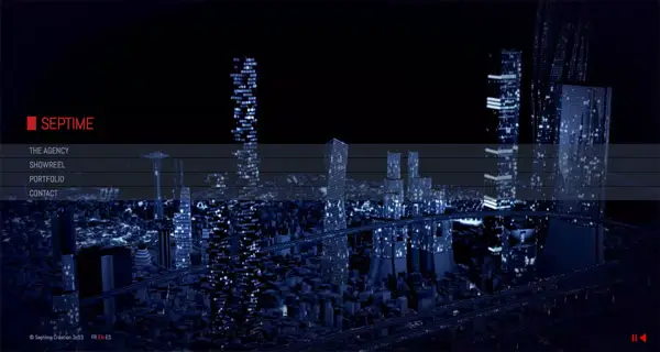
Warning: Background music
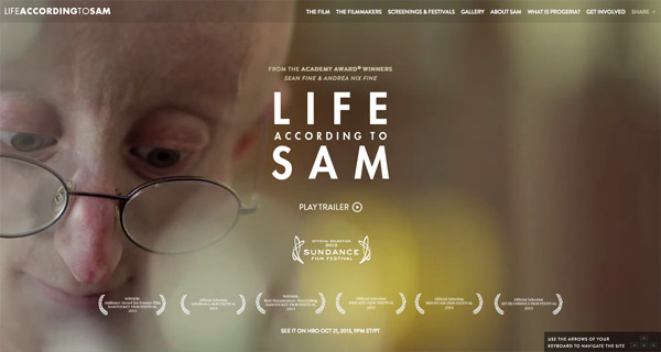
Life According to Sam
This is the website of the HBO Documentary Film Life According to Sam. It starts with the trailer, right on the homepage.
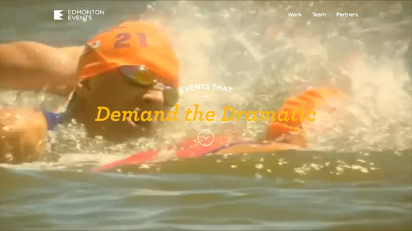
Edmonton Events
Edmonton offers residents and visitors many unique festivals and special events throughout the year. This is their website on which they showcase these events.
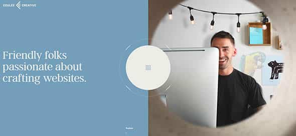
Coulee Creative
Coulee Creative is a digital agency specializing in handcrafted websites that stir emotion. This is exactly what their presentation website does right from the homepage.
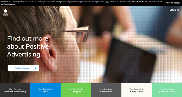
Positive Advertising
This website’s homepage features a large video background with a subtle pattern overlay. Looks very interesting!
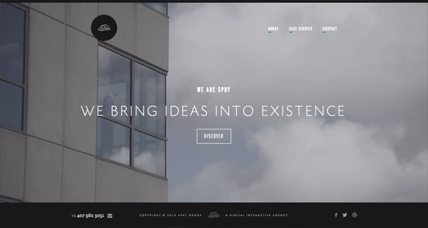
Spry
We love the quality of this video background. Discover it yourself, on the link above.
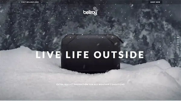
Bellroy
This website showcases an artistic video on a fullscreen layout. Looks interesting and the texts and graphics overlays are a nice touch.
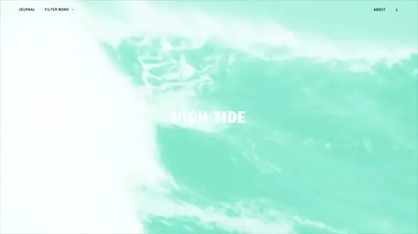
High Tide
Breezy and beachy are two words which describe this website’s homepage! Check out the teal-colored video background yourself!
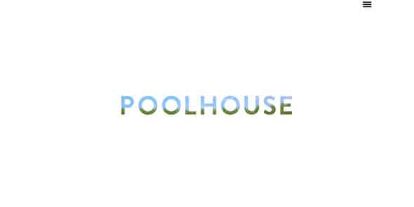
Poolhouse
There’s a video overlayed on the word POOLHOUSE. Very interesting and dynamic approach. See for yourself!
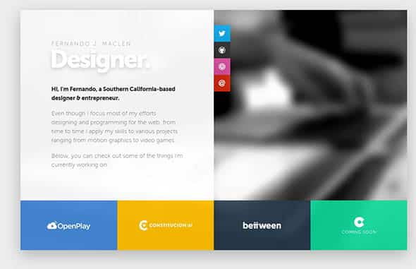
Fernando Maclen
This is the portfolio of a Southern California-based designer & entrepreneur. It doesn;t have a full screen video, but instead, it uses a very soft, blurred video on the right side of the layout.
Comments are closed.