Line25 is reader supported. At no cost to you a commission from sponsors may be earned when a purchase is made via links on the site. Learn more
It is safe to say that color has the potential to make or break a design. While sometimes a plain black and white design might get too monotonous, the use of gradients comes into the picture. Essentially, a gradient is one color that fades or merges into another. This gives a light to dark, or multicolour effect. Positively, gradients are making a comeback, and this trend is already visible on many websites as well. To make it easy, let’s try to understand what a gradient is, and then look at their usage through the course of this article with a few examples.
Web design trends are dynamic, in the sense what works right now shall work in a couple of years. While many trends mostly make a comeback as it is, or with specific changes, we must update our websites accordingly. Gradients are finally back and successfully adding a modern touch to designs – giving designers endless possibilities to mold the content and manipulate it through smart use of colors. The most prominent example of gradient use in a modern context is also Spotify – with their green and black gradients.
Since this age is full of flat design, gradients were an absolute no-no until recently we have started seeing them again – glowing more than ever! Another big shot online presence to have used a smart gradient is the Instagram logo.
But let’s try to understand what a gradient is.
Imagine a mixed softy cone of chocolate and vanilla ice-cream. The gradual shift of color from the brown of chocolate to the white is what a gradient is. Blending of colors to add an ombre effect is the easiest way to define a gradient. It enables a designer to make a new color altogether, which is why they use of gradients is flexible as well as modern.
Gradients work in a super-easy way: They make objects/text stand out and give your design a particular dimension as well as realism. In simpler terms, it adds depth. On the contrary, when a color blends into black or white (try playing with opacity here), one can mime the distance or proximity from a particular source of light. To be honest, a gradient is faithful to our world because real life doesn’t consist of flat colors with no depth or dimensions.
How do gradients help designers?
As mentioned earlier, gradients are coming back and showing up in most of the digital tools – including typography, branding, illustrations and UI/U-Ex. Gradients are known to bring a specific emotion to the table – that can evoke a sense of belonging in the viewer’s eye. Since you get many more color options when you use gradients, you can also change the look of your page just by using a combination. Eventually, your design results into an eye-catching, memorable and yet, a playful take on the subject.
Best practices to remember while designing a gradient:
- Do not overdo it. The smartest way to go about it is to use two colors only. And not more than three.
- Avoid randomly selected colors. Adobe Color CC is an online web tool that can quickly help you select colors following a scheme – analogues, complementary, triadic, and more.
- Visualise a light source. This exercise is necessary to figure out lighter and darker areas of your design.
- Find inspiration. Sometimes, you might need some help to come up with a reason to select specific colors. uiGradients is a page that can help you select perfect colors for the gradients.
- Figure out a way. It usually is challenging to understand how colors might work in a design. But it is a whole new game to make them communicate your exact idea while blending. You can look for color psychology to figure out which color depicts what.
- Linear gradients. Geometry often sticks together, hence, use a linear gradient for square or polygonal areas to achieve a structured look.
- Radial gradients. It makes sense for round shapes to make sure the curves, as well as the fluidity, is maintained well.
- Experiment with opacity. This helps color blend into fill areas as well as provides a background that is ready to bare text. It’s a great help with light and shadow as well.
- Use separate shapes. It is necessary to use different shapes for a gradient color and a fill color – this way, you can also change the actual color by the application of a gradient over it – and experiment with opacity to define new and different effects.
Let us now explore some gradients and also see how they add up to the entire design.
1. Banner Gradients:
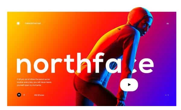
Dazzling is an understatement to define this banner. While it uses a stark contrast in colors, the idea is simple and to the point. Not only is it striking, but it certainly embodies a balance due to the equal and opposite colors used to create a stark difference. Though, what makes this banner look much more interesting is the way the color of the background also reflects upon the model’s face and body. It makes the gradient look simple, and spot-on as well as dynamic – a message the website might want to denote as well.
2. Atomic DNA Manifesto:
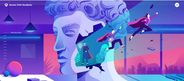
This website makes super-abundant use of gradients in graphics, typography, animation as well as background. Even the illustrations are all done in tonal shades. While this entire page is a genius when it comes to gradients, notice the smart use of a perfect color palette consisting of pinks, purples and blues – all analogous on the color wheel. It is a fresh, comforting color scheme with gradients sprinkled on the top – just to add depth and a fun element.
3. Grabient Landing Page:
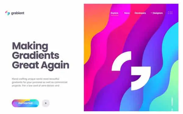
This page is a much more refined way of doing a traditional gradient. This page has an exquisite use of a gradient – in the way that it is a combination of various gradients within various colors, which makes it all the more dynamic and colourful. While finesse is at the peak for this design, one might get confused with the color choices. To avoid that, make sure your choice a good color scheme according to your subject.
We see that the smart use of a white to draw the over the colourful gradients also draws attention to the branding, which looks smart.
4. D25/Video Production:
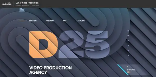
This page begins on a rather subtle note. With a slight gradient in the graphical background, the page progresses into a considerable background image covered in a blue to red tone color palette. Eventually, it flows into a big red text box which ultimately grabs the most attention out of the entire page – clearly solving the purpose of focus through design. This color palette is a safe choice when it comes to constructed and structured seamless websites.
5.Centexus Landing Page:

This page is the perfect example of a smooth gradient. This kind of gradient is known to give a rather elegant and clean look to your design. Especially considering the analogous colors with a broader area for the color to merge. Professional do not always look good in black and whites – a splash of occasional colors here and there is always advisable.
In case of this landing page, though the colors are slightly feminine, the design comes off to be active as well as in perfect synergy with the brand’s story. The use of gradients is occasional but specific to times when it is necessary. This page is a conversation-starter.
6. Ninety-Nine Seconds Game Prototype:
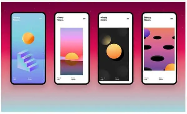
Game design is one aspect that is always changing and adapting to trends. Gradients fit into the gaming world easily. They add that extra touch – right from a necessary light shadow effect, to an entire game based out of gradients, just like this one.
A super artistic game based only and only on artistic gradient colors, this prototype is a genius design that incorporates various abstract designs as a part of its interface just by the use of thoughtful gradients.
7. DIY Course Landing Page:

What is charming about this gradient page is the fact that it encompasses almost every shade of blue brilliantly. The blues then seamlessly fade into a white upon scrolling. It is genuinely a ‘hero’ gradient that transitions so naturally throughout the page that an image is not required in the first place!
The gradient then reappears directly on the footer, which gives a very symmetrical and balanced look to the whole webpage. Blue is an intense color; hence, this gradient comes across as a very subtle yet statement piece of design.
8. Nantoni Landing Page:
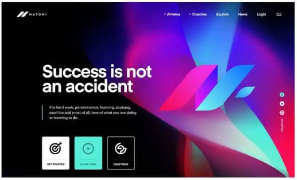
Sufficient gradients could be one of these two options: subtly out there, or flashy and bold – all that matters is how you achieve them. This landing page is affirmative on the latter part – it is bold and incorporates an excellent background graphic that is also the centrepiece of the entire design. The visual journey begins at the amazingly blended colors, followed by the striking text and back at the blended colors.
While one might even refer the graphic to the likes of Aurora Northern lights, it is starkly different and a superb merge of colors – it brings strength and positivity to the table – all while remaining in the same color palette.
9. Bitframemedia Logo:
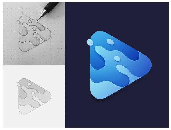
This is a fantastic work piece by the graphic designer. It is a simple, clean and pretty design that talks about the company/service on a visual level. The logo stands for ocean waves. However, what is more significant, is the way the waves grade from dark light to dark and meanwhile, also grade within each wave.
The use of reverse gradient effect for the light is a way to make the logo dynamic, give it depth and at the same time manage to make it look elevated.
10. Mindfulness App Onboarding Screens:
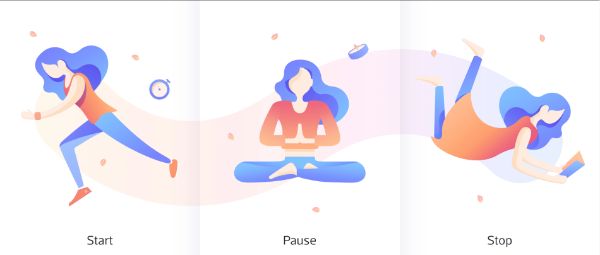
Pastels and light colors are the perfect choices to go for when designing a gradient. The reasons such as they do not overpower and can always be faded further into whites. In this particular theme, the effect is slight and yet compelling. The central characters get a darker and more dramatic gradient. But to balance that out, the background is so pale that it blends into the white straightaway. In return, this elevates the characters furthermore. This theme is a classic example of a subtle and smart gradient that also induces a sober feeling – suiting the audience of the page.
11. TinyMind Landing Page:

Flat design is something that is somewhat in trend when it comes to digital design. It’s easy to create, clean and also looks extraordinary. But sometimes, it can also be the element that pulls down the entire look of your design. To avoid such a scenario, a subtle tinge of gradient always elevates the look.
Adding a gradient also ensures that you are just making simple progress in the design. By retrieving the clean-cut and structure of the old flat design page – you can give it a whole new look!
Effective Gradients
Gradients are a super dynamic tool for designers. If used well, they can create wonder and also add a spark of beauty to the whole design. Be it a subtle or bold gradient; there’s always a place for it in any creation. The key is to notice the sense and tone of the design and pick a color accordingly. Whether you wish to use a gradient as a background or an accent is all up to you!
Various tricks such as adding contrast to some essential key points, highlighting areas, and making the use of gradients for UI purposes, are all possible if you chose the right colors.
These are all the things that you should know about a gradient before starting to design one. And remember, the most crucial step out of all – is not to overdo it! Last but not least, make sure you strike for inspiration and derive your gradient right out of there – otherwise, it might just end up looking flat!