Line25 is reader supported. At no cost to you a commission from sponsors may be earned when a purchase is made via links on the site. Learn more
We’ve seen full-screen images becoming more and more popular in web design, but one trend that really stood out to me is the use of black and white photography in some designs. Black and white images have always conveyed more emotion than a full-color photo, and that continues when it’s implemented into the header or background of a website design.
Monochrome websites will never go out of fashion! If you want to have a clean, minimalist website, then you should really consider the monochrome style. All of these website designs are monochrome. The monochrome style is often synonymous with black and white, and while most of these homepage design examples are black and white, some do have colored accents. They also have different layout arrangements and unique details. These are perfect for minimalism lovers and those who want to have a clean, modern website design.
These black & white themes and websites stand out due to their simplicity, clean and elegant designs. Browse through them all, take a look at their characteristics and choose the best monochrome theme for your website.
This post rounds up a showcase of 20 websites all featuring monochromatic photography as part of their layout and design. Which one of these homepage designs do you like most and why? Is your own website monochrome?
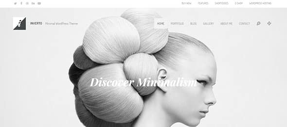
Inverto WP
Inverto is a beautiful monochrome WordPress template with a clean design. You can use this item for designers, architects, freelancers, agencies, photographers, and more. This portfolio WordPress theme comes with a visual drag & drop page builder, it is multilingual (WPML) ready, Contact Form 7 compatible and even has a one-click demo data import.
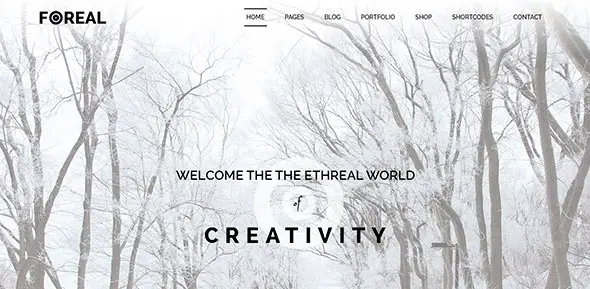
Foreal
Foreal is a great WordPress theme with an elegant design that you can easily customize with the help of Visual Composer to fit your needs. You can use it for personal portfolio, design agency, photography, magazine, blog, and more.
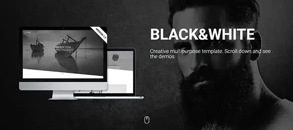
Black&White
Black&White is a premium WordPress template with a fully responsive layout. It comes with unlimited color schemes, cool effects, widgets and shortcodes, and more. The download also includes a full layered PSD file. This theme has some perfect jQuery and CSS3 animations, unlimited color options, it is multi-language ready, has a responsive design and plenty of unique design elements to play with.
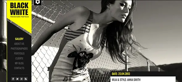
Black & White
Black & White is a neat WordPress theme that you can easily customize to fit your every need. It has a responsive design and it will look perfect on any screen. This theme has cross-browser compatibility and works well on FireFox, Safari, Chrome, IE11. Being retina-ready also has ultra sharp graphics on the newest screen sizes and also comes with a drag and drop page builder so you can customize every page with ease.
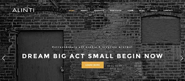
Alinti
Alinti is a creative WordPress theme that comes with a drag & drop page builder to help you easily customize it. It also includes a revolution slider, one click demo setup, custom widgets, and many other great features.
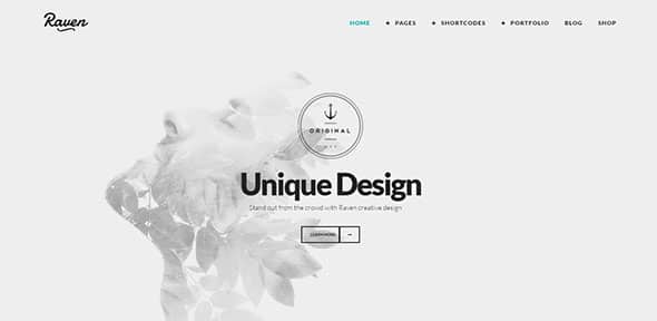
Raven
Raven is a strong WordPress template with an elegant design that is meant to attract the viewer’s attention. This bold and creative theme comes with an advanced theme options panel, lots of free updates and great attention to details. It is retina ready, has WooCommerce compatibility and it is, of course, fully responsive.
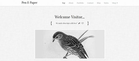
Pen and Paper
Pen & Paper is a beautiful WordPress template that has a fully responsive design. It includes widgets, shortcodes, 360 icons, PSD file, and more. This great theme is based on a slightly modified Skeleton boilerplate and 960px grid, comes with WP3 menu support, 600+ Google fonts, and more awesome features.
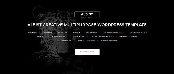
ALBIST
ALBIST is a wonderful WordPress theme that has the following features: more than 16 homepage designs, Slider Revolution, Visual Composer, parallax backgrounds, and more. This beautiful dark template can be used as a portfolio, to showcase your creative work in a professional way. It has everything you need to get started.
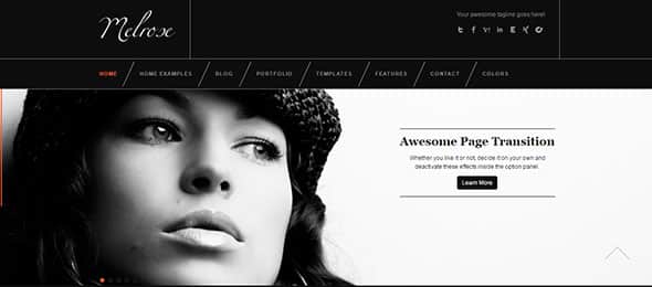
Melrose
Melrose is an amazing WordPress theme that has the following features: 14 unique skins, 4 custom header, logo uploader, shortcode generator, 8 custom widgets, and more. This theme is perfect for online portfolios for creatives from any design niche.
Fuse Design
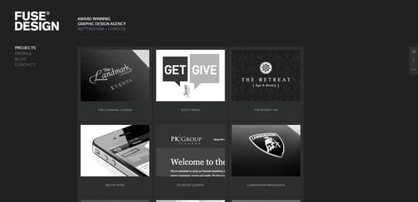
This is a graphic design and web design agency based in Nottingham and London which provides creative graphic design and web design solutions. They showcase their projects in a simple, 3-column grid layout, with even spacing between the rows and the same style applied to all the images – desaturated.
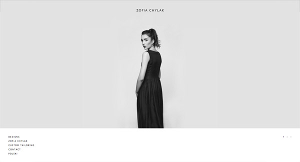
Zofia Chylak
On this fashion website, you will find handbags made from the highest quality Italian leathers. The designs combine black leather of different textures, patterns, and shades and the website design is clean and minimalist. This website design also has an interestingly placed menu, at the bottom of the page, which opens up once you hover it.
TH=SUM
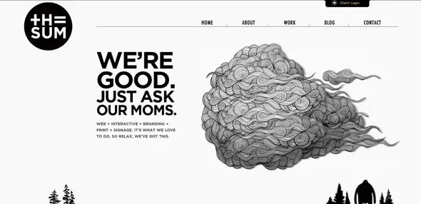
The Sum is a design studio based in Vancouver specializing in creating unique brand experiences and this is their black and white website design filled with large fonts and unique illustrations.
A Book of Beards
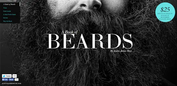
This project was created by photographer Justin James Muir, from West Chester, Pennsylvania, who self- published A Book Of Beards to help his friend Mike. It uses fullscreen photos on the homepge, a clean menu on the left side of the screen and a bright-blue badge to catch the visitor’s attention to the book’s special price.
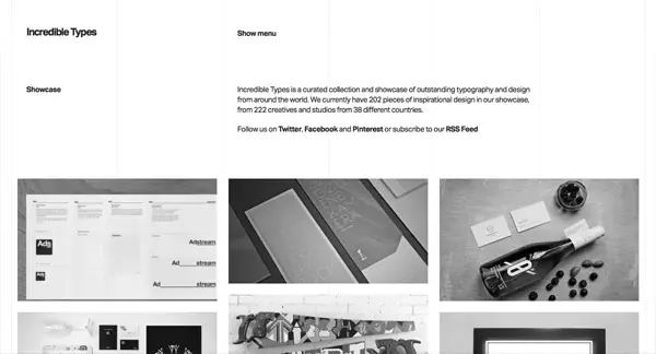
Incredible Types
Incredible Types is a curated collection and showcase of outstanding typography and design from around the world. Their website design is black and white and uses a grid layout for the portfolio.
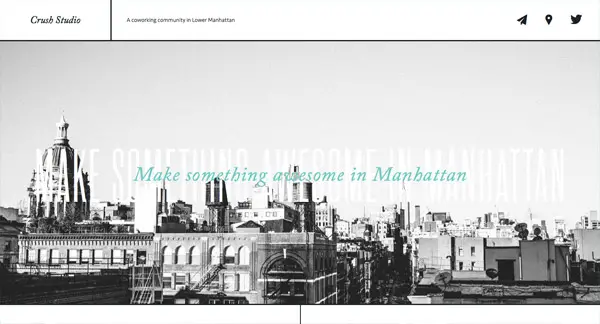
Crush Studio
CRUSH is a creative studio specializing in seamless prints for fashion and wearables. Their website is black and white, with full-screen photos and beautiful images. It also uses light blue as am accent color. The header design of this website is simple and interesting, with icons for Twitter, sending an email and location.
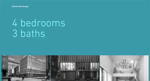
Dumbo Townhouses
This is the website of a building complex, at Pearl & Water in DUMBO, Brooklyn featuring 4 bedrooms, 3 baths, outdoor space, and private parking. Their website uses black and white images on a light blue background.
Guido Frascadore – Analyst and Developer for the creative industries
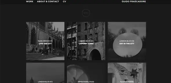
This is the portfolio website of an entrepreneur and digital strategist, visionary and pragmatic and CEO at @bemind and Head of Product Management at hype.it. It has a 3-column grid layout with square images and even gaps between the rows. All the images are desaturated, for a more unitary look.
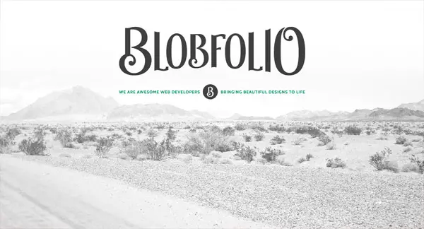
Blobfolio
This is the portfolio website of a group of web developers who develop web applications for LEMP environments, LEMP being a collection of free, open-source software. The website is mostly black and white, with turqoise-blue as an accent color.
Francesco Prisco / Graphic & Web Designer
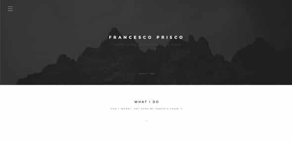
This is the simple portfolio website of Francesco Prisco, a graphic & web designer based in Milan. It has a simple layout, a hamburger menu on the left and lots of black and white images.
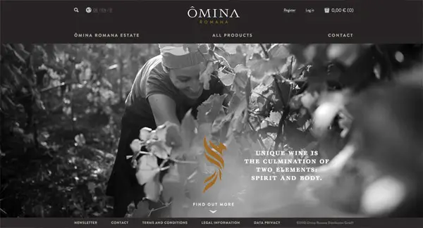
Omina Romana
This is the presentation website of a family-run vineyard that was founded in 2004. It is based in the Alban Hills in the Italian region of Lazio, close to Velletri.
Hungree – Web- und Grafikdesign
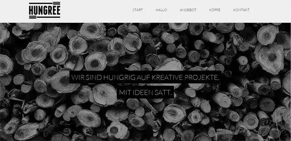
Get inspired by this fullscreen website design with lots of beautiful black and white images and a simple layout. Also, check out the portfolio section! You will surely find some projects you’ll like.
Comments are closed.