Line25 is reader supported. At no cost to you a commission from sponsors may be earned when a purchase is made via links on the site. Learn more
Typography plays an important role in design. To communicate a brands message effectively, designers have to spend time understanding the nuances associated with each typeface. There are a lot of variables that can affect the overall readability and legibility of a typeface. Rhythm is one of them. Just like music, text can flow like a symphony or be scrappy and disjointed like a persistent scratchy sound from an old vinyl record. A well-designed text with harmonious rhythm is easier to read than a scrappy one. There are two types of rhythm in typography – horizontal and vertical.
Both affect the overall reading experience. Horizontal rhythm effects readability whereas vertical rhythm effects legibility this, in turn, impacts the overall visual hierarchy. To make the act of reading effortless, designers should pay attention to a set of rules that can help improve the overall reading experience of the user. To help make typography work for you, here are a few practical recommendations that you can use in your projects.
1. Selecting a typeface

Start your project by selecting a typeface. This is an important decision, so make sure to take your time to find one that works for your project. The look and feel of the typeface you chose will have a strong impact on the quality of your design. Once you have chosen a typeface, take the time to learn it. Modern typefaces come with a variety of styles – play with different weights and styles. Once you have mastered the typeface, you should be able to use it in special contexts — like on a button or labels.
2. Use no more than 3 font types at one time
When combining fonts, it is better to stick to 2 or 3 types. If they are all placed in the vicinity of each other, they are going to make your site look busy and unstructured. Font combinations should create a contrast when paired together. Here is an example of a harmonious pairing. The text on the right, however, doesn’t quite work as well as the one of the left. Mostly because the one on the bottom overshadows its counterpart.
3. Font Sizing
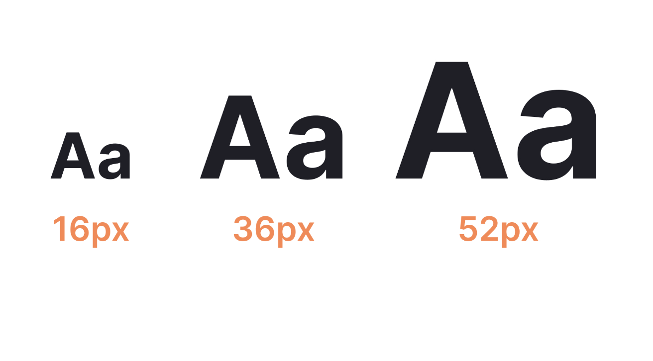 Text sizes impact the overall reading experience. When the text is too small, the users have to strain their eye to read. As a result, most of the information will be skipped. When the text is too big, it poses a different set of problems. So set the font size to a comfortable size to ensure maximum readability. Modular scale technique can help you find the best font size for the project you are working on.
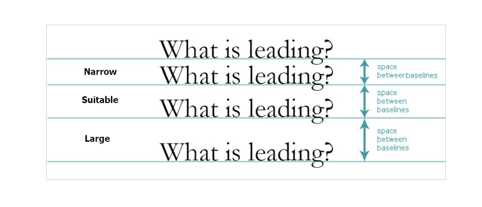
4. Horizontal and Vertical Rhythm
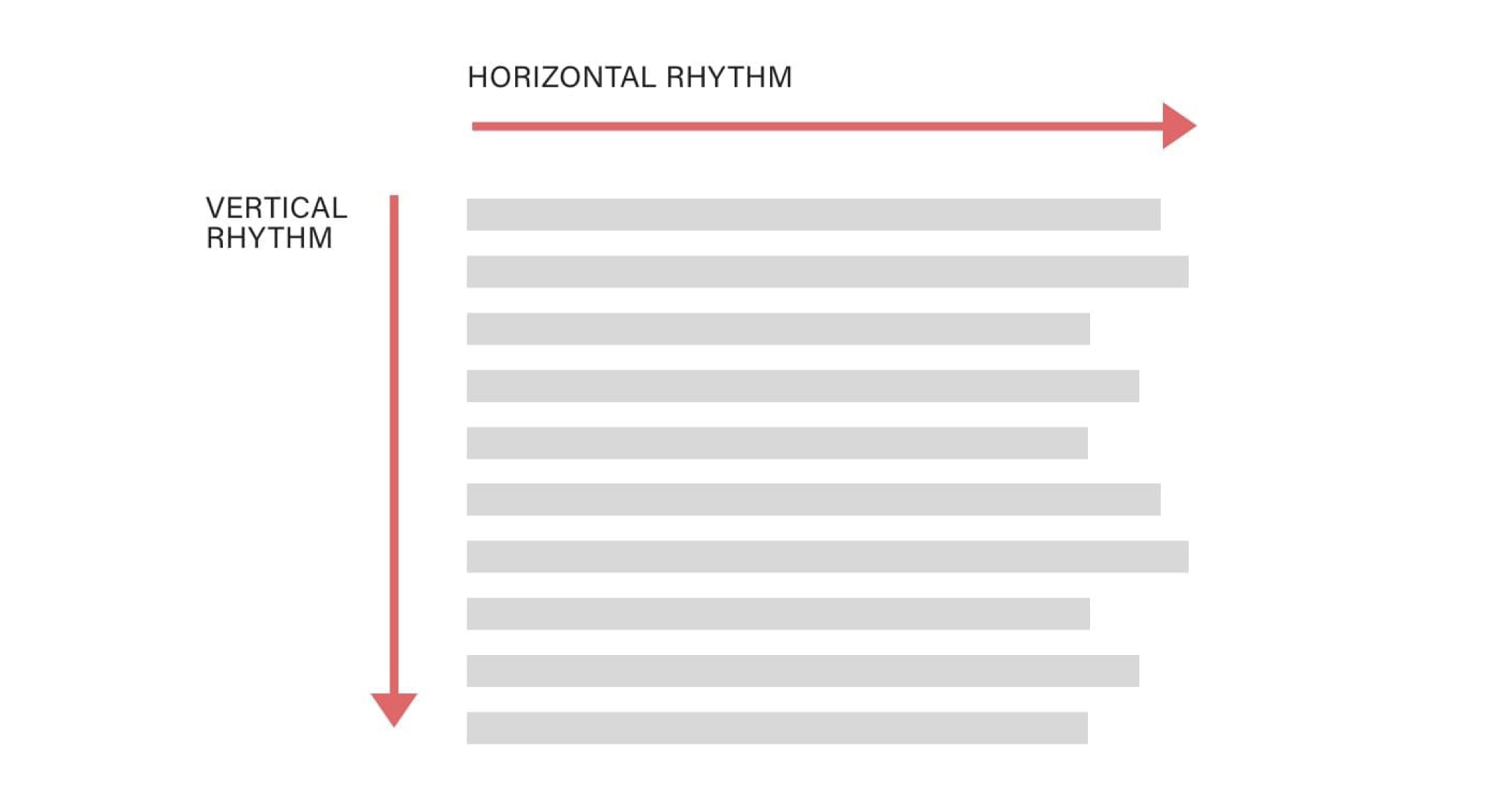
Letter spacing can have a huge impact on the legibility of words. When it is not done right, it can have a negative impact on the overall reading experience as it makes it hard to be deciphered by the brain. Kerning aka the space between letters is another issue that makes the words hard to read. To set a vertical rhythm, you have to have a basic rhythmic unit. This is called line height. The block of text needs to visually connect with the text underneath it, this is what we want to achieve with vertical rhythm and visual hierarchy
5. Mind the Gap
 The text is easier to read when it is left justified. The vertical edge to the left assists readers in reading the content from left to right. It is also important to look for gaps to avoid having a single word at the bottom.
It is also important to choose a typeface that works well on various devices. Try to avoid cursive scripts that have uneven rounded edges. This makes the text difficult to read on various devices.
6. Define your goals
When you begin a typography project, it is important to establish design goals. By defining goals ahead of time you are able to create a structure with the help of design principles. Design principles are abstract concepts that can help communicate the look and feel of your work. Setting clearly defined boundaries can help you narrow down a typeface from a plethora of typestyles. For example, typography that is clean and modern should look and feel different from a type that is stable and trustworthy. Different typefaces evoke different emotional responses in the user. So when choosing a type, having a clear understanding of the objective will help you find a suitable one.
7. Content Hierarchy
Once you have defined your goal, the next step should be reserved for understanding the content layout and hierarchy. If you have to design and don’t know what the content is, then it is still better to use a readable text than a lorem ipsum placeholder. Go through the copy and layout different instance of every unique type of content.
Picking typography is hard. It helps to lay them out in an artboard matrix to see how different layout combinations look like. Once you have the content layout, take time to look at the different options and compare one to its neighbor and see which one adheres to your brand objectives/principles. This should help you narrow down the typeface that can represent the look and feel you are going for.
Crafting good typography takes practice. Typography should not only be readable, but it should also make you feel. Designers should take the time to master this skill and this is only possible through daily practice. The more typefaces and styles you try out, the more you will understand different combinations and how best to use it in your project. We hope you take this practical guide to make your process better and faster.