Line25 is reader supported. At no cost to you a commission from sponsors may be earned when a purchase is made via links on the site. Learn more
We all know how important typography is in web design and design in general. Choosing the right typeface(s) for web, colors and, if necessary, applying the right type treatment can help tremendously in conveying your message to your audience.
Most of the websites showcased today use large typography mostly in their headers, but also in other places such as subheadings and other elements to draw attention to areas of importance. Let’s take a look at some of the best examples of typography in web design.
Kidd81
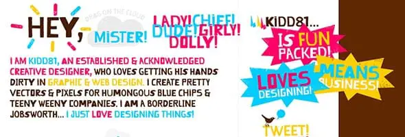
Kidd81 is a creative designer’s personal web site. This is a nice example of using both typography and a vast color palette of striking colors in your project. It has a childish design, but it matches the designer’s style perfectly.
Get Finch
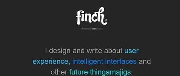
This website is an excellent example of using the right typography and colors to highlight important facts and present information to its readers. The important groups of words are emphasized using different shades of blue, to catch the readers’ attention.
Thisisjamhot
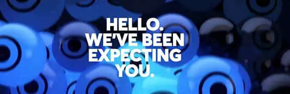
This website uses typography to establish a link between itself and its readers through a warm ‘hello’. Furthermore, this site uses horizontal bands which build jamhot’s portfolio.
PolarGold
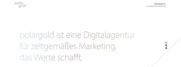
Polargold is a website that presents a digital agency for contemporary marketing through typography, color, and a minimalist design.
Demotive
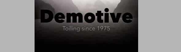
Demotive is a single page website that displays a compact and lightweight design through both bolded and regular fonts. It’s a great example on how to combine bold fonts with thin ones.
Fernandosilanes
Fernando Silanes’ website also has a good choice of typefaces, color and design to information about himself and his line of work. He uses both large fonts and normal-sized ones in this design.
Adlucent

This website uses a large typography in their header to present not just their motto but also other important information as to what they do, how they do it, their resources and team.
Digital Mash
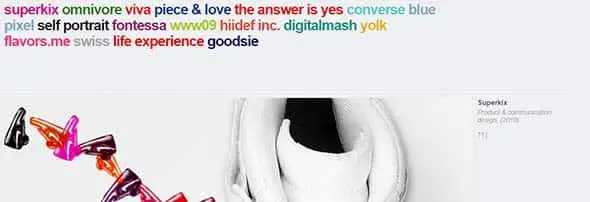
This website uses typography and color as a way to ease readers’ search through the gallery as each word represent a showcased project. It may be difficult to read the text with all those colors but the overall design definitely catches you attention.
Gummisig
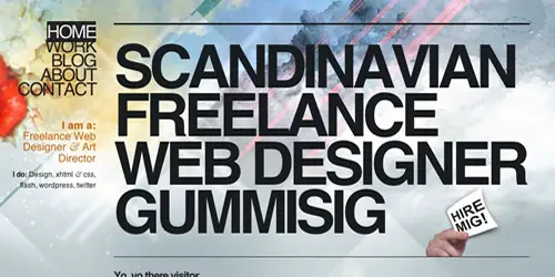
This website belongs to a designer that designs, codes and loves what he does. It is also another good example of large typography used in web design. He uses huge fonts on the homepage and in the menu as well.
Electric Pulp
Electric Pulp not only tackles projects of all shapes and size but they have also put a lot of effort into mixing good design with good typography.
Kyle Steed
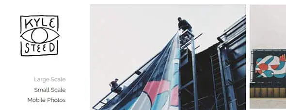
Kyle Steed’s website presents his passion through images, texts, colors, and fonts. Even the site’s logo is made of a playful typography.
Josh Hemsley
Josh Hemsley’s website is another example of choosing the right typefaces and colors to present information to readers. On his site, you’ll find a list of projects, details about him and his interests.
Bradfrost
Bradfrost.com is yet another example of using typography in the site’s header. This one uses a bold white font over a colorful horizontal band before to express an invitation to finding out more about what he does.
Hellomonday
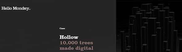
HelloMonday website is a Digital Creative Agency’s mission to turn Mondays into the best day of the week. This site uses an animated design to showcase different projects the agency has had over the years.
Jhische
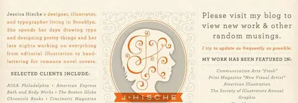
This example is a website that presents the work of Jessica Hische, who’s love is typography. With a great interest for letters, Jessica’s website is a good example of combining web design with typography.
Jlern
In my opinion, this is another way of using typography in your project. This website loads as a redacted file, letting you discover each category.
Mulletized
Mulletized uses animations, static images and typography to create a sensitive web design to connect its readers with the image gallery.
DIBI Conference
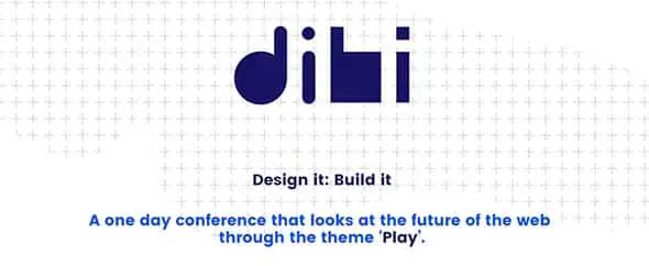
DIBI conference is a website that gives you the opportunity to share your story in 30 minutes. Furthermore, this website is an excellent example of creating a playful design through colors and typography.
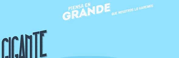
Nosotroshq
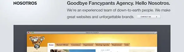
Nosotros’s website focuses on laying out information to its readers through a regular dark gray font on a light gray background. They are an experienced team that makes great websites and unforgettable brands.
Sparkcapital
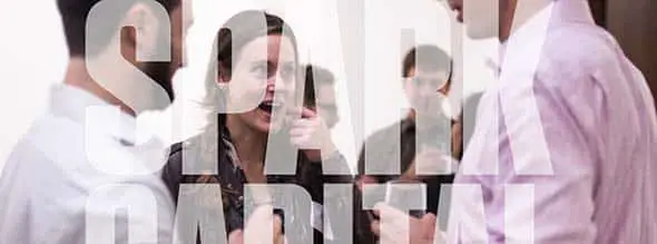
Sparkcapital focuses on investing in startups led by creative thinkers and their website surely expresses their aspiration towards creativity. They use large typography on a horizontal background that showcases images of their work.
Sourhaze EP
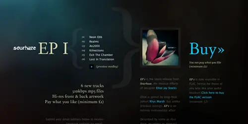
This website is yet another example of choosing the right typeface, colors and web design to lay out information to your readers.
Srburns.es
Srburns uses an interactive web design using a creative typography to connect with its readers. It has a slightly vintage touch, due to the styling of the typefaces used.
Stripgids
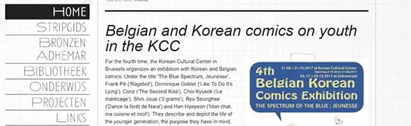
Stripgids uses typography to present information about a biannual magazine that showcases interviews, essays, news releases, columns, reviews and pre-publications, and with a very broad focus.
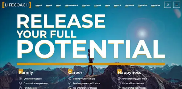
Life Coach
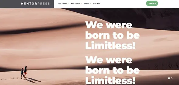
MentorPress
Huge Inc.
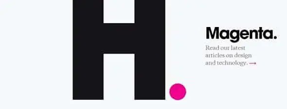
Huge Inc.’s website uses typography in a creative and interactive way. Keep scrolling to find out more about what they do and in how many ways the letter ‘H’ can be creatively changed.
Switchmw
Swtchmw was founded by a team of design addicts whose aim is innovative design quality. Their website sure expresses their aspirations through the use of animations, changing backgrounds, fonts and colors.
Thingsthatarebrown
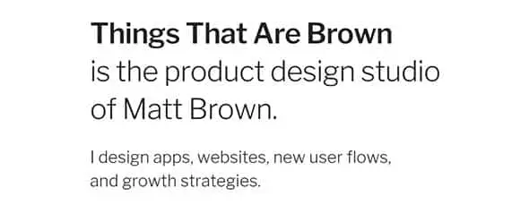
This website is another good example of using typefaces to convey your message to your audience. It uses the same font in different ways to present information to its readers.
For A Beautiful Web
Stuff & Nonsense express their taste for exquisite typography and experience in web design through their website. They specialize in creative design and have worked with clients from all over the globe.
Dkoo

Derrick Koo combines typography and minimalist design for his business card website which only displays links to his other social profiles.
Design Woop
Like most websites today, Design Woop uses large typography on a horizontal band, but also in other places such as the columns that showcase other articles the site is promoting.
Trentwalton
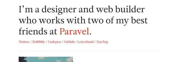
Trentwalton is a website that combines typography and minimalist design to showcase a designer and web builder’s works and thoughts.
What’s my IP
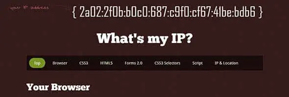
This website also uses large white typography in their header but also in other places to draw attention to areas of importance such as the first row of the articles which explains what a browser is.
Typejockeys
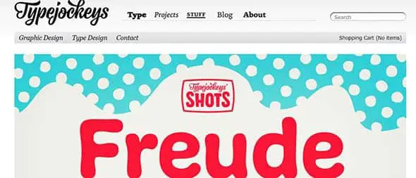
Typejockeys is a graphic and type design company. Their aspiration is towards an appropriate use of typography in their line of work. It is a fun design with cool typography.
Gabycastellanos
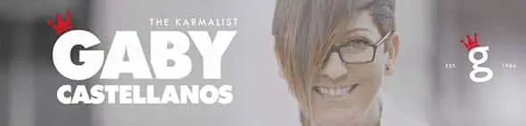
This is yet another example of using typography in a website’s header. This website uses different types of fonts, colors and illustrations to connect to its readers.
thanks
Great List, Huge typography can really look gorgeous.
Everyone else here is so nice. What's wrong with ME? (See my comment of Feb. 22, which I still stand by.)
Hi there, thanks for the list. It's really nice to see good typography in use.
I am also a hardcore typography fan.
I think you should also have included https://blog.fl-2.com/ in the list.
Hey, these are really awesome – great collection – I love them – though from SEO prespective, I'd use less graphics and use regular text for headings. Sometimes you have to sacrifice beauty :)
Some excellent examples of typography here. I'm always stressing to decide what fonts/colors/textures to use in my designs. Thanks for collecting them for us.
Hardly there's any designer who doesnt face problem with the font styles … the collection have given is amazing and at the same time very helpful to everyone :) Thankx
Great examples on how to get around the restrictions in traditionel web typography. The good news is that these restrictions is becoming a thing of the past. With the new @fontface tag, designers typographical pallet is greatly expanded. In theory you are now able to use any font for html text on the web. There are some browser, as well as copyrigth restriction. But finally we are moving in the right direction. Read more here: https://www.fontsquirrel.com/fontface
Very good examples, thanks for sharing
Brilliant collection. Website typography is going to continue to boom and increase in importance in 2010.
Is definitely a skill that I need to brush up on.
Beautiful collection, thanks for sharing.
I love your thread!
This typography is wonderful.
It is an exhaustive collection ! Good typography is just as important on a Web page as it is in any other medium. The fact that it appears on a computer screen and not on a piece of paper is immaterial. It should still be pleasing to look at and easy to read. However, my personal favourites from your list would include Get Finch, We Are Academy, Project 365, Digital Mash, Design Wise, Denise Chandler, FL2’s Blog, Sourhaze EP, Design Woop, Find Me By IP, Lorem Ipsum.
Carsonified Events is a nice design. The typography works really well with the simple theme and contrasting colours.
A showcase of websites using large typography in their headers, but also in other places such as sub-headings and other elements to draw .
Really nice stuff. Keep it coming!
Nice showcase. Carsonified rules for me.
I’ve put something similar to David Jonssons textured typography on my site: https://creativemashup.pl.
I think that this kind of big typography usage will be more popular in 2010.
“sophisticated*
Tom, thanks for featuring my site amongst some of my idols. I’m extremely honoured and was shocked to see my site appear in my RSS feed this morning :)
amazing! thanks for the compilation
Great gallery! I’m not sure which one is really the best one for me.. Maybe Finch and Carsonified. I love clean design!
Carsonified. clean, clean, clean.
Dibi: impactful.
As to some of the others. Handmade may achieve cut-through, but is the antithesis of ‘polish’.
great examples! love finch and carsonified
I like a lot of these, but others… I don’t know, maybe I’m missing something, but I just don’t see them as good, or even competent typography.
DevDays is horrible, IMO: no feel for letterforms at all, looks like a bad student project. Carsonified Events is also dreck – or is it an attempt are ironically evoking the early days of desktop publishing?
Lest you think I’m picking on Carsonified, their Carsonispace example is quite good. So’s Get Finch, Academy, Dustin Curtis, Alpha, and a few others.
The lack of basic typographic skills here is quite astonishing. Joao Andrade: Dude, you gotta kern. (Almost) everyone else: kerning doesn’t mean pushing the letters together until they touch. The 1970s are here, they want their typography back. Kylie Steed: the whole point of a script like that is to look hand-drawn. Repeating the same whimsical “e” three time destroys the effect.
Nice list. My fav is probably Design Wise. The color goes very well with the typography.
Cheers Tom for including me amongst some class websites! :)
awesome set of resources! thank you for sharing this and doing the research for us all to discover. i will definitely be referencing this time to time.
i just want to add, another excellent resource / place for typography is http://www.pilo.me – it by far is the most complete and solid font forum i have visited. you can definitely find similar resources as you have mentioned here at pilo. anyhow, give it a look if you are a type lover. i think it is invite only or it usually is at least, so good luck getting in. if you do get in, be sure to participate as i know they remove deadbeat users time to time.
thanks again for the excellent links!
beautiful typography techniques in web designs.
Nice Showcase.
I really enjoy sites that pay attention to typography, way to often it is the other way around.
Didn’t know you have guest writers on Line25 Chris.
beautiful showcase :)