Line25 is reader supported. At no cost to you a commission from sponsors may be earned when a purchase is made via links on the site. Learn more
The term ‘business card website’ has become widely associated with the popular style of website that has cropped up on the personal domains of designers and developers. The site is essentially a simple, single page design that displays personal information, contact details and links through to other social profiles, much like a traditional tactile business card is used to display basic information.
Business card websites come in all shapes and sizes, but popular characteristics include a compact, lightweight design, often small in size. Business card sites also tend to make use of Javascript to enhance the user experience and are commonly designed with a fresh take on the interface, taking inspiration from the clean style of Apple’s OSX.
Let’s take a look at an inspiring collection of examples, each with an individual twist on the original business card idea.
Tim Van Damme
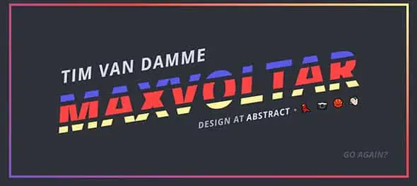
Tim Van Damme’s personal business card website is as playful and colorful as a designer’s page should be.
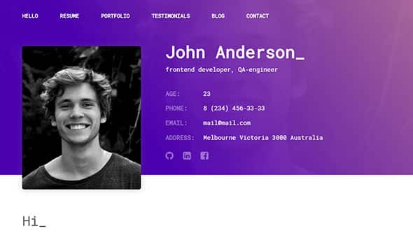
Michealmorgan.com
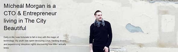
Michealmorgan.com is a young entrepreneur’s personal website which breaks the ice with a photo of him. Furthermore, you’ll find a lot more about him and his passions.
Florian Pichler

Florian Pichler chose a simple letter-like design that focuses on delivering information to his readers in an interactive way.

Besides the gallery of hobbies and activities she takes part in, Ximena’s website also highlights certain keywords that best describe her, making her personal web page an interesting way to learn more about someone.
Kristihines.com
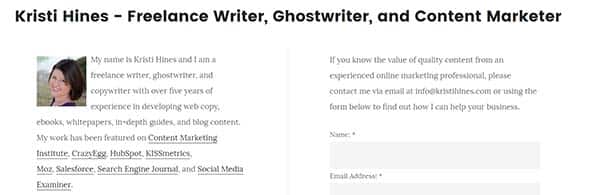
Kristi Hines business card website best shows her passion, writing. This site keeps things simple and focuses on her hobbies and aspirations.
Redrussak.com

Red’s page is one that makes you smile when you see it. Not only does it start with a question to make you curious but it also has a funny portrait of himself.
Thierry Castel
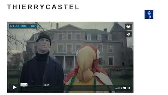
This page is another way of presenting yourself, this time not through the birth date and graduated schools, but through what you do best, your hobbies and passions.
Sarahlichang.com

Sarah Chang personal web site keeps it simple with a short presentation of who she is and a couple of links to her interests.
Ianenders.com

Ian Enders has an interesting way of presenting himself – a list of sentences that start with the same word and a couple of highlighted keywords that mark the important things in his life. Besides that, the photo is another way of getting you to know him because the t-shirt and the cup sure have personality.
Nathanielkoloc.com

This example shows a lot more information than a normal business card web site, making it one closer to a personal bio type site with a formal concept.
Greg Thongsophon
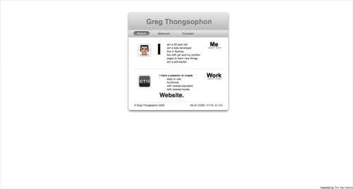
Greg Thongsophon’s business card web site focuses on presenting only the important information, just like a real-life business card.
Laurenicolesmith.com

This one has a simple design, with a blue background, Lauren Smith’s name and line of work and some links to her social media pages. These kinds of pages focus only on delivering the important information to readers.
Clément Simon
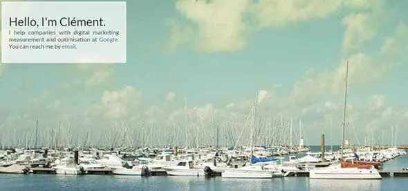
Clément starts his first contact with his readers through a ‘hello’ before even saying who he is or what he does. This helps to make the information more personal and less formal.
Pascalvangemert.nl

This page is an interactive resume which starts by presenting Pascal’s name over a superhero background before getting into any other details. Furthermore, you’ll find everything there is to know about him.
Eugen Buşoiu

Eugen Buşoiu also keeps it simple by choosing a background that best fits his personality and line or work to which he added some info about him.
Hopereagan.com
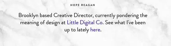
This website focuses on presenting Hope Reagan. This site uses a white marble texture to expose one name and some information about the person. Just like previous examples, you’ll find links which will help you find out more about Hope.
Jimramsden.com

Jim has quite an interesting way of showing us the two sides of his personality – the city’s skyline representing his logical mind and his creative heart through a pastel-coloured landscape. If you’ll continue scrolling you’ll find out more about him and even some of his articles.
Timothy Armstrong
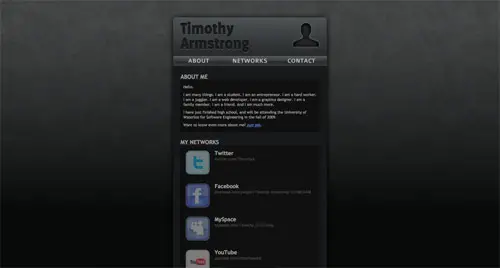
Timothy’s business card web site uses a dark and neutral layout. This way, the information stands out making it easier to be read by anyone who is looking for him.
Lee Adams Norris
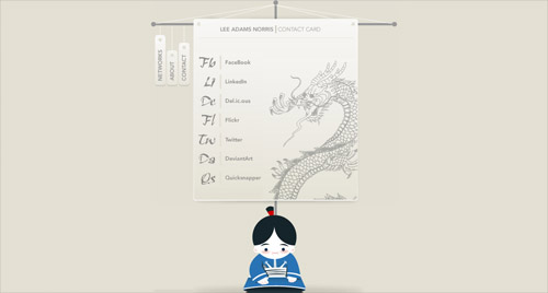
Lee Adam Norris’ contact card uses an Asian design. You’ll find a list of sites, pages and social media accounts where you can later contact him in case you need his help as a marketing manager.
Michael Dyer
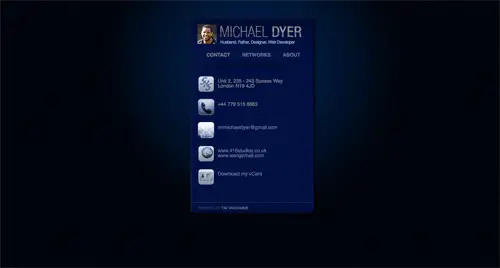
Michael Dyer’s website is another example of a business card web design that focuses on the important information of the person. In this case, Michael chose a neutral blue background for laying out his contact details, networks and some other info about himself.
Christian South
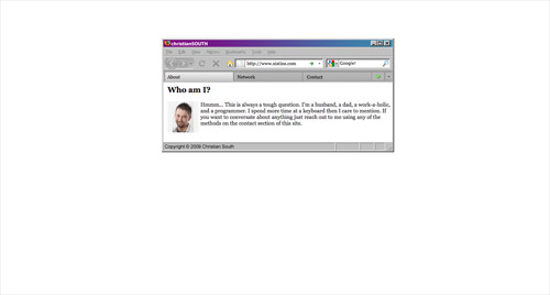
Christian South and his business card website tells us some facts about who he is before laying out any networks and contact information.
Ryan Glover

Ryan Glover has a different way of telling us more about himself. Instead of giving us all the possible information, he uses his passion, writing, as a way to describe himself.
Mark Tyrrell
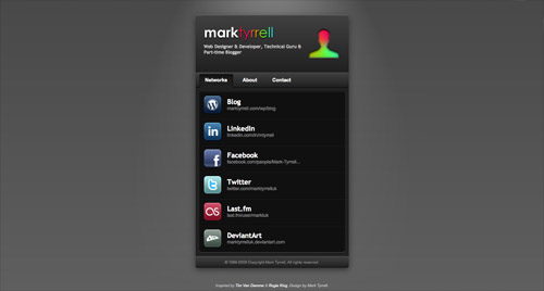
This website belongs to a designer, developer, and blogger called Mark Tyrrel who uses a single page to describe himself and his skills.
Allisonstadd.com
Allison Stadd inspires energy through her personal website and her way of presenting information. Her photo in which she smiles, the font and use of caps lock gives you a good vibe while visiting.
Ellensriley.com

Ellen starts her personal presentation through a horizontal band with her photo, name, and logo before showing us some of her projects, passions and aspirations.
Adamhartwig.co.uk
This website uses a changing and animated interactive background to present important of Adam Harwig’s interests and hobbies.
Andrevv.com

With a minimalist design, Andrew McCarthy presents himself in a fun and interactive way. Scroll down to find more about him and watch that logo change shape and color.
Michael Villar
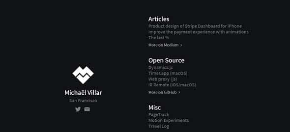
With an animated background, showing a personal logo before laying out any information, Michael Villar presents to us important aspects of himself and his line of work.
Nico Kaiser
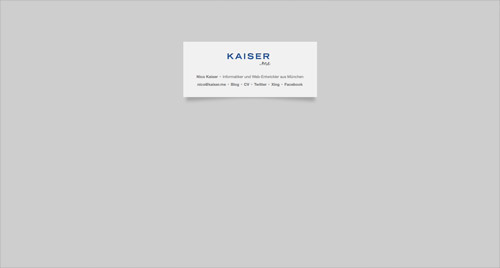
Nico’s website is another example of minimalist design, this time using a light gray background and an almost white rectangle to lay out information.
Rleonardi.com
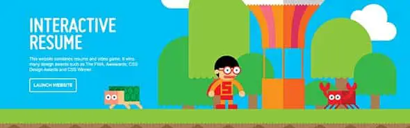
This website uses Robby Leonardi’s illustrations to portray himself. You’ll out it’s divided into 3 parts: a game based resume and two portfolios.
Gabor Szauer

Gabor Szauer’s business card website also uses a minimalist design to state out information about himself. If you want to get to know him more, you can check his page.
Pedro Duarte
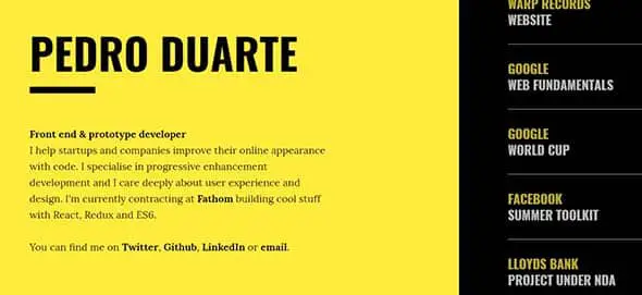
This site uses yellow shape to present information about Pedro Duarte, while the black stripe has a list of projects which you can scroll through.
Michaël Betsch
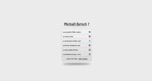
Michaël Betsch uses a light gray background and a centered, smaller panel to lay out some key information about himself.
Garysheng.com

Gary Sheng starts with a friendly hello on a band made out his photo. This way, he gives a good and positive impression about what a reader is about to see.
Karsten Rieger
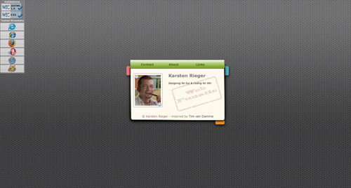
Kasten Rieger also uses a simple and minimalist design to present himself. He uses a small and representative photo along with some other data about him and about how you can contact him.
Rafaelderolez.be

Rafael uses key words and images which can be discovered while scrolling his page. He definitely found an interactive way to reach people.
Preshit Deorukhkar

This is another example of a static background, this time with a photo of the person this site is about, and a scrollable stripe that can be used to lay out information.
Brandoncjohnson.com

This personal website best shows Brandon Johnson’s interests through logos, images and even the way the text is displayed. You’ll find out he is a planetary scientist before even noticing this piece of information.
Quinntonharris.strikingly.com

This is a different example of a personal page. In this example, Quinton Harris uses a scrollable gallery of personal photos to present himself.
John Phillips
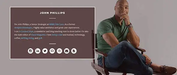
This is another example of a single, static page which contains pieces of information about John Phillips. Like previous examples, you’ll key words highlighted and linked to other pages (ex. ‘being a dad’ is linked to a photo of him and his two kids).
Seanhalpin.io

SeanHalpin has a very creative way of presenting himself to his readers. He is a web designer who uses illustrations to best display what he can do and how he can help.
Tyler Galpin

Tyler Galpin also uses a dark and neutral layout and only a logo of his name. This example is best used in smaller circles, as it doesn’t give you any other information about who he is and how to find him, and is much rather used to contour someone’s personality.
Mattias Kretschmann

Mattias Kretschmann combines the business card website with a showcase of projects he has worked on. You’ll find out he’s a designer and developer and although he’s not available for hire, you can try talking him into one of your small projects.
Melaniedaveid.com

Melanie’s page uses a horizontal band with her logo as a primary form of presenting her. By scrolling, you’ll find out her website turns into a grid-type that will showcase projects and more information about her.
Simoneviani.com

Simone uses a minimalist design. This page only lays out key information about the person it is presenting. Besides that, you might be surprised to find out you can play a game on her page as she likes ‘crafting interfaces and interactions’.
Luke Stevens

Luke Stevens uses his personal page to present himself to his readers and also to present ways in which he can help you optimize your site and business.
Nik.org
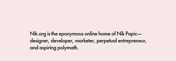
Nik.org presents itself as an online home of Nik Papic. With its lilac layout, Nik tells us more about his life, passions, and aspirations.
Grahamhicks.com

Graham Hicks uses an animated logo as the first thing you see on his page. The rest of the page uses a white background with bold colors to layout important information about this person.
Ryry.io
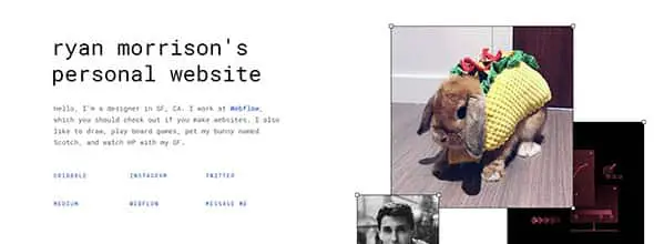
Ryan is a designer who works at Webflow and this is his business card website. What makes this page different are the 3 photos that play a good role in getting to know him and his hobbies. You can move them or change their size as you please.
Appenstein

The last example is Appenstein’s business card website. With his page’s green layout and logo, Justin Youens presents himself as an independent iOS Developer.
Rokstar

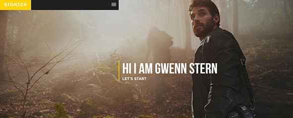
Bionick
SpirIT
Nice Collection of Cards. I needed this. Thanks
very nice post i like it!
Thanks for adding my card… nice post!
Really loved this post of a great compilation of site…so much so I was inspired to create my own “one pager”.
Thanks again for a great collection.
Great collection. Thanks for it.
Good Compilation… Lee Adams Norris, Katrina Neufield, Maykel Loomans, Luke Stevens and Dean Harris are on my top five list…This post will surely inspire many of us to explore the creative side which is dormant in this world of machines….Thanks…….
Obama had been misleading in suggesting he had a universal coverage plan. ,
Nice tips !!
Thanks for nice work!!
plain yet great looks good keep up the good work
Great list. Simple but great design work!
Thanks for including me in the list!
Regards.
I just love the simplistic look of a lot of these sites and the design thought that clearly went into them.
Some of these were showcased in .Net magazine recently and prompted me to completely redesign my own site in a similiar (nit nowhere as good!) style.
Wow, so nice to be showcased {:
Thanks for the mention, It got me around 300 visits :)
Guy.
Thanks for the mention Chris, appreciate it! :)
Thanks for including mine in there too Chris. Hoping to redesign yet again soon.
Now I want mine.
Thanks.
*Bookmarked, tweeted*
Nice stuff, thanks !
Hey great post – Tim’s site was an inspiration to my most recent personal site..
Nice site too Chad! :-)
I just talked to a reputable advertising company and their sales rep had no clue what a business card website was. That’s when I knew to hang up. Great designs!
Thank you for adding my site to your list
Thank you very much :) I’m glad to be on your showcase gallery <3
Thanks for the mention. I saw a spike in visitors, and was wondering where they came from.
And to everyone else on the list, great job.
Thank you for mentioning me.
Very cool! Thank you so much for putting together this collection. You’ve inspired me to maybe try something a little different.
Thanks for listing me!
thanks for the feature chris :)
Michael Villar is definitely my fav!
great list!
Muy buen blog de diseño! great blog! thanks from Argentina.
Great Website Layouts. Keep it simple and stupid!
Wow! these are brilliant! Thanks for sharing.
Business Card Websites…Very Interesting! This sounds like an excellent way for a small or homebased business to get started. Most new start-up businesses can not afford a full fledge website. In walks this….Good topic!
Great list! Very inspirational.
this one was my fav Daniel Genser
These are the most amazing things I have ever seen!
Great post and as the title suggests it is very inspiring. Until today I was unfamiliar with “business card websites” and now I am determined to make one for myself. Thanks a ton!
Many thanks for listing me, Chris!
Great stuff, got a few too many favourites in there to mention them in the comment! ;)
Wow! Thanks for the mention.
I really don’t think mine warranted (I actually just changed it this morning) being included in this list, especially with such amazing other examples.
And then I flicked it back. I guess this article made me realise that I liked the old version better.
Cant agree i think Nathan’s although unfinished works well. Lacking content maybe but it has all the necessary contact details.
They are some fantastic examples in this post. I still question the need for one of these sites especially if you have a full functioning portfolio website.
great list
Nathan Plante’s website is a bad example of the business card website, it has nothing
some of the rest are excellent implementation of less is more
Wonderful showcase.
I have to make one for myself.