Line25 is reader supported. At no cost to you a commission from sponsors may be earned when a purchase is made via links on the site. Learn more
We’ve all heard the saying “less is more”. Sometimes stripping away all the gimmicks and fancy elements from our layouts and focusing on the core design principles can result in a much more aesthetically pleasing web design. This post showcases some of the best examples of ultra minimal web design. Get inspired!
The latest web designs with loud colors, trendy headers, and stunning imagery are indeed attractive, but sometimes it’s nice to admire the everlasting style of minimalist design. The ultra minimal websites in this list focus on composition and typography to create stripped back, naked designs that are just as beautiful as those full of glamour.
The sophisticated image of minimalism has always been a popular style of design. In web design, a minimalist site is stripped naked of eye candy and fancy colors or effects, leaving the underlying structure exposed. The key to a beautiful minimalist site is a solid and structured layout, as well as focus on stylish and well-designed typography. These 50+ examples of minimalism in web design showcase some of the best minimal site designs out there on the web.
If you feel the need to change things up and try something new, check out these inspiring examples of ultra minimal web design. Browse through this selection and discover new web designs.
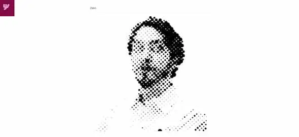
Yaron Schoen
Yaron Schoen’s website has a minimalist design which uses a white background and an interactive portrait of himself. You can also have a look through his impressive work. This example is definitely worth following and can be a great source of inspiration. Have a look and see if you think the same.
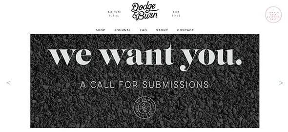
Dodge & Burn
Dodge & Burn is yet another good example of a website that uses a minimalist design in an eye-catching way. It has a white background on which content stands out. It also uses typography in a creative way that blends in well with the minimalist web design layout.
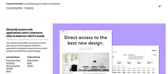
Friends of The Web
Friends of the Web also has a nice minimalist website that is worth checking out. It uses colours and nice infographics to present this company’s line of work. Have a look and see if you find your inspiration.
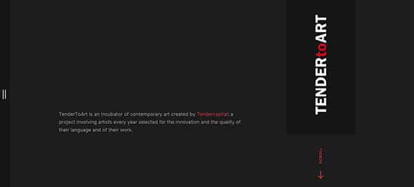
Tender to Art
Tender to Art has a dark theme that presents contemporary art created by Tendercapital. It has an interesting and creative design which can definitely be a great source of inspiration for future projects.
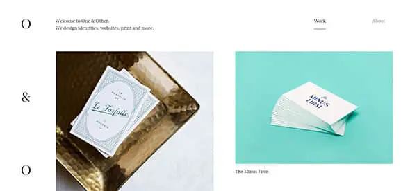
One and Other
One and Other is a company which designs identities, and this is exactly what they express through their portfolio website. It is yet another good example that uses a white background on which they place impressive and representative large photos. It is definitely an example worth following and which might be a great source of inspiration for future projects. Check it out!
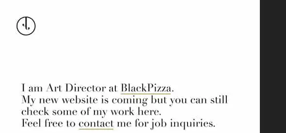
Johann Lucchini
This is yet another good example of a minimalist website that uses a white background and lots of typography. Johann Lucchini is working on a brand new website but you can still check out his works on his portfolio website and get inspired by its amazing design.
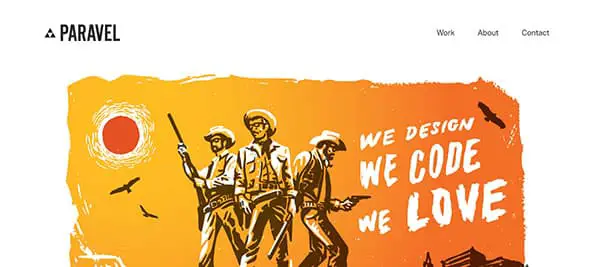
Paravel
Paravel loves coding and designing and you can see that on this company’s minimalist yet highly creative website. This is yet another good example worth following and which can be a great source of inspiration for future projects. It uses a white background and a cool representative image that will definitely grab your attention.
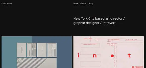
Chad Miller
This is yet another cool and dark themed minimalist website. This is Chad Miller’s website. He is an art director, graphic designer and introvert and his website prove his vast experience in this line of work.
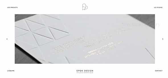
Epok Design
Epok Design is yet another good example worth following for future projects. It has a minimalist and elegant design that can definitely grab people’s attention.
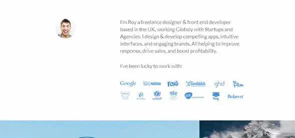
Roy Barber
Roy Barber is designer and front-end developer with a minimalist and elegant website. This website might be your next source of inspiration for future projects.
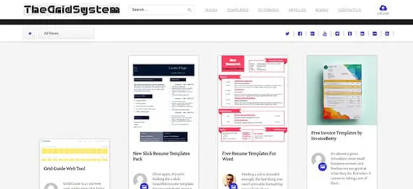
The Grid System
The Grid System has a minimalist design and a cool way to present templates. This example can be a great source of inspiration if you are working on a similar website and it can also come in handy thanks to its good and constant content.
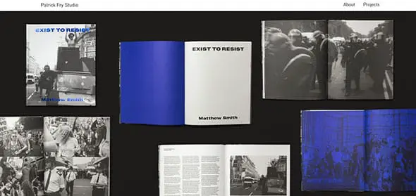
Patrick Fry
If you were working on a portfolio website and you were looking for some good inspiration Patrick Fry’s website might be exactly what you were looking for.
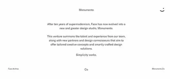
Monumento
This is a business card website for a design studio called Monumento. It uses a minimalist design with a white background and typography. They also have a cool logo. Check it out!
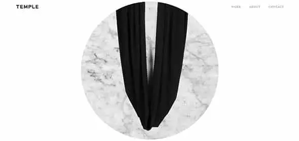
Temple
Temple is yet another good example of a minimalist website that uses a white background in which they present their work through a nice and round shaped slider.
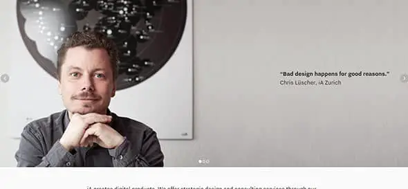
Information Architects
Check out this amazing website that presents the work of Information Architects. It uses a large and representative image as the first thing a visitor sees, followed by their projects.
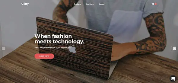
Glitty
Glitty presents wooden accessories for your devices through a minimalist website. This is yet another good example that can be a great source of inspiration for future e-commerce projects.
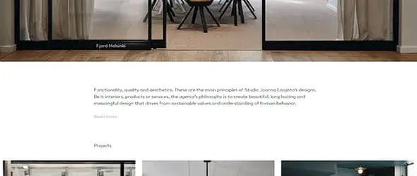
Joanna Laajisto
This website uses a large image as the first thing a visitor sees followed by a personal quote and a gallery of projects.
Minerva Streetwear
If you are a fan of Streetwear or you are working on a similar project, this example can be a great source of inspiration thanks to its minimalist yet friendly web design
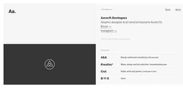
Aa.
This is a graphic designer and art director’s website that uses a minimalist design. It is yet another good example which can be a great source of inspiration. Check it out!
Oak.is
Last but not least, this example uses a much more colourful minimalist design. It has a blue background and uses pink typography in different shapes and sizes. Have a look and see if you find your inspiration.
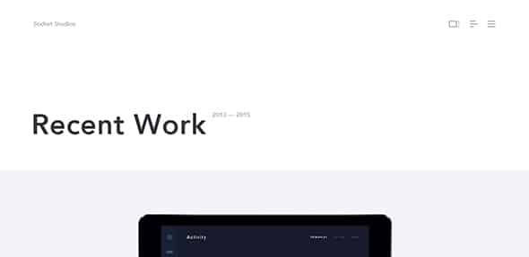
Socket Studios
Nowadays we don’t need so many words to express ourselves. A good picture placed in the right place provides us with all the information we need to draw our own conclusions. This web design is the perfect example for this.
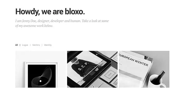
Bloxo
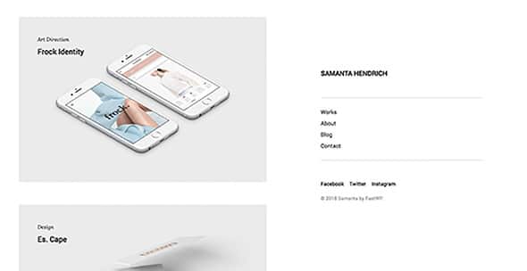
Samanta
Ape Unit
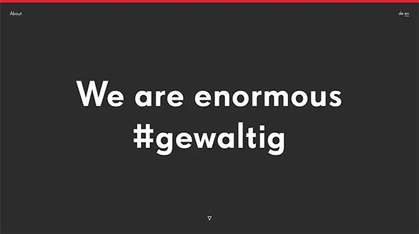
The color changing for each topic and the picture fading in the background really captures the interest of the viewer, shifting the focus from one topic to another.
Italic Studio
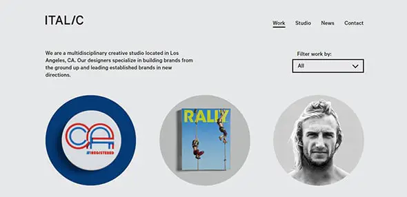
This site has a beautiful expression which is obtained through a minimalistic design. The use of neat animations is a great way to make this design pop!
Ten & Bourne
If you are tired by information crowded websites then this minimal web design will soothe your eyes. Check out this minimal presentation and discover its full features.
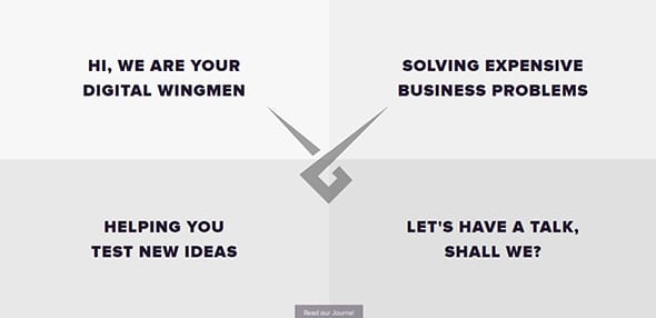
Wingmen
Enjoy the unique design of this website and the creative navigation. This minimal web design has a beautiful home page with an eye-catching animation effect.
Derek Boateng
Get inspired by this awesome website which takes the minimal design very seriously. This website includes beautiful geometrical elements and lovely colors.
Oh My! Digital Design Studio
Elegant website design which is a great example of a minimalistic and professional design. This website has an exceptional animated background which gets your attention. It uses a white background, a lot of typography and medium-size thumbnails in a modern eye-catching way.
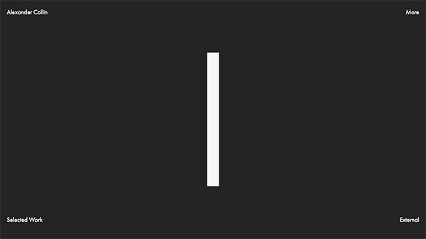
Alexander Collin
The minimalistic design, as well as the contrast between black & white, makes this design stand out. Browse to unveil the full layout.
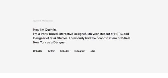
Quentin Morisseau Interactive Designer
Another online portfolio presented in a unique manner, a list of projects differentiated between the great public and the close friends with password protected works.
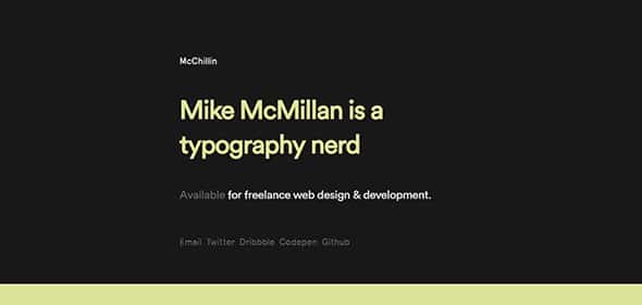
McChillin Chicago Web Design & Web Development
This website has a beautiful minimalistic design which stands out thanks to the continuous color changing font and background.
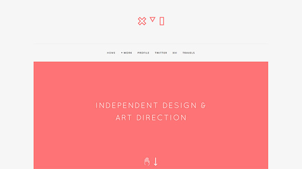
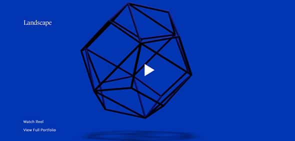
Landscape – An Independent Design Studio
An animated background design can really make your design stand out. This portfolio website has a creative minimalistic design with a creative layout.
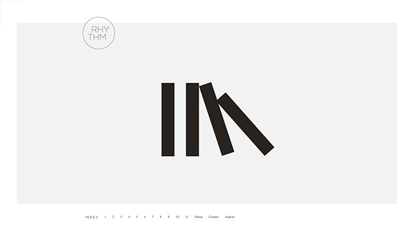
RHYTHM Design Studies
Here is another excellent example of a professional website with a minimalistic design. It’s a one-page website with a creative navigation.
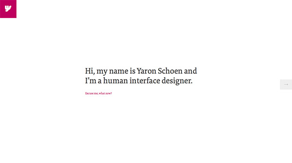
Yaron Schoen
You only need a message and a creative way to showcase it to the public. This minimalistic website also includes a full-screen menu design which can be accessed from the sticky logo design on the top left.
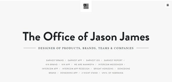
The Office of Jason James
A minimalistic design can say a lot about your website. This is a stunning portfolio website which uses a side menu and a creative clean design.
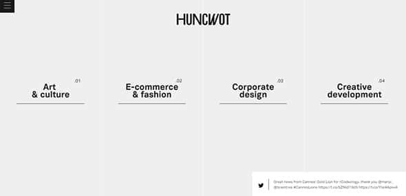
Huncwot
Sometimes a surprise in your design can keep your users engaged and connected. This website has a grid layout which comes to life when hovered over.
Omar Folgheraiter Web & Graphic
Minimalistic or not, a successful website requires powerful features to ensure its success. This layout includes a parallax scrolling effect, a well-designed timeline, and other great features.
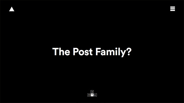
The Post Family
Discover the full layout of this minimalistic website. It begins with a black & white screen which showcases a big heading, the menu, and the logo design. Also, you can navigate through the site using your keyboard.
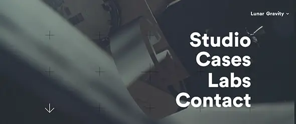
Lunar Gravity
This website includes a neat parallax effect which makes everything come to life, giving another dimension to the entire layout.
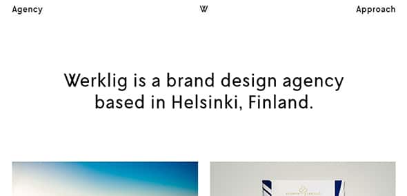
Werklig Brand Design Agency
You can express more with less! This website uses a white background and a grid layout to showcase each project.
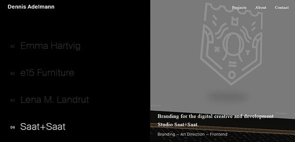
Dennis Adelmann
Enjoy this minimalistic design and get inspired by this creative way of showcasing each project.
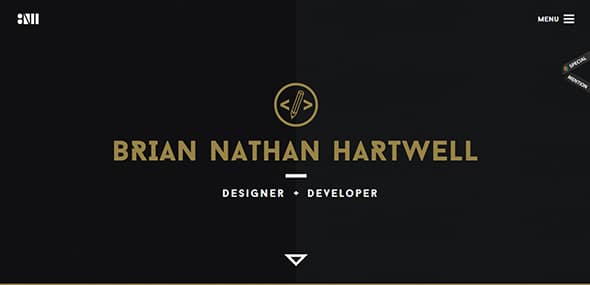
Brian Nathan Hartwell
This website is well-organized into a grid layout which includes a certain project. Each one has an amazing animation which comes to life when hovered over.
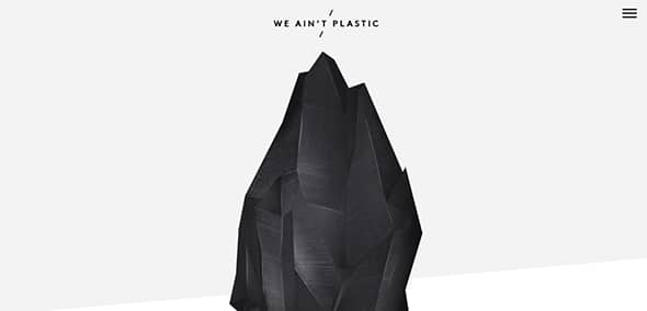
We Ain’t Plastic
With a minimalistic design, a soft colored background ordered content and soft animations, this website will definitely get your attention.
Kyle Steed
This blog depicts the writer’s work, life, and over-time progress in terms of change, dealing with change and more importantly, how to embrace your feelings.
Thefoodlens.com
This website presents an abundance of good food in the city of Boston. If you don’t know where to go out to eat or grab a snack you can always check out their picks.
Thesoulist.com
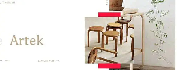
Thesoulist.com’s aim is to depict Federico Repetto’s struggles, experiences and his work in different fields. This website has a sensitive way of presenting its information to its readers through web design.
Qcterme.com
This website will help you find anything you need in the spa and hospitality sector. On qcterme.com you’ll find two main categories: destination and experiences which will make it easier for you to find what you’re looking for.
Martinpriotti.com
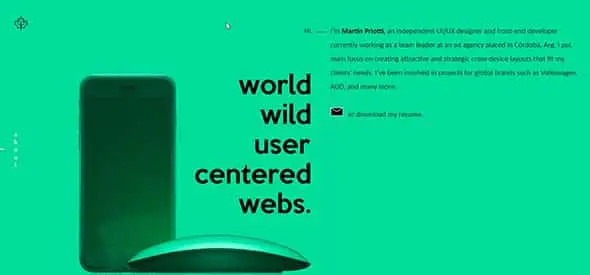
This website belongs to an independent designer and developer who is currently working in Cordoba. His main objective is creating attractive solutions for his clients.
Doyouspeakhuman.com
This website presents an experiment, a ‘playful research’ whose purpose is to listen to people’s needs before deciding anything else.
Agence-belle-epoque.fr
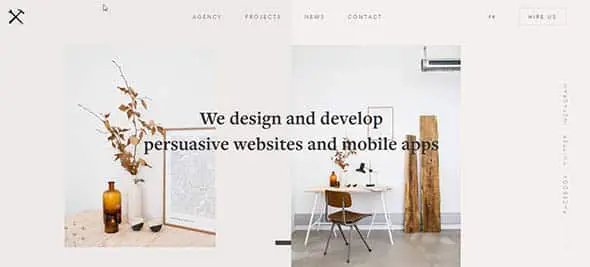
Agence-belle-epoque.fr comes in handy when you need help with your digital project. They will come up with a good strategy, design and so much more.
Elitefingers.com
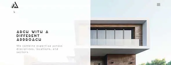
This website belongs to an Architecture Agency based in London. They present their projects with the help of an easy-to-read and watch minimalist design.
Biron.io
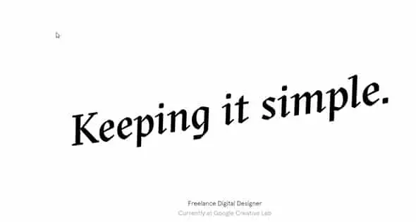
‘Keeping it simple’, as the home page of biron.io says, depicts the creative direction of a Freelance Digital Designer based in London. His website is a good example of an innovative minimalist design.
Paninibay.com
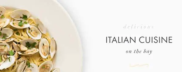
With its minimalist web design, Panini Bay is the product of a family’s love for food. They present through this website the Italian cuisine they serve and a breathtaking view thanks to the location of the restaurant.
AIGA
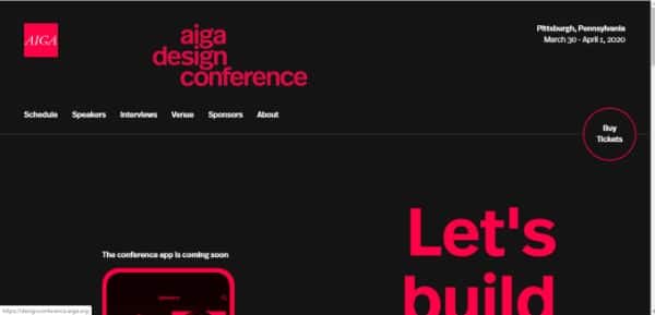
AIGA has designed an efficient website by using duotone theme. It definitely is an inspiration for people who are willing to create a great website which is subtle and attractive.







Comments are closed.