Line25 is reader supported. At no cost to you a commission from sponsors may be earned when a purchase is made via links on the site. Learn more
When visitors come to your website, they go through your text as it is the primary source of information. So while creating content, you should consider using innovative fonts that encourage people to stay and explore on your website. Fonts can also bring out the overall aesthetic value of your content. They make it easy for you to communicate with your users because certain fonts can decide the tone of the website.
Visitors can easily understand what your website or business is about by looking at your content if the fonts are used properly. Fonts also establish information hierarchy on the site, so visitors know what is essential and what can be skipped. Specific fonts attract users’ attention while making the information prominent. Here are seven trending, cool fonts that will make your website look attractive:
1. Reforma:
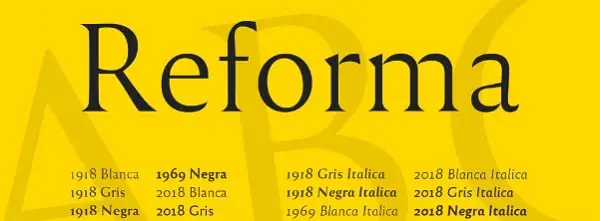
PampaType designed Reforma for Universidad Nacional de Córdoba in Argentina which a 400-year-old educational institution. Reforma consists of 3 subfamilies namely Reforma 2018 (a modern sans), Reforma 1918 (a classic Serif) and Reforma 1969 (an intermediate hybrid) that integrates the qualities of the other two. All of these come in 3 weights along with matching italics. This is a straightforward font that works well with a wide range of bodies. If you want to use it for body text, you can pair Reforma with its serif counterpart. However, if you want something unique for your title, you could use it with another creative serif.
2. Gangster Grotesk:

Adrien Midzic designed Gangster Grotesk. It is a modern grotesque with angled strokes that are curved inwards. Because of this quirky design, the fonts bring significant attention to headlines and posters if used in large sizes. It is excellent for giving a creative twist to a professional website. Its condensed width and low contrast make it an excellent choice for body text as well as other small size texts. The typeface comes in 3 weights with stylistic alternatives. For using it in titles, you can use Gangster Grotesk with low x-height serifs such as FF Atma. On the other hand, if you want to use it for body or small-sized text, you can pair it with Le Murmure.
3. VG5000:
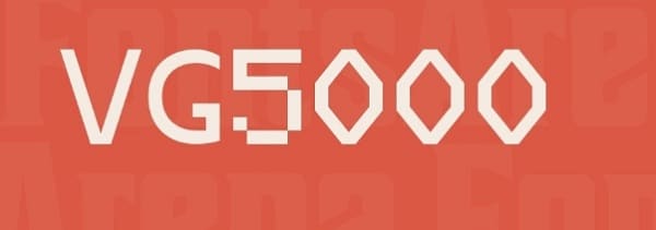
VG5000 is named after a computer that was created in 1984 by Philips. It is a mixture of old and new digital shapes. VG5000 combines pixelated line and curved strokes. It also comes with early pictograms and emojis from its original set, offering unique combinations. Furthermore, this typeface includes gender-inclusive characters such as “iel” for the French language. Because of the pixelated details in VG5000, you need to be careful while pairing it with other usual fonts. You can pair VG5000 with a monospaced font like League Mono. You can even pair it with a serif or sans version of input such as ETC Trispace.
4. Space Grotesk:
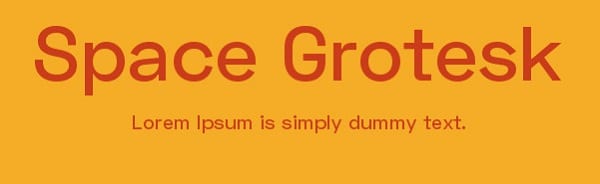
Florian Karsten found Space Grotesk, a geometric sans serif. It is derived from Space Mono that is a monospaced typeface that was designed by Colophon Foundry in 2016 for Google Fonts. Space Grotesk is a well-spaced font that comes in 5 weights. Along with five weights, it also has five sets of alternate letters, namely Light, Regular, Medium, SemiBold, and Bold. The 3rd one is great to create distinctive headlines. Space Grotesk can be used for bold headlines as well as body text depending on how you pair it. The most obvious pairing of Space Grotesk would be with Space Mono as it is derived from this font. Apart from this font, you can also pair it with pointy serif with sharp details like Wremena or Fortescue.
5. Le Murmure:

The Type Directors Club recently awarded Le Murmure a Certificate of Typographic Excellence. It was created by a French design agency called Murmure to renovate its brand image. It is a condensed sans serif with angled strokes at the terminal. It has an exciting mismatch between each character, making it distinctive for large sizes. You can use Le Murmure to display creativity and convey notions of experimentation as its height and singularity of shapes provide elegance. Le Murmure has a stylistic set that randomizes the alternatives. For titles, you can use Le Murmure with sans serif that has warm curves such as Standard CT or a font with more pronounced irregularities such as Dinoma’s Prophet.
6. Wremena:
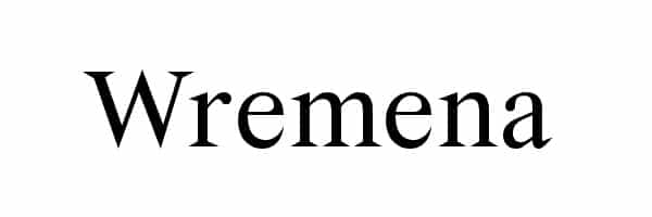
Roman Gornitsky designed Wremena. It was issued by Moscow based foundry Typefaces. It is a serif typeface that was developed based on a typeface called Vremena. The design was modified to add sharper angles and more pronounced triangular serif that are more visible in heavyweights. It is available in three styles, namely light, regular and bold with support for Cyrillic and Latin scripts. This font is very similar to Times New Roman, and so it can be used as a more contemporary alternative. You can use Wremena with Nowie Vremena as they both are sans serif. Also, it can be paired with Steinbeck that has intentional irregularities for titles.
7. Syne:
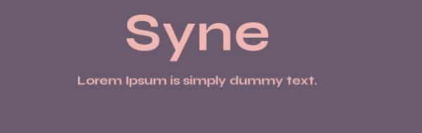
Syne was designed in 2017 by Bonjour Monde for the art center Synesthésie close to Paris, France. It has five distinctive styles, namely Syne Regular (a geometric sans), Syne Extra (wide and heavyweight), Syne Bold, Syne Mono, and Syne Italic. You can use Syne Extra for headlines as it is wide enough to catch visitor’s attention. Similarly, you can use Syne Regular for body text, making the text readable for the visitors. This typeface can be paired with various styles depending on the style you choose. However, make sure you balance the width and weight while pairing fonts.
All of these fonts are free, so they are perfect for a web developer with low or no budget. However, you should consider the distinctive styles for title and body in your content. Some fonts work well with others, but some create a bold statement alone. Hence you should pair fonts carefully to make the text stand out. An excellent tip to effectively match fonts is to look through the library of a typeface created by the same designer.