Line25 is reader supported. At no cost to you a commission from sponsors may be earned when a purchase is made via links on the site. Learn more
Combining typefaces is an art. The best part about art and design is that once you give shape to a form, you are free to explore different styles, techniques, and combinations to communicate a message. That being said, you have to understand the basics of typographic design to be able to move beyond these rules. Designers usually work with multiple fonts to create visual interest and establish information hierarchy. While there are no rigid and scientific rules to follow, it is important that you understand some tried and tested techniques to create a good typographic structure. By looking at some of the best practices in type design, you will be able to see what typefaces can be paired together and why they work well.
1. Complementary fonts
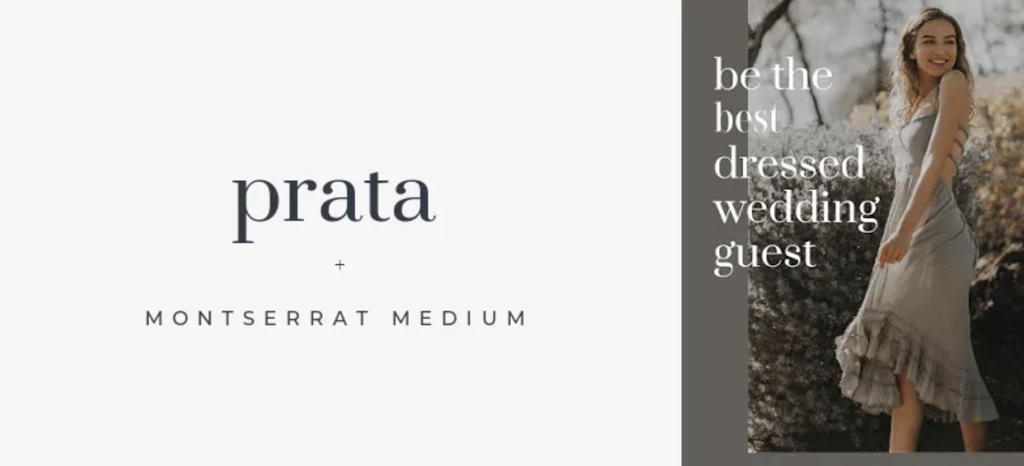
Most typefaces are able to evoke an emotional response in a user. Since they tend to have distinct moods and personalities, they should be combined only if they work well together. You want to ensure the mood of the typeface matches the mood of your design. Sometimes typefaces in the opposite sides of the spectrum work well together. Their differences in detail usually tend to balance each other and create a harmonious design. For example, if you are working with a specific font with a bold personality such as the font in the image above, pair it with something thin and elegant. This way you are able to create a balanced design. You’ll often find yourself relying on instinct or a gut feeling when making this decision – this is ok. Getting better at finding and pairing fonts that work well together takes practice but is easy to master with time.
2. Combining serifs and Sans serif
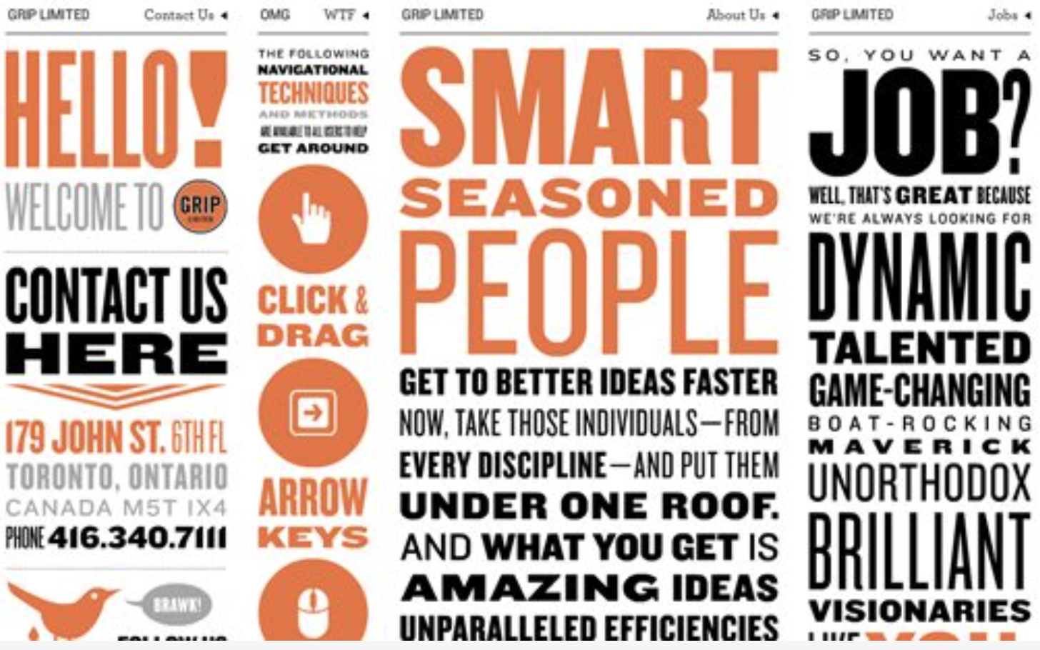
This is a classic combination that works really well for both web and print projects. If you are short on time, then mixing serif and sans serif fonts will always ensure great readability. Although it is advised not to pair fonts with strong personalities together. For example, if you look at the article below, you’ll be able to tell that Trade Gothic is a dynamic and elegant typeface while Bell Gothic, on the other hand, has a strong presence. Putting these two together may not be the best choice for readability.
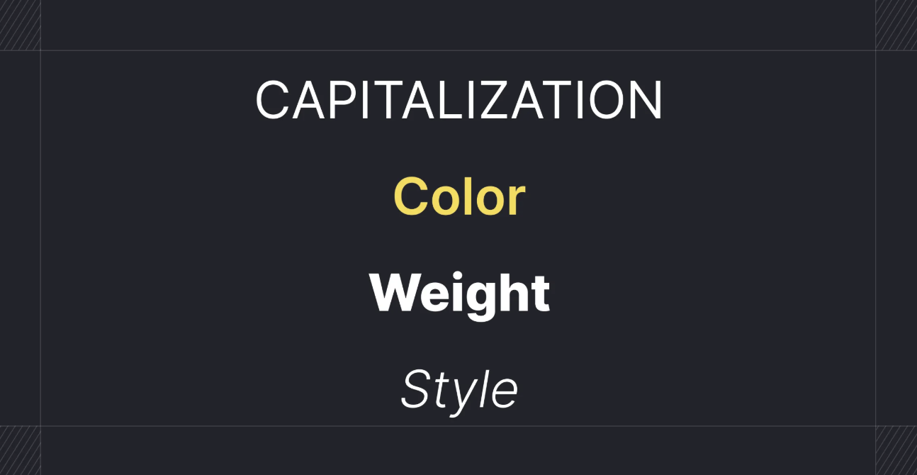
3. Create Contrast
One of the reasons why serif and sans serif typefaces work is that they are are able to create a visual contrast when paired together. Contrast can be achieved in a variety of ways – using color, styles, weights, size, and spacing. If you look at the above example, you’ll see how rounded and curvy letters look better when paired with their leaner, thinner and cleaner companions.
4. Establish a visual hierarchy
 When you are working on a design project, you would have to establish hierarchy not just for layouts and imagery but also for the body copy. This way of arranging words will help the viewer read the most important parts of a page. One way to approach this is by taking a look at what information is an essential part of the design. When you know the parts that have to stand out, you will be able to make more informed design choices. Traditional publishing formats such as newspapers, magazines, and zines all offer good examples of how to apply a hierarchy to a page layout.
5. Limit the number of fonts
It is usually a good idea to limit the number of fonts to 2-3 per design. This will usually ensure better overall readability and legibility. Although some projects may require you to go elaborate on your font combinations. If that is the case, then your design should look cohesive and harmonious and not messy and cluttered.
6. Consider Context
Your text considerations should depend heavily on your design project. It should be readable and displayed in the right font size. Font styles also play an important role in setting the tone of the overall project. The traits of the typefaces should match the attributes of the intended message. Sometimes you would want something that really pops and other times you would want to go with something neutral.
7. Assign distinct roles
One easy way to combine typefaces is to assign a distinct role to a typeface. You could do this by assigning a bold typeface for the headlines, something conservative for the copy, and back to neutral for the body copy. In the end, they should all be pulled together to form a cohesive design. When you assign distinct roles to these fonts, you are able to define a typographic hierarchy that can help draw the viewers attention to the most important elements of the design.
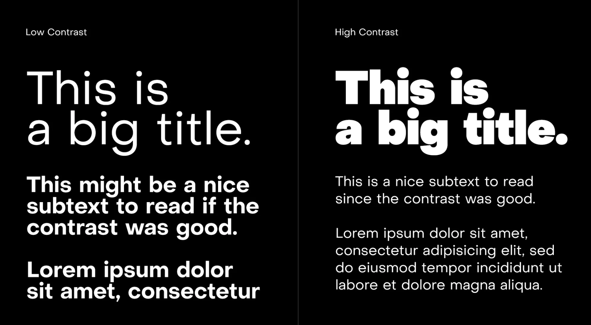
8. Use different point sizes

One of the best ways to create contrast and distinction is by varying point sizes. This basic principle can drastically improve the reading experience. If you look at the example below, you’ll see how the text on the right is considerably more readable than the one on the left. The size of the body copy can be adjusted to create a suitable contrast and help establish the typographic hierarchy.
Conclusion
There are many ways to combine typefaces, the fact that there are no rules that are set in stone can make the whole process time-consuming. This handy set of best practices will help you create typefaces of your own. The more you practice it, the better you will get at it. The art of pairing fonts is all about using your intuition, experimenting and taking risks. We hope that these tips give you a better understanding of the basic rules and what typographic situations to avoid to create the best possible combination.