Line25 is reader supported. At no cost to you a commission from sponsors may be earned when a purchase is made via links on the site. Learn more
Creating a coherent user-friendly website navigation structure just got a lot easier. We’ve tried one version of the mega menu after another. We have also tried complex schemes that only made navigation more complex.
It took a responsive design to get us back on the right track. We wanted to help visitors navigate through websites while using their devices.
This is still an ongoing process. However, the advent of minimalist architecture design concepts helps a lot. We are fast approaching the dark cloud’s silver lining.
Start following these 5 best practices now, and you’ll find yourself back on the right track.
Here are 5 website navigation best practices, start with:
Best Practice #1: Help the visitor reach her main goal
Sometimes a website visitor, especially a repeat visitor, wants to see what’s new or different. Make sure what they are looking for is either highlighted or pointed to.
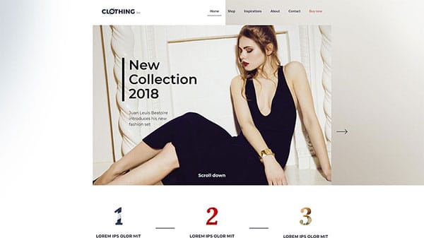
A good example would be a clothing store. Let’s say that it is just introducing a well-known brand’s new collection of out-on-the-town wear. Introduce the collection with an attention-getting home page image. Include a CTA that tells the visitor where to go for more details.
Pointing the visitor toward that specific information isn’t necessarily enough, however. You also need to make certain that she doesn’t get lost along the way and must return to Home and start over. This is an area where a search bar is often a better approach than a menu. A second approach being a series of CTAs that send her exactly to where she intends to go.
The visitor might be looking to get information about a subject that interests her. Make sure she doesn’t get lost before she finds it. Place a search bar at the top left of the page. Alternatively, sprinkle crystal-clear CTAs on the page that point her towards the information.
This best practice can be applied to topics or niches ranging from health and fitness to travel.
Best Practice #2: Always let the visitor know where she is
It can be easy for users to get lost in complex eCommerce websites. This is especially when two or more steps may be necessary to get to the desired place.
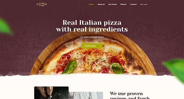
Clothing > boy’s clothing > shirts; or Pizza > locations > menus
To avoid sending someone off on a wild goose chase (or away from your site), you need to keep track of three things:
- Where the user is presently
- Where the user came from, and
- Where the user is likely to go next
Using a contrasting color is one means of letting a user know where in the website he or she is at the moment.
A mini-map of the user’s journey is a useful approach if the user needs to retrace her steps.
Consider having a fixed menu at the top of each page. It is another good way to give a user a possible escape hatch or the ability to quickly jump to another section. These can be Home, Services, Purchase, Contact, Wish List.

Best Practice #3: Use standard icons and lingo
Creativity is desirable and to be encouraged. Yet, not when designing a navigation scheme is the task at hand. Here, consistency and conformity rule.
To efficiently navigate a website, a user needs a sense of familiarity. This is not the place to use clever icons or play guessing games with visitors.
A rule of thumb: never make visitors have to think.
You can apply your creativity to other areas if you wish to provide a little entertainment. But, it’s best to keep navigating free of distractions.
Hamburger menu? YES.

A menu shaped like a chicken with random clickable areas? NEVER!
A Bold logo that takes you back to Home when you click it? DEFINITELY!
An animated logo that takes you off on a mystery trip? NO!
This one’s a no-brainer. It’s been demonstrated that people can, on the average, remember only 7 things. Although a lengthy menu admittedly contains more information and useful information at that. It also tends to confuse a site’s visitors. A concise, well-thought-out menu is good for ranking as well.
The same is true for links, especially on the home page, where you should keep the number to a minimum.
Only list the most important things for the user; placing the two main attractions at the top and bottom.
Following current navigation standards is a must, but don’t do so mindlessly. A navigation is part and parcel of any website’s UX. Thus, you need to keep users in mind while determining the best approach to take. The amount of content a website contains is a key factor.
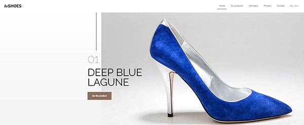
A small shoe store with a limited product line might require no more than a single navigation bar.
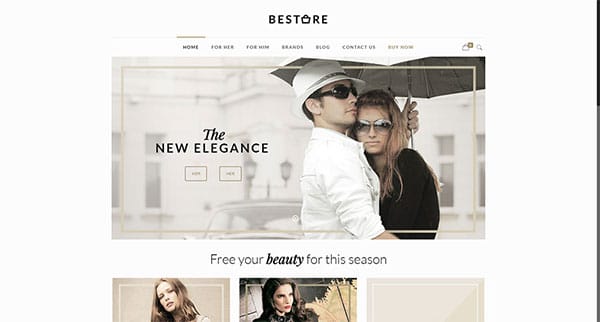
On the other hand, if you have an eCommerce shop that sells 100 or more different brands of clothing, a megamenu or a vertical collapsible menu will best serve you and your users.
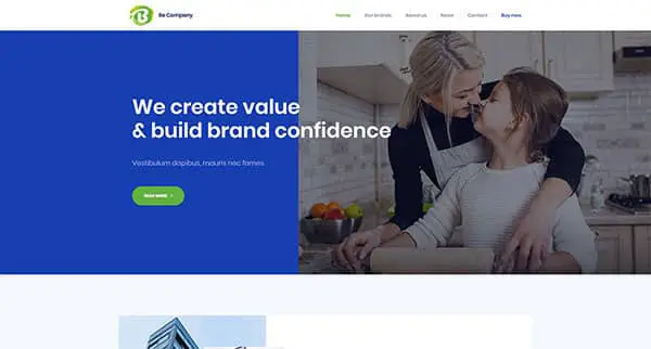
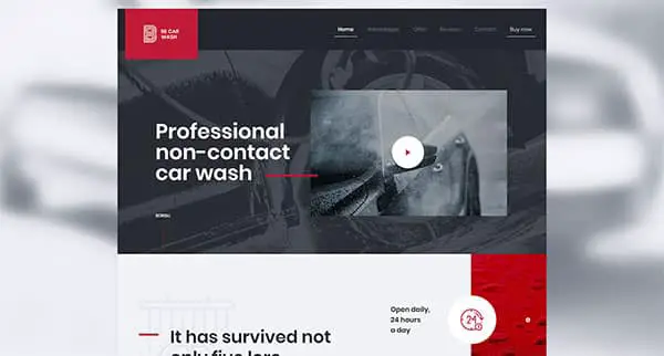
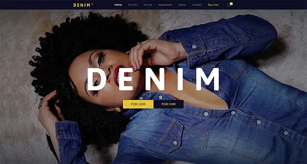
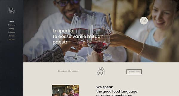
BeTheme – A Simple Solution
Website navigation standards are likely to change over time. But the practice of adhering to an easy-to-follow navigation structure will stay.
An alternate approach is to rely on Be Theme’s pre-built websites. Be offers 320+ responsive professionally-designed pre-built websites. All of them adhere to the latest industry standards and current user expectations. Therefore, any navigation issues are largely taken care of.
Summarizing
Here’s what we’ve covered:
- Direct the visitor towards her main goal on every page
- Always let the visitor know where she is, was, and could go
- Use standard icons and lingo to help users understand exactly what to do
- Limiting menu items to seven is good advice
- Let the amount of content determine the menu type
- Use pre-built websites; they make website navigation easy.