Line25 is reader supported. At no cost to you a commission from sponsors may be earned when a purchase is made via links on the site. Learn more
Attention to detail is what separates a professional website from an amateur looking site. These tiny details can completely change the appearance of your website without much time or effort. Fonts are one of these tiny details. Fonts make a significant difference when it comes to communicating your message on the website. Optimizing typography can improve accessibility, usability, readability, and overall graphic balance of your website. Choosing the right font for your website is necessary. Since Google Fonts are very popular, it is essential to know how best to use google fonts while designing a website so that you can improve your website’s look and feel.
1. Use Fewer Fonts:
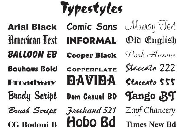
Less is more when it comes to the number of fonts. Different font styles are used to highlight important messages. Using too many typestyles and sizes at once can wreck any layout, and even the visitors have a hard time figuring out the message you are trying to communicate.
Hence, don’t use more than 4 different fonts (1 font style each for headline or page title, body content areas, subtitles, and quotes)as it can make your website look unprofessional and unstructured. Please note that having a separate font style for subtitles is not necessary, as you can use the same font style for your body content and subtitle. However, having a different font style for subtitles will make it stand out more. Also, limit the number of font families to maximum two and stick to it for the entire website.
If you want to use more than one font, try to choose the ones that complement each other based on the character width.
For example, you can use a combination of Verdana (left) and Georgia as they share similar values making a harmonious pairing. Compare this pairing to the pairing of Impact (right) and Baskerville where the words written using Impact overshadows its counterpart.
2. Use Standard Fonts:
Google has a lot of attractive fonts that can make your website designs look fresh, new, and unexpected. Every font design has its own personality, and so individual fonts give a different impression of the website. This is the reason most people get carried away while choosing new fonts.
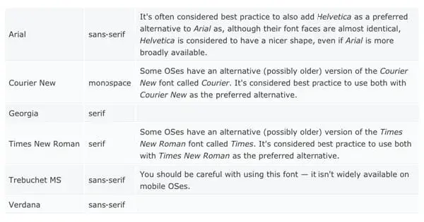
However, website visitors can find these new fonts very hard or complicated to read as they are not familiar with those fonts. So, try to use fonts that people are familiar with like Open Sans, Georgia, Lora, and more. Unless you own a website for branding purposes that needs a custom font, it is usually preferred to stick to the system fonts to look professional.
Also, one major problem faced by web developers is that they don’t understand which styles to use for different content like headline, subtitle, main body content, and quotes. Picking a font style for the main content is different from choosing a font for a headline or logo. The primary purpose of the content is to deliver useful information about the products or services to the readers. So try to choose font designs like Calibri, Arial, Trebuchet, and more.
3. Give Appropriate Space Between the Lines:
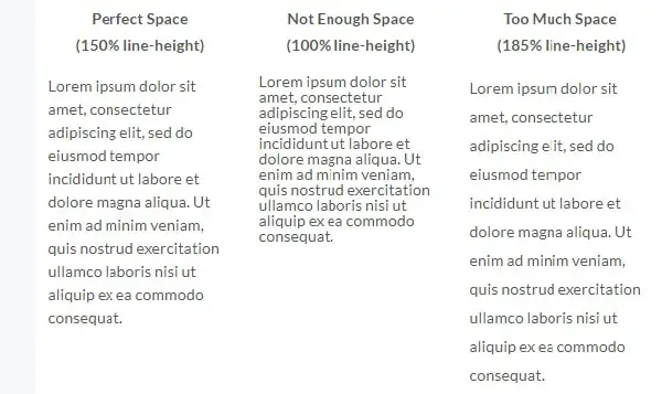
If you want to make your content more readable, try to add appropriate space between each line. In typography, there is a particular term for line spacing called leading or line-height. If you increase the line height, you increase the white vertical space between two lines of text, ultimately increasing the readability for your users.
It can be challenging for web developers to decide how much leading is enough. Generally, the line height should be exactly 150% (perfect line-height number) of the font size for good readability. If you drop or increase this percentage, space is either not enough or too much respectively. For example, if you have a font size of 24px, then the leading should be 36px, which is 150% of 24px.
Using proper white space between two lines has been proven to improve comprehension of up to 20%. The primary purpose of using white spaces is providing the users with digestible amounts of content, and then stripping away extraneous details.
4. Choose the Right Font Size:
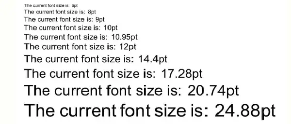
Users access the website from different devices, which means that your content must be compatible with different sizes and resolutions of these devices. Therefore it is essential to choose a size that works well with multiple devices to maintain usability and readability. You can pick any font size you like but make sure you do not randomly assign sizes to your headlines and titles. Try to choose a series of harmonious sizes that provide a perfect proportion for the visitors. This will make your website look cohesive and put together.
Moreover, instead of looking for different font sizes for a different purpose that maintains the perfect proportion, you can stick to the standard ones. Some of the recommended font sizes based on the mathematical model are 8, 16, 24, 32, 48, 64, and 95. Ideally, you should use a 16px font size for your main content to help improve the paragraph’s readability. Stick to these guidelines, and you will have perfectly proportioned font sizes.
5. Have Proper Color Contrast:
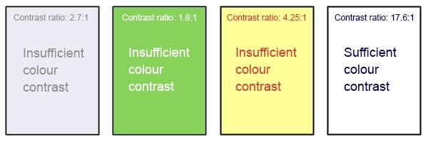
Websites can easily appear messy with similar colors for text and background. This can make your visitors feel overwhelmed because they have to focus harder to absorb the information. So, make sure you use contrasting colors to make content more visible to the users.
According to W3C, the contrasting ratio for image text and body for small text must be 4.5:1 against the background. While, in the case of the large text (14 point, 18 point or more) must have a contrast ratio of 3:1 against the background. After you have decided the colors, you must test it with real users to get better feedback.
Choose simple colors as they give an impression of sophistication, elegance, and beauty. It will also help users focus on important information. Basic colors that are contrasting with the background can highlight valuable content without appearing tacky. Also, try to avoid using neon colors as they put more stress on the eyes of the people, which makes them feel tired.
So here are some of the tips to optimize your website using google fonts and make it user-friendly without making significant changes. These small changes will have a meaningful improvement for your website. Try them out to see the difference yourself.
Comments are closed.