Line25 is reader supported. At no cost to you a commission from sponsors may be earned when a purchase is made via links on the site. Learn more
Having a website for any business is very crucial for the online presence of the company. When it comes to having a school website, the site must be made in such a way that it can convince the visitors. Your website visitors will either be parents, students, or alumni. Your website is a digital asset for your school or institute, so make sure your website is user-friendly and provide aesthetic usability, interactivity, and creativity.
A school website should also have Appealing CTA’s, clear navigation, be mobile-friendly, have a news section, welcoming quotes, videos, images, adequate information regarding the school, an About Us page, and a part of information about current and past events of the school. A responsive school website design can bring more applicants and visitors to your site as your website creates the first impression of your school. So if you want a good impression of your school, then your site must have all those elements which are mentioned above. Here are some examples of fantastic school website design. The following school websites will definitely inspire you, and you can use these design as inspiration when designing a school website:
1. The Children’s Centre of Austin:
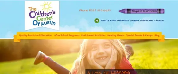
The Children’s Centre is a pre-school website. The website design is vibrant and juvenile. The quotes are inspiring. On the homepage, big and bold images are there that are shown using a slideshow. The site is straightforward. Once you open the site, all the essential information regarding the school is given, on the homepage itself. The site feels comfortable and suitable for any pre-school website. The color theme is beautiful, and so it enhances the site look. You can go to other links attached to the site like “Take a Tour” or any other link. For further information like the events, activities, other primary pages are also there. Overall, the site is responsive and mobile-friendly.
2. Little Dolphins:
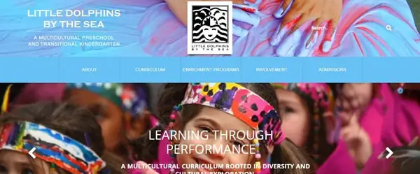
Little Dolphins website has done amazing work on their site. From aesthetic site design to the illustrative work, everything is done correctly. The site consists of many sections. Still, it’s not looking cluttered at all. On the homepage, images of different events have been shown through multi-media slideshow. The use of images is done creatively. The site look is vibrant and playful. The site has parallax scrolling, which is enhancing the look of the website. Plenty of information is featured on different sections of the site regarding the events and curricular activities, so one can quickly get all the information on the homepage itself. The CTA’s are big and bold. The site has a drop-down menu in the header section so one can quickly get whatever information they want. Overall, the site has correctly done many things. The site is engaging and attractive. Colors are playing an essential role in enhancing the site look.
3. Rochester Institute of Technology:

The website of Rochester institute has an intense look. The color theme is bold and eye-catchy. The site has a slideshow on the homepage which tells you why you should choose them. They have given all the necessary information. Also, the CTA on the top right side is big and bold so that visitors can quickly get in touch with them. The site consists of the drop-down menu so that visitors can get detailed information about the institute and classroom and regarding other things. One can easily find the contact details at the end so that visitors can connect with them easily. Overall, the site is simple.
4. Rhode Island:
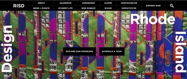
Rhode Island is a school of design. As it’s the school of design, the site design has to be attractive and visually appealing. The site has a black theme which makes the site look dark and intense. The images used are colorful and complementing the black color scheme of the website. The CTA’s are placed at the center so the visitors can not ignore them. The images are playing a significant role in the site as it is enhancing the site look. A different section of the site consists of important information regarding upcoming events, exhibitions, and portfolios. Other primary pages are also attached for detail information.
5. Scad:
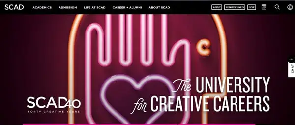
The Scad website has a creative background image on its homepage. The CTA’s are big and bold and are placed on the header section of the homepage. The site has a drop-down menu to give detail information about the university. The homepage has different sections where information regarding the upcoming events is provided. Overall, the site design is simple yet classy.
6. University of Coimbra:
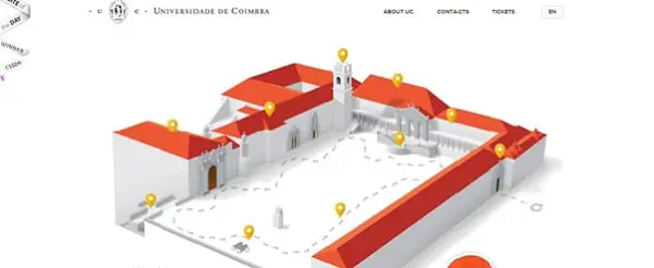
The award-winning website has an aesthetic design. One thing which makes this site different is the virtual structure of the university shown, and the point of interest of the tourists is shown on the homepage. On the top left side, the site has featured its achievements that makes a good impression of its university. A link is also attached to the right side of “play video” to have a look at the entire university. Visitors can have a virtual tour of the locations which is being shown in the header section of the homepage. Beautiful images are being featured on the site. The color theme is complementing the font style.
7. Our House:
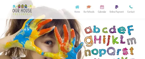
Our house is a pre-school website. The site design is juvenile and vibrant. The site has parallax scrolling, which is enhancing the look of the site. The font style is big and bold. The entire site has images of children. The different section of the site gives information about the school and testimonial section is also there to build the trust of the visitors. The site consists of other primary pages like contact, online payment, etc.
8. DE LA SALLE High School:
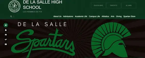
DE LA SALLE’s website has featured so many things on their site. The website design is excellent. The site has given information about the different activities of the school through multi-media slideshow. The content is good. Plenty of information is provided on the site. They also have a news section. One can quickly get to know about the mission and other detail information regarding the school. On the top right side of the site, the quick links option is there to get important details quickly. The site consists of other primary pages. The images used are big, bold, and high-quality.
9. Georgia Tech:
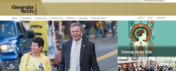
Georgia Tech’s site design is subtle and classy. The images are featured with the attached links. With just one click, visitors can get detail information about the institute. The site has a drop-down menu, which makes it easier for visitors to get information about different categories quickly. CTA’s are there on every section of the website. The news section is also there on the site’s homepage. The color theme is attractive. Overall, the site is designed simple yet effective. The navigation was correctly placed.
10. Stanford:
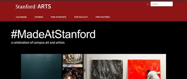
Stanford is an institute of art the homepage has a slow-motion silent video of an art piece. The video is attractive. On the homepage, the links are attached to the images of the different exhibitions held at the campus and links of many other topics related to art is also being attached to the photos. The #MadeAtStanfort page is excellent, and the page theme gives the site a dark and intense look. Moreover, the entire page consists of many pictures and videos. The other primary pages there for the students, faculty, and visitors. The search option is there on the top right side so that visitors can directly type and search for the information they want.
11. Austin’s Children’s Academy:
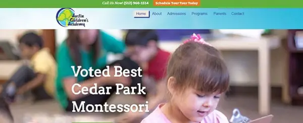
Austin Children’s Academy’s website design is lively and exciting. The site is very engaging. The navigation is clear. The color theme is enhancing the site look. The CTA’s are appealing and are placed on almost every section of the site. The design of the logo is going with the site theme. The site has used large and attractive images on its homepage. There is a blog, video gallery, and photo gallery section on the website to get more information regarding the activities and events happening in the school. The footer consists of four categories that show about their programs, Sign-up CTA for Newsletter and about the contact details.
12. Biola:
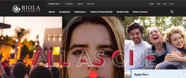
Biola university’s website is designed well. The site has made good use of images. The CTA’s are appealing and are placed on almost every section of the website. The site has parallax scrolling in it, which makes the site look decent. The images are playing a significant role on the website. The color theme is bright and attractive. The color theme and font style are complementing each other. It allows visitors to have a virtual tour of their campus. In the footer, all the links are present including about us, tuitions, News & events, and many more things attached for detailed information.
13. Hilliard Davidson High School:
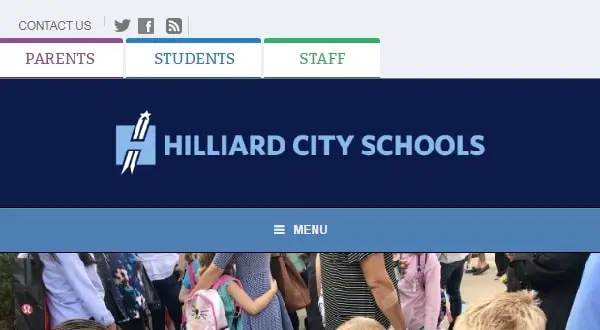
Hilliard Davidson School’s website has plenty of information on its website from Quick links to Upcoming events. Everything is given on the site. The site has a lot of content. A blog section is also there on the homepage. The good thing is they have a Daily Announcement section on the left side to keep their visitors updated. For more information, other primary pages are also there. CTA’s are placed on every part of the site.
14. Chapel Hill:
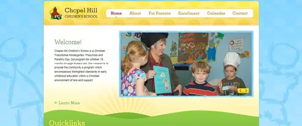
Chapel Hill is a children’s school. It’s a one-page responsive website. The website is straightforward. All the quick-links are attached on the homepage. Brief information is given about the school. The site design is joyful. And the images are shown through multi-media slideshow. The color theme is vibrant and delighted. The navigation is easy to use. For detail information, other primary pages are also there.
15. Queen Anne’s:
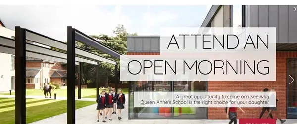
Queen Anne’s is a school for girls only. The site has a stunning design. Large images are shown through a slide show. The photos used are of high quality. The CTA’s are alluring and are placed on almost every section of the site. The images are playing a significant role in enhancing the site look. All the information about the school and its curricular activities is there on the home page itself. Videos are also placed to show the activities done. The News and Events section is also there on the homepage.
16. Matter De High School:
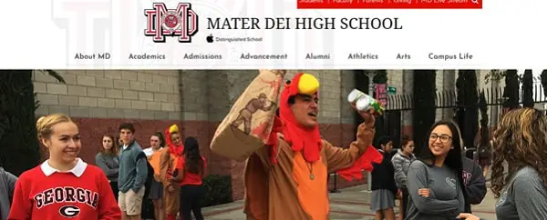
Mater Dei school’s website design is marvelous. The large images are featured on the homepage through a slide show. The site theme is lively and exciting. The color theme is enhancing the site look. The CTA’s are big and bold and are placed on every section of the site. On the homepage, there is a section where the number of students at their school is mentioned. Overall, the site is engaging and user-friendly.
17. Black Spine Circle School:
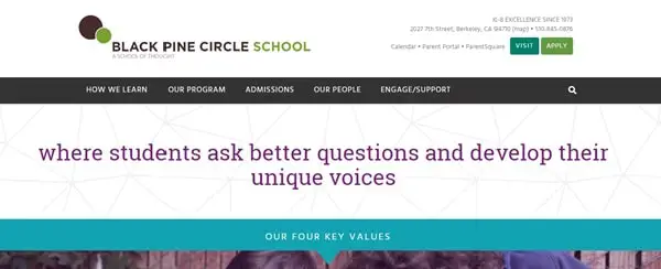
Black spine school’s website has done many things in the right manner. The site design is descent. The images are big and bold. The site has an adequate amount of information about the school. The has parallax scrolling, which enhances the site look. The CTA’s are big and bold. The testimonials are shown through videos. The site has given all the information about how they work and why one should choose them. Overall, the site is engaging and has an excellent user experience. The color theme is classy.
18. Westfield High School:
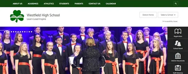
The Westfield school’s website has plenty of information on its site. The theme is bold and beautiful. The site design is going with the theme. All the other links are attached to the header section of the homepage. Site navigation is clear.
19. The Bush School:
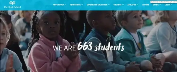
The bush school has a silent video on its website, which gives information about the curricular activities and other academics information about the school. For more information, the inks are attached for the information about summer programs, lunchtime, and many other things. The color theme is calm and pleasant.
20. New Hampton School:
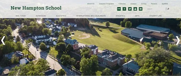
New Hampton School has featured many videos on its site for giving information about the school. The site design is astonishing. The site has a drop-down menu so that anyone can easily find the detail information.
Having a good design for a school website is very important as it will bring more applicants to your school and will build your school image. So take inspiration from these examples and create your unique school website.