Line25 is reader supported. At no cost to you a commission from sponsors may be earned when a purchase is made via links on the site. Learn more
Who said website footers have to be boring? Yes, that’s the place where you just add your copyright info, some social icons and maybe a couple of links and your sitemap. Also, that’s the place where most people don’t even look at, but if you know how to make it special and integrate it in your design, it can be quite an asset!
That is why we selected today 20 examples of creative footer designs, all belonging to some really awesome websites. These creative footer designs have illustrations, special graphics, nice typography and other cool elements.
Here they are! Which ones of these creative footer designs do you like most and why? Would you design such a footer for your future web design project?
Bei Blog
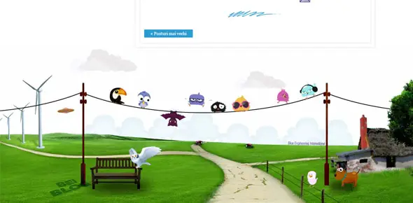
The Bei Blog is full of cute illustrations which go all the way down to the footer. The footer completes this website’s design concept with a landscape illustration. It has a friendly vibe and can definitely put a smile on your face.
K Digit
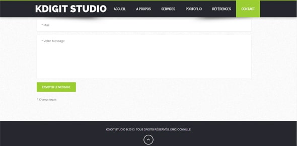
K Digit has a minimalist footer. It doesn’t use illustrations, the website ends nicely with a comment box. Its design features light supporting elements, which are used to highlight your content against the white background. What makes this website’s footer special is the button that takes you back to the beginning of the site.
Ectomachine
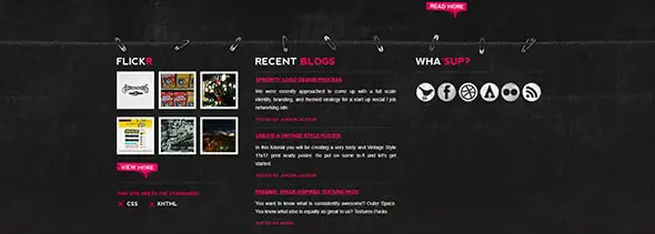
Ectomachine’s footer follows the web design layout. It has personality, uses the same texture as the rest of the site and has a hand-drawn illustration which will get your attention.
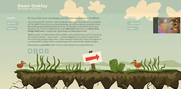
Dean Oakley
Dean Oakley’s entire website has a unique design layout. Not only does it have a unique footer, but the entire background is an illustration.
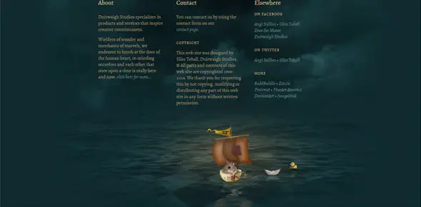
Duirwaigh
Let’s continue the series of unique footers with Duirwaigh. This company focuses on products and services that inspire creative consciousness and their website surely expresses that.
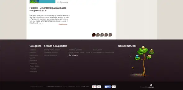
Productive Dreams
Productive Dreams website has a really nice and elegant footer. It has a simple purple texture with white typography. They also have a nice illustration which blends in perfectly with the design concept.
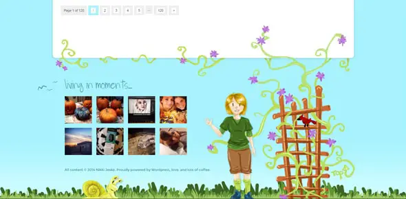
Snail Bird
Snail bird is a website that’s full of illustrations. It features a classic “thread” blog layout with a content-rich right sidebar, a stylish Instagram feed and various cross-linking widgets (Similar Posts, Recent Comments, Tags and others). They go all the way down to the footer making this website look nice and friendly.
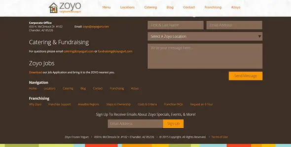
Zoyo
Zoyo is also a great example if you’re looking for some inspiration in regards to footers. The website keeps it simple, ends with a simple and clean comment box with a brown background and orange details.
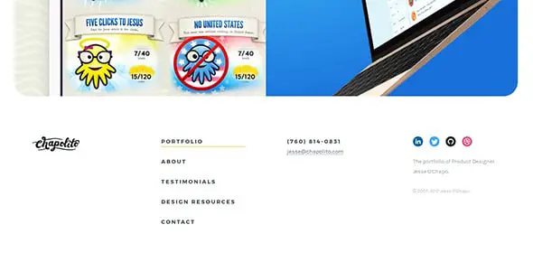
Champolito
If you prefer classic unsophisticated website layouts, which are easy to understand with just a quick glance, check this out! Champolito has a unique footer and the whole layout is 100% responsive and compatible with Google’s requirements for mobile-friendly designs. The website ends with this company’s logo, a menu bar which is unusual for footers and the contact details. It also has increased compatibility with modern mobile and desktop devices and business-oriented functionalities.
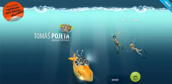
Tomas Pojeta
Tomas Jojeta’s website has an extremely colorful and provocative design that uses illustrations all the way down to the footer. Each character of the illustration has its own story, making this entire website unique. It was designed with attention to every detail, offering harmonious color combinations and modern fonts.
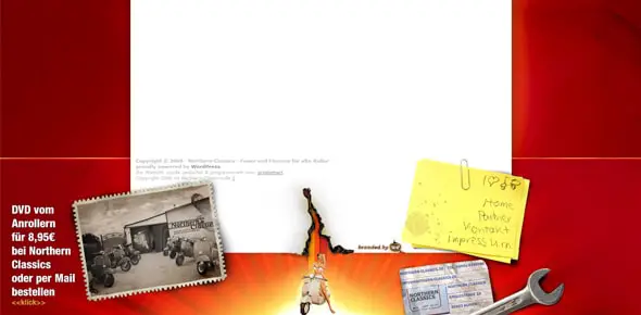
Northern Music
Although gradients are not so popular nowadays, Northern Music uses them wisely, spicing up the 3D design with a catchy gradient background. Northern Music also has a nice and unique footer. It ends with the same red background and some vintage graphic elements.
Morphix Design
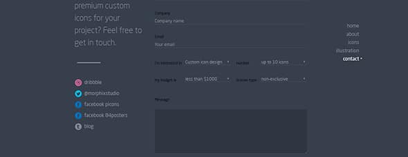
Morphix Design used a flat design for their footer. They also chose to keep it simple and used a simple and clean comment box. The color palette used for this design blends in perfectly and makes the social media icons stand out. The design is fully integrated with Facebook, Twitter and Dribble, displaying the respective icons on its homepage. It is focused primarily on sharp shapes – squares and rectangles, making the design look strong and straightforward.
Web4Biz
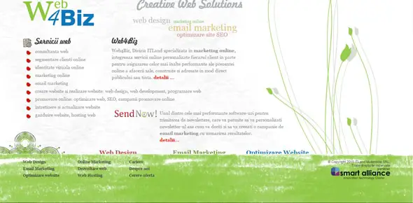
Web4Bix offers creative solutions and their website proves their vast experience in this line of work. The website uses a textured illustration as its background making it stand out the rest. This site’s design is sustained in an elegant style formed by gentle pastel colors and on-hover animations and is also designed with a bright color palette and enhanced with grainy textures.
Uforia
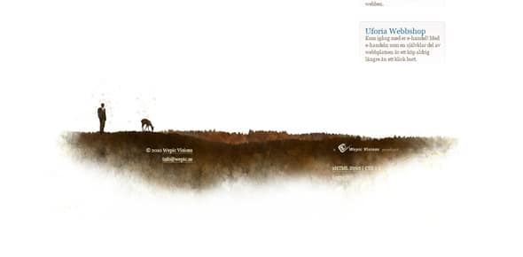
The simple layout of this website is balanced out by the great illustrations featured on the homepage. Uforia’s footer ends with a really nice and melancholic illustration. This example is really nice and it can be a great source of inspiration for future projects.
Tap Bots
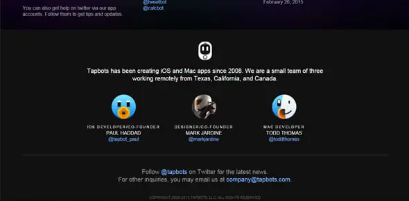
Tap Bots is a small team made out of three members working from different places. They have a vast experience in creating iOs and Mac apps and this website showcases their work. The footer has a dark layout which makes the icons and white typography stand out. The whole site has a dark design and bright details, which serve as attention grabbers. Its homepage features an enormous number of different content blocks, widgets, forms and buttons.
Poogansporch
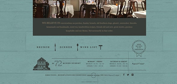
Designed with a vintage touch, Poogansporch is a really nice and elegant website with a clean design and a focus on light blue hues. It uses a wood texture with an overlayed blue color that goes all the way down to the footer. The footer uses unique icons and retro design elements that blend in perfectly with the design concept.
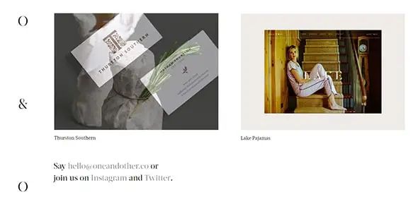
One & Other
In addition to a masonry grid portfolio page, which is the heart of this site, One & Other also offers a nice blog layout, tons of harmonious social sharing buttons, and a clean ’About’ page. This website impresses with a clean responsive design built around page-sized content blocks. One & Other is a design studio from Charleston, led by Will Allport and Ky Coffman. They focus on designing identities, websites, prints and much more. The website has a minimalist design with a white background and large thumbnail photos for each project. The footer also keeps it minimal, it only invites visitors to follow them on Instagram and Twitter.
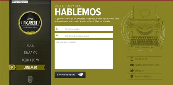
Jorge Rigabert
Jorge Rigabert is a simple website design accentuated by a neutral background, left logo and menu, and geometric design elements. This is a portfolio website with a very creative design layout and footer. The footer keeps the vertical menu bar and uses a green background. It also contains a comment box along with a typing machine and links to his social media profiles. It features rich contact options and subtle visual effects. The navigation of this site is fueled by a powerful flexible left vertical menu.
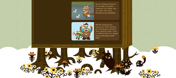
Meomi
Meomi’s footer contains the ending of a really nice illustration that starts in the header and greets the visitor. The entire website has personality. Its homepage is quite compact, and is used only to grab attention, but the inner pages are complex and well optimized.
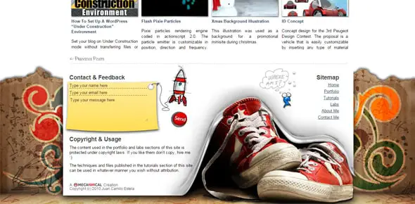
Mecannical
Last but not least, Mecannical also uses a really nice and creative footer. It looks playful and uses plenty graphic elements. Thanks to the combination of 3D elements and images with transparent backgrounds this design looks fun and practical.
Comments are closed.