Line25 is reader supported. At no cost to you a commission from sponsors may be earned when a purchase is made via links on the site. Learn more
Homepages are the first thing a visitor sees when they come to your website. It makes or breaks the impression of your website. Every year companies spend thousands of dollars to design a space that isn’t even a square foot. This is because companies have found out that creating a great homepage generates more revenue than other e-commerce revenue measures.
The homepage is the company’s face to the world. People understand your business by looking at your website’s homepage. Many times, clients decide to do business with the company if they find their homepage is fascinating, or leave the website if they found the home page too cluttered, confusing, not convincing or for numerous other reasons. It’s a fact that the homepage gets most views as compared to other pages on your website. The home page also improves user experience of your website by directing the users to appropriate pages by providing intuitive navigation. So ideally you should spend the most time on designing a homepage than any other page.
What should a great home page include?
Along with being user-friendly, a homepage must include these things.
- Call to action:
This is the most significant element in a homepage as this will help you bring in sales. So place your call-to-action strategically to get users’ attention. For example, ‘book a place,’ ‘buy now,’ ‘watch more,’ ‘get started’ and more.
- The theme of the website:
You should display the nature of your website on the homepage to help users understand what exactly your company offers. Make sure to display what kind of website you have directly on the homepage.
- Branding features and other supporting elements:
Designing a homepage that is memorable and identified by users can spread brand awareness. A well-designed logo and related color palette help the users recognize the brand. Most of the popular websites like Amazon, Apple, and Target have used this to create worldwide brand recognition.
- Future goals of the website:
It a good idea to add the objectives and plans of your company on the homepage. This will allow people to relate with your goals and help you accomplish them if they believe in it too. Also, people like honesty, so only provide the right information.
- Navigation bar:
Putting a navigation bar on the welcome page is a must-have for any website so that visitors can search around the site easily. This allows people to access other pages with ease and come back to the homepage whenever they want to.
- Contact details:
The homepage should contain things that users expect, such as email address, phone numbers, location, and more. This way, people can contact you without having to search in various places. Also, they will understand who creates, curates, and maintains the website and whom to contact for particular concerns.
- Social media handles:
Today everyone uses social networks to connect with people or organizations. Some people even use it to see where a website stands based on the following on different platforms. So it is essential to mention your account links where people can find them easily. This will increase your reach as well.
- Testimonials:
Adding past customer experience provides credibility to your website. Most people trust a brand based on other users’ experiences. This will attract people to explore other pages on your website and even end up becoming your customers.
Now let’s look at eight website homepage design rules you should never break.
Use visual hierarchy:
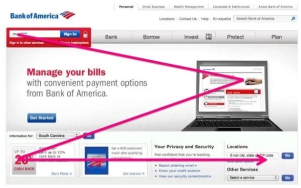
Representing elements based on importance helps your visitors know what is significant and requires attention. However, keep in mind that importance is defined based on what your audience wants rather than what you want. Create blocks of information and place them on your homepage in a hierarchy. This shows data in the priority order and relevance of the content. You can incorporate visual hierarchy by placing the most critical information on the top preferable on the left and by placing the least important information at the end of the page. You should also group related content and use different typography while writing heading and subheadings. You can use large fonts to display essential texts. You can even choose colors strategically to denote the significance of some elements. For example, you should highlight the navigation bar and make it easily visible to the users. You should also place call-to-action in the beginning in bold format to get users’ attention.
Don’t add too much text:
A homepage looks attractive because of high-quality images, icons, animations, and other visuals. Your visitors don’t expect much text on the site. Initially, users come on a website to visually experience the website rather than read detailed introductions. So, try to avoid long paragraphs as much as possible, compress the information, and create a one-line text that is effective. This will highlight compelling content, reduce visual noise, and make the page compact. Also make sure you use a comprehensible language, for example’ book appointment’, ‘sign up now,’ ‘buy now’ etc. These texts provide value to your website without taking up much space. On the other hand, texts like ‘Welcome to our website’ take up valuable space and do not serve any purpose. Hence make your website scannable by using vibrant visuals that appeal to your audience and communicates your message efficiently. This will define whether the visitors will stay and explore your website or not.
Don’t get too creative:
Some design elements are common in every website, and you shouldn’t redesign them by becoming creative with unique UI patterns. If users have to think too hard to understand what simple elements mean, chances are they would leave the site irrespective of the website’s excellent interface. So, you want to design your website by including familiar icons and interface where common elements like links stand out the way they usually do, or login access is placed on the top right corner. You should also keep the navigation bar on the top of the website to make it accessible to the users. Too much creativity with standard components can make your interface hard to understand, which does not promote usability. You may feel traditional elements do not go with your website design, but it essential to find a proper balance between creativity and usability. One way to do this is by creating a basic layout with standard elements and then add creative components.
Understand your audience:
You should always consider the target audience before creating a website. Once this target audience is set, you can move on to defining their needs and expectations from a website. For understanding all this, you can look through your competitors’ websites. This will help you get a basic idea about the color scheme, layout, features, and style that the audience desires. When you use designs and styles that users are aware of, they feel comfortable on your site. You can add your creative touch to differentiate you can make your design stand out. Once you have designed a website considering their needs and your ideas, make sure you add a section for feedback. This will help you get constructive criticism to improve your existing designs further.
Keep the design simple and clear:
![]()
Users take only half a second to evaluate your website’s design, so you need to carefully decide what you want to put on your site that attracts their attention. Firstly create clear action buttons and place them according to the Rule of Thirds. Visually focus attention on the call-to-action button rather than other buttons on the homepage. Continuously improve your website’s design to make it easy to use. Get feedback from your users to make changes. The main part of designing is to make the homepage highly usable for the majority of the visitors. Also, you should hide all extra functionality and make it discoverable only when users choose to see it. Furthermore, you should design a simple, consistent design so that users have a better picture of what to expect. You can do this by defining a specific color scheme and aesthetic for your website. When users are familiar with the design aspects, it makes the process easy to use.
Use negative space (or white space):

Negative space is actually a positive aspect of website designing. Negative space provides users’ eyes a place to rest. This space also differentiates sections on the homepage, making it easier to scan. If you put a lot of information on your homepage, your users will be confused as to what information is essential. You should keep the essential information large enough to catch the visitor’s attention. Also, don’t add anything around the call-to-action keep it blank so that it appears prominent. Negative space also provides enough space between headings, subheadings, and body. Also, keep line-height proportional to font size to make the text appear highlighted on the website. If you feel you have plenty of blank space on your website, consider adding elements that visitors want such as their tops tasks or searches. However, if the content does not serve the user’s requirements, don’t put it on the homepage.
Short loading time:
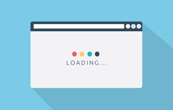
A well-built homepage does not take more than 3 seconds to load. Hence the majority of visitors expect the homepage to load within 3 seconds. If your website takes longer to load, the chances are high that visitors will leave the site and go on to your competitor’s website. However, it does not mean you provide your users with a poor user interface. You should be able to provide rich user experience along with good speed. One way to do this is to use responsive images. This will save time as well as the data without sacrificing on the quality of images. There are multiple ways to make images responsive; one of the easiest ones is to convert the file format to JPG. Also, you should make your homepage mobile friendly and responsive so that you don’t miss out on the traffic from mobile users. You can even cut down some extra unnecessary information from your homepage and place it on other pages to reduce the loading time.
Take control:
This is very important, especially for large organizations. Advertising companies are always looking for homepages of great websites to promote their brands. So you need to have control and authority over what goes on your homepage. You should know when to say no. Every element on the homepage should have a purpose and serve what the audience wants. You should also avoid designing the homepage according to the committee because if you try to satisfy everyone, you will get a low-quality website that doesn’t perform well. Your design will not be user-defined. When in doubt, you can look up your competitor’s site and take inspiration from it. You can even check the reviews of their website to get a better insight. You should seek objective criticism and filter personal opinion. For example, ‘you should use yellow in the background as it will go with the color scheme and make your website elements pop’ is more valuable than ‘I hate the background color.’
So while designing a homepage, you should keep in mind its purpose and how your website stands out from the crowd. You should also use engaging elements such as forms, links, unique layout, and expandable content to keep the visitors occupied on your website. Additionally, you can use contrasting colors to highlight some aspects like call-to-action, headlines, etc. and direct visitor’s attention to it. If you want to target more people always keep in mind to optimize your site so that it loads faster and your visitors don’t lose their calm while they are on your website.
Moreover, a good homepage design does not need to follow a specific set of rules. Some homepages in related fields may share some elements, but they are all different from one another. Some homepages work because of their unique design that attracts users’ attention. However, being too creative can even degrade the user experience of your website. So try to combine fundamental elements with your creativity to keep the usability of your website.