Line25 is reader supported. At no cost to you a commission from sponsors may be earned when a purchase is made via links on the site. Learn more
Over the past year or two, we’ve seen the latest CSS and Javascript animation abilities being used to really enhance the experience of browsing a web page, with sites these days being a closer resemblance to animated infographics or Powerpoint presentations.
No longer are we scrolling through passages of text with the odd image, now websites are performing a rehearsed show to entertain us with their content.
This post showcases some of the best examples of infographic websites that present their information with clever animation and motion effects. Let us know in the comment section below, which one of these web designs that look like animated infographics is your favorite!
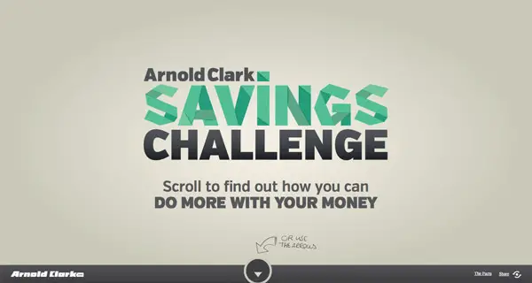
The Arnold Clark Savings Challenge
This animated and interactive website reels readers in using subtle motion effects and beautiful, geometric illustrations.
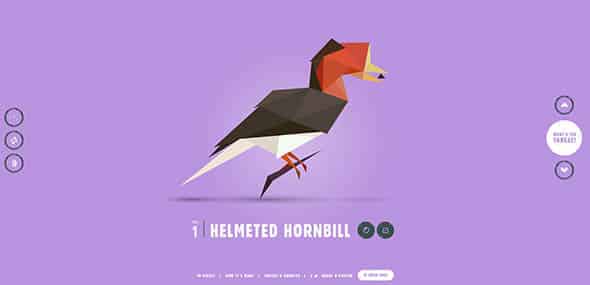
Species in Pieces
This cool infographic website uses predominantly flat colors and interactive graphs to create 3D designs.
Why Your Brain Craves Infographics
This cool website allows the viewer to direct the pace of the interactive piece by using the scroll mouse button.
Good Morning Breakfast app
This is an infographic website with a more realistic design. It combines high-quality images with smooth transitions and effects.
Atlantis World’s Fair
We love the illustrations on this infographic website. It delivers data in a fun and interactive manner.
Every Last Drop
This is another greatly illustrated infographic website we liked. The drawing style is really fun, plus the animations are smooth and appropriate.
Killing Kennedy
This is a more modern infographic website with dramatic, realistic images and data delivered in a professional manner.
MailChimp Annual Report 2013
Check out MailChimp’s annual report infographic website and learn how to deliver data in a fun and interactive way which is pleasurable to read by the visitors.
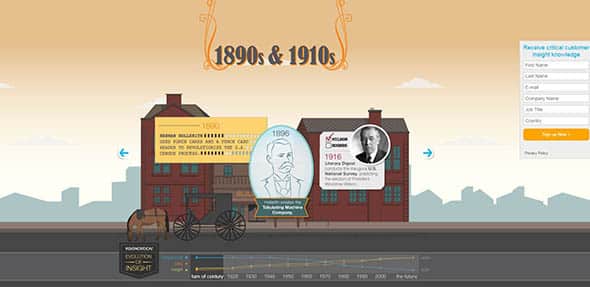
Evolution of Insight
This is an interactive and animated infographic in the form of a timeline. It uses high-quality graphics and subtle motion transitions.
Inception Explained
By combining high-quality graphics with cool animation effects, this infographic website design stands out from the crowd and draws attention to itself.
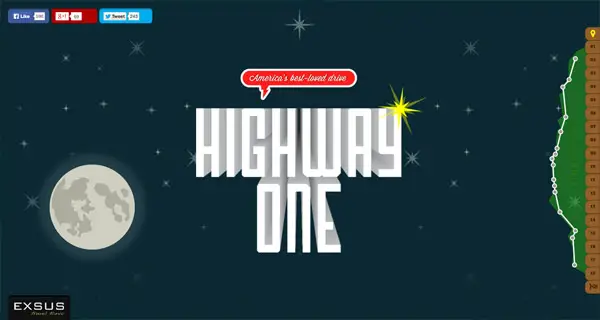
Highway One Ultimate American Road Trip
Combining 3D texts with cool illustrations and great transition effects, this infographic website succeeds in catching our attention.
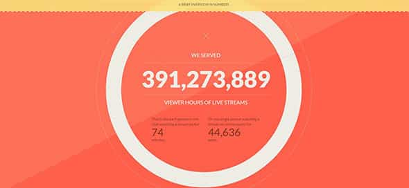
Ustream
This is a full-width interactive infographic that uses vivid and bright colors accompanied by subtle but effective animations and bold fonts.
MailChimp 2015 Annual Report
MailChimp always delivers awesome annual reports that are both engaging and informative. This full-screen interactive report uses vibrant color overlays, bold fonts and more!

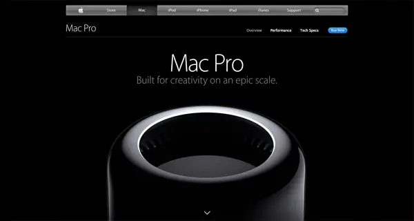
Mac Pro
From start to finish, this website’s animations are smooth and subtle and the visualizations don’t just look good, they also make the info easier to understand.
Shopify 2015 Annual Report
This interactive infographic report has a friendly and approachable style while delivering numbers and stats in a very pleasant way.
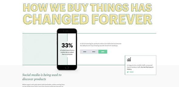
Warby Parker Annual Report
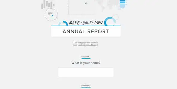
This annual report is unique, because it doesn’t give you the usual info, but instead it asks the visitors to create their own report.
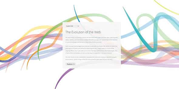
The Evolution of Web
This infographic website uses SVG elements to show the timeline of browsers and technologies, as well as how the Internet developed over time.
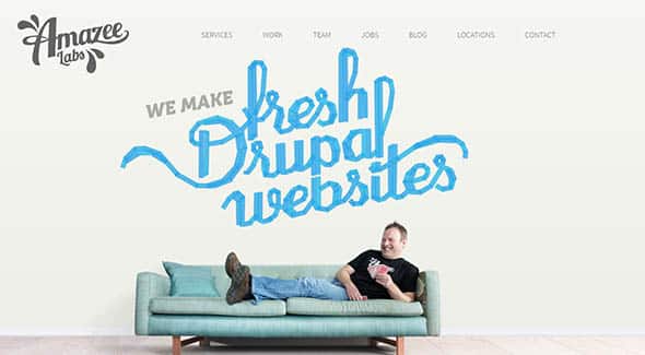
Amazeelabs.com
This is a web design studio presentation website with an animated infographic design style. Check it out and see what it has to offer.
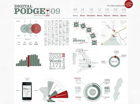
Digital Podge
This is a cool infographic page on the Digital Podge website. It has great animations and the data is delivered in an interactive manner.
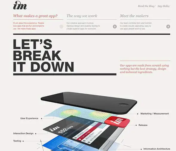
Imagemechanics.com.au
Here’s another great infographic website design this time showing how a great app it’s made.




Comments are closed.