Line25 is reader supported. At no cost to you a commission from sponsors may be earned when a purchase is made via links on the site. Learn more
Running a non-profit site is not something that everyone can do, as it’s not only about making people aware of it but also about encouraging people to support your organization. A good non-profit website not only has a good theme and design but it should have a great user experience, and it should be donor friendly as well as volunteer friendly. An effective non-profit site will create awareness and encourage people to take action, will provide all the necessary information regarding the organization and should give information on the not-for-profit organization’s volunteers and board of directors.
A responsive non-profit website has a focused website goal, such as to connect with other people of their community or build a community, encourage people to donate and participate in their campaigns. The following are 20 amazing non-profit website design examples through which you can get inspired when designing or creating a website for a non-profit organization.
1. Memphis Zoo:
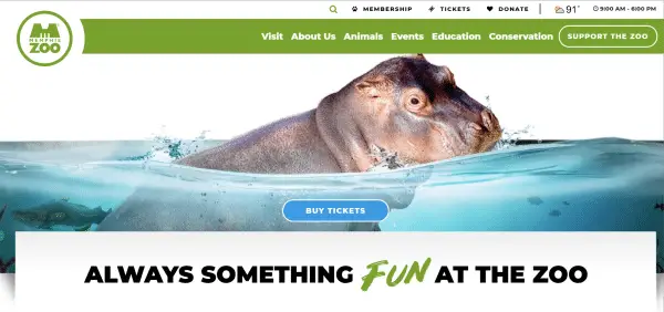
Memphis Zoo is a not-for-profit organization whose mission is to connect people with wildlife. They take care of the different species of animals. Their site theme is incredible the color and fonts are complementing each other and the site is full of beautiful images of animals.
The placement of call to action is done correctly as when you open the site you can see the Buy Tickets, Support the Zoo, Donate call to actions, which encourages the visitor to take action. They have included other primary pages like about us, visit, events, conservation and many more. And the amazing thing is they keep you updated with their daily schedule of the zoo and they also provide live cam so that visitors can watch them live, which is a great way to create engagement with the visitors. They have a long home page so that the visitors get information on the very first page without clicking anywhere. They have also included information about their volunteers, staff, mission, media kit so that people get to know more about them.
2. Green Peace:
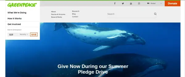
Greenpeace is a non-profit organization that fights for our environment to keep the surroundings green and less polluted. Their site theme goes with its mission of making the environment clean and green. From links to multimedia content, they have perfectly done it all. When you first open the website you can easily understand what they do, what their mission is and they also have the colorful and visible call to actions like Donate, GIVE, so that people can easily take actions. They also have other primary pages like about us, news & media, Stories & victories. By adding stories & victories they are building the trust of their visitors so that their organization should have a good image and people can take action. Moreover, by adding news & media they can create engagement on their site.
3. Undertheweather:
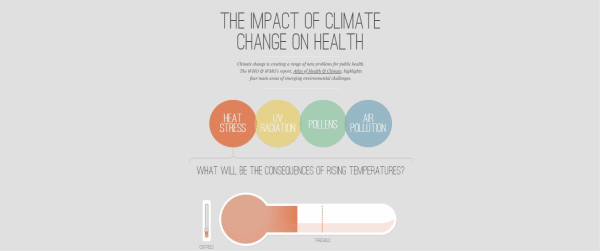
This website is so amazing and unique as the design of the website is so engaging. Undertheweather non-profit organization is for the awareness of the impact of climate change on our health, the site theme is so attractive and colorful. The site has great user experience and the user will surely have a great time visiting the site and the information regarding this is presented in a very creative way. Though this site lacks in some area as it does not have any about us or any other page and does not have any call to action but the way they have conveyed their message and given the information about the impact of climate change is very creative and unique. One will surely enjoy while going through the site. Their website design is very impressive.
4. Charity Water:
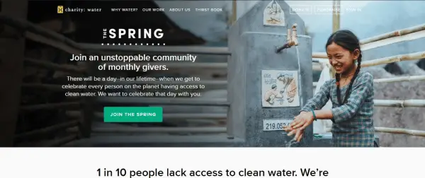
Charity: water is a not for profit organization that provides clean water to the people who are living in the areas where there is no proper supply of water and the water is contaminated. Their website is welcoming as when you open the website they have the call to action to join The Spring and to get all the information regarding joining their community. They have an interesting home page in which they have given information about what their aim is and the reason why one should donate. They have also shown the positive outcomes of the work they have done so that it will make the readers take action immediately. They have also put a video to show the results of their work. The theme is very pleasant, the primary pages are good enough as through these pages anyone can get more information about the organization, and the content is also complementing the other multi-media elements like pictures and videos.
5. RU4Children:
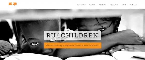
RU4Children is a non-profit organization that addresses poverty-related issues. Their site has an incredible desktop image. The color theme is also very pleasant and eye-catchy. They have also used the call to action correctly. The site navigation is also very clear, the content of the site is also maintaining the flow of the site. They have also linked their other social media accounts so that people connect with them on other social media platforms also. The primary pages include about us pages, updates, donation and shop page.
6. The Nature Conservancy:
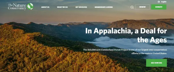
The Nature Conservancy has a very sophisticated theme and the pictures are beautiful and are of very high quality. The site has a very long home page which means visitors can get easily what they want. The font is complementing the theme. The call-to-actions are inviting, they have featured animal icons that look stunning. In their home page itself, they have featured their mission, stories and also a sign-up option to get information about the upcoming events which is a prodigious way to connect with people and build a community.
7. One Drop:
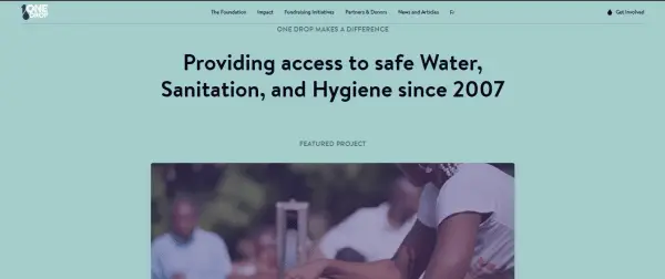
One drop nonprofit organization’s website has a very serene & satisfying color theme of blue & white. The site theme is also complementing with fonts and colors. They have featured images from their campaign and also included other multi-media content like videos, images. They have featured the other information like initiatives taken by them to raise fund prominently. Moreover, they have featured their partners so that their organization image should remain good. They have other impressive primary pages like partners & donors, news and articles, impact page. This will increase site traffic and create engagement.
8. Malala Fund:
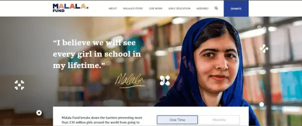
Malala Fund’s non-profit website gives feminist vibes as the not-for-profit organization is all about providing education to girls and women. So the site image and theme goes with the aim of the organization. The image itself portrays the picture of happy independent women. On the top of the home page only they have an alluring call-to-action. Their home page has a different section where they have featured information about their story and where they work. Their website provides a positive user experience.
9. Alex Lemonade Stand:
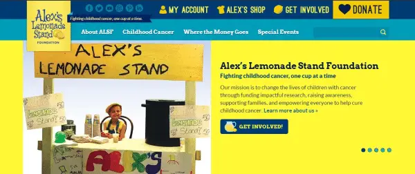
The Alex lemonade non-profit organization is for raising funds for childhood cancer. On their website, they are doing many things in the right manner. As the site is for children, the site theme is also very juvenile and colorful. The color theme of their site is very striking and eye-catching. They have featured multi-media like slideshows, videos, and images. The content is maintaining the site flow. They have linked their other social handles on their site. Site navigation is very clear and is the site is very responsive. The content of the site is complementing the font and color of the site. They have also featured their partners and the top donation to encourage people to take action.
10. Life In My Shoes:
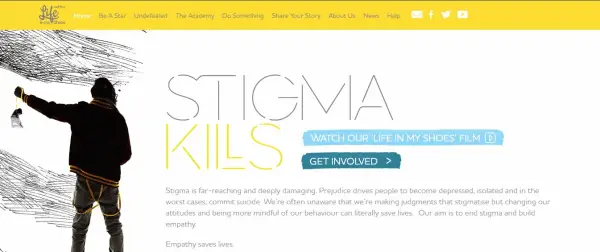
Life in My Shoes non-profit organization’s website is very simple and straightforward. The site theme is very simple and classy. They have added colors to different sections of the site to make the site look attractive. Their other primary pages include share your story page, news, help and other different pages. The content is also good.
11. HeforShe:

HeforShe is a non-profit organization for gender equality. Their site shows its strong intentions, as the theme is very solid. The site color theme is also relevant. Their call-to-actions are also very appealing. On their home page only, they have featured information about their movement, their community and also invited the visitors to take action and join the movement. The content of the site is also going with the flow of the site. They have featured different multi-media elements like images, videos to give more information about their campaign.
12. Feeding America:

Feeding America’s website has many things on their site. They have a pop-up for sign-up. Many other primary web pages. They have featured other multi-media elements like slideshow, happy faces images and videos. On the top of the website only they have tempting call-to-action and the content of the site has rightly conveyed their message. They also have their blogs so that people get to know more about the site. The color and fonts are complementing each other.
13. World Wild Life Fund:
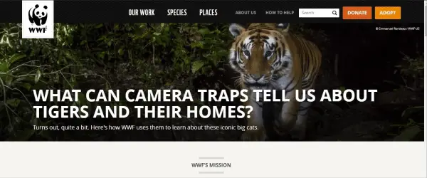
World wildlife organization is for the conservation of the forest and the species. Their organization’s website is focusing on providing content and features information about their work, how they can help. The site has a different section and they have included different beautiful images of animal icons. They have featured call-to-actions like Donate and Adopt on the top right of the home page. Without clicking anywhere the users can easily know about their mission. The site’s colors, fonts are suitable for the site’s theme.
14. Acumen:
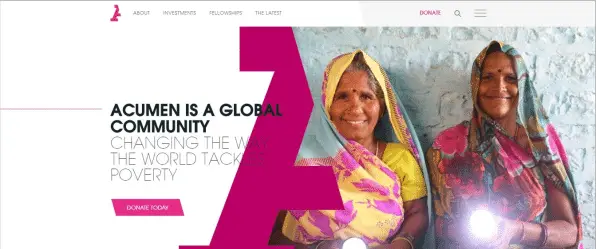
The acumen nonprofit organization’s website has a solid color theme of pink and white. The site has featured all the information regarding the organization. Their site has many images. On the top of their home page only they have featured the appealing call-to-action. So that people can immediately take the action. They have other primary pages like investments, fellowship and about us page, the latest page. This will keep their visitors updated. At the end of the page, they have options for signup. So that people can connect with their organization and get updates.
15. Care:
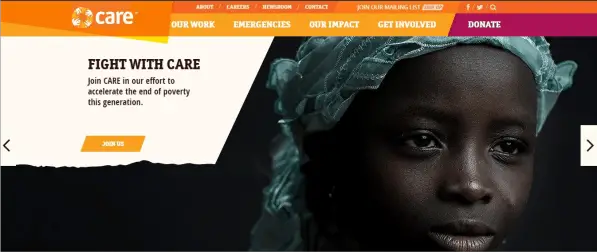
The care not-for-profit organization has a very eye-catching sight as the site consist of bright colors and has very intense images. They have featured many multi-media elements like slideshow, images prominently. On the top of the page only they have featured call-to-actions like Donate, Read More, and Join Us to create engagement and it will inspire users to take action immediately. They have different sections on their home page. They have other primary web pages like our impact, emergencies on their site.
16. Save The Storks:
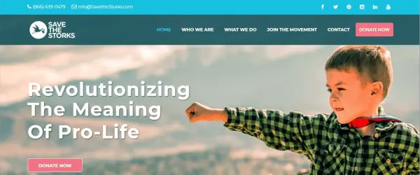
Save the Stork non-for-profit organization’s website has used the blue color theme to justify their website. They have featured multi-media videos, images. They have a different section of stories and have shown the outcome of their work. The call-to-action is placed correctly. Their web design is simple and classy.
17. Nashville Zoo:
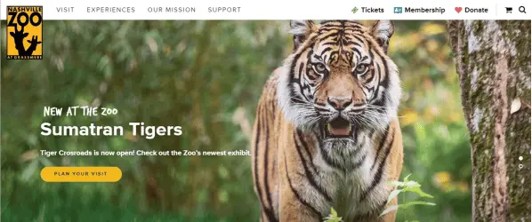
Nashville zoo’s website design is just astonishing. Right from the theme, fonts, Images everything is just wow. On top of the website, they have featured stunning images of animals through multi-media slideshow. The animal icon on the entire site is looking very attractive and is enhancing the website look. This non-profit website has a different section in which they are updating their users about the upcoming events and has given information about their organization. At the end of the page, they have also mentioned the sign-up option to build community. The color theme is also very tempting.
18. The Girls Who Code:
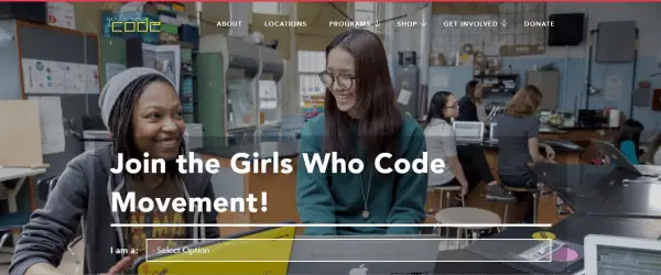
The girl who code works to decrease the gender gap. But the interesting thing is, the website does not have a girly look at all. The website theme is simple yet bold. This not-for-profit organization site is primarily focused on featuring information on what they do. They also have a news section and also featured their partners to improve their organization image.
19. Teach For America:
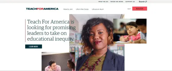
Teach for America’s website is a typical non-profit organization website. Their theme is humble and tranquil. They have given deep information about their mission, approach, their challenges. They have an “Apply” call-to-action on the top right of the page.
20. Beyond12:

The Beyod12 website is very modest yet bold. They have featured videos and images so that people should know more about their organization. This non-profit site is more focused on the content. They have also a featured form for sign up.
Were you inspired by these non-profit website design examples? If you have created a website for a not-for-profit organization that you would like to share with us for inspiration, please feel free to share it in the comments section!