Line25 is reader supported. At no cost to you a commission from sponsors may be earned when a purchase is made via links on the site. Learn more
Pairing appropriate fonts is a great way to improve your design and introduce a little variety in it. You may want to pair 2 fonts when designing a wedding invitation card or setup fonts for a business card. It’s a challenge to figure out the right combination of fonts, though. So, first let’s look at how to pair fonts to match the latest trends. While working with pairing fonts, there are three things you should keep in mind:
1. Concordance:
Concordance is when you use a single typeface in multiple fonts on the webpage. It is the simplest way of font pairing as you only need to find one cool font that works well in different styles. So, first, you need to pick a font superfamily. Font superfamily is a typeface with multiple variations that fall into different categories. There are several classifications for a typeface. However, they are primarily divided into four categories:
Decorative: Boilerplate, Mythos STD, Rosewood
Script: Mistral, Young Baroque, Lobster
Serif: Chaparral, Minion Pro, Garamond (Subcategories: Slab, Old Style, Modern, etc.)
Sans-Serif: Proxima Nova, Helvetica, and Franklin Gothic (Subcategories: Humanist, Grotesque, etc.)
A common superfamily comprises of font families that are present in both sans-serif and serif. For example, Lucida font includes versions in Handwriting, Typewriter, Calligraphy (script), Blackletter (Gothic), and Sans Serif all in the same family. Because these font families are created to fit in the same family, they share their basic characteristics that help them work well with each other.
2. Contrasting:
Contrasting refers to 2 or more different typefaces that work well together. It is challenging to pair fonts this way, but it also a more original and successful method to design a unique font pairing. The key is to look for different types that have something in common that can make them work well. Even if the fonts are entirely different, they must have one or two of these feature to become a successful pairing:
Weight: It refers to the thickness of the lines. You should always pair thick fonts with thin fonts.
X-height and glyph width: X-height refers to the height between the top and bottom of lower case letters such as “s” or “c.” Glyph width simply refers to the width of characters.
The direction of the axis: Draw an imaginary line over each letter. Different fonts will have different angles on their axis, and that will have a notable impact on how the fonts to pair together.
The shape of character: Every character changes its dimensions in different fonts. Some become small and squat while some are long and lean. Try to pair fonts that have similar shape to show uniformity.
3. Conflicting:
Conflicting refers to 2 or more typefaces that are similar to each other and also work well together. It is obvious you want your fonts to have some similarities, but they should have enough difference to work together effectively. Some of the ways to avoid conflicts are:
Font category: Make sure that you select fonts that are different enough even if they have the same subfamily.
Consider hierarchy: Use weight and size to distinguish between fonts. Hierarchy is essential, so choose fonts that highlight the relative importance of the text in your design.
Use color: If you want to highlight different segments of text, it’s a great idea to use different colors.
Now that you understand how to pair different fonts effectively, here are some latest font pairings to make your design stand out.
1. Proxima Nova and Futura:
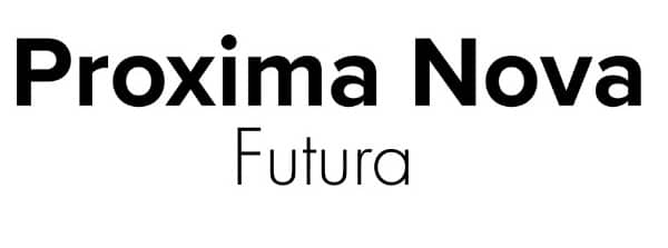
Proxima Nova and Futura show us that you can stay in the same font subfamily and still manage contrast. They share a similarity in the shape of character and weight, so they work well together.
2. Bebas Neue and Libre Baskerville:
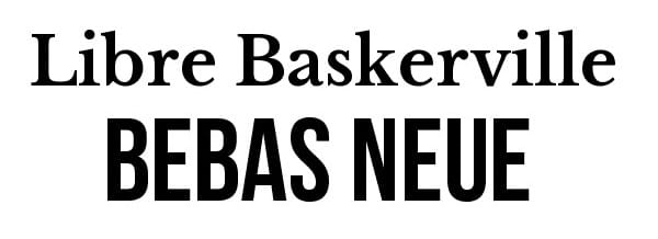
Bebas Neue is a bold and heavy sans-serif. While on the other hand, Libre Baskerville is a traditional, delicate serif font. They do not share x-height, the shape of character or weight but are similar in terms of the direction of the axis.
3. Nautilus Pompilius and Museo slab:
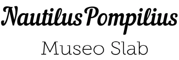
Museo Slab is a flexible serif while Nautilus Pompilius is a modern script. They both have unique character but still, share a similar weight to maintain proper balance.
4. Adobe Garamond and Hoefler:
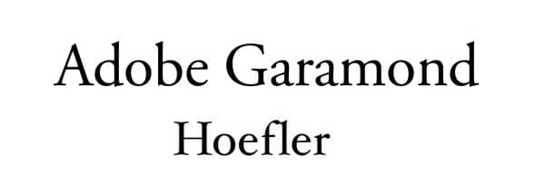
Adobe Garamond and Hoefler are both beautiful old-style serif fonts but still work well with each other when it comes to font pairing.
5. Merriweather and Montserrat:
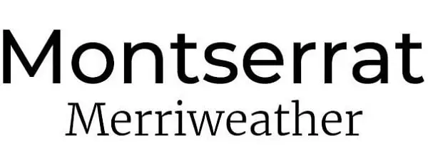
Montserrat is streamlined, modern and legible sans-serif font, while Merriweather is a classic serif font. They make a great pairing if you want your design to be minimalistic.
6. Source Sans Pro and Playfair Display:
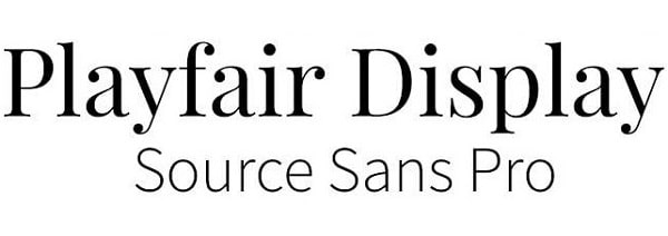
Playfair Display is a traditional style font, while Source Sans is a very simple font. They give an elegant look to your design when paired together.
7. Lato and Raleway:
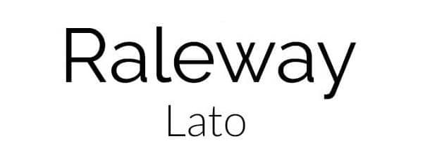
Raleway is a stylish yet simple sans-serif font that can be used with different design styles making it versatile. Lato is also a sans-serif that is much thinner and smaller, which complements the header text.
8. Roboto and Elsie:
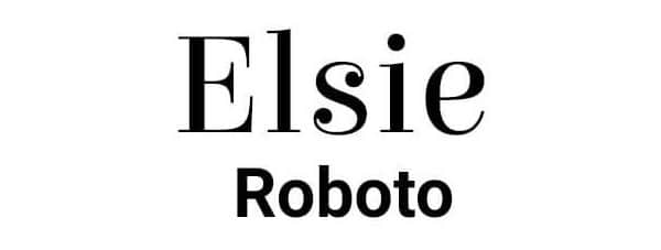
Elsie is a detailed, elegant, and artistic serif font that was created to celebrate women. Its smooth edges make it entirely compatible with a font like Roboto that is simple and classic. This pairing is perfect for highlighting specific texts in your design.
9. Josefin Sans and Dancing Script:
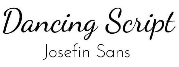
The dancing script is flowing and creative font that should be paired with simple fonts. Most script fonts look better with basic fonts, so Josefin Sans is a great choice here.
10. Open Sans and Spirax:
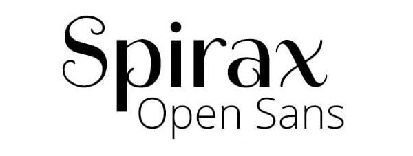
Spirax gives a sense of storytelling and mystery, so it is smart to use something like Open Sans with this font. You can use this beautiful combination in your design to give it a unique twist.
11. Raleway and Cherry Cream Soda:

Cherry cream soda is a creative font that is inspired by the 1950’s soda craze. Its unique style should be paired with a simple font like Raleway to tone down the mood of your design
12. Open Sans and Sansita:
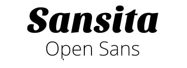
Sansita is a stylish, wavy font with a variety of sizing options available. This font should be paired with a classic font like Open Sans to keep a fun balance.
13. Lato and Wendy One:
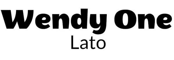
Wendy One is a quirky, eye-catching, bold font that is great for emphasizing specific parts of the text. Because the width of Wendy One is large, it needs to be paired with a slim font like Lato.
14. Oswald and Merriweather:
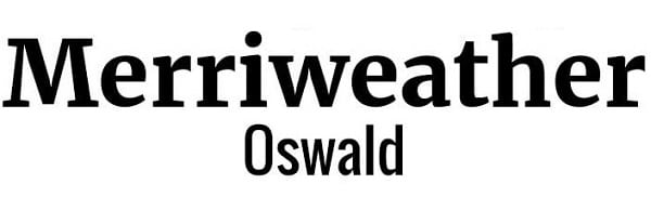
Merriweather is easy to read, and it can also be altered in terms of height and width. This legible serif text works well with thin sans-serif like Oswald.
15. Montserrat and Baloo:
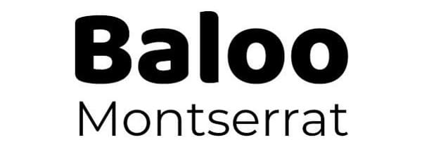
Baloo is a rounded, bubbly font that can be overpowering if not appropriately balanced. So, a classic font like Montserrat is paired with Baloo to make the weight lighter.
These are some latest pairings for you to be inspired and create your exclusive font pairing, although there are no fixed rules for pairing fonts to create a unique design. But you should pay attention to context and select fonts according to different genres. If you are looking for great fonts for In addition to this, make sure you don’t use more than three fonts in your design. Otherwise, people will get distracted from your actual content.
Comments are closed.