Line25 is reader supported. At no cost to you a commission from sponsors may be earned when a purchase is made via links on the site. Learn more
If you have ever been to the presentation room, you might know what a bad presentation can do. Despite the presenter’s knowledge and skills, audience notice everything. And if we talk about design, it directly relates to the presenter and audience.
Presentation design is the foundation of the whole presentation, and it determines the result of your efforts. So whether you are a student, designer or any business person, you should know some essential designing know-hows in order to achieve your goals.
And to help you with that, we will discuss some excellent expert-described tips to make your presentation stand out. For a successful presentation, some helpful tips can move you ahead of the competition, and therefore these tips explain what you can do to design your presentation in a most efficient and appealing manner.
1. Try To Avoid Default Templates:
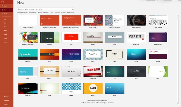
If you are using common presentation software and making your important presentation with one of the default templates, then this could be the first thing you need to stop doing. Default templates are generally outdated and very much overused. There are high chances that your client or audience must have seen your template and default colors and font styles.
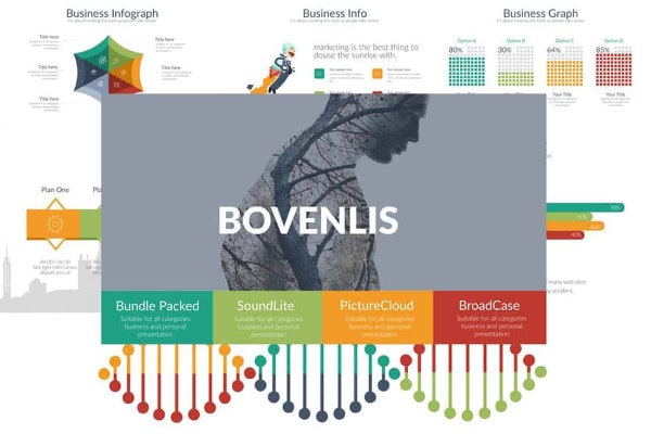
To make a unique and notable presentation design, you have to pick the best elements. You can create your own or get some trendy templates from various online platforms. The template is the baseline of your whole presentation, so be careful and thoughtful while selecting one for your project.
2. Pick Attractive Color Palette:
The next thing you should take care of is your color palette. In a presentation, you get restricted with slides and content; therefore, many other elements get the wide space to create impact. A color palette of your presentation should have minimum colors, and they should not damage the visual hierarchy. Colors should be comforting and complimenting the theme and content.
Multiple different colors can not create a decent design. Therefore, if you want to experiment, try to check out some online templates and examples to understand the color concept better. The ideal limit is five colors, and more than that can trigger the overall image of your presentation, so try to avoid such mistakes while designing a presentation.
3. Use 6X6 Rule:
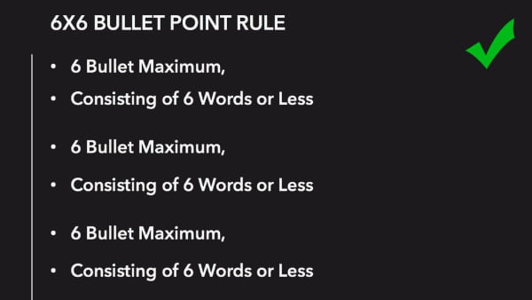
It is a simple rule that helps you keep the presentation balanced and neat with the content. 6X6 rule explains to use a maximum of six bullet points in each slide and keep six words as a maximum limit in each bullet sentence. Sometimes you tend to put more than required lines and content in the slides, which are definitely not suggested. So in order to keep the presentation appealing and accessible, you have to manage the content balance.
With this rule, you get a simple guideline of how far you can go with bullet points and words in your presentation. So don’t overburden your presentation with loads of information because instead of helping, that can damage your presentation. It’s better to keep things simple and attainable.
4. Avoid Fancy Fonts:
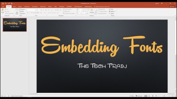
Your presentation is representing your content and objective, so it does not have to be overwhelming with fancy design elements. However, when it comes to font style, it should be clean, impactful, and readable. While working on your screen, you might be liking fancy and creative font styles, but you need to think from the projection perspective where the presentation is going to take place. And on that screen, fancy and creative styles might not look as attractive as you thought.
That is why it is always suggested to go for sans serif fonts in presentations because they make the content easily visible and readable. So it would be really helpful if you select a font style that has clean and straightforward sans serif fonts that can make your presentation design better.
5. Maintain Consistency Of Font Size And Layout:
Consistency is a very crucial subject in every design. It helps your design to carry out the intended message and context successfully. So when it’s about your presentation and if you are using some default template or pre-designed template, then you have to maintain consistency of your font size and font style strictly. More than two or three font styles can tone down the consistency level, and different font sizes can make your content look abrupt.
If you are designing your own presentation, then you have to take care of the layout and shapes as well. There should be no unnecessary and too many variants of design in the presentation. So take good care of this subject to maintain consistency level.
6. Create Effective Contrast In Design:
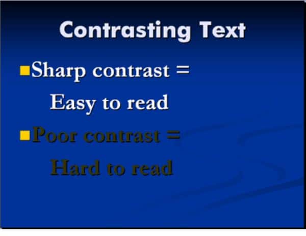
It’s highly important in a presentation that your content is not only visible but looks attractive and draws people’s attention. A weak presentation design can have many flaws, and one of them is a lousy contrast setting. That is why it’s very crucial for you to understand colors and their importance in design.
When your content is wrongly placed on a similar colored background, or you have given a bad color scheme to your fonts and text box, then your presentation quickly loses the contrast game. On the other hand, a good contrast elevates the whole design and content, which can eventually favor your presentation. So wisely select colors while keeping contrast, brightness, and saturation in mind to make the perfect design.
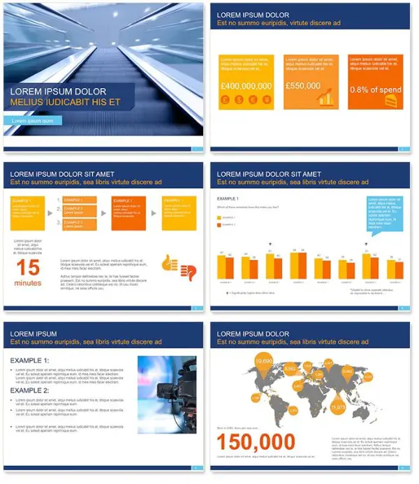
7. Don’t Add Multiple Images In One Slide:

When you need to add images to support your content, you have to act smartly. A slide filled with different images is not a good sign for a decent presentation. You can select one or two of the most compelling images and include them in your presentation, or if multiple images are really required, you can use multiple slides.
There are some creative transition and animation options as well. But stacking your slide with all the images can make the appearance weak. Your overall presentation design can look sophomoric, and that is something you surely want to avoid.
8. Add Strong Visuals Instead Of Words:

Visual content can be more impactful than written content, and that’s a proven fact. If you want to increase your presentation’s designing score, you need to give importance to every designing factor. Sometimes, when you are stating facts and examples, it’s advisable to speak through the visuals like graphs, images, and videos rather than just words.
It can boost your content and get the attention of your audience. They can easily understand and connect with your presentation. For a good presentation design, try to make a perfect balance of written content and visual content without overdoing any part so that you can seamlessly win your audience.
9. Incorporate Interesting Animation:
Thanks to some tremendous online software and platforms, anyone can make an excellent design with minimum effort. However, while designing a presentation, things would look more attractive if you add some pinch of animation. And for that, you don’t have to be an expert with the help of some online tools and marketplace; you can simply add animated objects in your presentation in few steps.
As discussed above, visual content is very much powerful, so animated content would be the next step from images and graphs. Animation helps your audience to stay connected where you require their most attention. So add animated content in your presentation at some intervals of slides to keep the interest of your audience alive and distraction away.
10. Highlight Your Text With Shapes And Objects:
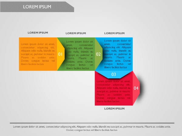
Simply adding content to the images or background is a bit boring. People have been doing this for ages, and for attention, it’s probably not enough. So for a striking presentation design, find ways to illuminate your content part. And adding different shapes and objects can be an excellent way.
For example, with a contrast-colored geometric shape, your content can have more volume. Your slide can have different aspects, and your overall presentation can look more vibrant. Right placement of the shape is also essential, and do not forget about consistency.
Once you include shape and object for your content background, you need to stay consistent throughout the design, or things can go otherwise. You can use this idea only for headings and titles as well because that also would be enough to draw attention to the respective topic.
11. Use Seamless Transitions:

The transition between the slides is also another interesting aspect. You may not give much attention and simply shift the slides. But all the good presentation software and tools have transition options. Instead of sudden shifts, it’s better to give some seamless transition effect to your slides. Dramatic and loud transitions are not needed, but some interesting and eye-pleasing transitions can surely make your presentation more engaging.
You can maybe put transitions on some special slides as well if you believe all the slides don’t require a transition effect. As per your subject and audience, you can decide what kind of transition effect would look good and then use it smartly to make your presentation stand out.
12. Use Images Creatively:
Going deeper into the designing part next thing is making changes to the images of your presentation. When you are using more than one image, it’s nice to make the slide vacant by doing some manipulation to the images. You can crop your images into exciting shapes and objects. You can rotate them and change their projection as well to add creativity to your ordinary slides.
As per your layout and overall theme, you can select the shape and crop your images accordingly. If you want to put extra effort, you can separately edit your images and create something extraordinary to make your presentation more impactful. So do not just copy and paste the images; turn them into creative accessories for your presentation and see the results.
13. Go For Innovative Presentation Styles:

It can be a brilliant idea to choose any other software or platform for your presentation that is not PowerPoint. Microsoft PowerPoint is a widely used software for presentations, but we have so many other exciting software that provides great flexibility and creativity for innovative presentations in today’s time.
You can create interactive and unique presentation styles that do not follow common linear structures. You can create 3D styles and website-like structures as well. Some software and tools require subscription and payment, so highly advanced presentation styles can be expensive, but they can definitely provide an end number of benefits for a professional purpose.
So, according to your requirement, if you need a solid and compelling presentation design, then build your presentation on an innovative platform.
What is the deciding factor between good and bad presentations? The answer is design and content. While you are working hard on the content part as you should, you have to give equal importance to the design part as well. For example, suppose your colors, images, slides, and fonts are poorly placed. In that case, your presentation can become a significant distracting object for your audience, and that’s the last thing you want in your presentation session.
A bad presentation can also affect your impression in front of your audience because it can create trouble if you are being evaluated on a specific basis. So help yourself and learn essential things from the tips mentioned above so that when you start making your presentation, you would know what you must include and what you must avoid.
These design tips are easy to understand and follow. That’s why they can help almost everyone who is delivering some content through the presentation.