Line25 is reader supported. At no cost to you a commission from sponsors may be earned when a purchase is made via links on the site. Learn more
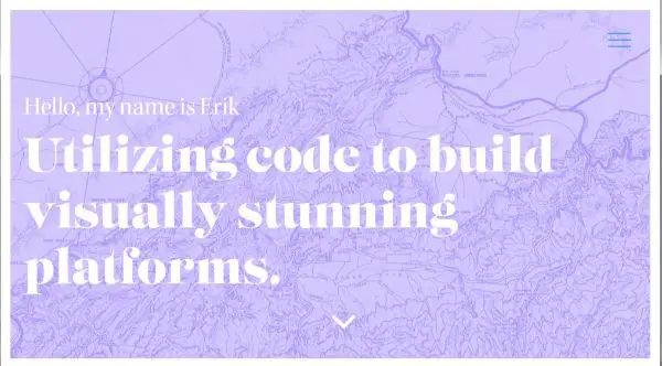
A hero image is the main banner which is placed on a web page prominently, generally in the front and center. A banner image is always larger than other images present on the web page, and is generally above the fold, at the center of the page. Majority of the space is taken up by the Hero Image.
The hero image can be an individual image (banner) or a carousel of images. Further, it can be either static or dynamic as well. You can have videos, illustrations or any design element that makes up the canvas in the most appealing manner possible.
What is the need for Hero Images?
Appealing web design is a pre-requisite in today’s competitive world. There is a 50 milliseconds window in which the visitors decide if they want to stay or leave your website.
Capturing the visitor’s attention in such a short span requires a pleasing, relevant and aesthetic visual. Good Hero Images have that visual appeal that makes visitors decide to stay. This increases the engagement on the website. Once you have arrested their attention, you can further exploit the attention span by cleverly placing your CTAs and mentioning your USPs here to reinforce your importance in their mind.
Now that the relevance of Hero Images is understood, we should talk about essential considerations to keep in mind for Hero Image Website Design Best Practices for Highest Conversions.
Using Optimized High-Resolution Images:
The hero image is as the name suggests the hero of your webpage. It is going to create the first impression of your website in your visitor’s mind. Quality of the image has to be of proper resolution to ensure the image doesn’t pixelate or feels weary. While this stands true, using a large file image for your website can have its drawbacks. The website can take longer to load, which could irritate the visitors and make them leave. Hence it is essential to properly optimize your image for your webpage to ensure quality and efficient experience for the visitor.
Show Value to the Visitor:
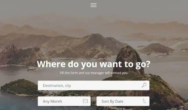
You may have a striking image of a beautiful sunset, but will it help visitors engage with your site? If you run a travel page, it definitely would. However if you are into selling pens, it won’t. Your hero image has to be true by the product/service you provide. The relevance is crucial as it gives the visitor value and a sense of direction to understand your niche better. Use your hero image as a trailer to what is in store for visitors to hold their interest.
Highlight your USPs:
If your website is related to an industry where creativity is appreciated, don’t shy away from showing your USPs on your hero image. Even for highly monotonous sectors, you could break from the code and try adding a hero image in the most innovative yet subtle way possible. A minimal line that encompasses your website’s message can go long ways to leave a lasting impact on your visitors. It allows the visitor to create a better understanding of your services in a shorter time. It also shows confidence you have on service/product if you provide some stats. A creative or important USP if displayed with the right design elements, can set you apart from your competitors.
Have Multiple Choices
You might have a mental visual of an image you think would go great as your hero image and as per your web design. While that is a good thing to have, it’s advisable to come up with a few alternatives. This would allow for room for options and assessment to see what looks best.
Furthermore having more than one relevant hero image also allows you to either use it as an image carousel or plan different looks over the period. Never be in haste to select and get done with the hero image, as it plays a vital role in dictating your website aesthetic and appeal.
Allow Interaction
While creating your hero image, keep in mind what is the delivery of your hero image. The visitor must take away what you meant them to from the hero picture for effective communication. There is a great way to ensure the same, through dynamic hero images/illustrations; you could see how the visitors are responding to your hero image. This also makes the visitor feel more connected as their actions cause the reactions on the web page. This increases engagement. You can do this by using essential design elements like parallax scrolling, image slider and mouseover effects.
Don’t Use Stock Images
While a high-resolution hero image can be attractive and drive more engagement, using stock images to do the same can have a reverse effect on the traffic on your website. While there is no prohibition on using stock images, they wouldn’t be as specific and relevant to your website as an original image/illustration would be. Many times overuse of stock images doesn’t only not increase engagement, and it can also reduce engagement if poorly chosen. The personal touch is essential for your visitors to identify you as a brand before identifying you as a service offering an alternative because there are good chances the stock image you end up using, someone else might too.
Evoke Emotions:
There is always a better chance of efficient conversion if you can connect to the visitor on an emotional level. Your hero image should be such that it should appeal to the emotion you want to evoke in your visitor’s heart. For instance, if you run an NGO for homeless children, your hero image can be powerful imagery or illustration of a small child in distress with authoritative text to evoke their emotion of guilt. Alternatively, another approach could be showing a happy child to showcase hope and positivity. Many times using extreme emotions can act repulsive, which is why you should be careful as to what emotion you’re catering to when creating your hero image.
Align with content:
It is important to align your hero image with the content of your webpage. The experience has to be seamless, and it should follow the same hierarchy in terms of design language and relevance. If your hero image is designed in a way where it has a lot of white space and minimal approach, but your other webpages or content pockets are clustered and filled with animations, the design language becomes confusing and abrupt for the visitor. It is crucial to create an overall feel of your website and to make sure the hero image compliments it and enhances it. Otherwise, it would have the opposite effect and not increase the conversions.
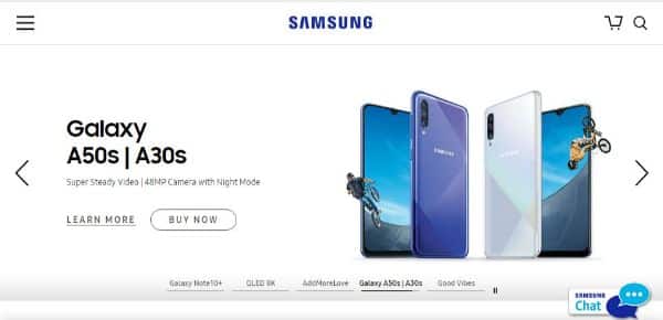
Make your Service/Product the Hero:
This is another crucial point to understand that often is forsaken. When you use an image for your hero image, the composition matters a lot. You may have multiple subjects in the hero image, along with the main focus subject. All other elements of that image must be acting as guiding lines or leading to the main subject in focus. Otherwise, visitors may miss the actual message or purpose behind the hero image. Same goes for illustrations or any other element you use for your hero image, as there needs to be clarity of what the main subject is, and what is not. Either way, you should only include additional elements if they serve a purpose somehow. Having anything that doesn’t serve a purpose creates noise without adding any value.
Make Sure Your Images Fit All Screens:
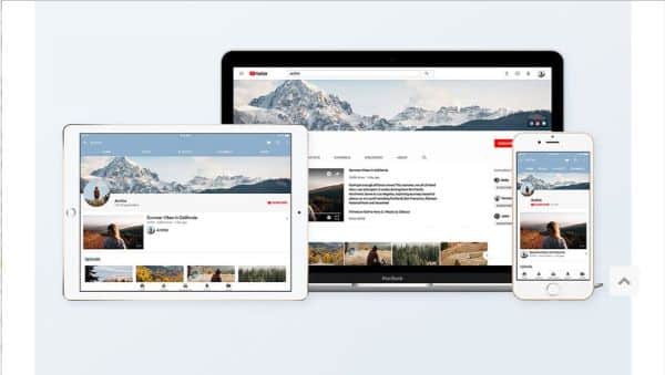
The hero image needs to be such that it is displayed as intended on any screen of any device. Proper optimization of these images may require resizing or changing a small image with a larger one or vice versa, but the extra effort would ensure your visitors have access to your webpage through multiple devices. Good user experience across all devices shows commitment to details and seriousness on behalf of the company towards their website. This can help reach a wider audience and also increase engagement. It is ideal to try keeping the format of text to image if you’re using that design, uniform across all platforms. However, if doing so is making the hero image or the text ambiguous or confusing, consider changing accordingly but still maintaining similarity.
Choose Wisely
The format you decide for your hero image should depend on the purpose you want it to solve. If you’re an artist who’s creating their professional website, adding your sketches or illustrations would add a personal touch to your website as well as showcase your best work in the first 50 milliseconds to your visitors. This would work better than using an image for your case as it’s more relevant to your profession. Similarly, images could be helpful for a photographer trying to create his website. These are extreme examples to demarcate the difference. However, you could use any form of content for your hero image as long as it remains relevant to your niche and business.
Highlight the CTAs:

CTAs are essential guiding points to ensure conversion on any website. Smart placement of CTAs ensures visitors interaction which leads to a substantial conversion. Thereby, placing CTAs on the hero image ensures maximum exposure and highest chance of visitors interacting with it. However, the CTAs shouldn’t steal the limelight from the hero image. Don’t make it unnecessarily or disproportionally big or bold to impose it on the visitors as that would repulse them and annoy them. It is essential to still guide visitor’s attention to them, for which you should place it strategically. Making the CTAs brighter than usual and using contrast is an excellent way to highlight it without disturbing the visual appeal of the hero image.
Reinforce Brand Aesthetic:
If your website has a layout that uses the colour schematic of your logo, and it’s pleasing to the eyes, incorporate that in the visual language of your hero image as well. This reinforces the brand aesthetic and also creates a visual story for the visitors to connect. Most of the times, the colour palette of the image itself doesn’t match the brands colour palate, which is all right. Instead of imposing or over-editing the image to fit your brands, colour aesthetics ‘overlay’ is a technique where you could add a colour block that is closer to your brand. Adding a gradient would also add depth to the overall image. This way, the image doesn’t look imposed, and the brand aesthetic also gets incorporated, which creates a strong visual memory for the visitors.
Play with Fonts:
Experiment with different fonts when you’re selecting one for the hero image. You can use a font that compliments the style and feel of the hero image or change it entirely to create a contrast between the hero image and the text which could also add depth in the overall image. Try different fonts until you find your perfect match, but also keep in mind that the font should be readable. Don’t let the process of getting creative make you select fonts that require efforts to read/understand. Your message remains as effective as it is simple and easy it is to read.
It is advisable to invest substantial time when working on the hero image as it is the focal point for your visitors even if for a short moment. This forms their initial impression about your page and thereby it is crucial to get the details right down to perfection.