Line25 is reader supported. At no cost to you a commission from sponsors may be earned when a purchase is made via links on the site. Learn more
Any branding effort has persuasion at its core. You want to persuade your audience and potential customers and create a positive user experience that makes them interested in wanting to know more about you. And for getting persuasion right, you need to target your audience’s emotions. Generally, people think of words or images to have a considerable impact on the audience’s emotions. To a significant extent, it is true as well. However, no other medium or tool has as much impact on their emotions as colors do. Colors appeal to people’s emotions. Based on how well you implement your color strategy, your audience will either have a positive or a negative user experience.
The problem with getting color right in branding is that it is not a binary or definite design concept. Color liking can differ from individual to individual, and people tend to have subjective biases towards some colors. However, all colors have some pre-conceived and psychological impact on all of us in the same manner. Some brands and companies have been nailing the use of color in their branding efforts. Here are 14 examples of great use of color in branding to inspire you:
1. Apple:
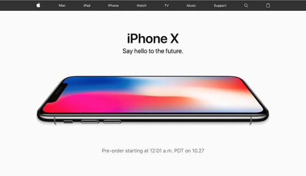
Apple is one of the leading smartphones and smart devices company. It has maintained a very minimalistic brand approach from the start. Their website stays consistent with their branding, and they make use of grey, black, and whites. Grey is a very neutral color that generally is used to represent balance. Generally, grey can have a little negative connotation, especially when linked to loss and depression. The absence of color makes it feel dull. However, when rightly used as Apple does, it can be used in headers, font color, graphics, and other places to appeal to a mass audience.
Most apple products are grey or have a silver-tone, so people have gotten used to it. They use grey on their website to contrast the white logo, which looks aesthetically pleasing. Their entire balance manages to keep the right balance between white, black, and grey, promoting a uniform, clean, and minimalistic look.
2. Starbucks:
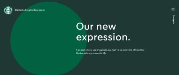
Starbucks ‘ primary color for its branding is green. Green is a secondary color that is made by mixing yellow and blue. Since it is made using a balance of cool and warm colors, it gives a very neutral and peaceful feel. Green is almost considered the fourth unsaid primary color. This is visible in board games where the first three player characters are always red, yellow, and blue. The fourth one (if any) is always green. Starbucks is one of the well-known coffee shops, and its green logo communicates the idea of sophistication and calmness.
Starbuck uses green to promote their approach to world peace and reassuring consistency and stability of their products. Starbuck coffee shops are also used to unwind or for casual business meetings at times. They are supposed to be a relaxing place. Hence they use a significant amount of green on their walls and subtly reinforce their brand association with green by putting it on the smallest things they sell.
3. McDonald’s:
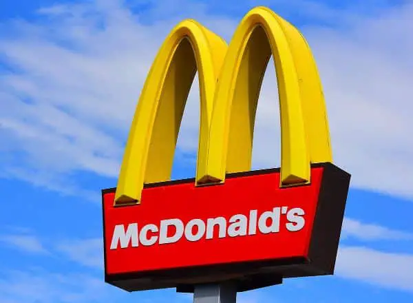
McDonald’s chose red and yellow colors for a particular reason. And it wasn’t to match the face of their mascot Ronald McDonald. It was more scientific than that. The red color is generally associated with being active and increased heart rate. This helps jumpstart your appetite. Yellow is the brightest and warmest color that is generally associated with happiness. It is also the most visible color in daylight. This makes McDonald’s to stand out from a crowded neighborhood or road. Red works to make you hungry and encourage you to buy the products they sell, and yellow makes you feel happy.
4. Talor Jorgen Coffee:

This is a Norwegian roastery that uses subtle pastel versions of the primary colors – blue, red, yellow to communicate their playful and warm identity. They make use of illustrated characters that were this primary color clothing with an identical yellow background. They also offer a coffee subscription service that delivers freshly roasted beans from all around the world to subscribers depending on their drinking habits. The characters they use are repeated in all their designs giving their branding a subtle storyline.
5. Hurly Burly Live Cultures:
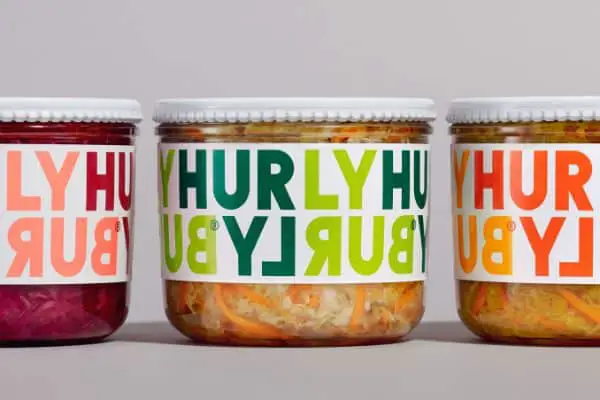
This brand took the right colors for their branding from their products. Their color palette is inspired by the actual color of their food itself. They are a food brand that sells naturally fermented food in the U.K. Their first range of products is raw organic coleslaw. They are available in flavors like Oregano and Jalapeño, Lemon and Ginger, and more.
They market their products in its branding by bringing the turbulent and continual fermentation process to the forefront by emphasizing the intense flavor profile by combining bold typography using color play. The bright color palette makes it stand out from the rest of the products on a shelf. They use colors to link the top line and bottom line in their logo, which is supposed to indicate the neverending process of fermentation.
6. Blu Saigon:
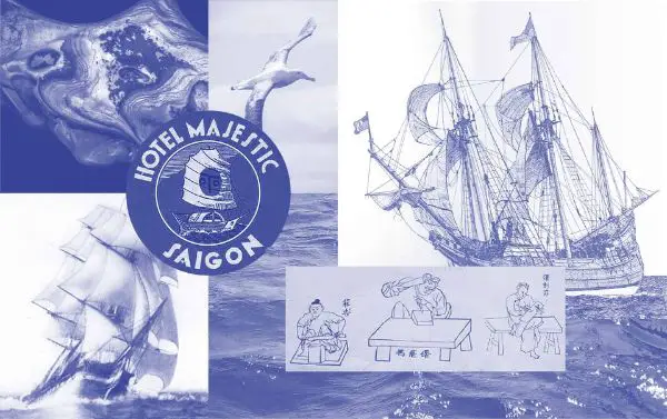
Blue Saigon is a Vietnamese button making family business brand. They use indigo as their primary brand color. The color indigo works are apt for them as it holds a historical and cultural relevance to Vietnam. Indigo plants grow in the country’s northern highlands and are also used for creating a lot of their fabric. They use blu in their name, which is an abbreviation for the color blue. They choose to associate their brand with blue in their name because blue represents the ocean. The ocean is the source of raw materials they need for button making. Blue also represents the sky.
7. DropBox:
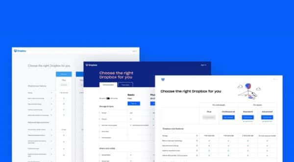
Blue is one of the most universally preferred colors when it comes to big brands. DropBox is one of the most effective file-sharing services that use the color blue for its branding. It does so to show reliability, communication, and trustworthiness. These are all critical features that a collaboration tool like DropBox should be good at.
8. Google:
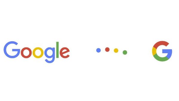
Google is the internet’s biggest search engine. It is used by millions of people each day. The original logo for this search engine giant was created by Ruth Kedar back in 1998. The colors he chose then are the same colors you see today on Google’s newest logo and brand communication. As per Ruth, the colors evoke memories of child play. If you notice, Google uses the three primary colors yellow, red and blue, for 90 percent of its logo. The ‘l’ in the logo is, however, in green, which is not a primary color but often used as a replacement primary color for board games like Ludo.
General branding guidelines dictate brands not to use more than two or three colors in their branding. Google defies all rules and makes use of 4! And it works because they have constantly maintained their brand identity, and the playful nature of the colors has made it more welcoming to the users over the years and continues to do so.
9. Asana:
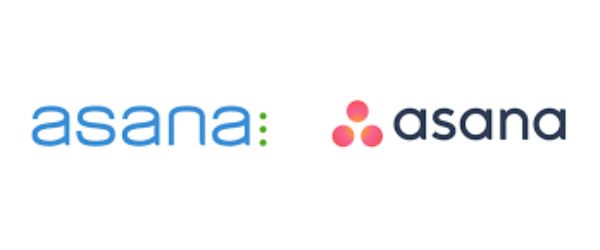
Asana is a web-based and mobile-app based application designed to help people and teams to organize, manage, and track their work. They simplify the team-based work management process. They grew rapidly during 2014. In 2015, they felt the need to rebrand their business to represent their values and mission better. Earlier, Asana had a blue logo with a lower case ‘a’ and three vertical dots stacked on top of each other to its right. These dots were supposed to show a spirit of collaboration. This logo was cool green tones.
When they rebranded their logo to the logo we all know now and love. The three dots were arranged differently, which represented them more collaboratively. The color palette changed to warmer tones of yellow, pink, orange, and other warm tones. This makes the brand look more approachable and changes its branding communication entirely.
10. FedEx:
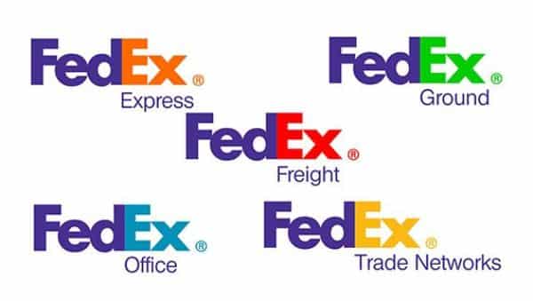
FedEx is the leading multinational company that provides delivery services. The name FedEx is an abbreviation of their company’s original air division ‘Federal Express.’ They are also known for their creative logo. The space between ‘e’ and ‘x’ represents a hidden arrow that indicates moving forward. FedEx makes use of two entirely different color schemes for their different services. They represent their ground services with green and air transportation services with orange. Green is used for ground as it depicts reliability, calmness, and trustworthiness. Orange is used for air as orange represents energy, confidence, and reliability of making the couriers reach faster and safer to their locations. They use this switching color strategy for all of their different services. To create consistent branding, they always change the color of ‘ex’ in their logo.
- Orange denotes standard express delivery service.
- Grey is for its supply chain services.
- Red is for freight.
- Green is ground and home delivery.
- Yellow is trade networks.
- Blue is a custom critical products.
11. Mastercard:
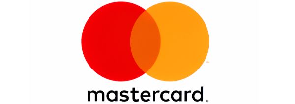
Mastercard has a very memorable and yet simplistic logo with two circles overlapping each other. One of the circles is red, and the other is yellow. Together they produce a bright shade of orange. This orange is also the company’s primary color, with two gray shades as the background colors. The secondary colors used in Mastercard are gold and yellow. They also use supporting accent colors like teal and red.
12. Instagram:
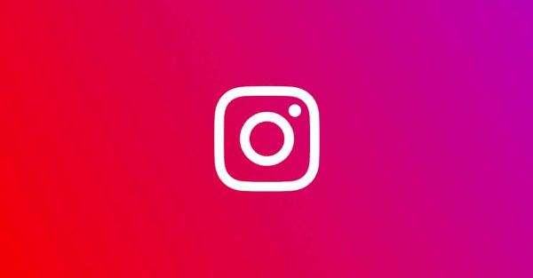
This is the world’s largest photo-sharing social media platform. One of their initial logos was welcomed by all, and while it wasn’t out of the blue spectacular, it was safe and well received. When the company decided to change the logo, many people weren’t happy about it. They wanted it changed back to the original one. This logo had a square instant camera with a tiny rainbow.
The CEO Kevin Systrom had earlier designed a more real-camera looking logo that was taken off as it had no relation to the services of Instagram as a platform. They were using the brown logo for a retro polaroid-esque feel and effect. They needed to update their logo for being more tech-savvy and modern as the crowd on Instagram mostly were youngsters who wouldn’t be interested in the platform’s retro feel.
Their head of design stated the intention behind creating the new logo was to create a look representing all community’s expressions – past, present, and future. Instagram shifted colors to warmer tones with gradient colors to give their visitors a sense of comfort and feel-good when they open the app.
13. Slack:
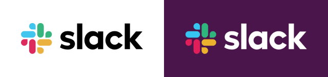
Slack is one of the leading proprietary business communication platforms. Their color palette is very playful and yet refined. It uses four primary colors – two shades of purple, black and white. There are also supporting accent colors such as – green, blue, yellow, and red. In their logo, the accent colors take center stage in place of its primary color. When they come together, they create a sense of octothorpe. The four colors coming together create the perception of teamwork and collaboration.
14. Dunkin Donuts:
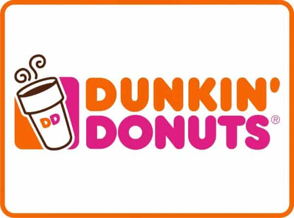
This is an American multinational doughnut company. Dunkin donut is also more or less in the same niche as Starbucks. Their target audience and approach to the café industry is entirely different, though. As we discussed earlier, Starbucks uses green to represent a sense of calmness and spacious seating with a detailed list of drinks. It gives a sophisticated and exclusive vibe. Compared to this, Dunkin Donut uses orange and pink colors for their logo. These colors look very playful and light. Dunkin Donuts is supposed to be a café brand that is more accessible, fun-loving, and easy to notice. The colors help the brand portray this very effectively.
These are the 14 examples of great use of color in branding. These brands make use of colors after a lot of deliberate thought and logical reasoning. The science of color theory helps a brand better communicate its values to its respective target audience. It also helps redefine a brand if they wish to change their communication style. Colors are perceived faster than text, images, or even audio, for that matter. Hence you should use them correctly and wisely to get more out of your branding projects.