Line25 is reader supported. At no cost to you a commission from sponsors may be earned when a purchase is made via links on the site. Learn more
With more and more people buying stuff online, the number of eCommerce websites has increased over time. When a customer decides to purchase something from an eCommerce site or an online store, many factors make them reach a decision. For instance, the after-sales service, returns and exchanges, the delivery time, and more. Apart from these, color psychology plays a vital role in driving a visitor to convert and become a loyal customer. Like red signifies danger, power, and violence, blue soothes the onlooker and offers a sense of trust and security. The designers employ this kind of psychology to target the customer’s mind and try converting the visitor into a customer. Color psychology can be used in the eCommerce website design and can make the website a success.
This blog discusses the hottest color combinations that are perfect when you are designing an eCommerce website. Let us look at the combinations on the list.
1. Website design based on color theory:
The color theory defines everything about how we mix colors, how we perceive them, and the way we respond to the colors. It is logical to understand colors first before we can combine them for our website design.
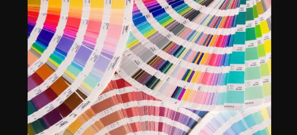
1. Hues, shades, tones, and more:
It would be so much easier if we only had to deal with primary, secondary, and tertiary colors. But even if we look at only one color, it has so much variation to offer when specific parameters are changed. This is where hues, shades, tones, and tint are concerned. The pure color defines hue without any kind of variation. When you add white to any pure color, it results in tint. Adding black to any pure color gives you shade. When you add gray to the pure color, it gives you tone.
In our daily life, we are not used to seeing many pure colors. Hence, tints, shades, and tones, please the human eyes visually. It is imperative to notice that the hue remains the same, even if we create a tone, hue, tint, or shade. The only thing that changes is that the pure color appears lighter, darker, or less bright when mixing something with it. And every color sends across a different meaning to the one who sees it.
In this era, tints are popularly known as pastels, and human eyes find them soothing and calming. Hence, the pastels are very famous for travel agencies and travel websites. When the trip is based on self-discovery, pastel colors are generously used.
Shades are generally used when the websites want to appear sophisticated. Moreover, they want to target customer experience and confidence, hence sites with high-end products use shades to lure in, the high-end customers.
Looking at these combinations and mixtures, it is clear that you cannot base your website on a single color. It would be best if you had different color combinations and color themes to target the right customers. And you can achieve this using color harmony.
2. Color wheel:
To understand the association between different colors, you should always look up to the color wheel. We have often seen a color wheel in the schools, which consists of 12 colors. Red, blue, and green are the primary colors in any color wheel that you must have seen. The same colors can be used to make secondary colors like orange, green, and violet. When we mix primary and secondary colors, we get tertiary colors called red-orange, yellow-orange, yellow-green, blue-green, blue-violet, and red-violet.
3. Color Harmony:
Color harmony is the concept of combining the colors in a way that pleases the human eye. And these combinations are based on the color wheel. There are specific techniques to achieve color harmony through various well-defined color combinations. The following are the techniques to achieve color harmony that are well-known and often used. Monochromatic is the technique where you use only one color, but you create and use multiple variations of the same color. You create hues, shades, tones, and tints but only with one pure color.
The analogous technique uses the hues placed next to each other in the color wheel. For instance, blue-violet, blue-green, and more are positioned adjacent to each other on the color wheel. The complementary technique defines using the colors that are placed on opposite positions in the color wheel. For example, red and green represent complementary colors because they are contrary to each other on the color wheel. Another technique is, split-complementary where you select any color from the color wheel, then take up two that side the complementary color of the chosen color. The example of this is yellow-green and red with violet. The last technique is the triadic technique, which makes use of three colors that are evenly spaced on the color wheel. An example of this is green, orange, and violet.
These techniques help you determine the color scheme for your website, and you can decide what colors you should target to target the correct audience. Changing text size and color signifies a change and something that the customer should take notice of. When you place the content in the light and dark sections, then it notifies the website visitor to notice the change. It attracts the attention of the customer. According to a study, customers tend to remember the information when you make things pop out.
Let us see some examples of websites with different color themes and how they target the customer’s attention successfully.
1. Libenar:

Libenar is a website that sells baby products, and when the baby products are concerned, we tend to use soft pastel colors. These colors identify well with the products and services that involve babies. Libenar has employed pastel colors to specify that the website is all about the baby products. It has been carefully designed using soft pink and blue colors to send across the website message effectively. They have used snow, Spanish pink, dust storm, soap, and yale bubble colors in their website design.
2. Beauregard:
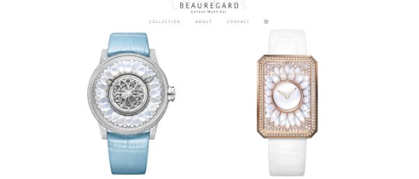
Beauregard is a website that deals with beautifully crafted hand watches. It has a beautiful color scheme that provides an intuitive user experience. As it has a blue and white theme all over the website, it offers a sense of hygiene, purity, and serenity. The colors that they have used are isabelline, quicksilver, aurometalsaurus, light gray, and black olive.
3. Squilla Fund:

Squilla Fund is a website that associates itself with investment in cryptocurrencies. The color theme of the site is very calming and soothing. They have combined nuances of turquoise with the soft tones of beige. It is a corporate website, yet, the color theme balances the serenity with the professional approach. They have used teal blue, moonstone blue, powder blue, magic mint, and white smoke.
4. Helbak:
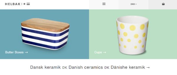
When we talk about monochromatic color schemes, Helbak has aced the website design using the same technique. This technique can be helpful when you have products from different categories. And you can put the same background color for different products that belong to the same group. This lets you differentiate between the groups of the products. You can opt for color continuity while also including color variation according to the change in the products’ category.
5. Sahel:

The Sahel offers website design services, and their website looks like it is straight out of an artist’s painting. The website’s color theme revolves around gentle pink and beige variations with copper and gold hints. The colors used are dark goldenrod, tan, dust storm, white smoke, van dyke brown.
6. Cure Nails:

Earthy color scheme or the color combinations of nature found colors are also an inspiration behind the website design and its color themes. It incorporates green color from trees, brown from the soil, and blues from ocean and skies. These colors create a profound impact on the onlooker’s psyche. Cure Nails is a website that takes inspiration from nature and has used all the earthy pastel colors. These colors define purity in the website design. Cure Nails deals with organic skincare products, and hence, these colors go perfectly with the website’s concept. They have used platinum, turtle green, gray-blue, tan, and coconut.
7. Andris Gauracs:

Andris Gauracs has built a website to showcase his portfolio and the projects he has secured as well as worked with. His site uses sky blue color along with a tiny hint of brown. Though these colors are inspired by nature, the maximum usage of sky blue keeps the professional attitude of the website in place. It extensively uses white, sky blue, and brown. Andris Gauracs has done a beautiful job designing his website and definitely knows how to showcase his talents and prestige projects. The colors that he has used on the website are tufts blue, French sky blue, Alice blue, white, and copper.
8. The Green Organic Dutchman:
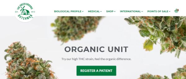
This website deals and works with organic products. Hence, they have also taken up earthy tones to design their website. And there is a tendency to think that natural products are associated with nature in some ways. So, TGOD has managed to combine all the tones related to life in one way or another. They have used Bistre, Vegas Gold, Desert Sand, White, and Palm leaf colors to enhance their website.
9. Ma-Tea:
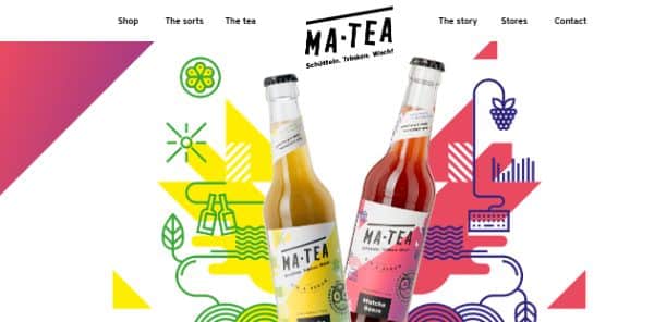
When it comes to nailing the users’ attention, nothing can compete with the color theme that has bright and bold colors to its disposal. Moreover, bright and vibrant colors represent freshness and energy. Hence, websites with similar colors seem refreshing and offer a lot of fun elements. Ma-Tea is one such website that combines bright colors with certain pale shades of colors. They deal with the beverages that refresh their customers in the scorching heat of the summer. Hence, they have taken up colors that go hand in hand with the purpose of their website. They have used paradise pink, cosmic cobalt, aureolin, Kelly green, and sage.
10. Montreal in Motion:

Montreal in Motion is a website that showcases the events of digital artists. It also hosts award functions. Their website offers a peek into the future using their color theme. They have combined the hints of purple along with pink and blue. Also, the site employs gradients to add an enchanting glint to the appearance of the website. Montreal in Motion uses paradise pink, palatinate blue, midnight blue, dark orchid, and rich electric blue.
Conclusion:
You should never generalize the design and the color scheme of your website. It would be best if you understood how blue soothes people down, or how red energizes them. But you can find the right balance with the colors only by following them in great detail. Moreover, you can use the combinations based on trial and error to see how they play out. It would be best if you also considered color psychology to see how the colors affect the click-through rate.
Before finalizing the color scheme, you should shortlist a few themes and let your colleagues play with it. This will give you an insight into how they perceive the colors and how colors can affect your brand story and your business. No matter how much you play with the colors strictly, but it cannot promise you a hoard of traffic on the website overnight. You need to evaluate everything about your brand, its image, and the story behind it.
Once you understand it, you should know how colors can make or break your concept. An accurate understanding of colors and the brand story can make you create magic out of their combination. It would be best if you played around with the color wheel to see how you can come up with the color combinations that suit your website. Facebook is in all blue because Mark Zuckerberg, the owner of Facebook, is color blind and can see this color better than reds and greens. Hence, while playing with colors and designing an eCommerce website, you should have a robust knowledge of colors. The experience of colors in the right hands can only create a lasting impact on your website.