Line25 is reader supported. At no cost to you a commission from sponsors may be earned when a purchase is made via links on the site. Learn more
We all know the importance of website content. Good content is a great marketing tool if it is well optimized, well written and thoroughly researched before writing. But, content is only useful if the reader can read it and the writer can send the point across, because at the end of the day, we write the content for the readers and not just the search engines and the bots. It is important to have for your website design to be legible.
Good content is not just the text that explains a point well. It is also the text that is easy to read across different screen sizes and resolutions. Users generally consume an aesthetically good looking and well-structured content. Let us see the factors that contribute to good looking and readable content.
1. Font Selection:
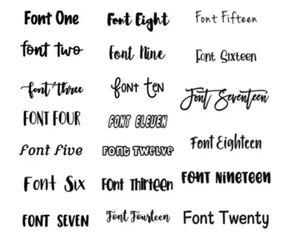
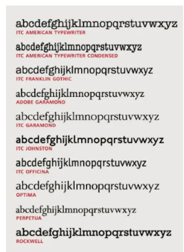
The most basic choice for any content is the font selection. Correctly selected fonts make much difference in website design legibility. Earlier, we did not have much selection amongst the font styles, which left no possibility of choosing the wrong font style. But in this era, we have many choices with the font style selection. So, how to choose the right fonts?
You can choose large, bold fonts to highlight the header. For the rest of the content, the font style should be chosen according to the structure of the content and should remain the same for the rest of the content. For example, if the main header contains five sub-headers, then all those five sub-headers should have a similar font style.
2. Font Size:
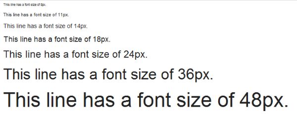
Too large or too small a font size can be scary for a reader who generally skims the content through different screen sizes. Fixed font size designed only for desktop devices may seem too large to fit the mobile phone or tablet screen. Too small font size may be an issue with the old aged person trying to read your content. And too big size may not fit all the screens. Hence, the font size should be optimum, which is easily readable on different screen sizes.
Initially, the font sizes were selected according to the number of pixels. But now the writers and designers use percentages that adjust the font size according to the browser settings of the device.
3. Color Contrast:
After discussing the font style and size, let us look at the color contrast that developers use. The general idea is to maintain a light backdrop with dark-colored fonts that enable the reader to read the content easily without squinting his or her eyes.This is a charactetstic of good website design legibility. The light-colored background against the dark color font employs psychology that the eyes of the reader are compelled to see and read the content in front of them.
But, if the background is bright-colored like indigo blue and the font color is yellow, black, red or green, it drives the reader away because no one wants to look at such color contrast.
4. Line Length:
Line length is the number of words/characters stuffed in one line before the sentence breaks down and drops the content into the next line. A general tradition is to write 50-60 characters per line for great website design legibility. But, if the line length is too big, the reader may get lost while navigating between the sentences of the content and may find it difficult to read the next line correctly.
There are chances that they may have to scroll right and left to read your content which is not very friendly. Hence, the line length should never be too short or too long. And it should be according to all the devices that your target audience uses.
5. Compact Paragraphs:
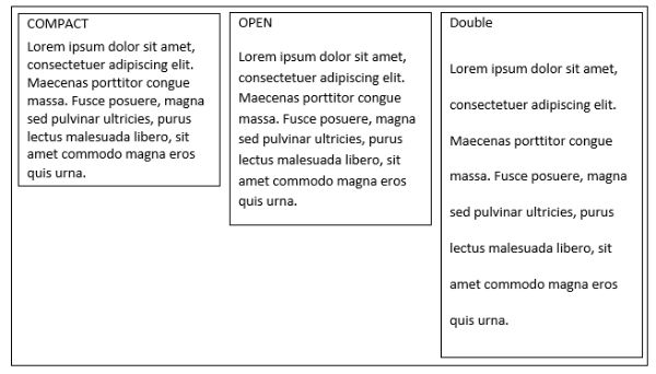
The paragraphs of the content should be short and concise.This allows to improvise the website design legibility. Today’s reader is used to scanning and perusing the content through short paragraphs to find the useful bits and pieces of the information. Longer paragraphs may make the user scroll through the entire content, and the user may leave the page eventually. Hence, a paragraph with 3-4 lines is advisable to use in the content to make it reader-friendly.
6. To-the-point content:

The content should focus on the topic without beating around the bush. Constant blabbering about the topic may make the reader lose interest because the readers are used to scanning the content to find whatever they need. Hence, the content that talks about exact things are generally preferred than the large thousand-words content.
7. Minimizing the jargon:
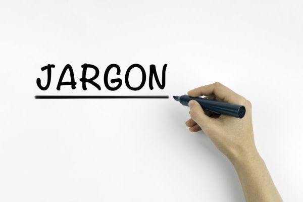
The point of writing the content is to help the reader understand the information you are trying to convey. Heavy technological terms and difficult-to-understand the content language, makes the user feel stupid. Hence, reader-friendly content is the kind of content that helps readers understand the concept that you have thoroughly understood.
8. Formatting and structuring the content:
Correctly formatted text is successful in drawing the reader’s attention at the right places and focus points. Focus points are the points that are important things that the reader needs to read, which envelops the underlying meaning of the content. It helps with website design legibility.
The text should have the correct amount of white spacing that would compel the user to read the content. The text consistency should be maintained at all times. For instance, a bulleted list should have a similar font style and size; the headers should have the same font color, style and size; all the sub-headers should be italicized if the first sub-header is in italics. That helps maintain the flow and the context of the content.
9. Text density:
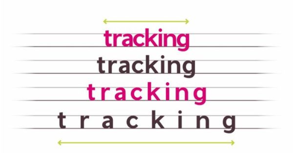
Text density is the number of words arranged in one point of the page area- the more number of words in a specific area, the less readability of the text. The text density is decided upon factors like line-height, font size, character spacing and line spacing. These factors decide the text density and eventually, the appearance of the content. And text density should be maintained throughout the page with the same consistency.
Generally, writers use text highlighting to draw the reader’s attention to a specific point or term. They highlight the text by italicizing them, putting them in a different color, or simply by quoting them under the double-quotes. Not everything but, important words, phrases, or idioms should be highlighted to enhance and draw attention to them.
10. Content Structure:
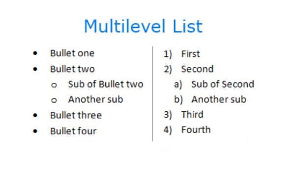
Even if all the above factors are considered, the content is meaningless if it is not well structured or placed in a certain hierarchy. The structured content looks systematic and well readable. Using a graph for showing the statistics, images or pictures to depict certain points, bulleted lists for enlisting important points, makes the content reader-friendly and easy to navigate.
11. Implementation of Graphics:

Web content on any web page requires some kind of graphical representation. Graphics may include static maps, images, videos, audios, icons, and more. But they should be arranged clean and clearly so as to not to interrupt the flow of the content.
Any graphical representation like images, graphs, maps, or videos should be placed into the borders to differentiate the textual content from the graphics systematically. It should be taken care that it is not very heavy sized-graphic, and it does not take much time to load on slow-internet devices.
It should also be taken care of that the image does not bleed out of the boundaries or the screen size. Sometimes, the graphics take so much space that it bleeds out of the visible screen space. This results in the reader having to scroll up and down or sideways.
12. Separators:
The text should be divided into different sections to enhance the readability for the user. It should also differentiate one group of text from another. Hence, the use of separators becomes imperative to structure the content according to different parameters.
The simplest way to divide and structure the content is through lines. Lines can be used vertically or horizontally to divide the text elements and to draw the hierarchy of the content. The line should be simple and subtle.
Another way to separate the text is by using the boxes. Boxes or text boxes can be used to divide the content according to the sections and the subsections of the content. They can be arranged nicely to allow the reader’s eyes to gauge the flow of the content on the page.
13. Margins:
Margin is one of the key elements of the white space domain. Containing text in margins helps the reader draw and maintain focus on the content’s core body within an article.
Margin also helps to differentiate between the content and the rest of the page layout. It should be ensured that the text does not bleed into the layout of the page and the other elements of the page.
14. Typography styling:
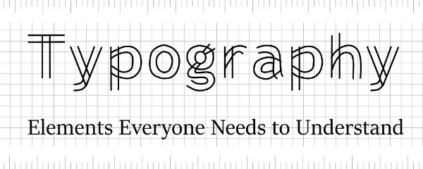
Generally, text against a plain, monochromatic backdrop works the best and has been a tradition for a very long time. But, occasionally, playing around with fancy texts on a fancy background cannot harm as far as the text fonts don’t lose their readability on given screen size. There are so many ways to implement fancy text and experiment with them.
15. Fancy Textual Representation:
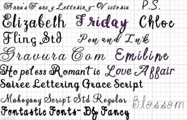
All the content written in the same font style can be a bit monotonous, especially if the article is very long. Hence, adding some different font styles for certain kinds of content can add up the zing in the content making it aesthetically attractive to the reader.
For instance, putting headers in different font styles may add the fun element to the content. We could also differentiate the headers and subheaders according to the selection of the fonts. But, the only condition that comes with using the fancy font style is, to use a font style that doesn’t decrease or eliminate the readability of the content in the article.
16. Using letterpress styling:

Letterpress is used to add depth to certain content on the page. It offers a kind of look to the content where the text in the letterpress looks like it has been embossed. This looks as if the text is pushed in the writing space and has been impressed with it.
It looks clean and helps adjust the flow of the content according to the usage of the letterpress. For instance, to add some quotes from the famous writer, the letterpress can be used to emphasize the importance of the adage as well as to attract the reader’s focus on the adage.
17. Background styling:
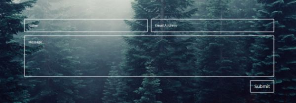
The text readability is enhanced if the background is designed nicely. A good background can make an article look good. It also increases the website design legibility. The background should not be very bright. Otherwise, the reader would have to squint through his mobile screen to read the content.
The background can be plain in some subtle muted colors where the text is readable. It can also be a textured background in muted shades where the focus of the reader is still on the text. The only condition is, the shade of the background and the font color should be decided in such a way that the contrast between the two is maintained.
18. Styling the hyperlinks:
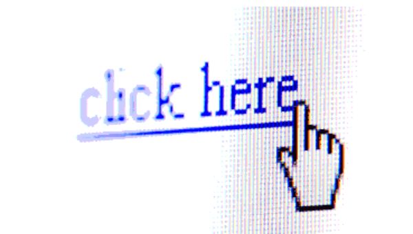
When the articles are too long for a user to read, the links often get washed out in the content of the article. Hence, to make the hyperlinks in the article stand out, they can be styled too. If the hyperlink is in the middle of the content, then it can be put in the bold or can be italicized or underlined.
But if the hyperlink is, for instance, given to a text that is lonely and away from the crowded content, then the hyperlink can be put into the stylized fonts. The color of the hyperlink fonts also can be fixed according to their performance. For example, if the link has not been clicked yet, it should stand out in red fonts. And, if the link has been visited, the link should change its color from red to let’s say purple or dark grey which depicts that the link has been visited once. You can also use a painted background for the links to enhance the readability as well as its aesthetic looks.
After looking at the above points, it is very clear that no matter how nicely written the content is, or how perfectly it is optimized, if it is not readable to the reader, it holds very little value.