Line25 is reader supported. At no cost to you a commission from sponsors may be earned when a purchase is made via links on the site. Learn more
Readability is the priority when you are used to writing long essays and articles for your readers. You are someone who needs to write paragraphs after paragraphs, get deeply involved in the subject matter to do justice to the topic thoroughly. Therefore, you cannot afford to use fonts that are difficult to read, making the reader squint their eyes or feel overwhelmed while scrolling or flipping pages. Hence, you need to make the best of the most legible fonts for books and long texts.
Legible fonts help create a bold visual impact without compromising on the easiness and effortlessness of reading. There are some aspects to look out for a while looking for such legible fonts. Firstly, any legible fonts for books and long texts would have large counters. Counters are the letterforms created inside a few of the letters, like O, A, B and more. The whitespace inside these letters needs to be substantial. Secondly, they should have large lowercase x-heights. Thirdly, for readability purpose, you want to stick to fonts that have subtle serifs as opposed to long or heavier ones.
Moreover, the font must work to blend in and help readers read the content. Don’t use fonts that would outshine the message, as it would have a counter-effective impact. Lastly, the kerning of the fonts should be carefully crafted.
Now that we have a clearer idea as to what we are looking for, let us discuss some of the most legible fonts for books and long texts:
1. Hawking:
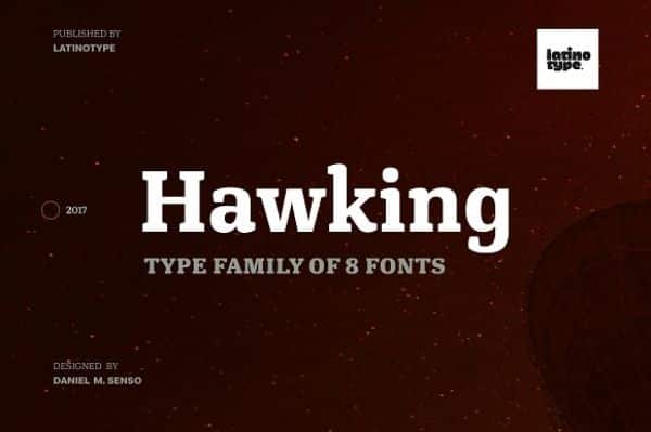
Hawking is one of the most legible fonts that have unique characters. It is a slab typeface that has square-like shaped letters. The overall font looks modern and rational. This font uses larger x-heights with ascenders for lowercase that exceeds over the cap height. This creates a synergy between the letters, which helps the readers connect them to form words.
The name stands true for its purpose; this font was initially created for scientific publications. However, it is open and versatile to be used with any book or long text format such as technical, literary or journalistic content. The font can also be used efficiently for headlines, due to its heavier weights.
2. Vistol Sans Latin Pro:
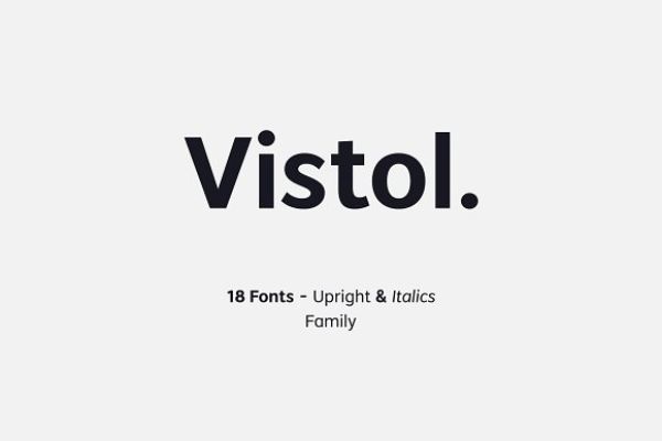
As the name suggests, Vistol Sans Latin Pro is a sans-serif font family. This legible font comes with 18 weight variations. It uses a low-contrast tone on the strokes, which make it ideal for printing, titles, packaging, branding and publishing.
The font also comes with italics variant to help emphasize a certain portion of the text, if needed. This font is so easy to read that it can be used at sizes as small as 6 pts for print and still be read effortlessly.
3. Solitas Serif:
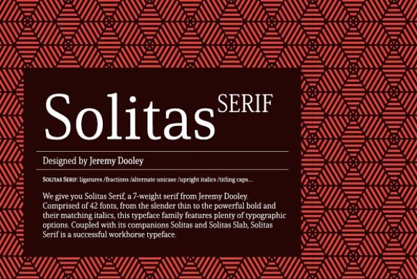
Sans-seif fonts are known to be more comfortable on the eye and for their variations. Serif fonts, on the other hand, are generally very stiff. Solitas Serif is one exception to all the other serif fonts, as it is designed to be more curved and softer serif. This legible font can be used for print, packaging and online content with ease.
There are many useful variations such as regular, extended and condensed. These variations open up more possibilities for the designers to optimize space as per their requirement. This font also comes with intermediate weights for books and long texts. Moreover, it has bold weights as well for creating a noticeable and impactful headline or subheading. The font is easy on the eyes, doesn’t feel imposing and subtle yet graceful.
4. Newslab Family:
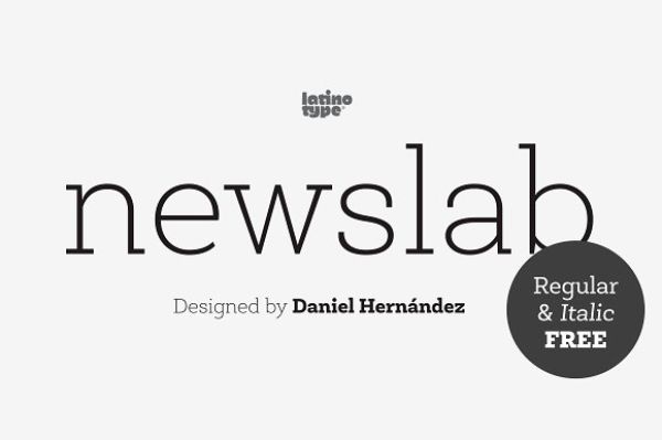
Newslab is a slab serif font made by combining three different typefaces – Roble, Andres and Sanchez. This legible font has a sense of harmony with each element of the typefaces that makes Newslab a subtly imposing font. This font comes with 16 variations, 8 weights and support for italics. It is ideal for logotypes, posters and informal articles as well. The regular and the italics version are available for free.
5. Bebas Neue Pro:
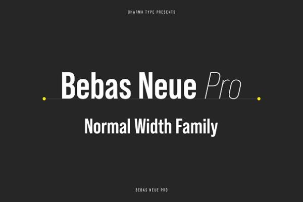
Bebas Neue Pro is a font that family that has an impressive range of styles that are handpicked by various large organizations. They have used it for a variety of projects from corporate documents to packaging and more.
The font also has semi-expanded and expanded versions. The font started as a free font with only uppercase fonts and gained massive popularity. This lead to excessive demand for lowercase characters as well, which they updated in the Bebas Neue Pro version.
6. Sanchez Condensed Family:
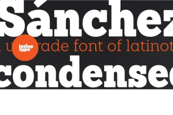
Sanchez Condensed Family is a font family with slab serifs, square-like structures and 12 different variations for enabling the designers to find the perfect weight for their long text projects. It has a strong resemblance to the iconic Rockwell. However, it has rounded edges. This helps balance the square-like structure and gives the font a sense of contrast. This improves the font’s readability and makes it a legible font. The regular and italics version of this font is available for free.
7. Merriweather:
Merriweather is an ideal font for reading content on screens. This makes it particularly a great choice for fonts for eBooks like Kindle and other platforms. The font has condensed letterforms and has very large x-height. The font uses modern shapes; however, it still gives a traditional design sense. This font is easy to read in smaller sizes as well and looks neat and elegant.
8. Pluto Sans:
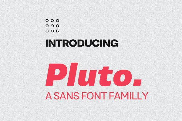
Pluto Sans is a clean sans-serif font family which is based upon the architecture of Pluto. It has a hint of friendly feeling. The font uses geometric shapes and forms alongside large x-height. This makes the font perfect for long text formats and been used in smaller font sizes such as 8 points and on screens as well. The font is ideal for classic branding, logos, clothing, product packaging and video requirements.
9. SmytheSoft Pro:
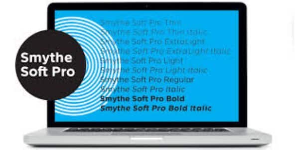
SmytheSoft Pro is a great contemporary sans serif font. It is a great legible font for both print and screen. The font has rounded terminals and has been spaced and kerned optimally. The font family has support for Western, Eastern and Central European as well as Vietnamese characters. Moreover, the font has five italics and roman weights – thin, light, regular, ultralight and bold.
The font has a huge x-height, economical yet comfortable spacing for the capitals and ink traps that makes it suitable for printing conditions. The italic characters also offer calligraphic like italic characters. The font has lighter weights that are slimmed down as compared to the regular and bold weights. This gives the typeface a vertical perspective that allows readers to read with contrast and reduced optical dazzle.
10. Saya Serif FY Family:
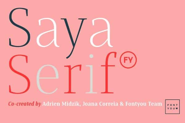
Saya Serif is a lightly condensed and thin font family. This font is legible in all sizes and is ideal for display as well as text. Saya Serif has sharp letterforms, and it has six weights options from thin to black, as well as italics. The font makes use of balanced shapes for small size use and elegant ones for large sizes. The designers can make impressive magazine designs, logotypes and other content related uses.
11. Quincy CF Font Family:
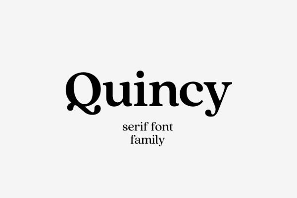
Quincy CF is a serif font that has medium contrast to ease readability. The font comes in five different weights alongside italics. It also has multilingual support for Latin and Cyrillic languages. The characters have tall x-height. The overall design has been rebalanced to give a smoother, flowing and unified look to the overall font appearance.
12. RNS Miles:
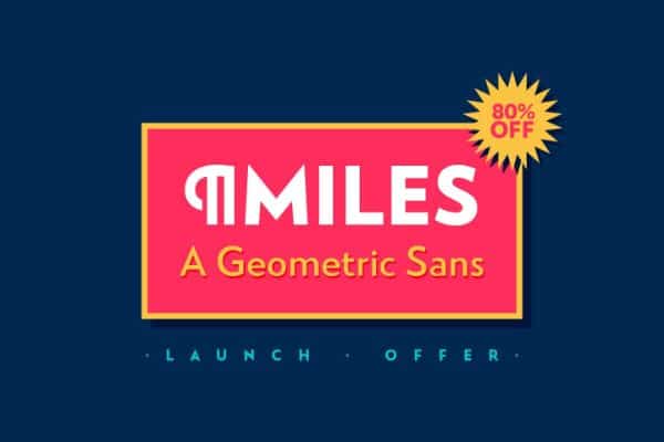
Miles is a geometric san serif font. It is easily readable and is useful for creating headlines and quotations, as well as short text pieces. The font comes with seven weights, symbols, alternate glyphs and also old-style figures. It also has support for external Latin character set. The font design is modern and has a neutral and friendly style.
13. Archille II FY Regular:
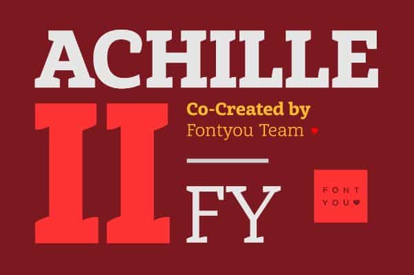
This is a regular slab serif font that has angled and curved characters. The font has solid and well-balanced characters, which makes it legible for small as well as headline sizes. It comes with four different weights, small caps as well as italics.
14. Lato:
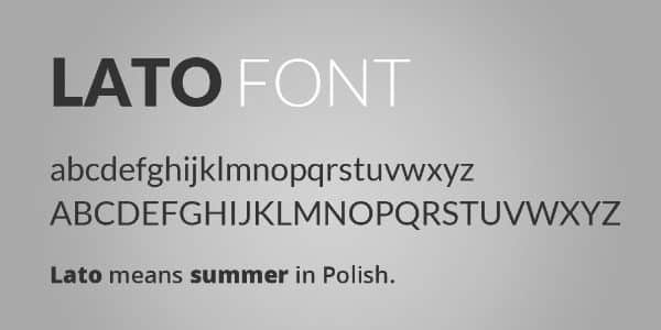
Lato is a san serif font that has over 10 different styles to choose from. It is somewhat similar to Today Sans and Freight Sans. The idea behind Lato was that it should look transparent when used in long texts and body texts. However, it should also display original traits when used as headings or in larger font sizes. The font uses classic proportions to give the letters a sense of harmony and elegance. The font has semi-rounded curves that give the font a warm feeling. Lato has a strong stricture that enhances seriousness and stability to the font. This makes Lato one of the most legible fonts for books and long texts.
15. Tisa:
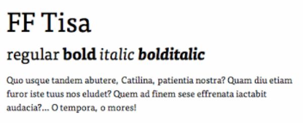
Tisa is a great font that is very popular with the newer generations and graphic designers. The versatile legible font works best on both web and print. It has a large x-height. The letters are well spaced that helps with the legibility at various font sizes. This font is ideal to use on Behance and other design projects. It is an ideal legible font to use.
16. Droid Sans:
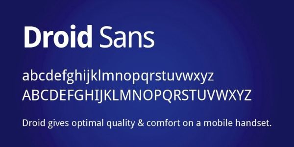
Droid Sans is a legible font for books and extended text. It is designed with a focus on making open forms and neutral looking font that looks friendly as well. The font is optimized for user interfaces. Hence it would be easier to read on mobiles, web browsers and any other display.
17. Minion Pro:
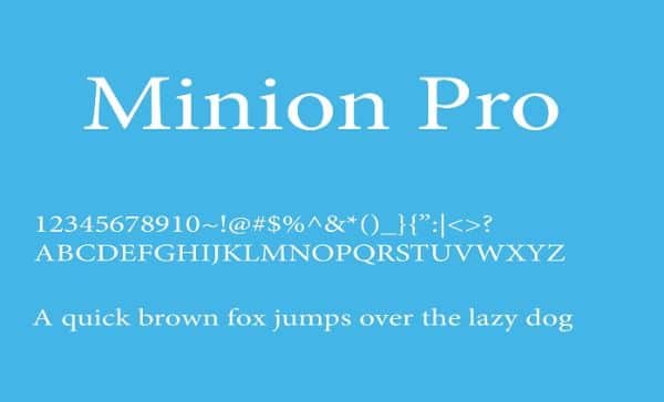
Minion Pro has a classical and old-style typeface from the late Renaissance. It was an era of elegant, highly readable and beautiful design. The font makes the best of functional and aesthetic value which enhances the legibility and gives it versatility. There is much typographic control when it comes to writing content for long text.
18. Ulises:
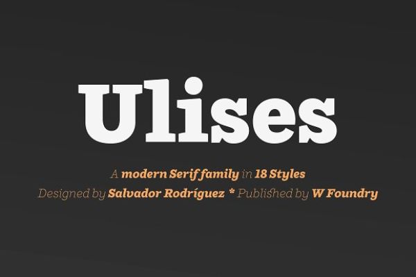
Ulises is a great legible serif font. It has been inspired by Brioni, Skilar and Shift fonts. The font can be used for small texts as well as headlines, as hence it is a very versatile font. It allows the user to use glyphs, superscripts, individual numbers as well as fraction. The font family has 9 weights and a complementary italics variant as well. This font is identified as classic-modern serif that is ideal for web design, graphic design, printed publications and branding too.
These were the 18 most legible fonts for books and long texts. Readability is important for smaller portions of the text as well, but it takes the most priority for long text. Easy readability would ensure that the font remains legible and easy to process for the readers. Any fancy and complicated font would take away the value of the content, as well as feel overwhelming for the readers. This would lead to people barely skimming through the content or discarding it totally and moving to something else. Hence by using legible fonts like the ones mentioned above, you can ensure more active readers. It would also draw them back to your content time and again since they had such a comfortable experience reading your content. It would contribute to the experience, and if the content is well written and articulated, it would have the edge over the competition.
Keep looking for such awesome legible fonts for books and long texts. Keep improving your engagement and readability ratios, and to attract more subscribers or readers.