Line25 is reader supported. At no cost to you a commission from sponsors may be earned when a purchase is made via links on the site. Learn more
Typography is a very vast field and a skillset that takes years to master. With the advent of the Internet and the plenty of resources available for font design, it is nevertheless important to understand the basic principles of good font design. With the proper usage of fonts and implementation of typography, your typography can be elevated to another level – to that of a professional. This knowledge is also beneficial in communicating your brand message and values in an appropriate manner. Having a good working knowledge of typography is also useful in creating better designs from a UI point of view. These fundamental points can also be used as a checklist to refer to for your future assignments.
The Do’s Of Font Design
1. Set a Typography Hierarchy:
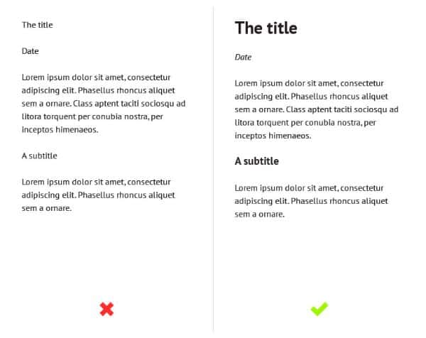
This can be established by using several methods such as color, contrast, size, and weight. It basically gives a structure as well as guides the user or the audience through the design/content. Without establishing a proper hierarchy, it is very much difficult to read, assimilate, and most importantly, to scan through. In this example, on the left side, the text written is of the same weight and size, whereas on the right side, the same content is displayed. However, the one on the right is much more legible and clear, with a clear distinction between the different elements, and has very clear typography.
2. Select Appropriate Font for Body Text:
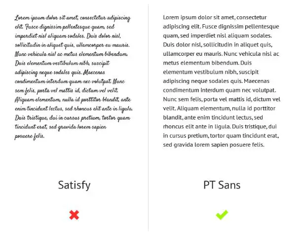
Coming to the legibility part, this is an important point that needs to be focused upon. The text needs to be legible and clear for the users to read and comprehend, above everything. Certain typefaces might suit a design, particularly; however, it is essential to assess the kind of impact this typeface would have. For example, typeface like Satisfy can be tempting to use. However, the images given below are a testament to the fact that the font is much harder to read and is definitely not as legible as the one on the right.
3. Give Some Room to Your Text:
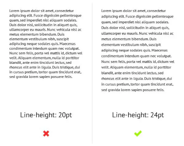
White space is an element that is often considered underrated and neglected too. However, it is of prime importance in the design segment. Lack of white space can severely affect readability. It can be tough to track from one line to the next one. This is a problem that can be solved easily by simply increasing the line-height. However, be careful not to overdo it- too much of white space can also create a negative impact.
4. Ensure contrast:
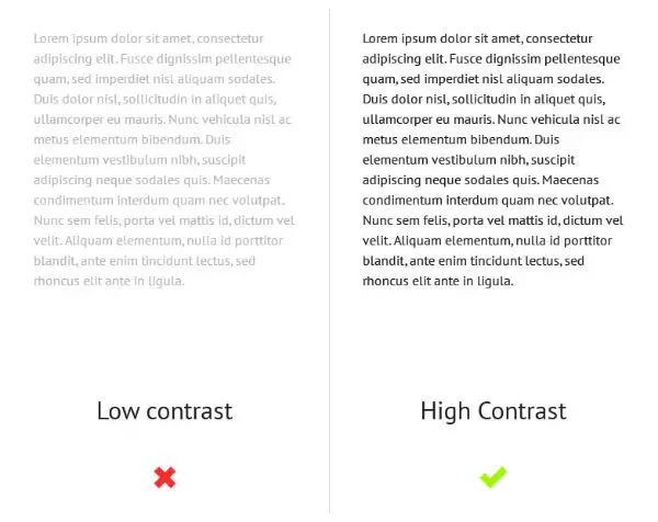
This goes for all the elements involved. Use the color scheme generators available to help you with finding colors that work the best together. There also has to be a clear difference between the background and the text. If not done properly, your content will be absolutely illegible. It is always wise to pair up different weights and colors – light and dark. Apart from this, there has to be a contrast between the fonts too, as if they are too similar, then there can be confusion.
5. Separate the Text Boxes:
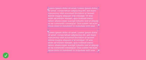
This is very important, especially while writing text, which contains smaller lines. It can be extremely tempting to create a big box- spacing out the lines by using the ‘enter’ key function to create an illusion of separate lines. However, this is certainly not a great way of separating the lines. Creating separate boxes is surely recommended as it provides a great level of flexibility when it comes to moving around.
6. Opt for Paragraph & Character Styling:
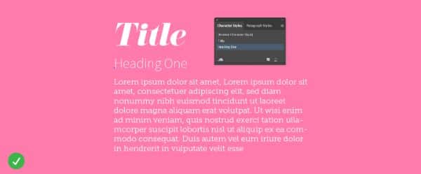
Changing the look and feel of the different text boxes can only be possible, that too very easily if there are character and paragraph styles applied. This is beneficial in cases where the amount of text on the canvas is significantly greater. Styling the character and paragraph allows you to apply pre-defined font styles automatically, with just a click. There is absolutely no need to change the font styles of each and every box manually whenever you change the styling.
7. Title Text Tracking:
![]()
Tracking is basically the spacing between the letters of the text. One might wonder how this is of importance here. However, it adds a lot of character to your text. Again, it is not something that can be used every time. However, if and when used in an appropriate manner, it can elevate your design skills surely. For example- increasing the tracking in the title or header images is a great way to create a bigger impact and/or attract attention in a very much subtle manner.
8. Give Enough Padding to Text:

The text, which goes from one edge to another, is very much cramped up. It also appears very tight and feels suffocating too. This can be resolved by keeping in mind to add enough spacing around four sides of the text block. By doing this, your text will be aesthetically pleasing and easy to read- since the spacing gives the text some breathing space. Be it graphics, newsletters, or websites, all of them must have appropriate padding on all four corners of the text block.
9. Familiarize with the Difference between Typeface and Fonts:
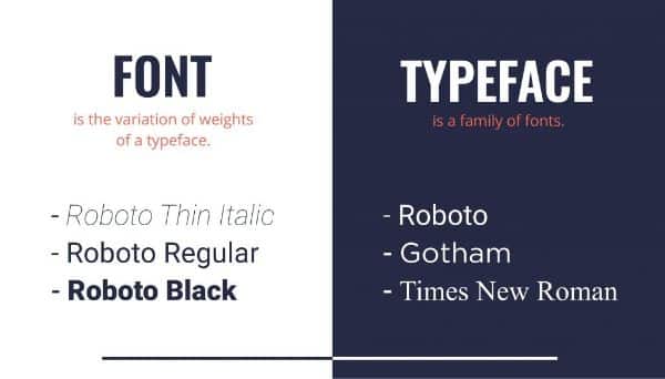
These two terms are more often than not, used interchangeably. It is always good to learn the difference between them both and be able to distinguish them. This can be of immense help in the long term. To explain simply, typeface are designs, and the font is the representation. A font is basically a variation of type in the style and sizes- like bold or italic.
10. Smart Guides:
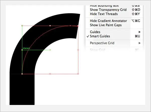
This is important to consider while working with grids. It is difficult to align without using the smart guides and margins. The latest software we have today are well-equipped with these smart guides, and help you avoid making alignment errors.
11. Combining Serifs with Sans Serifs:
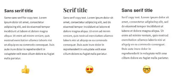
The main heading of the project can be written in a bold sans-serif. You can also use the serif font with the body copy- it is a wise move. This will help you in creating the required contrast, which will highlight the difference between the two sections in your project. However, avoid mixing up two serifs or two sans-serifs.
12. Kerning, Tracking, and Leading:
![]()
These three concepts are an integral part of typography, and understanding them is very crucial. Kerning refers to the space between the two letters in a single word. Leading, which is also known as ‘line height,’ denotes the space between the lines of the text. Finally, tracking is the spacing between the letters of your text. These three work together well, but you can always check different spaces to ensure the best readability.
13. Understand typeface usage:
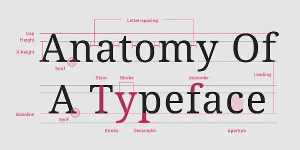
There are plenty of amazing typefaces available for your use- be it for a website or a billboard. Apart from these, there are free fonts available too for personal use. However, consider the license before using, even if the typeface was free for downloading. Whenever you download a typeface, always keep the license for future references. Similar rules are also applicable for the ones you have purchased. You need to ensure that whatever typeface you choose to use has a license. Check this to know whether you are allowed to use this in a project.
14. Research:

This goes without saying it clearly. Design is something that keeps on evolving and changing. It is hard but absolutely necessary to keep up with the trends and techniques. Typography was not that common earlier but now is used everywhere possible. Keep yourself updated with the latest trends, and try to incorporate the new along with the old techniques in your work- but consider the mood and tone of the project.
The Dont’s of Font Design
1. Smaller Text Sizes:
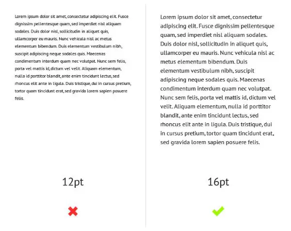
This is much more prevalent than we could possibly believe. This is much more common on blogs, magazines, and such platforms where readability is of utmost importance. It happens when the emphasis is more on the aesthetic appeal rather than the User Experience and readability of the content. However, User Experience is now taken into consideration significantly, especially in terms of design. This is something that needs to be in check.
2. Making Continuous Use of Uppercase:
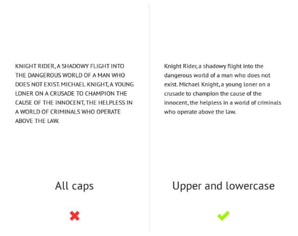
The audience is not habituated to reading the text in all caps, especially when there is a large chunk of it. It becomes actually difficult to read and comprehend sometimes. Apart from this, the uppercase is usually associated with aggression and shouting. It can also appear to be spammy, especially when used in marketing copies. Ensure that usage of uppercase is in moderation.
3. Using Multiple Fonts:
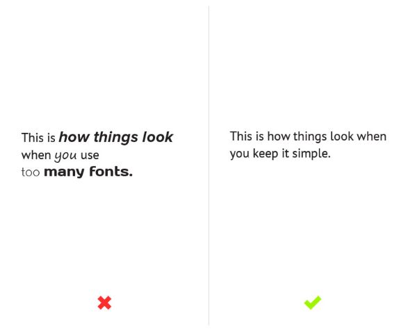
Generally, one can use three types of complementary fonts- for Title, Header, and Body Text. Using different fonts for these three is not a problem usually. However, you can also use two fonts for increasing readability. With access to Google Fonts and Typekit, it is tempting to experiment. Using more than three fonts, in any case, is a big overkill and is very distracting too.
4. Using Centered Texts in Large Amounts:
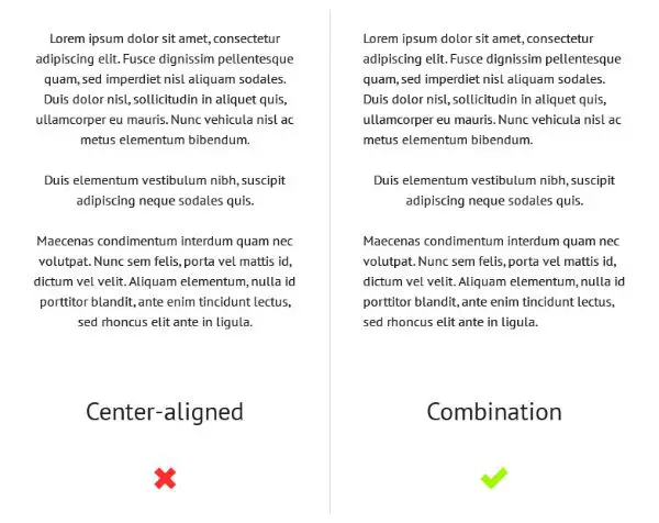
Edges of the text block are uneven in a centered text. Hence, this makes it difficult to read. It is also harder to scan through, as each and every line has a different starting point. Centered text blocks are tough to align as well with other objects and are also considered a bit amateur. Just like the usage of uppercase and fonts, this too must be used in moderation.
5. Stretching the Type:

This is an absolute no-go. Never stretch your type. This is equivalent to deviating from a font-intended design. It also distorts your type entirely, which is not at all functional and appealing.
6. Long Lines & Paragraphs:
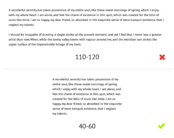
When the line is too long, the readers can begin to lose attention and can have readability problems. Readers can also have trouble distinguishing and even following one line from another. In the other scenario, shorter lines can also distract them and disrupt their flow. The optimal length of the lines for the body is essential to consider- which, ideally, is 40-60 characters for one line.
7. Tight Spacing:

Two lines of the text touching is a common mistake- which can feel a bit redundant and unnecessary. However, by indulging in this, you are just going to bend (or even break) plenty of design rules and fundamentals. Another term for this is ‘leading.’ By having tight spacing, your text is too difficult to read and comprehend. Consider working on this for an enhanced aesthetic appeal.
8. Drop Shadows:
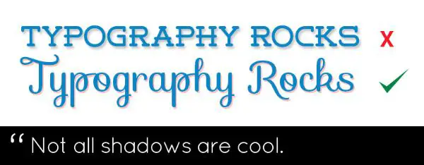
Drop Shadows are absolutely obsolete now. Think again before you make the mistake of adding the drop shadow to your impactful work. By using these, there is a greater chance of your design going from professional to DIY/cheap. Also, drop shadows make your text harder to read, which defeats the entire purpose. The idea is to make text easy to read and drop shadows just don’t comply with it.
9. Dependent on Photoshop Effects:
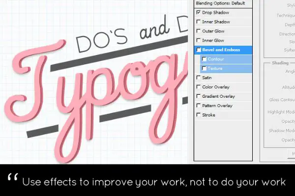
Some designers rely on Adobe Illustrator or Photoshop blending options to do the work for them. However, this is where you can distinguish between good and bad typography. These effects must be used to improve and enhance the work, instead of the other way around. Use these wisely and sparingly. When you use effects, ensure that you play around with the different options and keep on modifying until you reach the desired point.
10. Overdo The Design:
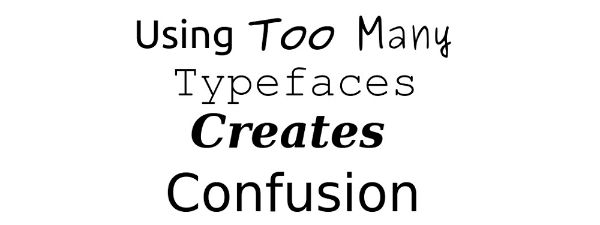
It is absolutely fine to be excited and experimental, especially with the endless freebies coming up every now and then. Avoid using all the tools at once. Playing around and experimenting can be fun and also be great learning. However, it is extremely important to be mindful of the tone and mood of the work. This will help you in knowing the direction and also prevent you from overdoing it.
