Line25 is reader supported. At no cost to you a commission from sponsors may be earned when a purchase is made via links on the site. Learn more
Brand recognition is mainly aided with logos, which the audience often fails to realize. Whenever there is a conversation about brands, aside from the brand name, it is the logo that comes to mind first. Visuals leave a strong impact, and furthermore, influence how the brand is perceived, based upon the principles of psychology. An effective logo is the perfect combination of elements that include colors, shapes, font type, font size, text, and graphics. From all elements of a logo design, the element of shape is the strongest, as it is an important determiner of the entire design. According to the Journal of Consumer Research, the most basic yet the most important element of the logo, its shape, is helpful in influencing how the perception of the audience is built. Several organizations continue to be dismissive of the fact that shapes truly are an integral part of the logo. Like the typeface and color, shapes are capable of being symbolic of the emotions and ideas. It is through the logo and, in turn, the shape, that a brand is able to portray the values, products, and services it offers. It is a popular conception that designing a logo can be a highly artistic affair. However, it is important to note that it requires a thorough understanding of logo design and the product in order to facilitate the brand recognition and recall value
There are mainly three types of categories into which the logo shapes can be classified: Geometrical, Abstract, and Organic. Geometric Shapes resonate with people strongly whenever they come across the term ‘shapes.’ Shapes such as squares, rectangles, circles, triangles, and so on represent the feeling of similarity and symmetry. Logos based on these shapes tend to be visually satisfying. Designing logos based on Abstract Shapes can be complicated, especially when it comes to structuring. Some of these shapes can be easily recognized, but some of them do need to be deciphered. Organic or Natural shapes can generally be in an irregular format. However, one can easily decipher and recognize these shapes. This is why they can be ‘soothing’ and visually appealing in nature. The importance of the various shapes in logo design is as follows:
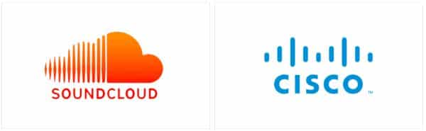
1. Circles:
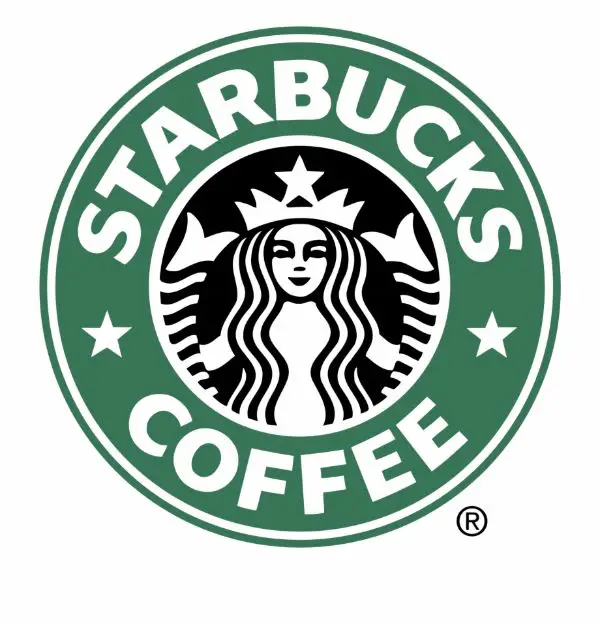
Circles are the most common shape found in the logo design. They are used widely all across the world- as a matter of fact; this shape is used in 20% of world’s popular brands. Circles, ovals, ellipsis, and spheres mainly represent a cyclical process. They also invoke a sense of ‘completeness.’ The shape is quite graceful and is often viewed to be feminine in nature as they have a soft curvature. The logos involving the use of circles generate a sense of warmth, energy, power, and harmony. Since there are no sharp edges or breaks in the shape, the logos based on the circular shape tend to make your business appear much more reliable. Apart from this, since the circles are softer than the sharp-edged triangles and squares, they are much more welcoming to the eyes. There is also a sense of optimism connected, related to community, friendship, and unity. Concentric rings are often associated with the concept of marriage; hence they tend to communicate a significant sense of bonding when used in logo design.
2. Squares & Rectangles:
Due to the edges, the shapes such as squares and rectangles are preferred if the purpose is to invoke a trust factor, especially when the sector is related to safety and strength. This shape is also popular and widely used in the logo design. These shapes are used mainly to convey the ideas of balance, proportion, and even professionalism. It is a good way to ideate the brand story in a safer manner. As these shapes are widely associated with the subject, Mathematics, using squares and rectangles, do usually connect with the feelings of order and rationality. However, the nature of this logo tends to be a bit basic- hence, there is always a risk associated with using these shapes. They can become outdated, boring, despite being strong and solid. While using these shapes, it is very much essential to combine both the ideologies- color psychology and shape psychology, in order to communicate the brand diversity and the USPs, as well as engage the attention of the audience.
3. Triangles:
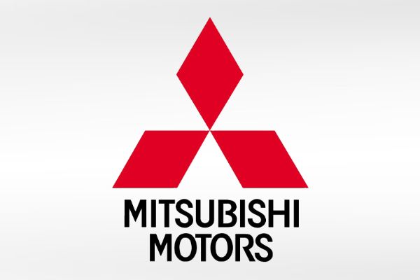
Triangle is a less popular shape. However, if presented properly, it can be very appealing and can also create the desired effect. It is masculine in nature and has strong edges. When utilized in an optimum manner, triangles can be very dynamic and powerful. Due to the structure, the shape also inspires the sense of hierarchy as well as a continuous motion. The major drawback of utilizing this shape for logo design is that it can appear stable and unstable- considering the fact that it is rested on a base or not. If portrayed as stable, they carry a lot of energy and power, but if not rested properly on a base, they can also portray the emotion of conflict. Apart from this, triangles also exude a certain amount of energy, due to the edges pushing ‘away’ at the three different corners. When compared to the squares and rectangles, they are much different for logo design- however, triangles are very significant in portraying innovation for the brand. This shape is also often related to the concept of spirituality. Hence, it is wise to note that triangles pointed downwards or left are perceived negatively.
4. Organic Shapes/Spirals:
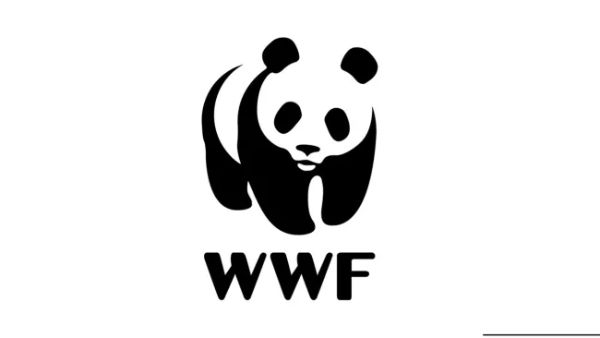
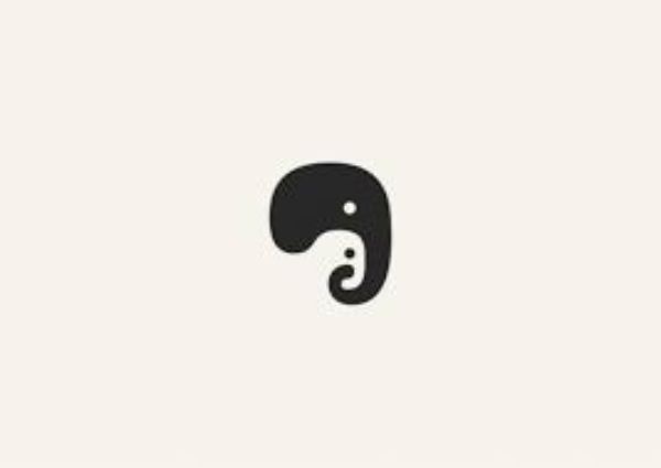
Organic shapes are softer and hence, tend to be less intimidating and harsher than the shapes with sharper edges. Logo designs created using these shapes are much more inviting and elicit a better response too from the audience. Organic and spiral shapes are unique in nature, as they are vastly different from the basic and usual frames such as circles, triangles, squares, and rectangles. The popular argument and conception state that spirals can be included as a type of a circle- however, the effect is otherwise. They are less than the ordinary, but they have a hypnotic and a centralizing effect when portrayed aptly. This is very much essential for engaging your audience for better brand recognition and recall value. Spirals are very natural in nature- they are generally observed in the growth pattern, and hence, they generate the ideas of expansion, growth, transformation, fertility, and so on. Spirals are widely used in the Medical Industry due to these reasons, as well as due to the fact that the shape is synonymous to the DNA structure. Organic shapes are widely perceived and even used as the natural shapes of nature. In this context, spirals can certainly be considered as an organic shape. These shapes, when used as elements in the logo, are warm and comforting in nature, which cannot be replicated with the sharp-edged geometrical shapes.
5. Lines:
Often overlooked by the brands, lines, or linear design is definitely worth considering while designing the logo. The inclusion of the formation created with lines is a good way to have a profound effect on the perception of the audience. Vertical lines have a subconscious association with the virtue of sophistication and strength, and also makes the logos look a bit slimmer. They are also powerful and captivating, which works best for quicker brand recognition and recall. They make the audience focus downwards- towards the brand name. Just like the squares and rectangles, they too convey a keen sense of professionalism, along with expressing the idea of motion. The horizontal lines have quite the opposite effect, as they tend to bring calm and tranquility. These lines have a drastically different effect as compared to the vertical lines. Using horizontal lines in logo design can surely make the audience feel settled and protected. However, it is important to know the brand thoroughly before choosing between the types of lines for the logo.
While the understanding of the logo shapes can be clear, it is always essential to keep in consideration the color psychology and several other factors before zeroing in on the logo design. It is important that the finalized design conveys the exact message, values, and attributes which the brand wants to. Keen understanding of the audience persona and the brand is a very integral part of the logo design process. Here are a few tips to help you out with the process, using psychology.
1. Choosing the Shape Wisely:
As understood in great detail, the shape you choose for logo design will ultimately decide the further course. Each and every shape is associated with emotions, and they invoke a certain set of emotions amongst the audience when viewed. In order to get the right message and feeling across, choose the appropriate shape for your design.
2. Combining Shape & Color:
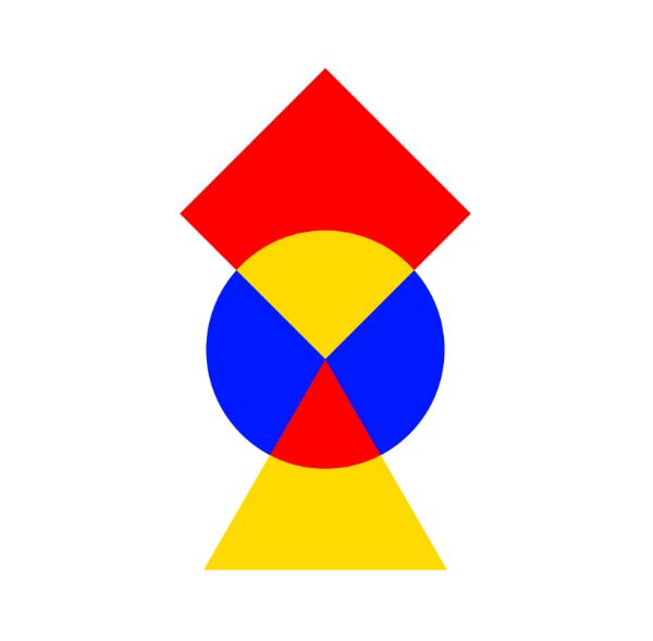
Shapes do convey emotions and feelings, but when combined with the right set of colors, they act as additional support for the image that you want to portray. Colors, too, elicit a specific response and generate a series of emotions. It is best to leverage this and create a design that leaves a lasting impression. For example, pairing red with squares and blue with circles is a great idea, as they go along together.
3. Identifying & Choosing Industry Relevant Shapes:
Choosing the logo shapes according to the industry is very beneficial. Circles are indicative of warmth and inclusion- hence, they are widely used and preferred for service sector industries, such as charities, childcare, education, etc. Compared to this, squares and rectangles indicate a trust factor, which is very much essential for the industries which are more conservative, such as insurance, banking, finance, and so on. Hence the usage of these two shapes is preferred for these industries.
4. Negative Spaces:
While designing the best logo for the brand, it is also necessary to review the negative spaces remaining and the shape it forms. It can be a good opportunity for the brand to utilize the negative space for adding weight to the logo. Case in point- FedEx. This example is cited often to portray how negative spacing can be used to the best of abilities, which would complement the logo design in itself.
5. Typography:
![]()
Choosing the perfect typeface can be a task. It is important to remember that the elements which create a logo must be in the perfect sync, and this definitely includes the typeface and font. They, too, have their own shapes, and this must supplement the primary shape of the logo. Diagonal and angular typefaces can sometimes be loud but are dynamic in nature. Similarly, soft letters are preferred by the companies who choose to give a fresh look and add a fun element to their business.
6. Combination of Shapes:
Brands are in the constant struggle of standing apart from the crowd, especially using the logos. As a result, the temptation to use several shapes and make the design unique is much greater. It is significant that the finished product is not cluttered, and the core values and ideals of the brand are portrayed, which will help the brand achieve what they aspire to. It is always wiser to be simple- yes, comparing and even creating several combinations of typography, shapes, and colors is fine, but the execution must not be overworked. If you want to test the simplicity of the design, you can try this method. Keep on subtracting the elements until you have reached the point where you feel that the design is conveying the same message using the basic image. This will help you achieve a minimal and effective logo design.
The shapes that you incorporate into your logo design will form an intrinsic and inseparable part of the logo design. Once you have developed a better and a keen understanding of how the shapes work and the entire psychology behind it, you will be able to use this knowledge of consumer behaviorism and create an impactful brand. With a powerful logo, you can capture the attention, loyalty, and recognition of the audience, as they would resonate and identify with it.
Logos are the face of the brand as well as the company. Creating the perfect logo is never an easy job. It requires a lot of brainstorming, multiple reworks, and revisions, and sometimes you may even need to go back to the drawing board again and start over. However, the efforts you put in will ultimately lead to an enhanced understanding of the brand for the audience.