Line25 is reader supported. At no cost to you a commission from sponsors may be earned when a purchase is made via links on the site. Learn more
Did you notice that gradients are making a sneaky comeback in web design? We started to see more and more gradients being used in website designs, and some of them look pretty amazing!
The gradients we see today are much more subtle than those used in the era of web 2.0 or after. They are combined with flat elements, beautiful vector illustrations, applied on photographs, and more!
Gradients are a great way to add color, depth and subtle eye-catching effects to a website design. You can use the same color in different shades or different color combinations, in order to create a nice gradient. Also, you can opt for either a linear or a radial type of gradient.
The website designs we selected below will prove that gradients are beautiful and if used properly, they can enhance your website’s overall appearance.
Let yourself be inspired by the 20 beautiful examples we selected below and learn how to use gradients in web design, by analyzing them and applying the techniques in your own designs.
Lewis Lopez
NYC Pride
Just Actions
This website uses a more subtle gradient effect. They add a light pink gradient filter over some images, in order to make the pop out.
Pleid
This website’s background photo has a natural blue gradient which gives the whole website a calm and professional atmosphere.
Snipcart
This is another subtle example of using gradients in web design. This design uses a grey gradient as background. It looks a lot more better than using flat colors.
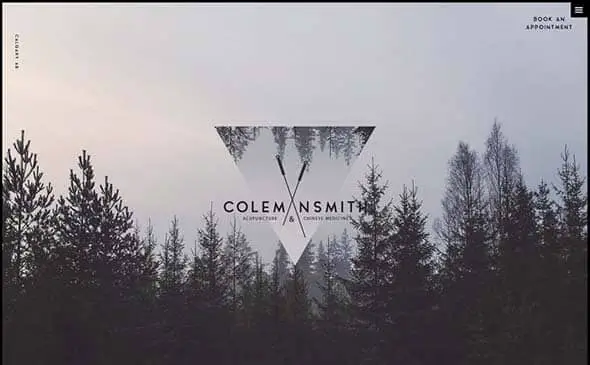
Coleman Smith
Some photographs have natural gradients, which makes them perfect to be used as website backgrounds or on large website sliders. This is one great example.
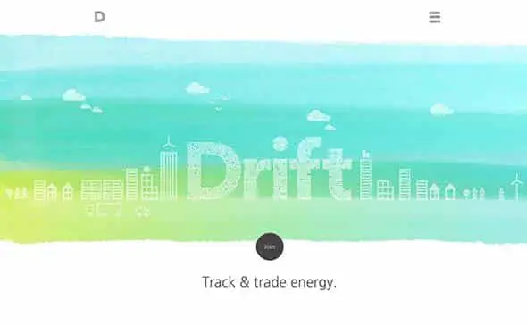
Join Drift
Gradients and watercolor are two effects which combined together will definitely make your website design stand out! The gradient adds a unique touch to the website’s design.
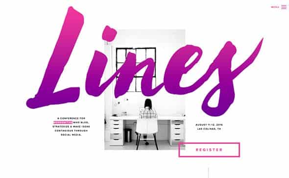
Lines Conference
This design uses gradients in a different way. The designer colored the text with a gradient. It’s pretty unique and looks cool. It is a creative way to style your text.
Symodd
Premise Health
This website uses a gradient in the homepage slider area. The designer opted for overlaying the blue gradient over a photo. The gradient here isn’t too harsh and looks pleasant to the eyes, making the CTA stand out.
CoLofts
Why making a completely de-saturated background, when you can opt for applying a grey gradient to it and make it look so much better! Here’s a great example!
Leen Heyne
Combine geometry with gradients and the result will be an amazing, subtle 3D effect. These gradients have good contrast making them pretty pleasing to look at!
Designer Trek
This is another photograph background with a natural gradient of a sky. Choosing a photo like this as a background, creates an almost magical atmosphere.
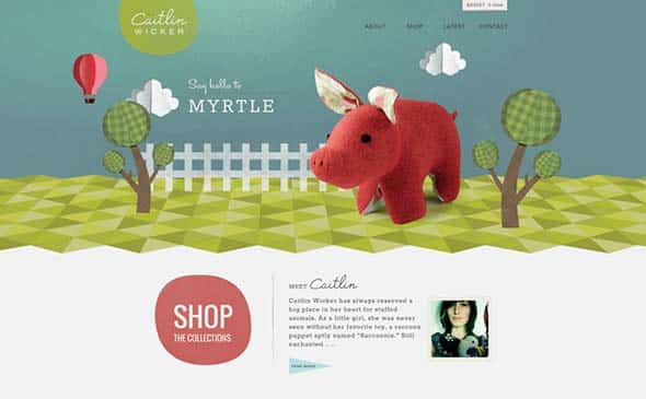
Caitlin Wicker
Gradients can be successfully combined with illustrations, both in 3D and 2D. Check out this awesome combination of styles.
MC3 Design
This is such a beautiful gradient. This design uses a contrasting gradient with a cooler and warmer shade. It looks dramatic and creates a nice atmosphere.
Names for Change
Gradients and polygon backgrounds look great together! In this case, two gradient techniques were used: adding a gradient filter on photos and using gradient polygon backgrounds.
Tubatomic
This subtle, purple-red gradient looks visually pleasing and works pretty well for this type of website.
Lighthouse Brewing Company
This is another example of how vector illustrations can be combine successfully with gradients. Doesn’t it look amazing?!
Echo
This gradient is very light and looks even a bit washed out. The color choice creates a friendly vibe for the site and also makes the white text stand out.
Impossible Bureau
Gradients and illustrations look great together. Here is another successful example f how to use them together and create an amaing website.

