Line25 is reader supported. At no cost to you a commission from sponsors may be earned when a purchase is made via links on the site. Learn more
Last week I posted part one of this tutorial series covering the process of creating a typography based blog design in HTML5 and CSS3. We finished off the Photoshop concept with the design based on a strict grid and text laid out in our desired typeface. Now let’s replicate the design in a static HTML5 and CSS3 prototype before finishing it all off as a fully working WordPress theme.
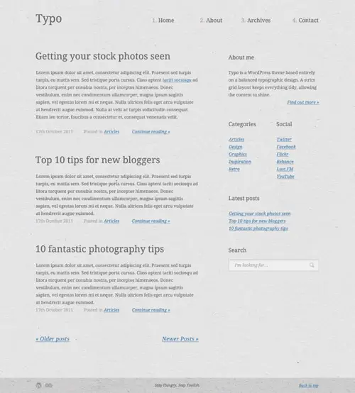
Head back to last week’s tutorial post if you want to follow the step by step process of building this design in Photoshop. The WordPress theme we’re creating is called Typo. It’s a design that’s entirely based on typography to allow the content to shine. To allow the design to work without the use of any graphical interface elements it is based on a strict grid to balance the design and tie everything together.
Preparing the concept
With this design being pretty minimal and largely typography based there’s not much in the way of background image files that need exporting. The only files we’ll need to save are the background texture file and a couple of icons. However, to make life easier while coding up the design we can also export copies of the columns and grid lines so we can quickly align our elements.
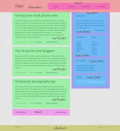
This particular layout will be built with HTML5 elements, so it’s important to take a moment to familiarise yourself with the elements and check whether they fit into the layout semantically.
The HTML5 Structure
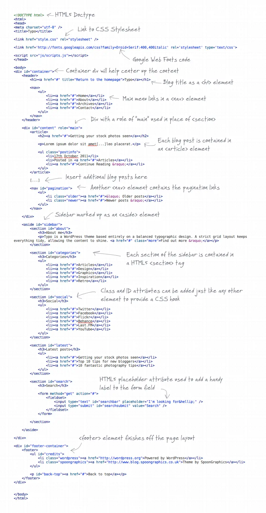
<!DOCTYPE html>
<html>
<head>
<meta charset="utf-8" />
<title>Typo</title>

<link href="style.css" rel="stylesheet" />

<link href='https://fonts.googleapis.com/css?family=Droid+Serif:400,400italic' rel='stylesheet' type='text/css'>

<script src="js/scripts.js"></script>
</head>

<body>
<div id="container">
The static HTML file begins with a HTML5 Doctype and the usual content for the <head> section of the document, including the page title and link to the CSS stylesheet. Our design is using a somewhat unusual font courtesy of Google’s Web Fonts library, so the relevant code is also added. It’s important not to just straight swap your <div> tags for <section> tags when coding in HTML5, sometimes a <div> is still the most semantic choice, like when adding a wrapper or container div to your code.
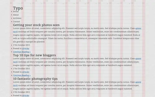
<header>
	<h1><a href="#" title="Return to the homepage">Typo</a></h1>

	<nav>
		<ul>
			<li><a href="#">Home</a></li>
			<li><a href="#">About</a></li>
			<li><a href="#">Archives</a></li>
			<li><a href="#">Contact</a></li>
		</ul>
	</nav>
</header>
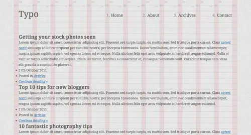
One new HTML5 element we can make use of in place on a standard div is the <header> element, which can also contain a <nav> element to wrap our main navigation menu. The h1 is marked up as the blog title, with a handy anchor title describing where the link goes. If you remember in our concept we numbered the menu items, an obvious option would be to use an <ol> element, but semantically this isn’t correct because there’s no consecutive relationship between our menu links, the number is just for visual flair so we’ll add them later with CSS.
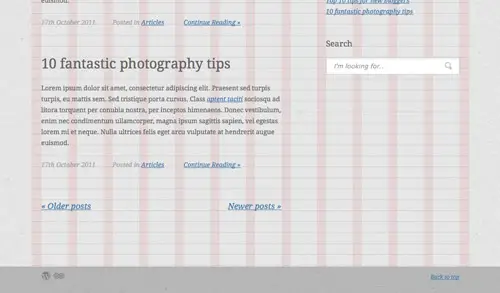
<div id="content" role="main"> <article> <h2><a href="#">Getting your stock photos seen</a></h2> <p>Lorem ipsum dolor sit amet[...]leo placerat.</p> <ul class="postinfo"> <li>17th October 2011</li> <li>Posted in <a href="#">Articles</a></li> <li><a href="#">Continue Reading »</a></li> </ul> </article>
I originally used a <section> element to contain my page content, but after some reading it turned out this wasn’t 100% semantic. The preferred method would be to use a plain old <div>, but the addition of the ARIA role attribute of ‘content’ ‘main’ (I mixed up the role and ID in the writeup!) gives a little extra meaning to the tag. Inside the content area each blog post can be contained in its own <article> tags with the usual HTML elements mocking up the dummy content.
<nav id="pagination"> <ul> <li class="older"><a href="#">« Older posts</a></li> <li class="newer"><a href="#">Newer posts »</a></li> </ul> </nav> </div>
Underneath the series of blog posts is a couple of pagination links. Usually pagination links wouldn’t qualify as being important enough for the <nav> element (which can be used in multiple places, not just for the main menu), but for a blog layout I see pagination links as one of the primary navigation elements to access further content.
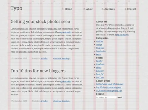
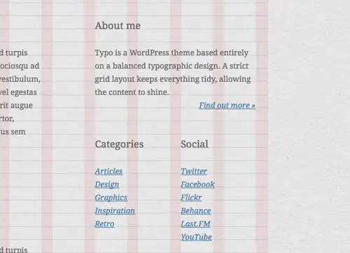
<aside id="sidebar"> <section id="about"> <h3>About me</h3> <p>Typo is a WordPress theme based entirely on a balanced typographic design. A strict grid layout keeps everything tidy, allowing the content to shine. <a href="#" class="more">Find out more »</a></p> </section> <section id="categories"> <h3>Categories</h3> <ul> <li><a href="#">Articles</a></li> <li><a href="#">Design</a></li> <li><a href="#">Graphics</a></li> <li><a href="#">Inspiration</a></li> <li><a href="#">Retro</a></li> </ul> </section>
Until the <aside> spec was revised it didn’t have a semantic use as a sidebar, but it can now be safely used without the semantic police knocking at your door. The sidebar in this design contains a number of various sections, which lend themselves well to being marked up with <section> tags over plain old divs.
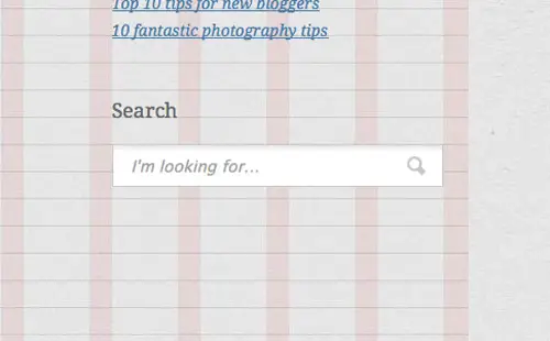
<section id="search"> <h3>Search</h3> <form method="get" action="#"> <fieldset> <input type="text" id="searchbar" placeholder="I'm looking for…" /> <input type="submit" id="searchsubmit" value="Search" /> </fieldset> </form> </section> </aside>
At the bottom of the sidebar is a simple search bar, which allows us to touch on some of the handy new form related features in HTML5. The one feature we can make use of is the placeholder attribute, which allows us to enter a passage of text to create the popular in-field label effect.
</div>

<div id="footer-container">
	<footer>
		<ul id="credits">
			<li class="wordpress"><a href="https://wordpress.org">Powered by WordPress</a></li>
			<li class="spoongraphics"><a href="https://blog.spoongraphics.co.uk">Theme by SpoonGraphics</a></li>
		</ul>

		<p id="back-top"><a href="#">Back to top</a></p>
	</footer>
</div>
The layout is then finished off with the footer area, which in the case of this design needs to be outside of the main container area to allow it to span across the whole page. The footer area itself fits well as a <footer> element and contains a couple of handy links.
The full HTML layout
View the full annotated HTML5 code
The CSS Styling
With the HTML structure in place the document can now be styled to match the Photoshop design concept.
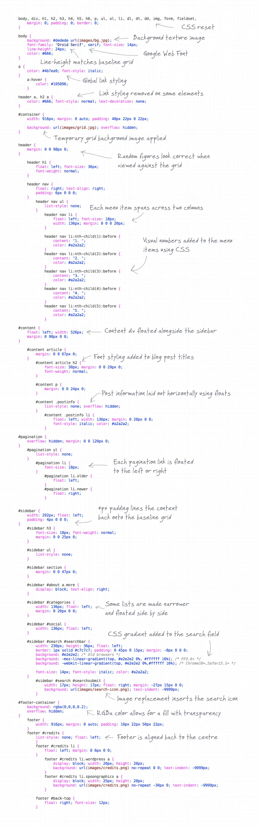
body, div, h1, h2, h3, h4, h5, h6, p, ul, ol, li, dl, dt, dd, img, form, fieldset, input, textarea, blockquote {
	margin: 0; padding: 0; border: 0;
}

body {
	background: #dedede url(images/bg.jpg);
	font-family: 'Droid Serif', serif; font-size: 14px;
	line-height: 24px;
	color: #666;
}

a {
	color: #4b7ea9; font-style: italic;
}
	a:hover {
		color: #105896;
	}

header a, h2 a {
	color: #666; font-style: normal; text-decoration: none;
}

#container {
	width: 916px; margin: 0 auto; padding: 48px 22px 0 22px;

	background: url(images/grid.jpg); overflow: hidden;
}
The CSS file begins with a simple reset, then the global styling is added to the body. The Google Web Fonts code has already been added to the HTML, so our desired font can be called directly in the CSS. The subtle texture background is added and the body text styling set to 14px #666 with a 24px line-height to match the baseline grid. Global link styling is set up, but is removed from links in the header and blog post H2 titles to match the concept. The container div is then centred up and a temporary grid image added as a background to make it easy to line up page elements according to the original grid based design.
header {
	margin: 0 0 98px 0;
}

	header h1 {
		float: left; font-size: 36px;
		font-weight: normal;
	}

	header nav {
		float: right; text-align: right;
		padding: 6px 0 0 0;
	}
		header nav ul {
			list-style: none;
		}
			header nav li {
				float: left; font-size: 18px;
				width: 136px; margin: 0 0 0 20px;
			}

			header nav li:nth-child(1):before {
				content: "1. ";
				color: #a2a2a2;
			}
			header nav li:nth-child(2):before {
				content: "2. ";
				color: #a2a2a2;
			}
			header nav li:nth-child(3):before {
				content: "3. ";
				color: #a2a2a2;
			}
			header nav li:nth-child(4):before {
				content: "4. ";
				color: #a2a2a2;
			}
			header nav li:nth-child(5):before {
				content: "5. ";
				color: #a2a2a2;
			}
Margins and padding are used to line up the elements according to the grid lines, with random figures like 98px being needed to ensure everything lines up correctly. Making live adjustments with the help of plugins such as Firebug is much easier than confusing your brain with complex calculations. Earlier we talked about those visual numbers next to the menu items. They aren’t anything important so they can be added using CSS so they don’t actually appear in the HTML markup, this is done using :nth-child and :before selectors to add the numbers using the content property.
#content {
	float: left; width: 526px;
	margin: 0 98px 0 0;
}

	#content article {
		margin: 0 0 67px 0;
	}
		#content article h2 {
			font-size: 30px; margin: 0 0 29px 0;
			font-weight: normal;
		}

		#content p {
			margin: 0 0 24px 0;
		}

		#content .postinfo {
			list-style: none; overflow: hidden;
		}
			#content .postinfo li {
				float: left; width: 136px; margin: 0 20px 0 0;
				font-style: italic; color: #a2a2a2;
			}

#pagination {
	overflow: hidden; margin: 0 0 120px 0;
}
	#pagination ul {
		list-style: none;
	}
		#pagination li {
			font-size: 18px;
		}
			#pagination li.older {
				float: left;
			}
			#pagination li.newer {
				float: right;
			}
The CSS to style up the dummy blog posts is then added, starting with the content div. A width is calculated according to the columns and gutters, which when combined with the width of the sidebar and any margins equals the width of the container div. The font styling of the H2 elements is added and margins used to keep everything tight to the baseline grid.
#sidebar {
	width: 292px; float: left;
	padding: 4px 0 0 0;
}
	#sidebar h3 {
		font-size: 18px; font-weight: normal;
		margin: 0 0 25px 0;
	}

	#sidebar ul {
		list-style: none;
	}

	#sidebar section {
		margin: 0 0 47px 0;
	}

	#sidebar #about a.more {
		display: block; text-align: right;
	}

	#sidebar #categories {
		width: 136px; float: left;
		margin: 0 20px 0 0;
	}

	#sidebar #social {
		width: 136px; float: left;
	}
The sidebar element is then floated alongside the main content div and any content not already styled is given treatment to match the Photoshop concept. Some sidebar elements such as the categories and social links and placed side by side, so specific widths are added according to the grid.
#sidebar #search #searchbar {
	width: 230px; height: 36px; float: left;
	border: 1px solid #c7c7c7; padding: 0 45px 0 15px; margin: -8px 0 0 0;
	background: #e2e2e2; /* Old browsers */
	background: -moz-linear-gradient(top, #e2e2e2 0%, #ffffff 16%); /* FF3.6+ */
	background: -webkit-linear-gradient(top, #e2e2e2 0%,#ffffff 16%); /* Chrome10+,Safari5.1+ */

	font-size: 14px; font-style: italic; color: #a2a2a2;
}
	#sidebar #search #searchsubmit {
		width: 17px; height: 17px; float: right; margin: -27px 15px 0 0;
		background: url(images/search-icon.png); text-indent: -9999px;
	}
The search bar in the concept is the only element with visual styling other than typographic tweaks. The gradient effect added to the sidebar can be easily replicated with CSS gradients, whereas the small icon image can be quickly added with good old image replacement techniques.
#footer-container {
	background: rgba(0,0,0,0.2);
	overflow: hidden;
}
	footer {
		width: 916px; margin: 0 auto; padding: 10px 22px 50px 22px;
	}
	footer #credits {
		list-style: none; float: left;
		}
		footer #credits li {
			float: left; margin: 0 6px 0 0;
		}
			footer #credits li.wordpress a {
				display: block; width: 20px; height: 20px;
				background: url(images/credits.png) no-repeat 0 0; text-indent: -9999px;
			}
			footer #credits li.spoongraphics a {
				display: block; width: 25px; height: 20px;
				background: url(images/credits.png) no-repeat -30px 0; text-indent: -9999px;
			}

		footer #back-top {
			float: right; font-size: 12px;
		}
The footer area of the design is filled with a darker texture, which can be replicated with CSS using the RGBa color mode with a 20% alpha opacity on a black fill. The footer-container div will span the full page, so the footer div requires new widths and margins to match the main content container area. Finally the footer credits are added using image replacement techniques and the back to top link is moved into place with a right float.
The full CSS stylesheet
View the full annotated CSS stylesheet
The Final HTML5/CSS3 Prototype
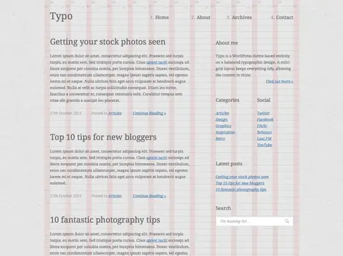
The final working prototype is now ready for testing before the design is converted into a full WordPress theme. Everything appears to be working as it should in Firefox, Safari and Chrome, and unbelievably IE9 has no problem rendering those HTML5 elements too. Some additional work is required for Internet Explorers 7 and 8, but I’ll save those for a rainy day.
Comments are closed.