Line25 is reader supported. At no cost to you a commission from sponsors may be earned when a purchase is made via links on the site. Learn more
Last week we went through the process of designing a stylish blog layout in Photoshop. Now let’s take our visual concept and cut it into slices for use with neat HTML and CSS code. All our browser testing will be done on this coded concept before converting the design into a full WordPress theme.
At the end of the last post, the design concept had been put together in Photoshop and was all ready to rock. To refresh your memory, here’s the design we’ll be working on.
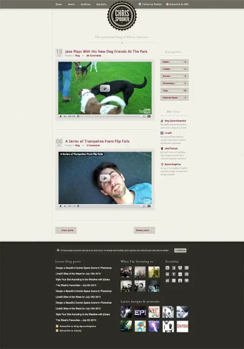
Exporting the images
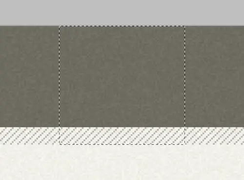
The first step is to go through the whole design and export tiny images. Being a design that makes use of textures and patterns, many of the graphics are clipped down to repeating tiles.
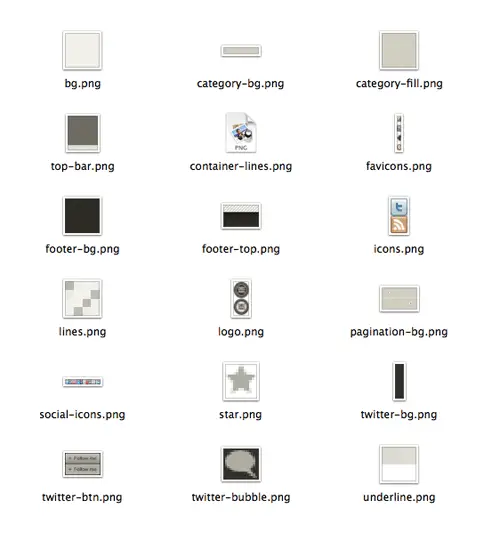
In final collection of files the majority of images are saved with the PNG format due to their minimal colour palette. This bunch of small files will also help drastically with page load times.
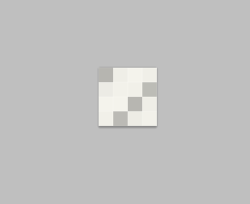
Some images, like the diagonal lines swatch are just 4px in size, making them super small images, but they cover a large portion of the actual design.
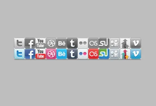
Where there’s lots of instances of a similar graphic, they are combined into a sprite image. Each individual graphic will be picked out using CSS background positioning.
Writing the HTML markup
<!DOCTYPE html>
<html>
<head>
<meta charset="utf-8" />
<title>ChrisSpooner.com</title>

<link href="style.css" rel="stylesheet" type="text/css" media="screen" />

<body>

<div id="container"></div>

</body>
</html>
The HTML document is started with a Doctype. Here the new HTML5 Doctype is used simply because it’s cool and does the job in 15 characters. Not all the HTML5 markup tags are supported, but HTML in an XHTML fashion will still validate perfectly fine. Elsewhere the CSS stylesheet is loaded, then the markup begins with a container div to house the following elements.
<div id="header">
	<h1><a href="#">Chris Spooner</a></h1>
	<ul id="nav">
		<li><a href="#">Home</a></li>
		<li><a href="#">About</a></li>
		<li><a href="#">Archives</a></li>
		<li><a href="#">Say hello</a></li>
	</ul>
	<ul id="subscribe">
		<li class="twitter"><a href="#">Follow on Twitter</a></li>
		<li class="rss"><a href="https:#">Subscribe by RSS</a></li>
	</ul>

	<h2>The personal blog of Chris Spooner</h2>

</div>
First up in the markup is the header area, which is neatly contained within a <div> named “header”. Within this is a <h1> element to act as the logo, and <ul> elements to produce the two menus. In the concept the items appear in the following order: Nav – Title – Subscribe, which is fine in visual terms, but doesn’t read correctly as a document so it’s ordered as Title – Nav – Subscribe in the HTML. The elements can be rearranged with CSS positioning later.
<div id="content">
	<div id="main">
		<div class="post">
			<h2><a href="#">Jake Plays With His New Dog Friends At The Park</a></h2>
			<p class="date">18 <span>Jul</span></p>
			<ul class="meta">
				<li>Posted in <a href="#">Vlog</a></li>
				<li class="comments"><a href="#">5 Comments</a></li>
			</ul>
			<div class="post-content">

			</div>
		</div>

		[...]

		<div class="pagination">
			<p class="prev"><a href="#">Older posts</a></p>
			<p class="next"><a href="#">Newer posts</a></p>
		</div>

	</div>
A div with an ID of “content” contains the divs “main” and “side” which will act as the main content and sidebar columns. Inside the main content, each post is enclosed within a “post” div. Every post is made up of title, date stamp, meta information and of course the post content.
		<div id="side">
			<div id="categories">
				<h3>Categories</h3>
				<ul>
					<li><a href="#">Apple</a> 4</li>
					<li><a href="#">Design</a> 3</li>
					<li><a href="#">Events</a> 2</li>
					<li><a href="#">Giveaways</a> 5</li>
					<li><a href="#">Vlog</a> 48</li>
					<li><a href="#">Website News</a> 2</li>
				</ul>
			</div>

			<div id="my-sites">
				<h3>My Sites</h3>
				<dl>
					<dt class="bsg"><a href="#">Blog.SpoonGraphics</a></dt>
					<dd>My digital playground where I post various design tutorials.</dd>

					<dt class="l25"><a href="#">Line25</a></dt>
					<dd>My second blog featuring various web design tutorials, articles and inspiration.</dd>

					<dt class="jakethelab"><a href="#">JakeTheLab</a></dt>
					<dd>My dog’s very own website. See insights into the life of Jake the Labrador Retriever.</dd>

					<dt class="spoongraphics"><a href="#">SpoonGraphics</a></dt>
					<dd>Home to my creative Graphic and Web design services and design portfolio.</dd>
				</dl>
			</div>

		</div>
	</div>
</div>
The sidebar is made up of a category list titled with a <h3> and created using a <ul> element. Underneath this is the “My Sites” list, which will be hard coded into the site as a Definition List. The relationship between the site title and description make it perfectly suited as a <dl>.
<div id="footer-container"> <div id="footer"> <div id="tweet"> <p id="follow"><a href="#">Follow me</a></p> </div> <div id="latest-posts"> <h4>Latest blog posts</h4> <ul> <li><a href="#">Design a Beautiful Cosmic Space Scene in Photoshop</a></li> <li><a href="#">Line25 Sites of the Week for July 16th 2010</a></li> <li><a href="#">Style Your Site According to the Weather with jQuery</a></li> <li><a href="#">This Week’s Favourites – July 9th 2010</a></li> <li><a href="#">Design a Beautiful Cosmic Space Scene in Photoshop</a></li> <li><a href="#">Line25 Sites of the Week for July 16th 2010</a></li> <li><a href="#">Style Your Site According to the Weather with jQuery</a></li> <li><a href="#">This Week’s Favourites – July 9th 2010</a></li> <li class="subscribe"><a href="#">Subscribe to Blog.SpoonGraphics</a></li> <li class="subscribe"><a href="#">Subscribe to Line25</a></li> </ul> </div> <div id="music"> <h4>I'm listening to</h4> <div id="lastfmrecords"></div> </div> <div id="socialize"> <h4>Socialize</h4> <ul> <li class="twitter"><a href="#">Twitter</a></li> <li class="facebook"><a href="#">Facebook</a></li> <li class="youtube"><a href="#">YouTube</a></li> <li class="dribbble"><a href="#">Dribbble</a></li> <li class="behance"><a href="#">Behance</a></li> <li class="tumblr"><a href="#">Tumblr</a></li> <li class="flickr"><a href="#">Flickr</a></li> <li class="lastfm"><a href="#">Last.FM</a></li> <li class="stumbleupon"><a href="#">StumbleUpon</a></li> <li class="digg"><a href="#">Digg</a></li> <li class="designbump"><a href="#">DesignBump</a></li> <li class="vimeo"><a href="#">Vimeo</a></li> </ul> </div> <div id="photos"> <h4>Latest designs & artworks</h4> <div id="flickrimages"></div> </div> <p id="back-top"><a href="#">Back to top</a></p> </div> </div>
The markup is finished off with the footer. Because the design uses a contrasting footer colour, an extra container is used to surround the footer elements, then the actual footer div is centred up inside the container. Each section of the footer is laid out inside its own div to group the elements together and make it easier to lay out the design later. Some sections like the Last.FM and Flickr streams are created using Javascript plugins, which require empty divs in which the content is placed. If the site needed to be super accessible, HTML messages for non-Javascript users would be placed inside these elements, then hidden by Javascript so they don’t appear for Javascript-enabled users.
Styling with CSS
body, div, h1, h2, h3, h4, h5, h6, p, ul, ol, li, dl, dt, dd, img, form, fieldset, blockquote {
	margin: 0; padding: 0; border: 0;
}

body {
	background: #f6f5ee url(images/bg.png);
	font: 14px/22px Helvetica, Sans-Serif;
}

@font-face {
	font-family:'Tallys';
	src: url('images/Tallys.otf') format('opentype');
}


#container {
	background: url(images/top-bar.png) top repeat-x;
	background: url(images/top-bar.png) top repeat-x, url(images/footer-top.png) bottom repeat-x;
	padding: 0 0 31px 0;
}
The CSS document begins with a quick reset to remove any browser default styling, then gets to business setting the background colour and texture on the body, as well as setting a global font style. Underneath this, the CSS3 @font-face rule is set up to load the font Tallys, which is used on certain headers within the design.
The #container is given the repeating graphic that generates the top bar, as well as a second background for browsers supporting CSS3 multiple backgrounds. Those supporting browsers will also see the strip of diagonal lines that appear just above the footer, but being just a visual touch it won’t be missed by the more unfortunate viewers on older browsers.
#header {
	width: 961px; margin: 0 auto; position: relative;
	overflow: hidden;
}
	#header h1 a {
		position: absolute; top: 5px; left: 376px;display: block; width: 208px; height: 213px;
		background: url(images/logo.png); text-indent: -9999px;
	}
		#header h1 a:hover {
			background-position: bottom;
		}

	#header ul#nav {
		float: left; margin: 22px 0 0 24px; list-style: none;
	}
		#header ul#nav li {
			float: left; margin: 0 0 0 45px;
		}
			#header ul#nav li:first-child {
				margin: 0;
			}
				#header ul#nav li a {
					display: block; font: 13px Georgia, Serif; letter-spacing: 2px; color: #eeede6;
					text-decoration: none;
				}
					#header ul#nav li a:hover {
						color: #d0cfc8;
					}

	#header ul#subscribe {
		float: right; margin: 22px 24px 0 0; list-style: none;
	}
		#header ul#subscribe li {
			float: left; margin: 0 0 0 32px;
		}
			#header ul#subscribe li a {
				display: block; height: 16px; font: 13px Georgia, Serif; letter-spacing: 2px; color: #eeede6;
				text-decoration: none; padding: 1px 0 0 27px;
				background: url(images/icons.png) left 1px no-repeat;
			}
				#header ul#subscribe li.rss a {
					background-position: left -16px;
				}
					#header ul#subscribe li a:hover {
						color: #d0cfc8;
					}

	#header h2 {
		margin: 250px 0 0 0; min-width: 500px; clear: both; text-align: center;
		background: url(images/top-divider.png) center bottom no-repeat; padding: 0 0 30px 0;
		font: 24px Tallys, Georgia, Serif; letter-spacing: 4px; color: #afada2;
		text-shadow: 0px 1px 0px #fff;
	}
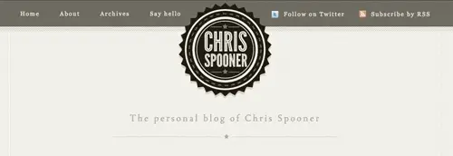
The #header is then centred up on the page and is given position:relative to allow for absolute positioning of the logo inside the confines of the header div. The logo itself is generated from the h1 using a specific width and height for the logo background image. The logo graphic contains both the normal and hover variations of the logo, so the position of the sprite is changed on :hover.
The two navigation elements are floated to the left and right sides of the logo, then the default list styling is removed and each li floated to display horizontally. Text styling is set up as 13px Georgia with letter-spacing giving the type a cool visual touch. On the anchors inside the ul#subscribe, icons are added as background images to produce the RSS and Twitter graphics.
The tagline on the design concept sits centrally underneath the logo, so a mixture of margin, text-align and clear:both help move the h2 into place. The font styling on the concept uses the custom Tallys font, so this is added using the @font-face rule recently setup. The inset effect is created using more CSS3 magic, this time in the form of a simple 1px white text-shadow.
#content {
	width: 917px; margin: -240px auto 0 auto; padding: 280px 22px 0 22px;
	background: url(images/container-lines.png) repeat-y;
}

	#content #main {
		width: 684px; float: left;
	}
		#content #main .post {
			position: relative; margin: 0 0 60px 0; padding: 0 0 66px 0; overflow: hidden;
			background: url(images/underline.png) bottom repeat-x;
		}
			#content #main .post h2 {
				float: left; margin: 0 0 10px 75px;
				font: 24px Lucida Grande, Lucida Sans Unicode, Helvetica, Sans-Serif; letter-spacing: normal;
			}
			#content #main .post p.date {
				position: absolute; left: 0; top: 0; padding: 4px 7px 4px 7px;
				background: url(images/lines.png);
				font: bold 40px Helvetica, Sans-Serif; color: #b6b6b1; text-align: center;
			}
				#content #main .post p.date span {
					font: normal 20px Helvetica, Sans-Serif;
					display: block; margin: -5px 0 0 0;
				}
			#content #main .post ul.meta {
				float: left; list-style: none; margin: 0 0 30px 75px; overflow: hidden;
				font: 16px Helvetica, Sans-Serif; color: #b6b6b1;
			}
				#content #main .post ul.meta li {
					float: left; margin: 0 20px 0 0;
				}
					#content #main .post ul.meta li.comments {
						padding: 0 0 0 32px; background: url(images/star.png) left center no-repeat;
					}
			#content #main .post .post-content {
				clear: both;
			}


			#content #main .pagination {
				margin: 0 0 60px 0; overflow: hidden;
			}
				#content #main .pagination p {
					margin: 0;
				}

			#content #main .pagination p a {
				display: block; width: 102px; height: 33px; overflow: hidden;
				background: url(images/pagination-bg.png); font-size: 16px;
			}
				#content #main .pagination p.prev a {
					float: left; padding: 14px 0 0 46px;
				}
				#content #main .pagination p.next a {
					float: right; text-align: right; padding: 14px 46px 0 0;
					background-position: 0 -47px;
				}
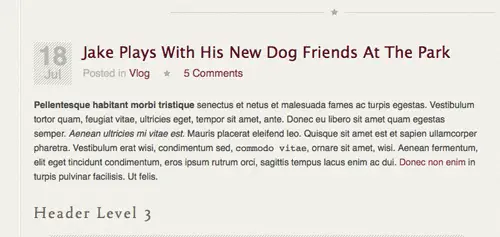
The #content div is moved into place using margin: -240px auto 0 auto. The -240px margin on the top helps pull the content back up where it had previously been dropped down by the logo graphic. Each .post div is given margin and padding to space out each blog entry, and a background image provides a neat underline between each one. All the elements inside the post are then styled up with the appropriate font styling to match the concept. The date stamp p.date is given a large font-size to accommodate the date numbers, then the span is reset with a smaller font size and given the display:block; rule to drop it down underneath.
After all the post content styling the .pagination buttons are transformed from plain paragraph elements into large button graphics. They’re first floated left and right, they’re given specific widths and heights according to the actual image file. padding is added to the anchor to position it centrally inside the button.
	#content #side {
		width: 196px; float: left; margin: 0 0 0 37px;
	}

		#content #side h3 {
			font: 22px Tallys, Georgia, Serif; letter-spacing: 4px; color: #afada2; text-align: center; text-shadow: 0px 1px 0px #fff;
			background: url(images/underline.png) bottom repeat-x; padding: 0 0 15px 0; margin: 0 0 20px 0;
		}

		#content #side #categories {
			margin: 0 0 66px 0;
		}
			#content #side #categories ul {
				list-style: none;
			}
				#content #side #categories ul li {
					position: relative; width: 156px; height: 29px; padding: 11px 20px 0 20px; margin: 0 0 10px 0;
					background: url(images/category-bg.png); font-size: 16px; text-align: right;
					color: #afada2; text-shadow: 0px 1px 0px #fff;
				}
				#content #side #categories ul li a {
					float: left; background: url(images/category-fill.png); padding: 0 10px 0 0;
				}


		#content #side #my-sites {
			margin: 0 0 66px 0;
		}
			#content #side #my-sites dl dt {
				font-size: 16px; padding: 0 0 0 26px;
				background: url(images/favicons.png) no-repeat;
			}
				#content #side #my-sites dl dt.bsg {
					background-position: 0 1px;
				}
				#content #side #my-sites dl dt.l25 {
					background-position: 0 -24px;
				}
				#content #side #my-sites dl dt.jakethelab {
					background-position: 0 -51px;
				}
				#content #side #my-sites dl dt.spoongraphics {
					background-position: 0 -76px;
				}

				#content #side #my-sites dl dd {
					font-size: 14px; color: #bcbbb5; margin: 0 0 10px 0;
				}
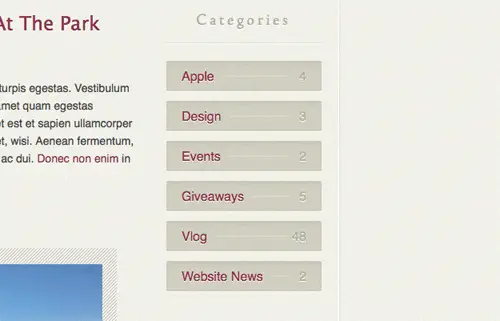
The sidebar is floated alongside the main content div and given a spot of left margin to space out the columns. All the h3 elements in the sidebar use the Tally font styling with inset text effect. An underline background image provides a divider between the titles and content. The #categories ul li elements are given similar styling to the pagination buttons, where a specific width and height is used to display a background graphic. To recreate the line between the category and post count, a line was added to the background image, then a plain textured fill added to the anchors to hide the line where it runs underneath the text.
The styling for the definition list is quite simple, other than some CSS to set the font styling, just the favicon images had to be set with different background positioning on each dt element.
#footer-container {
	background: #2f2f28 url(images/footer-bg.png);
}

#footer {
	width: 917px; margin: 0 auto; padding: 20px 22px 66px 22px; overflow: hidden;

}
	#footer a {
		color: #eeede6; text-decoration: none;
	}
		#footer a:hover {
			color: #d0cfc8;
		}
	#footer h4 {
		font: 22px Tallys, Georgia, Serif; letter-spacing: 4px; color: #afada2; margin: 0 0 14px 0;
	}

	#footer #tweet {
		width: 897px; height: 39px; margin: 0 auto 38px auto; padding: 19px 10px 0 10px;
		background: url(images/twitter-bg.png) repeat-x;
	}
		#footer #tweet p#message {
			float: left; color: #afada2; padding: 0 0 0 25px; font-size: 12px;
			background: url(images/twitter-bubble.png) left 2px no-repeat;
		}
		#footer #tweet p#follow a {
			float: right; display: block; width: 85px; height: 27px; margin: -3px 0 0 20px;
			background: url(images/twitter-btn.png); text-indent: -9999px;
		}
			#footer #tweet p#follow a:hover {
				background-position: bottom;
			}


	#footer #latest-posts {
		width: 430px; float: left;
	}
		#footer #latest-posts ul {
			list-style: none;
		}
			#footer #latest-posts ul li {
				font-size: 16px; margin: 0 0 27px 0;
			}

			#footer #latest-posts ul li.subscribe {
				margin: 0 0 10px 0;
			}
				#footer #latest-posts ul li.subscribe a {
					display: block; height: 17px;
					font: 13px Georgia, Serif; letter-spacing: 2px; color: #eeede6;
					padding: 0 0 0 27px; background: url(images/icons.png) left -16px no-repeat;
				}
					#footer #latest-posts ul li.subscribe a:hover {
						color: #d0cfc8;
					}
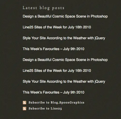
The design ends with a large footer which contains all kinds of information. Being of full width and having the dark background fill it required both the #footer-container, and the child #footer divs to allow the concept to be replicated. Slightly different font styling was needed inside the footer, particularly link colours, so the #footer a and #footer h4 were altered from those used in the upper portion of the design. At the top of the footer is a latest tweet box. This is styled up as a div named #tweet, while the tweet message and follow button are restyled paragraph elements.
In the #latest-posts ul the list is spaced out with some bottom margin and set at a font-size of 16px. The two li items with the class of .subscribe are given slightly different styling using a serif font and an RSS icon as a background image.
Adding Javascript functionality
With the main website now all coded up, all that’s left is to populate those footer sections with content from the various social sites. The Twitter div should display my latest tweet, the music div should display a list of my popular music tracks from Last.FM and the photos div should display recent pictures from Flickr.
$.getJSON("https://twitter.com/statuses/user_timeline.json?screen_name=chrisspooner&count=1&callback=?",
		function(data){
			$.each(data, function(i,item){
			ct = item.text;
			ct = ct.replace(/https:\/\/\S+/g,  '<a href="$&">$&</a>');
			ct = ct.replace(/\s(@)(\w+)/g,    ' @<a href="https://twitter.com/$2">$2</a>');
	 		ct = ct.replace(/\s(#)(\w+)/g,    ' #<a href="https://search.twitter.com/search?q=%23$2">$2</a>');
	   		$("#tweet").append('<p id="message">'+ct +'</p');
	  	});
	 });

    jQuery(document).ready( function() {
       var _config = {
         username: 'spoongraphics',
         count: 6,
         period: '7day'
     };
    lastFmRecords.init(_config);
    });

	$('#flickrimages').flickrush({id:'10201900@N03' });
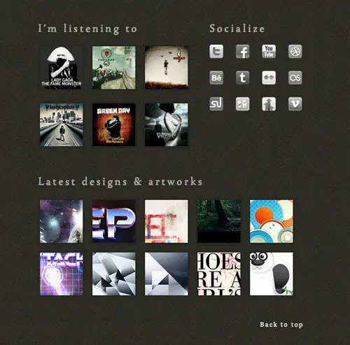
Three jQuery resources were used to create the functionality. Firstly, the Twitter message is called using JSON as described in this handy tutorial from Ninanet. The Last.FM top tracks list is generated using this fantastic plugin from Jeroen Smeets, which can either be used as a WordPress plugin, or directly through jQuery. Finally, the Flickr stream is producing using a slightly modified version of the Flickrush plugin from Philip Beel.


Good post mate. (y)
Great tutorial, I’m new in web designing so this really helps me a lot.
Thanks.
Wow… Awesome tutorial, thank you.
Hy Chris, Thank’s for this tuts.. Now i get new experience, like formula’s.
Design + Coding = Wonderfull as Results.. :)
Awesome tutorial, always cool to see how other people code and the final demo looks brilliant!
Thanks for sharing :D
how do I get those images which were to be used in css style sheet
how can i make my blog stylish kindly help me any one
good design and minimilastic
Hey man this tutorial Got me so excited, ive been looking to get started in WordPress theming for a While now and ive done some of you other Tuts and really enjoyed them, i ran into a good number of issues when i got to the Css though.
It's big stuff too, there are things completely missing with in the steps that are shown in the final full view of the Css.
Please examine your code and make another version, i'd love to finish this Tutorial!
Best of Luck
Jordan
Nice Tutorial :D keep it up :)
Dude, you mentioned using @font-face in your styling. Unfortunately you havn't made this compliant with IE. Here's a super-tip, head over to: https://www.kirsle.net/wizards/ttf2eot.cgi
Here you can convert your .ttf (true type font) to an .eot file. Follow the instructions and viola, you have your font file converted.
Hi Chris-
Awesome work. How much time does it take you to put these tutorials together? I can't imagine…but I am grateful that you do.
Let me echo the sentiment of others here who would love to see a follow up tut that takes this into a WordPress Theme.
Thanks much!
Hi Chris,
Excellent walkthrough of yet another awesome website.
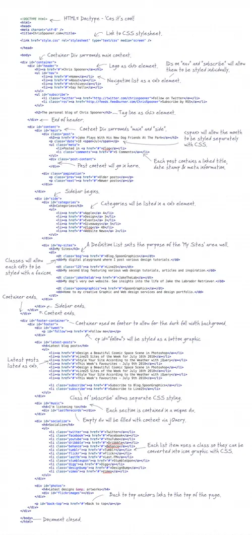
Just a quick question, in the annotated html and css sheets. What font did you use to annotate your work? looks really professional and I could use a lot in my college annotations.
Many Thanks
Jonathan
Wow… Awesome tutorial, thank you.
This is a really informative tutorial and enjoyed reading through it.
I was just wondering if you could upload a folder with the files you used for this tutorial (for the images and such)
so its much easy to follow the tut
thanks!
Really good tutorial with great detail. This has been added to my resources, thanks.
Hey Chris, great tutorial! I'm really hoping that there will be a part three, when you integrate the layout into a WordPress theme.
Great tutorial, Designing the website helps you as a developer see roughly what the finished product will look like and how every page will be related to the other. Visit https://www.buildingwebsitesmadesimple.com for more tutorial
Also would it be possible to get a more in depth tutorial regarding this…
"Where there’s lots of instances of a similar graphic, they are combined into a sprite image. Each individual graphic will be picked out using CSS background positioning."
I know how it works and stuff, but it would be good to get your take on the theory behind it, and how you implement it.
Thanks Chris!
Hey Chris,
Another great tutorial! These series of tutorials are really good in that you show how to go from the design to the fully coded version to the WordPress version.
How about a web app tutorial? Anything in the pipe-line?
Thanks again Chris!
Very nice blog!
Great tutorial, I'm new in web designing so this really helps a lot learning css, I'm surely gonna bookmark this site!.
Hi Chris,
I have been attempting to do a custom blog template on Tubmlr. I purchased a theme called Nuance and got the HTML and CSS and such but since I am new at this, I am having trouble getting the them to work for me.
It came with instructions and all but I just know I am doing something wrong. Your article has helped me to understand a little better but I was wondering if you could offer any specific pointers … if you are familiar with Tumblr.
Thanks in advance & great article.
wow… just started learning CSS lately…
this sure help a lot….
thanks =D
This is a great tutorial for anyone learning about web design
Nice, but no need type attribute for link… and a little bit heavy. No ?
Less classes and id will be better.
You can also use nav in place of div#nav…. ^^
I enjoyed your step-by-step on this, but am wondering if you're going to do a next phase where you integrate this site into WordPress?
great tutorial man, i bookmaked this site..very helpful..keep up!
nice color combine…
its an awesome…
Great tutorial. You put a lot of work into your designs and code and it definitely shows. Keep it coming :)
I've learned to make a dinamyc wordpress theme using a simple HTML file watching a video in Nettuts+, and thanks for this tutorial, and the photoshop one. I think I can make this a real theme soon ;)
Hey Chris!Love your tuts,really.But from where do you get such awsome background textures like here on 25line and others?
They're just made from scratch in Photoshop. Often I'll add a noise filter to a plain background colour to create a subtle texture.
Awesome tutorial, always cool to see how other people code and the final demo looks brilliant!
The large annotated code views are very helpful!
Thanks Chris
Great tutorial Chris. You always provide the most detailed (and fun) tutorials I've seen on the web.
@Joe – I have used my title as a h1 for a while now. It seems to be a a big debate lately, some developers use it, others don't.
Having your logo as h1 allows you to have the name of your site be the most important h tag, followed by page titles with h2, which should be the second most important anyway. It seems to work for me, but like I said, some people don't like doing it that way.
Cheers :)
very good tuts thanks
Hi Chris, Really nice tutorial. Just got a couple of questions though..
Why do you use a h for your logo? Doesn't this mean your h1 for every page will be the same? I would have though for seo purposes and general usability to have a real, descriptive h1?
Thanks,
Joe
Actually, there has been an <a href="https://h1debate.com">ongoing</><a href="https://polldaddy.com/poll/1327218/"> debate</a> about that for quite some time.
Interesting read about this: https://www.iheni.com/html-5-to-the-h1-debate-rescue/
The old H1 topic is a popular debate. It's touched on in more detail in this old Line25 post – https://is.gd/dZWSI
I stick to using it as the logo in most cases because I think it creates a more readable document structure when viewed without CSS etc. It titles the page with the name of the site you're actually on.
The tagline 'The Personal Blog of Chris Spooner' would make a good H1, but this will be used as the body title anyway.
Thanks for your responses guys.. Ill have a read of those posts..
Cheers,
Joe
Hi Chris, Really nice tutorial. Just got a couple of questions though..
Why do you use a h for your logo? Doesn't this mean your h1 for every page will be the same? I would havr though for seo purposes and general usability to have a real, descriptive h1?
Thanks,
Joe
Great article and nice design, but I have one question:
Why do you use the HTML5 Doctype?
You don't use any HTML5 elements, and you even got the link-element wrong (XHTML style!!!) The only element which is HTML is the meta charset, which, by the way, isn't backwards compatible to older browsers…
Please don't abuse HTML5 just because it's hot…
Simply because it does the job in 15 characters, instead of the usual super long Doctype declaration. Everything still validates correctly as HTML – which is basically what it is (with a little XHTML flavour here and there!).
True, the 'real' HTML5 elements like <article> etc could have been used to make it a little more HTML5'ish, but half the elements I'd want to use for a blog design (<details> for instance) still aren't supported. (See https://is.gd/dXWmJ for a full HTML5 build tutorial)
PS. I've been trying to pick out the fault with the link element you mentioned but can't seem to find it?
Hey Chris,
you could've used HTML5 tags fully actually. IE (< 9) will refuse to style those tags by default, though there's a simple workaround to that. To make a long story short, check it here -> https://code.google.com/p/html5shiv/
It may be a valid HTML5 document, but it's quite lacking on the efficiency / semantic side of things.
Loved the design though, as usual. I'm a happy subscriber.
I think demo link is broken.
Great article after all!
Yes, still broken
Really terrific tutorial, thanks very much.
Demo link is broken
Great follow up to the design aspect, Chris. I love the subtle use of texture. I find that is the most powerful way of utilizing textures. I also dig the white space that breathes and the large footer.
I need to stop being lazy and start using sprites…
Your final "View the coded site demo" link is broken. It is the period right before index.html that should be a forward slash.
Thanks for this!
Link fixed, thanks for letting me know!