Line25 is reader supported. At no cost to you a commission from sponsors may be earned when a purchase is made via links on the site. Learn more
Learn how to code a web design concept into HTML and CSS, by following this easy, step by step tutorial. Check it out and start learning!
I’ve recently been working on a design concept for a WordPress theme as part of a personal project. In this walkthrough, we’ll go through the process of converting the design concept from PSD document right through to completed HTML and CSS mockup, complete with clean and valid code, a few touches of CSS3 and some quick fixes to help out old IE6.
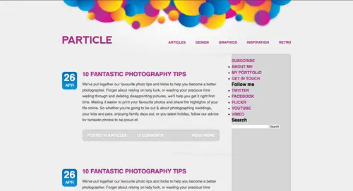
The design concept
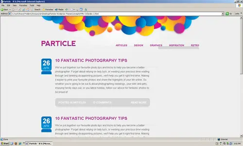
The design we’ll be coding up is this WordPress theme concept I’m currently working on as part of a personal project. The design features a clean grey background, but with splashes of vibrant colour in the header, and throughout the page with links and buttons taking bright colour swatches from the main illustration. Overall the design has plenty of clean lines, and uses subtle shadows and inset text effects to add that touch of style.
Slice the PSD
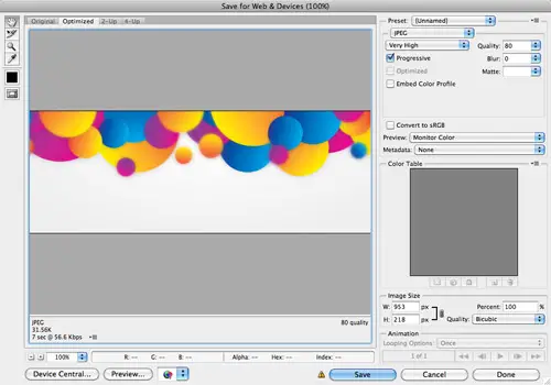
The job is started by slicing up the various images that make up the design. The first being the bright header graphic. With this image being heavy on colours and gradients, the JPEG option would be the best fit.
Each subsequent element of the design is cut up. Layers are toggled off to allow access to background images, such as the date area and the button graphics.
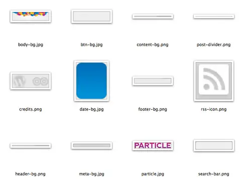
Once every graphic has been exported, we’re left with a collection of image files, some large, some small, some JPEG and some PNG. Certain images will be used as repeating background images, while others are combined as sprite graphics.
Build the HTML structure
A new HTML page is created and the basic structure of the document written out, including Doctype, links to stylesheets and a container div to hold the following markup.
<!DOCTYPE html PUBLIC "-//W3C//DTD XHTML 1.0 Strict//EN" "https://www.w3.org/TR/xhtml1/DTD/xhtml1-strict.dtd">
<html xmlns="https://www.w3.org/1999/xhtml">
<head>
<meta http-equiv="Content-Type" content="text/html; charset=UTF-8" />
<title>Particle</title>

<link href="style.css" rel="stylesheet" type="text/css" media="screen" />

</head>

<body>
	<div id="container">

	</div>


</body>
</html>
The header
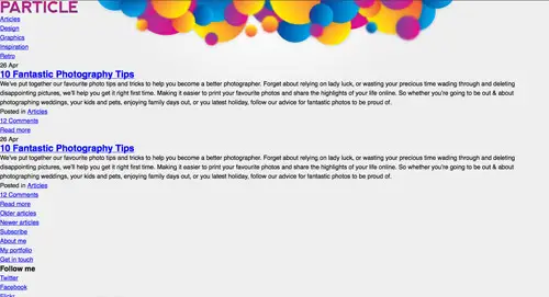
The first portion of design at the top of the page outlines a simple header. The logo can be recreated as a <h1>, seeing as there’s no other title on the page, while the categories list can be formed with a good old unordered list.
<div id="header">
	<h1><a href="#"><img src="images/particle.jpg" alt="Return to the homepage" /></a></h1>

	<ul id="categories">
		<li><a href="#">Articles</a></li>
		<li><a href="#">Design</a></li>
		<li><a href="#">Graphics</a></li>
		<li><a href="#">Inspiration</a></li>
		<li><a href="#">Retro</a></li>
	</ul>
</div>
The content
Next we add a <div> with an ID of content to contain the main areas of the layout. This particular design uses two columns, one main content area and a sidebar. These are written out as individual <div> tags with corresponding IDs.
<div id="content">
	<div id="main"></div>

	<div id="side"></div>

</div>
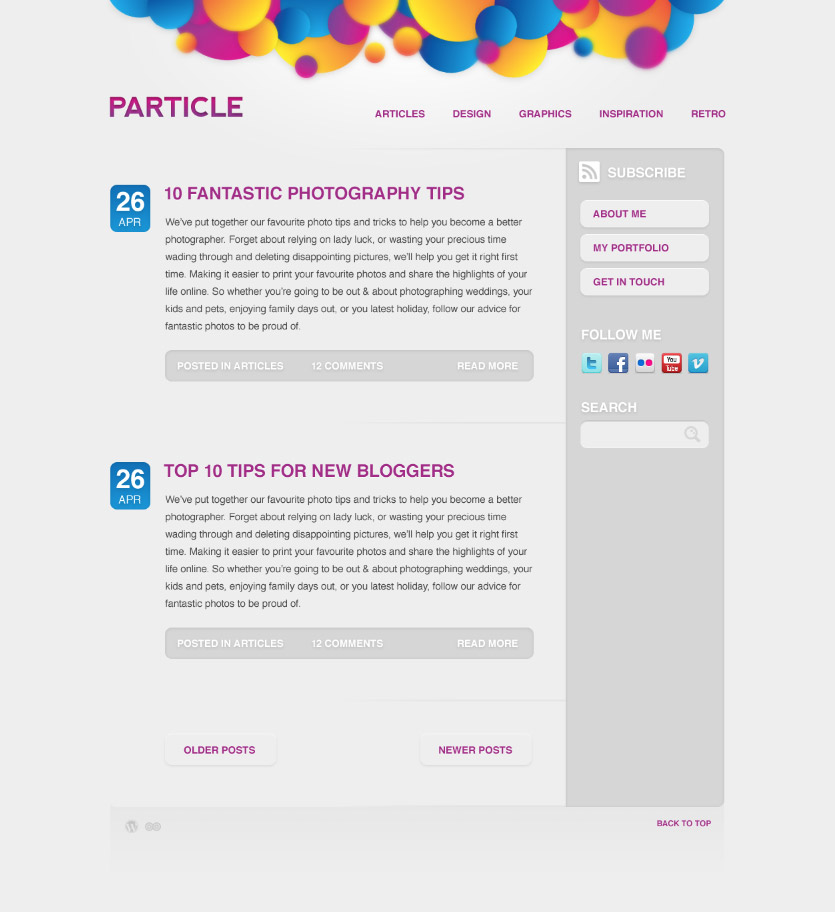
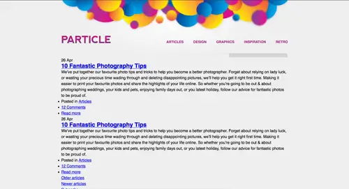
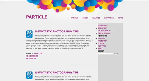
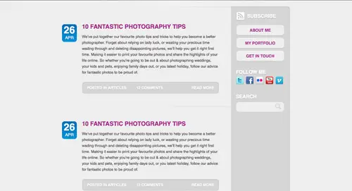
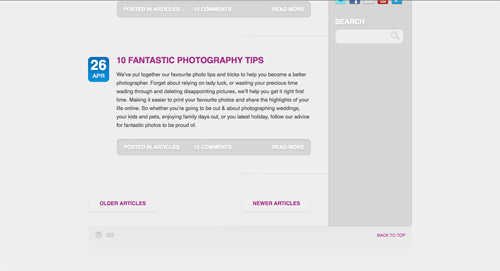
Inside the main div sits the list of blog posts, each one contained within a <div> with a class of post. A class is used here rather than an ID because there will be multiple posts, whereas IDs may only appear once. Inside the post div the information is written out in the post relevant HTML elements, a <p> holds the number that will be generated for the date and a <span> used to provide a target for the later CSS that will allow the month to appear at a different size. The next heading element available is a <h2>, so this is used along with an anchor to generate the post title.
A <ul> is then given a special class as post-meta, which then includes the information about the post in list format. The <li> containing the read more link is given an extra class to allow this particular list item to be floated over the right, just like in the PSD concept.
<div id="main"> <div class="post"> <div class="date"> <p>26 <span>Apr</span></p> </div> <div class="post-content"> <h2><a href="#">10 Fantastic Photography Tips</a></h2> <p>We’ve put together our favourite photo tips and tricks to help you become a better photographer. Forget about relying on lady luck, or wasting your precious time wading through and deleting disappointing pictures, we’ll help you get it right first time. Making it easier to print your favourite photos and share the highlights of your life online. So whether you’re going to be out & about photographing weddings, your kids and pets, enjoying family days out, or you latest holiday, follow our advice for fantastic photos to be proud of.</p> <ul class="post-meta"> <li>Posted in <a href="#">Articles</a></li> <li><a href="#comments">12 Comments</a></li> <li class="read-more"><a href="#">Read more</a></li> </ul> </div> </div> <div class="pagination"> <p class="older"><a href="#">Older articles</a></p> <p class="newer"><a href="#">Newer articles</a></p> </div> </div>
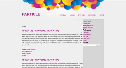
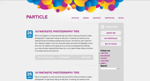
Once the main div has been completely marked up, the next section of the design is the sidebar. The first item to appear in the div titled side, is the subscription option. This is written out as a plain old anchor, contained within a paragraph tag. A unique ID will allow us to target this exact anchor with CSS to add the relevant styling and RSS icon later.
The three links in the concept that look like buttons can simply be marked up as a <ul> and CSS can be used to give the button-like appearance.
<div id="side">
	<p id="subscribe"><a href="#">Subscribe</a></p>

	<ul id="pages">
		<li><a href="#">About me</a></li>
		<li><a href="#">My portfolio</a></li>
		<li><a href="#">Get in touch</a></li>
	</ul>

	<h3>Follow me</h3>
	<ul id="follow-me">
		<li><a href="#" class="twitter">Twitter</a></li>
		<li><a href="#" class="facebook">Facebook</a></li>
		<li><a href="#" class="flickr">Flickr</a></li>
		<li><a href="#" class="youtube">YouTube</a></li>
		<li><a href="#" class="vimeo">Vimeo</a></li>
	</ul>

	<h3>Search</h3>
	<form id="search" method="get" action="">
		<fieldset>
			<input type="text" class="search-bar" />
			<input type="submit" value="Search" class="search-btn" />
		</fieldset>
	</form>
</div>
The simple footer can then be finished off with a couple of links housed within the footer <div>. Each of the two credits are given a separate class, so each link can be transformed into the relevant logo image later with the CSS. Finally the back to top link is placed as an anchor targeting the header. You can target an anchor to any internal ID by using the # symbol.
<div id="footer">
	<ul id="credits">
		<li><a href="https://wordpress.org" class="wordpress">Powered by WordPress</a></li>
		<li><a href="https://blog.spoongraphics.co.uk" class="spoongraphics">Theme by SpoonGraphics</a></li>
	</ul>
	<p id="back-top"><a href="#header">Back to top</a></p>
</div>
Write the CSS styling
The first couple of lines in the CSS are used to reset any default browser styling, giving us a clean slate to start with, without the risk of inconsistencies between each browser. Next, the body is styled up with the basic font-family, and background. The colour #eee is specified, followed by the bright background image, which is positioned centrally on the page and told not to repeat. The container div provides the basic layout, allowing the design to appear centralised with the margin: 0 auto; declaration, and pushes the content down with a little padding so that it appears under the bright illustration at the top of the page.
body, div, h1, h2, h3, h4, h5, h6, p, ul, ol, li, dl, dt, dd, img, form, fieldset, input, blockquote {
	margin: 0; padding: 0; border: 0;
}

body {
	font-family: Helvetica, Arial, Sans-Serif; line-height: 24px;
	background: #eee url(images/body-bg.jpg) center top no-repeat;
}

#container {
	width: 925px; margin: 0 auto; padding: 143px 0 0 0;
}
We can then work down the HTML markup in order, adding the necessary CSS styling as we go. The header is the first section on the page, so this is given a background image forming the tip of the content area, and given some padding to match the PSD concept. The categories list is then floated off to the right, and each anchor given the various font sizing, and uppercase transformation to match the original design. A spot of CSS3 comes into play in the form of the text-shadow property to enable us to recreate the inset text effect. This extra styling will be visible to those with modern browsers, such as Safari, Firefox and Chrome, while IE will just show the flat version.
Colours are then sampled from the PSD and the hex codes pasted in place as the link and hover classes.
#header {
	background: url(images/header-bg.png) right bottom no-repeat; overflow: hidden;
	padding: 0 0 50px 0;
}

	#header h1 {
		float: left;
	}

	#header ul#categories {
		float: right; list-style: none; margin: 16px 0 0 0;
	}
		#header ul#categories li {
			float: left; margin: 0 0 0 40px;
		}
			#header ul#categories li a {
				display: block;
				font-size: 14px; font-weight: bold; text-transform: uppercase; color: #a42988;
				text-shadow: 0 2px 0px #fff; text-decoration: none;
			}
				#header ul#categories li a:hover {
					color: #006ab1;
				}
Next, the content div can be given a repeating background to create a faux column effect. This image will generate the the darker grey sidebar, and will continue on from the background image added to the header. Because the main and side divs will be floated, the content div will need clearing. The easiest way to do this is to add overflow: hidden;.
The global anchor styling for the anchors are then added, so anything within the content div will be given this treatment, unless otherwise stated according to the more specific styling within the main or side divs.
#content {
	background: url(images/content-bg.png) right top repeat-y; overflow: hidden;
}

	#content a {
		font-weight: bold; text-transform: uppercase; color: #a42988;
		text-shadow: 0 2px 0px #fff; text-decoration: none;
	}
		#content a:hover {
			color: #006ab1;
		}

	#content #main {
		width: 685px; float: left; padding: 55px 0 0 0;
	}
		#content #main h2 {
			margin: 0 0 16px 0;
		}

		#content #main p {
			margin: 0 0 25px 0; color: #474747; font-size: 15px;
		}
Each individual post div is then given a background image to replicate the dividing lines between each entry. Some padding and margin helps recreate the same amount of white space as the concept, and the overflow: hidden; declaration is added to clear the post div after the floating the date and content side by side.
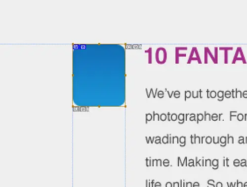
The date tab itself can be quickly styled up by specifying the exact dimensions and adding the blue background image. The <p> tag can then be given some typographic treatment to replicate the large white text in the concept, and the <span> used to specifically target the month, making it smaller in size and block format so that it appears underneath the date number.
#content #main .post {
	background: url(images/post-divider.png) right bottom no-repeat;
	padding: 0 47px 55px 0; margin: 0 0 55px 0;
	overflow: hidden;
}
	#content #main .post .date {
		width: 62px; height: 57px; float: left; padding: 15px 0 0 0; margin: 0 20px 0 0;
		background: #0085cc url(images/date-bg.jpg);
		text-align: center;
	}
		#content #main .post .date p {
			font-size: 40px; font-weight: bold; color: #fff;
			text-shadow: 0 2px 3px #006ab1;
		}
			#content #main .post .date p span {
				margin: 5px 0 0 0;
				display: block; font-size: 17px; font-weight: normal; text-transform: uppercase;
			}
With the date tab in place, the main content panel can also be floated alongside it. Then the styling can move on to fleshing out the meta information list with background image, and text styling. It’s important to remember to add a background colour along with background images, just in case the user is viewing without images being displayed. Otherwise the white text will become unreadable on the light grey background.
The <li> tags inside the meta list are floated to the left, with the exception of the read-more link, which is floated off to the right instead. That extra class allows this <li> to be targeted individually.
#content #main .post .post-content {
	width: 556px; float: left;
}
	#content #main .post .post-content ul.post-meta {
		width: 515px; height: 21px; list-style: none; padding: 14px 20px;
		background: #d6d6d6 url(images/meta-bg.jpg);
	}
		#content #main .post .post-content ul.post-meta li {
			float: left; margin: 0 40px 0 0;
			font-size: 15px; font-weight: bold; text-transform: uppercase; color: #fff; text-shadow: 0px 2px 3px #b8b8b8;
		}
			#content #main .post .post-content ul.post-meta li.read-more {
				float: right; margin: 0 0 0 0;
			}
				#content #main .post .post-content ul.post-meta li a {
					color: #fff; text-shadow: 0px 2px 3px #b8b8b8;
				}
					#content #main .post .post-content ul.post-meta li a:hover {
						color: #eee;
					}
The main div is now all styled up, so the next section is the sidebar. Its width is firstly calculated by taking away the width of the main div from the overall width of the container, taking into consideration any extra padding and margins. If this is calculated exactly, they’ll both float side by side. A miscalculation of just 1 pixel will send the sidebar underneath the content, so here’s where that box model knowledge comes into play.
The first element within the sidebar is the subscribe button. The anchor is targeted directly through the unique ID, and is given the background image to generate the RSS icon. Some text-shadow soon styles up the text to replicate that of the original concept.
The button links in the sidebar are also styled up from basic anchors. First they need converting from inline to block elements, this then allows specific widths and heights to be added, along with the background image and necessary padding to push the text into place centrally. The actual colour and styling of the anchor text will be inherited from the previous styling to #content a {}.
#content #side {
	width: 200px; float: left; padding: 5px 20px;
}

	#content #side p#subscribe a {
		display: block; height: 30px; font-size: 20px; color: #fff; padding: 7px 0 0 45px; margin: 0 0 15px 0;
		text-shadow: 0px 2px 3px #b8b8b8;
		background: url(images/rss-icon.png) left no-repeat;
	}
		#content #side p#subscribe a:hover {
			color: #eee;
		}

	#content #side ul#pages {
		list-style: none; margin: 0 0 30px 0;
	}
		#content #side ul#pages li {
			margin: 0 0 5px 0;
		}
			#content #side ul#pages li a {
				display: block; width: 157px; height: 23px; padding: 12px 20px; text-align: center;
				background: #eee url(images/sidebar-btn.png);
			}
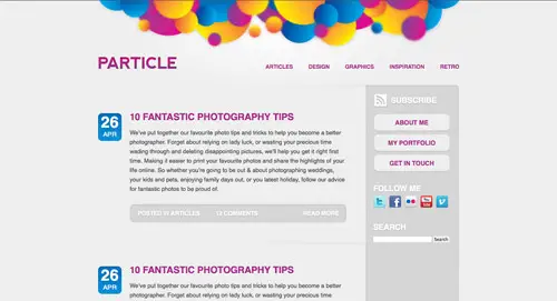
The next feature in the design is the list of social icons (courtesy of Komodo Media). The basic markup is made up as a simple list and anchors, but they can be manipulated with CSS to give the desired appearance. First the list bullet points are removed with the list-style: none; declaration, and because the icons are floated, the <ul> will need clearing with overflow: hidden;. Each anchor is given specific dimensions, then each individual anchor can be targeted with the relevant class to add the correct icon as a background image.
#content #side h3 {
	font-size: 20px; text-transform: uppercase; color: #fff; margin: 0 0 5px 0;
	text-shadow: 0px 2px 3px #b8b8b8;
}
	#content #side ul#follow-me {
		overflow: hidden; list-style: none; margin: 0 0 30px 0;
	}
		#content #side ul#follow-me li {
			float: left; margin: 0 8px 8px 0;
		}
			#content #side ul#follow-me li a {
				display: block; width: 32px; height: 32px;
				text-indent: -9999px;
			}
				#content #side ul#follow-me li a.twitter {
					background: url(images/social-icons/twitter_32.png);
				}
				#content #side ul#follow-me li a.facebook {
					background: url(images/social-icons/facebook_32.png);
				}
				#content #side ul#follow-me li a.flickr {
					background: url(images/social-icons/flickr_32.png);
				}
				#content #side ul#follow-me li a.youtube {
					background: url(images/social-icons/youtube_32.png);
				}
				#content #side ul#follow-me li a.vimeo {
					background: url(images/social-icons/vimeo_32.png);
				}
The search area then needs a couple of lines of styling to match it up to the concept. The basic structure is there from the HTML elements, but we can quickly spruce them up with the relevant background images. The search bar is given exact dimensions so the background image appears as expected. Some padding and font styling also tweaks how the input text will display. The search button itself appears as a small icon within the search bar. This is replicated with CSS by adding the appropriate background image, then moving it into place with floats and negative margins. Extra padding on the right side of the search bar then ensures the text won’t overlap the button.
#content #side form#search {
	margin: 0 0 30px 0;
}
	#content #side form#search input.search-bar {
		width: 135px; height: 43px; padding: 1px 45px 0 15px; float: left;
		background: #eee url(images/search-bar.png);
		font-size: 15px; color: #474747;
	}
	#content #side form#search input.search-btn {
		width: 27px; height: 27px; float: right; margin: -36px 15px 0 0; cursor: pointer;
		background: url(images/search-btn.png); text-indent: -9999px; padding: 0 0 0 27px;
	}
Everything can then be finished off with some styling to the footer div. The footer background image includes the bottom portion of the content panel, giving the rounded corners and soft shadow, so this is positioned to the top. Inside the footer are two credit links, which are styled up using the image replacement technique just like the social icons. Finally there’s the back to top link which is sent over to the right, and given the same link styling as the rest of the document.
#footer {
	background: url(images/footer-bg.png) center top no-repeat; overflow: hidden;
	min-height: 139px;
}

	#footer ul#credits {
		overflow: hidden; list-style: none; float: left; margin: 25px 0 0 20px;
	}
		#footer ul#credits li {
			float: left; margin: 0 10px 0 0;
		}
			#footer ul#credits li a {
				display: block; height: 21px; background: url(images/credits.png); text-indent: -9999px;
			}
				#footer ul#credits li a.wordpress { width: 21px; }
				#footer ul#credits li a.spoongraphics { width: 26px; background-position: 26px 0; }

	#footer p#back-top {
		float: right; margin: 25px 20px 0 0;
	}
		#footer p#back-top a {
			font-size: 12px; text-transform: uppercase; text-decoration: none;
			color: #a42988; text-shadow: 0 2px 0px #fff;
		}
			#footer p#back-top a:hover {
				color: #006ab1;
			}
Fixing IE6
A quick test in the popular browsers shows no problems at all, with the design looking identical between the CSS3 supporting browsers of Safari, Firefox and Chrome, and just slightly less visually appealing in IE7. IE6 however, throws its usual panic attack at the CSS code and struggles to interpret it correctly.
At first impressions the site looks a complete mess, but under close inspection there’s not too much to fix. Just a couple of extra CSS values soon brings everything into place. The two declarations of overflow: hidden; and height: 100%; were all that were needed on the problem elements. These are added using an IE6 only stylesheet link in the HTML.
#content #side, #content #main .post .date, #content #main .post .post-content ul.post-meta {
	overflow: hidden;
}

#content, #footer, #header  {
	height: 100%;
}
<!--[if IE 6]>
	<link href="css/ie6.css" rel="stylesheet" type="text/css" media="screen" />
<![endif]-->
The final design
With IE6 neatly tidied up, the site design is complete. Next week we’ll be taking the design from this HTML/CSS mockup and transform it into a fully loaded WordPress theme. Stay tuned!
but how to download this psd template ??
nice tutorial very nice explanation..thank you so much
Thank you so much, this is what I looking for a long time. It’s useful. Once again, thank you so much for easy explanation.
really good tuts ever.Nicely done!
After having a website created, it's important to do the proper steps for search engine optimization. Without doing marketing for a website, it would be pretty much useless unless you have some form of marketing to drive the traffic there.
We do Direct Marketing, which is a direct unique visitor that would be searching for your specific product or service. These type of leads are much more beneficial than indirect flyers or emailing.
Great tutorial. I find it's always interesting to check out other people's thought processes when designing/coding.
It's interesting how you indent child selectors in your CSS code.
I won't be adopting that, but I will be adopting how you group related properties together ('box properties', graphic/styling properties, etc) on the same line. Makes sense to me…
Brilliant as always Chris
you give people who want to learn up to date stuff, the solutions it in clear terminology.
Just one question though I'm now ditching dreamweaver what text editor would you recommend ( ideally free)
Cheers
Would you mind if I took the CSS/HTML file and I convert it to a Blogger-Blogspot Template ???
Of course I'll give you credits (both on my post and in the xml file) as the Template designer,
something like <b>Designed by line25</b>
Again, Great information!
Good tutorial, as always! )
Nice article, a lot of people don't know how to do this.
Great post ! thanks
Awesome tut! Really clear and easy to follow with the stagnated, sectioned coding elements.
A nice crisp layout & design too. Looks simple (and not in a bad way) and clean. Will be eager to read on about the WP implementation now.
Thanks again Chris for your hard work in posting this.
Really nice blog layout! I've never really quite understood how to make wordpress layouts until now, thanks!
Good and very helpful! Thanks!
Sigurfreyr
Hey,
Great tutorial, I use drupal to integrate my designs. I'm curious if it will work out!
Thanks,
Jonas
Excellent tutorial. If I'd seen this a few years ago it'd saved an awful lot of heartache!
Thanks
you explain it very well. thanks for this great tutorial
Nice one, although we use do ofter quality psd to html service for our client. but have to say that this one is pretty well written.
Good article. I like to know how code another people for improve my skills.
Hey Chris,
When you are designing websites, using ps. What are the dimensions that you use? Cheers
Nice explanation on HTML and CSS design concepts…
Looking for more of the same kind with different examples from you… :)
So beautiful and vibrant.
Excellent job done
Great tutorial and nice design as always but I have a few slightly related questions.
First, do you have some kind of awesome WordPress theme design checklist when you create your your design and mark up?
Second, has it ever happened to you that the theme you designed, once integrated into WordPress, doesn't have the same feel after the HTML markup & CSS styling has been done regardless of the fact that both the original .psd and the theme are practically visually identical?
I hope the second question doesn't sound too philosophical!
Thanks in advance!
Amazing tutorial, and a very nice design.
Thanks, Chris for great tutorial.
Great tutorial. Just had a read through myself. Quick question – would it not be better to use two separate images – one for the sidebar, and one for the content or is the technique you used just as effective?
Hmmm.. Good work, but Layout isn't very good. For beginners is perfect! Best regards!
Chris, this is awesome. I love how clean and simple your design and at the same time how powerful the color and placement of every object is… great job.
Really a great and thorough tutorial.
thanks!!! This TUT is really helpful :)
wow, great tut, i wish i had found this before i build my own side step by step …
they are not so many good articles in german, but this here is easy to understand and i can follow every step …
thanks V.
Thanks… you may also want to look at some of the CSS grid systems/frame works such as Blue Print and 960.gs… they make life even easier – grid systems are a bit like art… it's all about personal preference so it's worth taking a look at a few – they make website design with CSS quicker and more flexible… you won't look back.
I m really interested in 960.gs do you have any links to some tuts….i m a as new to web site design as as Conan O Brian is to unemployment.
What an nice tutorial, thanks so much for sharing with us. Especially the psd part.
really cool! awesome tutorial yet again! =) *bookmarks and shares*
What kind of resources you often look for when you see differences in your website when generate by Firefox and by IE? You haven't talked about it in this article
great! this is what i am looking for^^ gonna try this. thx chris
Nice tutorial i like
This is a very well written tutorial, along with a very clean, subtle design. Crisp.
Great article! Thanks for taking your time and writing.
I have found very interesting tool on the net, picker of html color codes, maybe you find it useful: <a href="https://html-color-picker.com/">Online Color Picker</a>.
Bye! Primoz
Nice article, i will use for future code style reference.
I wanna make a request, if possible… Can you post some of the jquery codes what you like or use ?
Thanks again about the article.
This is symply awesome!
Congratz!
Chris,
Thanks for a great tutorial! I can't wait to see this converted to WordPress.
One thing I think would be a neat addition is a rollover for the RSS feed, giving it that extra bit would make it pop in my mind.
Keep it up!
Hey Chris,
Great tut! I've been looking into how to do the side tabs with the post date (can't wait to see it converted to WordPress).
One thing I think might be a neat addition is a rollover for the RSS Feed, giving it a bit of color.
Keep it up
Devon
I am a print designer, but these days most of my time is filled with web concepts. I can make sites look beautiful in photoshop, but that is as far as I go. I have read a couple of xhtml/css books, but I always find myself fighting robots, if you know what I mean.
Great article, thanks.
Nice Tutorial!
Just Fabulous!!!!
Thanks for the kind comments everyone!
Hey Chris, thank a lot for tutorial.
How much time does it usually take to code a design concept into HTML/CSS?
This is a great PSD tutorial! Thanks!
Great tutorial! I may have to have a go at this, I hate coding but its something I need to get on with and do!
Thanks Chris! :)
good practice
I cannot wait until the next installment! Your PSD to HTML walk-throughs are fantastic, but being able to see how it's skinned and made to work on a CMS – WordPress – will be invaluable and a value-add to any self-taught web designer. Thank you so much for this!
Another great PSD to HTML tutorial. Thanks again Chris!
Another great psd2html tutorial, don't have time to read through now but I'm 110% sure it's gonna be good!
Need to get some coding practice in like Nick above, so will give this a good look over when I get the time! :) Thanks!
Ah, beautiful code. So clean, so nice. I can't wait to see the next post when it gets converted to a WordPress theme. I've been meaning to get into WordPress themes.
Great post. Bookmarked for future use. I really need to get more coding practice in…thanks
Thanks Nick. Practice makes perfect! Creating these kind of tutorials is excellent practice for me, too.
Awesome demo….. gonna read it now…….thanks a lot :-)
Nice! I like the header a lot. Thanks for this nice tutorial.
Nice tutorial…I love the explanations…very helpful! PSD file would be nice, so I could start from the slicing.
This particular design is due to be included as part of the Access All Areas section of Blog.SpoonGraphics, where the source file will be available, so this unfortunately means it's not available publicly.
Maybe check it out when the whole theme is complete? :-)
I think it might be a good idea to make a 'Sprite image' for all the most used Pictures/icons
but after all great tutorial :D
A sprite would definitely be handy to speed things up slightly.