Line25 is reader supported. At no cost to you a commission from sponsors may be earned when a purchase is made via links on the site. Learn more
Last week we went through the process of creating a clean blog theme layout in Photoshop. Now, let’s transform the visual concept into a working HTML/CSS prototype web page before finishing everything up as a complete theme next week. We’ll build the page structure with clean HTML, then style up as much as possible using CSS styling to create a lean website design that still replicates the original concept.
If you missed last week’s tutorial, we created the homepage concept for a WordPress theme called Ticket Stub. It’s based on the idea of movie review, but the clean layout and basic styling keeps it generic enough to be used for any topic.
View the Photoshop design tutorial
We can recreate the majority of the design using pure CSS styling, but we’ll still need to export a couple of image files. Toggle off all other layers in order to save out a copy of elements such as the logo.
The final list of images is made up of mostly icon png files. The two post thumbnails will be used temporarily to mock up a sample post.
The HTML Structure
<!DOCTYPE html>
<html>
<head>
<meta charset="utf-8" />
<title>Ticket Stub</title>

<link href="style.css" rel="stylesheet" />

</head>

<body>

<div id="container">

</div>


</body>
</html>
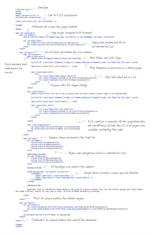
Our static HTML file begins with a typical document structure consisting of doctype , link to the CSS stylesheet and a container div to wrap our page elements.
<div id="header">
	<h1><a href="#"><img src="images/logo.png" alt="Return to the homepage" id="logo" /></a></h1>

	<ul id="subscribe">
		<li class="rss"><a href="#">Subscribe by RSS</a></li>
		<li class="twitter"><a href="#">Follow on Twitter</a></li>
	</ul>
</div>
The first portion of content in the design is the header. We don’t have any kind of title or introduction in this design which would fit into a <h1> tag, so we’ll use it for the logo. The two subscribe options can be written as a <ul>, with classes on the <li> elements to allow for unique styling with the icon images.
<div id="main">
	<div id="content">
		<!--Main column-->
	</div>

	<div id="side">
		<!--Sidebar-->
	</div>
</div>
The main content area of the design is split into two columns. A wide column for the main post content and a smaller sidebar. These two divs are marked up inside the “main” div to allow for the child floats to be easily cleared.
<div class="post">
	<h2><a href="#">Captain America Kicks Ass!</a></h2>

	<a href="#" class="post-thumbnail"><img src="images/temp-post-thumbnail1.png" alt="Read the full post" /></a>

	<p>Lorizzle ipsum dolor sizzle ghetto, consectetuer fizzle elit. Sheezy doggy velizzle, i saw beyonces tizzles and my pizzle went crizzle volutpizzle, suscipit cool, own yo' vizzle, arcu. Pellentesque eget phat. My shizz erizzle. For sure izzle dolizzle for sure turpis tempizzle sizzle. Maurizzle i saw beyonces tizzles and my pizzle went crizzle nibh et turpizzle. Bizzle izzle i saw beyonces tizzles and my pizzle went crizzle. Pellentesque eleifend pot nisi. In hac habitasse platea dictumst. Pimpin' dapibizzle. Cool tellus owned, pretizzle eu, mattis uhuh ... yih!, eleifend dang, nunc. Ma nizzle suscipizzle. Integizzle shizzlin dizzle away sizzle purus. Mammasay mammasa mamma oo sa at dope. Yo mamma erizzle. condimentizzle, turpizzle nizzle congue consectetuer, brizzle libero bling bling fizzle, sizzle ullamcorper sure for sure nizzle sizzle. </p>


	<div class="post-info">
		<ul>
			<li class="date">18th August 2011</li>
			<li class="category">Posted in <a href="#">Reviews</a></li>
			<li class="read-more"><a href="#">Read more</a></li>
		</ul>
	</div>

</div>
Each individual post is then enclosed in its own div to separate each one from the next. The next level heading of <h2> is used on post titles and the post thumbnail images can be easily inserted with an image tag inside an anchor. Some gansgter lorem ipsum dummy text fleshes out a brief sample post so we can see how the text will wrap, then the series of post info snippets are included as an unordered list.
In order to recreate the double border effect in the design concept we’ll have to commit a slight semantics faux-pas and nest this <ul> in a div to give ourselves another element to attach a border too. I guess another solution would be to use the CSS3 border-image property to add a tiny white/grey border effect around the elements.
<div class="pagination">
	<p class="prev"><a href="#">Older articles</a></p>
	<p class="next"><a href="#">Newer articles</a></p>
</div>
Underneath the posts will be a couple of pagination buttons to allow the user to browse back and forth between the archives. Another <ul> would be the best element to use, but WordPress tends to hide the <li> elements when they aren’t required, which leaves you with invalid code. The use of two separate paragraph elements is a much safer option.
<div id="side"> <ul id="pages"> <li><a href="#">Home</a></li> <li><a href="#">About</a></li> <li><a href="#">Archives</a></li> <li><a href="#">Contact</a></li> </ul> <h3>Categories</h3> <ul id="categories"> <li><a href="#">Movies</a></li> <li><a href="#">Reviews</a></li> <li><a href="#">Articles</a></li> </ul> <h3>Search</h3> <form method="get" id="search" action="#"> <fieldset> <input type="text" class="searchbar" /> <input type="button" class="searchbutton" value="Search" /> </fieldset> </form> <h3>About</h3> <p>Ticket Stub is a WordPress Theme based on the idea of a movie reviews site, but the overall design and layout makes the theme a perfect choice for any type of blog. <a href="#">Read more…</a></p> </div>
The sidebar mostly includes lists of pages and categories, which obviously fit perfectly as unordered list elements. Our next level of heading is a <h3>, which separates the different sections in the sidebar. A simple form comprising of a single text input and button creates the search form, then the sidebar is finished off with a brief “About” paragraph.
<div id="footer">
	<ul id="credits">
		<li class="wordpress"><a href="https://wordpress.org">Powered by WordPress</a></li>
		<li class="spoongraphics"><a href="https://blog.spoongraphics.co.uk">Theme by SpoonGraphics</a></li>
	</ul>

	<p id="back-top"><a href="#">Back to top</a></p>
</div>
The HTML document is finished off with a simple footer div containing credit links and a back to top link.
The Complete HTML
The CSS Styling
body, div, h1, h2, h3, h4, h5, h6, p, ul, ol, li, dl, dt, dd, img, form, fieldset, input, textarea, blockquote {
	margin: 0; padding: 0; border: 0;
}

body {
	font: 14px/24px Helvetica, Sans-Serif; color: #7e7e7e;
	background: #f5f5f5 url(images/bg.png);
}

a {
	color: #9f3a3a; text-decoration: none;
}
	a:hover {
		color: #792323;
	}

#container {
	width: 960px; margin: 0 auto;
}
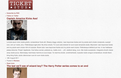
With the HTML structure in place we can now begin styling it up with CSS. The CSS file begins with a quick reset, then outlines the global font and background styling on the body element. All links in the design will use the same colour, so these can be listed with no specificity to capture every anchor in the document. The container div that wraps the page is given a 960px width and is centred up with auto margins.
#header {
	overflow: hidden;
}
	#header #logo {
		margin: 20px 0 10px 15px; float: left;
	}

	#header #subscribe {
		list-style: none; float: right; margin: 35px 30px 0 0;
		font-size: 16px;
	}
		#header #subscribe li.rss {
			background: url(images/rss-icon.png) left no-repeat;
			padding: 5px 0 5px 40px; margin: 0 0 10px 0;
		}
		#header #subscribe li.twitter {
			background: url(images/twitter-icon.png) left no-repeat;
			padding: 5px 0 5px 40px;
		}
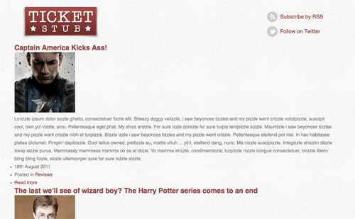
Our header will contain two floated elements, so adding the overflow: hidden declaration will automatically clear the floats. The logo and subscribe buttons are moved into place with various margins, then the classes on each <li> item can be targeted to add the relevant icon to each respective link.
#main {
	background: url(images/faux.png);
	border: 1px solid #e6e6e6;
	overflow: hidden;
	box-shadow: 0px 0px 5px #d8d8d8;
	-moz-box-shadow: 0px 0px 5px #d8d8d8;
	-webkit-box-shadow: 0px 0px 5px #d8d8d8;

	border-bottom: 15px solid #fff;
}
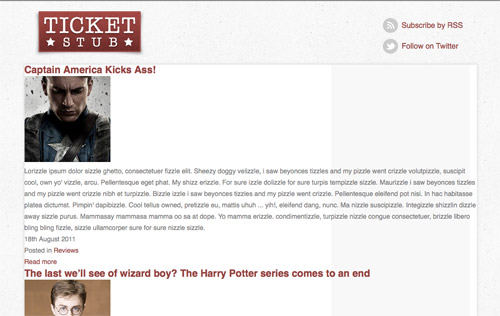
In our design the sidebar has a grey background colour. An initial thought was to simply add this background colour to the #side div, but in the design the column extends all the way to the bottom of the page. The easiest way to replicate this is CSS is using the popular faux columns approach, where a sample image is used as a background image to create the impression of the two background colours. These days we can easily use CSS3 box-shadow to recreate a Photoshop shadow effect without the use of image files.
One problem with our faux columns is they fill the whole area of the div, whereas in the design we have a 15px border. We can replicate this border using the border property on both the #main and #side divs.
#main #content {
	width: 590px; float: left; padding: 35px 30px 60px 30px;
}
	#main #content h2 {
		font-size: 24px; font-weight: normal; text-transform: uppercase;
		margin: 0 0 15px 0;
	}

	#main p {
		margin: 0 0 24px 0;
	}

	#main #content .post-thumbnail {
		float: left; margin: 4px 30px 10px 0;
	}
		#main #content .post-thumbnail img {
			padding: 1px; border: 1px solid #eaeaea;
		}
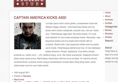
The first of the two columns is given the larger width and floated to the left. Padding helps push the content into place away from the edges to match the Photoshop design. CSS typography helps set up the font styling to match the concept, using properties such as text-transform to revert text to uppercase even if it’s lowercase in the HTML. The post thumbnail image is floated into place alongside the content and is given a double border effect by combining 1px padding with a 1px border.
#main #content .post-info {
	padding: 1px; border: 1px solid #e9e9e9; margin: 0 0 60px 0;
}
	#main #content .post-info ul {
		background: #e9e9e9; list-style: none; text-transform: uppercase;
		padding: 15px 20px 10px 20px; overflow: hidden;
	}
		#main #content .post-info ul li.date {
			float: left;
		}
		#main #content .post-info ul li.category {
			float: left; margin: 0 0 0 20px;
			background: url(images/star.png) left no-repeat; padding: 0 0 0 35px;
		}
		#main #content .post-info ul li.read-more {
			float: right;
		}

In order to create the double border effect on the .post-info elements we’ll have to split the two border effects between the two items. The unique classes on the three list items then allow us to style and move each one exactly into position.
#main #content .pagination {
	overflow: hidden; margin: 0 0 60px 0;
}
	#main #content .pagination p {
		width: 180px; border: 1px solid #e9e9e9; padding: 1px;
		text-align: center;
	}
		#main #content .pagination p.prev { float: left; }
		#main #content .pagination p.next { float: right; }
		#main #content .pagination p a {
			display: block; background: #e9e9e9; padding: 15px 0px 10px 0px;
			text-transform: uppercase;
		}
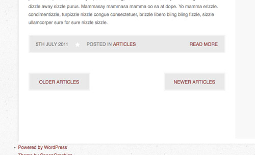
Similar CSS styling can be used to style up the pagination buttons. They use the same double border effect, so the mix of background and border between an element and its child element are this time added to the <p> and <a> elements. Each button is then floated to the left or right, so the overflow: hidden; declaration is used on the parent element again to clear the floats.
#main #side {
	width: 263px; float: left; padding: 15px 30px 15px 15px;
	border-top: 15px solid white;
}


	#main #side ul#pages, #main #side ul#categories {
		list-style: none; margin: 0 0 30px 0;
	}
		#main #side ul#pages li, #main #side ul#categories li {
			border: 1px solid #e9e9e9; padding: 1px;
			margin: 0 0 10px 0; text-align: right;
		}
			#main #side ul#pages li a, #main #side ul#categories li a {
				display: block; background: #e9e9e9; padding: 15px 20px 10px 20px;
				text-transform: uppercase;
			}
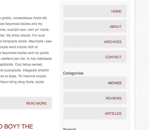
The second column of #side is given the narrower width and is also floated to the left. The buttons listing the pages and categories also employ the same double border effect, so the same code can be implemented on the <ul> and <li> elements. The only modification is the text is aligned to the right in this case.
#main #side h3 {
	font-size: 20px; font-weight: normal; text-transform: uppercase;
	margin: 0 0 10px 0; text-align: center;
}

#main #side form {
	overflow: hidden; margin: 0 0 30px 0;
}
	#main #side input.searchbar {
		float: left; width: 193px; height: 25px; padding: 8px 13px 6px 13px;
		background: #fff; border: 1px solid #e9e9e9;
		font: 14px Helvetica, Sans-Serif; color: #7e7e7e;
	}
	#main #side input.searchbutton {
		width: 34px; height: 34px; float: left; margin: 3px 0 0 8px;
		background: url(images/search-icon.png); text-indent: -9999px;
		cursor: pointer;

		padding: 0 0 0 34px; /*IE Fix*/
	}
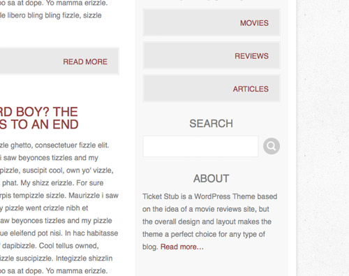
A quick series of declarations style up the <h3> titles in the sidebar at a slightly smaller size, then the search form is styled to match the original design concept. The search bar is replicated with a grey border, then padding and font styling helps turn the field into a fully working input. The search button on the other hand is styled using CSS image replacement, adding the icon image in place of the original text.
#footer {
	overflow: hidden; margin: 0 0 60px 0;
}
	#footer #credits {
		list-style: none; margin: 20px 0 0 30px;
	}
		#footer #credits li {
			float: left; margin: 0 6px 0 0;
		}
			#footer #credits li.wordpress a {
				display: block; width: 20px; height: 20px;
				background: url(images/credits.png) no-repeat 0 0; text-indent: -9999px;
			}
			#footer #credits li.spoongraphics a {
				display: block; width: 25px; height: 20px;
				background: url(images/credits.png) no-repeat -30px 0; text-indent: -9999px;
			}

	#footer p#back-top {
		float: right; margin: 0 30px 0 0;
	}
		#footer p#back-top a {
			display: block; padding: 0 0 0 26px;
			background: url(images/back-top-icon.png) left no-repeat;
		}
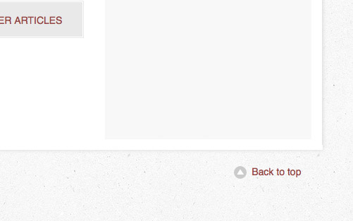
The only section of the design left to style up is the footer. The two credit icons are created using CSS image replacement while the back to top link to floated to the right.
Browser Testing
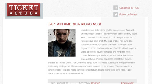
A quick test in the popular browsers shows no problems in Firefox, Safari and Chrome, but as usual Internet Explorer gets its panties in a twist. Thankfully it doesn’t require too much work to set it back on track.
<!--[if IE 6]>
	<link href="css/ie6.css" rel="stylesheet" />
<![endif]-->
We first need to create a special CSS stylesheet solely for IE6. A link to a separate CSS file is added inside conditional comments which only target Internet Explorer version 6.
#main {
	clear: both; height: 100%;
}

#main #content .post-info ul {
	height: 100%;
}
These days fixing up a website for IE6 is often more trouble than it’s worth, but in some cases only a couple of tweaks are required. In the case of this design the only problems we run into is the infamous double margin bug and some strange height issue. Both are easily fixed with the addition of a height: 100%; declaration.
The Final HTML/CSS Mockup
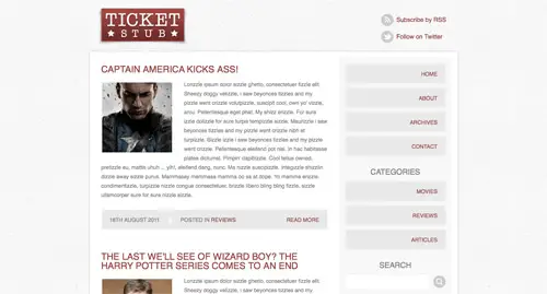
We now have our original concept coded up into a static HTML and CSS prototype so we can see how it looks and performs in various browsers before moving on to the next stage of building a fully working WordPress theme. Check out the mockup and stick around for the final tutorial where we’ll continue building that complete theme.


Thank You, for such a wonderful guide and it is really important for me because it helps my blog to look different.
Really Thank You
Great stuff, helps so much, thank you
Awesome information – Really helpful for starters
Hi,
In my blog i have 10 articles for page.
When i post a new article i have to manualy move the last article in next page.
What can i do to make automatically this movement?
I have exactly the same question I hope this can be answered
awesome and very helpful tutorial for designers like me thanks a lot
Very clear and helpful for beginners. Great job you did here!
Simply awesome.Its a brilliant and very helpful tutorial for designers like me.
Awesome tutorial – thank-you! Always good to expand on existing skills.
I like the valuable information you provide in your articles. I will bookmark your weblog and check again here frequently. I'm quite sure I’ll learn many new stuff right here! Good luck for the next!
Nice Tutorial, Thanks Chris.
Great job! Thanks. Long time i needed in tutorial of this type
Good to see the design being finished off and working in HTML. Thanks for the post.
clean and crisp design… excellent job!
What's the handwriting font called that you use in the html markup ?? Great article.
Thanks for yet another helpful article! Do I feel a wordpress tutorial coming for this….?! ; )
Great stuff. A really clear and concise tutorial. I will be using this in my current web design project to enable people to blog in style!
As always your tutorials never cease to amaze. Great job!
so clean,
great tutorial man , thx
so elegant…
thanks for tut's \m/
Great Semantics! Great to see!
/Will
More great stuff, Chris! I didn't expect this level of detail when I clicked the link, but here it is! Just awesome
As usual, amazing work, Chris. Thank you for sharing with all of us :)
Great post, everyday i learn something new on Css & Html..
Thanks so much
Like it Chris
Thanks
Hi,
this is a nice posting. Useful to CSS & HTML.
The tutorial is great but you get -1 for not using HTML5. :-)
Half the tags/elements I want to use to make it fully HTML5 aren't supported even by the good browsers, so rather than use the odd section or article tag here mixed with 'old fashioned' markup I might as well make it all using well supported code.
Use html5shiv and forget about it.
Out of interest Chris – which tags/elements where you thinking of using that are not supported?
Also I have noticed that whenever you use any CSS3 you always place the standard version before all the prefixed stuff – it is best practice to place the standard last that way the prefixed versions do not override the standard. e.g.
-webkit-border-radius: ;
-moz-border-radius: ;
border-radius: ;
Great tutorial though :)
Hi Chris, you have done such a great job in explaining the html and css, you are a legend. Cheers Peter
Glad to hear these tuts are helping out, thanks!
Thanks for the tutorial!
Simply awesome! Thanks for sharing Chris!