Line25 is reader supported. At no cost to you a commission from sponsors may be earned when a purchase is made via links on the site. Learn more
A couple of weeks back we went through the process of creating a gnarly snowboarding themed website design concept in Photoshop. The tutorial covered the process of designing our site concept from sketch to finished PSD design. Now, let’s take the design to the next step and code up a complete mockup in HTML and CSS, ensuring our code is semantic and standards compliant. We’ll then add some finishing touches with a spot of jQuery.
To refresh your memory
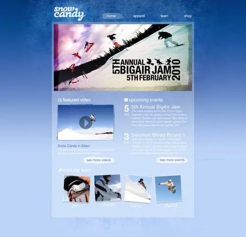
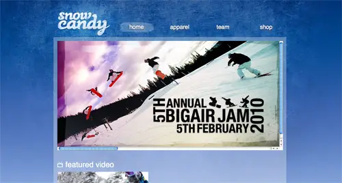
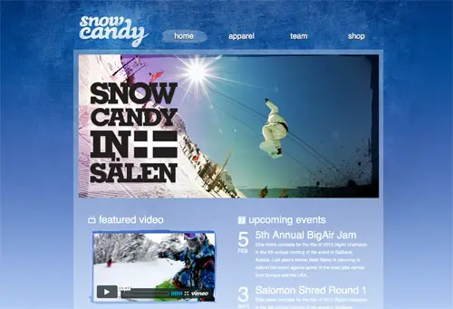
Cast your mind back and you’ll remember we left off at the end of the post titled Create a Gnarly Snowboarding Themed Web Design with a finished PSD sporting a textured background, large feature area and a mix of text, images and video making up the main content area.
Cutting up the PSD concept
With our design being pretty design heavy, there’s a good selection of elements that will need exporting from the PSD. The first is the large textured background.

Disable all other layers then draw a large marquee across the design that includes all the textured elements and blue gradient. Press CMD+Shift+C to copy this selection, then paste in into a new document.
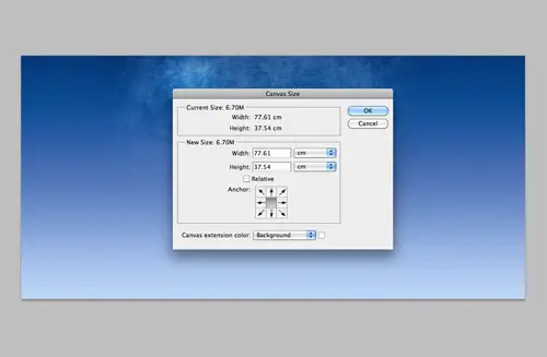
To take into consideration larger monitors, we need to make sure our design is wide enough not to be cropped off. A width of 2200px should be more than sufficient to accommodate even the larger of monitor setups. Select a portion of the gradient and press CMD-T to transform and stretch the background to fill the white space. Save this large image for the web, but take care to balance between file size and quality. With the image being super-sized, it’s important to carefully select the appropriate compression settings. My final file weighs in at 220kb, which is pretty heavy in normal circumstances, but considering that the rest of the design is quite lightweight, it’s a sacrifice that can be justified. We could have made things much easier for ourselves by not including a gradient as well as a texture, this way we could set a smaller graphic in the center that fades out to a flat colour. (Or wait until the multiple backgrounds CSS3 property is more widely supported!)
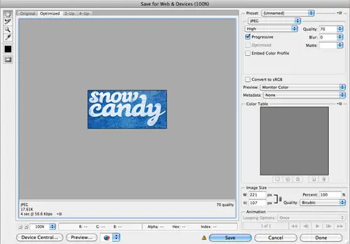
Continue selecting individual page elements with the marquee tool, pressing CMD-Shift-C to copy-merged then paste in a new document and export. Elements such as the logo, feature graphics, profile shots and every small icon needs saving as an individual graphic.
Remember to choose the most appropriate file type and compression setting for each item. An element that is made up of flat colours will be more suited to PNG format. Elements that require a transparent background can be exported using the PNG-24 option.
Once all of the images have been saved, you’re ready to move onto the HTML section of the website build.
Building the HTML structure
It’s always important to build the house before decorating the rooms, so we’ll begin by writing out the HTML structure of the website. We’ll base the HTML on the XHTML Strict Doctype and add the initial link to the stylesheet and a containing div to hold the content.
<!DOCTYPE html PUBLIC "-//W3C//DTD XHTML 1.0 Strict//EN" "https://www.w3.org/TR/xhtml1/DTD/xhtml1-strict.dtd">
<html xmlns="https://www.w3.org/1999/xhtml">
<head>
<meta http-equiv="Content-Type" content="text/html; charset=UTF-8" />
<title>Snow Candy</title>

<link href="style.css" rel="stylesheet" type="text/css" media="screen" />


</head>

<body>
<div id="container">

</div>
</body>
</html>
The header
The structure for the header is pretty simple. We have our logo, which is set in a H1 and links back to the homepage. Our navigation is perfect for an unordered list, and each contains an anchor to the relevant page. A class of active will then allow us to target an individual page for highlighting the active page.
<div id="header">
	<h1><a href="#">Snow Candy</a></h1>
	<ul id="nav">
		<li><a href="#" class="active">Home</a></li>
		<li><a href="#">Apparel</a></li>
		<li><a href="#">Team</a></li>
		<li><a href="#">Shop</a></li>
	</ul>
</div>
The content
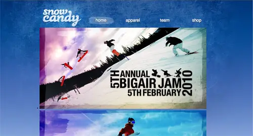
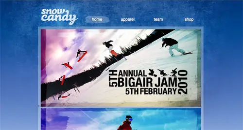
Next we flesh out the bulk of the page content. The whole main area can be contained within a div with an ID of content. Within this we’ll start with the large feature graphics, an unordered list will once again be a handy element to use, as it allows us to easily list them out in sequence. Inside each list element is each image graphic, complete with a descriptive alt attribute.
<div id="content"> <div id="features"> <ul> <li><a href="#"><img src="images/feature-1.jpg" alt="5th Annual Big Air Jam. 5th January 2010" /></a></li> <li><a href="#"><img src="images/feature-2.jpg" alt="Salomon Shred Round One" /></a></li> <li><a href="#"><img src="images/feature-3.jpg" alt="Snow Candy in Sälen" /></a></li> </ul> </div>
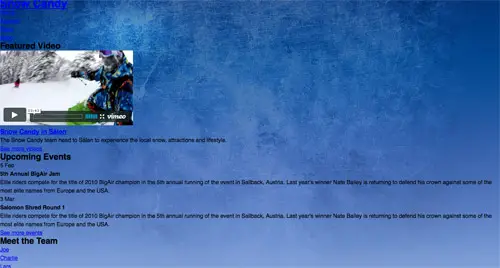
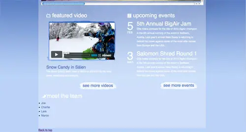
The design then splits into two columns, so we can add a div with a class of column ready for floating with CSS later. Within the featured video section I’ve embedded a cool snowboarding video from Vimeo, followed by the title and description, both set in natural header and paragraph tags. A paragraph tag with a class of “btn” will allow us to set up a global style for any button style objects, allowing some unique styling to be added. The actual Vimeo embedding code has been modified slightly to keep it valid within our Strict doctype, thanks to the help of this article.
<div class="column"> <h2 class="featured-video">Featured Video</h2> <div class="video"> <object width="379" height="213" type="application/x-shockwave-flash" data="https://vimeo.com/moogaloop.swf?clip_id=3155182&server=vimeo.com&show_title=0&show_byline=0&show_portrait=0&color=00adef&fullscreen=1"> <param name="allowfullscreen" value="true" /> <param name="allowscriptaccess" value="always" /> <param name="movie" value="https://vimeo.com/moogaloop.swf?clip_id=3155182&server=vimeo.com&show_title=0&show_byline=0&show_portrait=0&color=00adef&fullscreen=1" /> </object> </div> <h3><a href="#">Snow Candy in Sälen</a></h3> <p>The Snow Candy team head to Sälen to experience the local snow, attractions and lifestyle.</p> <p class="btn"><a href="#">See more videos</a></p> </div>
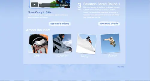
In the second column, the list of events has a layout that lends itself well to being rendered as a definition list, with the date and event description being relative to each other. The date can be set as the definition title, and the definition description as the content, which will help us target these tags to style up the fancy layout we’ve got going on. With the dates being laid out vertically at different type sizes, adding a span around the month will help provide that extra hook needed for the CSS styling.
<div class="column">
	<h2 class="events">Upcoming Events</h2>
	<dl>
		<dt>5 <span>Feb</span></dt>
		<dd>
			<h4>5th Annual BigAir Jam</h4>
			<p>Elite riders compete for the title of 2010 BigAir champion in the 5th annual running of the event in Sallback, Austria. Last year’s winner Nate Bailey is returning to defend his crown against some of the most elite names from Europe and the USA.</p>
		</dd>

		<dt>3 <span>Mar</span></dt>
		<dd>
			<h4>Salomon Shred Round 1</h4>
			<p>Elite riders compete for the title of 2010 BigAir champion in the 5th annual running of the event in Sallback, Austria. Last year’s winner Nate Bailey is returning to defend his crown against some of the most elite names from Europe and the USA.</p>
		</dd>
	</dl>
	<p class="btn"><a href="#">See more events</a></p>
</div>
The last portion of content is the list of team members. Again, this list of objects is tailored nicely to be written as an unordered list element. Within each list element is an anchor link that will head off to the relevant page. Each anchor also has a class to help identify each team member when styling them up.
<h2 class="team">Meet the Team</h2>

<ul id="team">
	<li><a href="#" class="joe">Joe</a></li>
	<li><a href="#" class="charlie">Charlie</a></li>
	<li><a href="#" class="lars">Lars</a></li>
	<li><a href="#" class="marco">Marco</a></li>
</ul>
The HTML is then closed out with the footer, containing a simple back-to-top link, and the body and HTML tags closed to finish off the document. A quick validation ensures there’s no errors, meaning it’s time to move onto some CSS styling.
	<div id="footer">
		<p><a href="#header" class="back-top">Back to top</a></p>
	</div>

</div>

</body>
</html>
Styling the CSS
The first line of CSS that’s written is to quickly reset any browser specific styling. Ensuring that we’re starting from a clean slate when it comes to margins, padding and borders. Next, the sans-serif font-family is set on the body tag, to render the Helvetica font throughout the design. A line-height of 24px will help us stick to our 24px baseline grid from the design, and will help fix any differences between browsers.
The main background of the site is then added. First the flat blue colour is specified, then the large textured background. This is positioned at the top center, and told not to repeat. Unlike inline images, background images don’t create scrollbars if they are larger than the content window, so despite our graphic being a huge 2200 pixels wide, a portion of the edges will be hidden according to how large the viewer’s monitor is.
body, div, h1, h2, h3, h4, h5, h6, p, ul, ol, li, dl, dt, dd, img, form, fieldset, blockquote {
	margin: 0; padding: 0; border: 0;
}

body {
	font-family: Helvetica, Arial, Sans-Serif; line-height: 24px;
	background: #b9d2f8 url(images/body-bg.jpg) center top no-repeat;
}
The header
Next up for styling is the main container div, which is simply given a 980px width and set to appear centrally. This is followed by the header and its sub-elements. The header div is given some padding to create the spacing at the top and sides according to the PSD concept, and is given an overflow:hidden property to clear itself and correctly calculate its height after the floated navigation elements.
The header one tag is given specific dimensions in order to properly display the logo as a background image, and a negative text-indent shifts the standard header text out of the way off-screen. The navigation is then floated alongside it, with a little margin to help align the elements. Each anchor inside the list items is styled to give the appropriate appearance according to the PSD concept, which includes setting the font-size and gaps between each element. They are then finished off with the addition of the transparent brush stroke graphic as a background image for links that have the active class, or are being hovered by the mouse.
#container {
	width: 980px; margin: 0 auto;
}

#header {
	padding: 48px 16px 0 16px; overflow: hidden;
}
	#header h1 a {
		display: block; width: 221px; height: 107px; float: left;
		background: url(images/logo.jpg); text-indent: -9999px;
	}

	#header ul#nav {
		width: 720px; float: right; margin: 42px 0 0 0;
	}
		#header ul#nav li {
			float: left; list-style: none;
		}
			#header ul#nav li a {
				display: block; width: 155px; height: 34px; margin: 0 0 0 25px; padding: 12px 0 0 0;
				font-size: 24px; text-transform: lowercase; color: #fff; text-decoration: none; text-align: center;
				text-shadow: 0 3px 3px #333;
			}
				#header ul#nav li a:hover, #header ul#nav li a.active {
					background: url(images/active-nav.png);
				}
General content styling
The main central content area can then be styled to mimic the original PSD concept. First it’s given a specific width, with padding to push the content away from the edges. It’s set to overflow:hidden because it will contain some floated elements, and is given a transparent-white background PNG to create the translucent effect. Other options to create the white transparency could have been the opacity property, or the CSS3 RGBa property, but a good old PNG-24 graphic is the most cross-browser friendly, with just IE6 requiring extra work to enable the alpha transparency.
To finish off the content area, a small radius is added to the corners using the border-radius property. Because this isn’t fully supported yet, browser specific code can tell individual browsers to add the novelty effect.
#content {
	width: 938px; padding: 16px 16px 60px 16px; overflow: hidden;
	background: url(images/white-trans.png);
	border-radius: 3px;
	-moz-border-radius: 3px;
	-webkit-border-radius: 3px;
}
Styling the feature section
The large features section in the design currently holds three slides, but the aim is to only display one at a time. When Javascript is added, these can be tweaked to transitionally fade between each one, but we also need the section to work without Javascript being enabled. To do this, the features section is given the specific dimensions of one slide. The overflow:scroll property will then add scrollbars to allow the user to manually navigation between slides. The UL is given a width of 2820px (3x the width of the slides), and they’re floated side by side. Without limiting the features container to a specific size, the slides would simply fill up the whole page, which ruins the usability of the site. This way, the user can experience the features slideshow, albeit in a much more low-tech way.
#content #features {
	width: 940px; height: 457px; margin: 0 0 48px 0;
	overflow: scroll; /* Changed to hidden if javascript enabled */
}
	#content #features ul {
		width: 2820px;
	}

	#content #features ul li {
		float: left;
	}
Styling the columns and their content
Remember those two columns we wrote out in the HTML? They need floating side by side, so a width is calculated that will fit inside the content div, and the float:left property added. Inside these columns the video and upcoming events sections are styled. The video div simply has an image background to style up the embedded video, and some padding quickly aligns everything up. The definition list for the events section requires some extra CSS to manipulate the basic definition list element into the fancy layout we have planned. The date of each event is contained within the definition title, so that can be floated to the side and set to a large font-size. The extra span we added then comes in handy to render the month text at a smaller font-size, and as a block element so that it drops down below the number.
The definition description and its header h4 tags can then be given the appropriate typographic treatment once the DD is floated alongside the DT. With all styling complete it matches the original concept perfectly.
#content .column {
	width: 409px; float: left; padding: 0 30px 0 30px; margin: 0 0 24px 0;
}
	#content .column .video {
		width: 387px; height: 222px; padding: 13px 0 0 17px; margin: 0 0 24px 0;
		background: url(images/video-bg.jpg) no-repeat;
	}

	#content .column dl dt {
		width: 55px; float: left; padding: 10px 0 0 0;  overflow: auto;
		color: #fff; font-size: 64px; line-height: 34px;
	}
		#content .column dl dt span {
			font-size: 16px; text-transform: uppercase; display: block;;
		}
		#content .column dl dd {
			float: left; width: 354px;
		}

		#content .column dl h4 {
			font-size: 32px; font-weight: normal; color: #fff; margin: 0 0 5px 0;
		}
Styling the team list
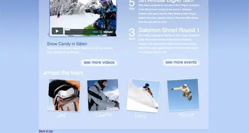
The last part of the content styling is to flesh out the list of team members. Earlier each team member photo was exported, so these can now be set to each individual anchor tag. Each list item is set to float left, and is given the appropriate margin to space them out across the page. Anchor elements are by default inline elements, so to allow a specific width and height to be set, they need to be converted to display:block. Each individual team member can then be targeted through the class names on each anchor, with each photo graphic and image dimensions being added as a background.
#content ul#team {
	list-style: none; overflow: hidden;
}
	#content ul#team li {
		float: left; margin: 0 0 0 27px;
	}
		#content ul#team li a {
			display: block; text-indent: -9999px;
		}
			#content ul#team li a.joe {
				width: 199px; height: 229px;
				background: url(images/joe.jpg);
			}
			#content ul#team li a.charlie {
				width: 199px; height: 229px;
				background: url(images/charlie.jpg);
			}
			#content ul#team li a.lars {
				width: 205px; height: 233px;
				background: url(images/lars.jpg);
			}
			#content ul#team li a.marco {
				width: 198px; height: 229px;
				background: url(images/marco.jpg);
			}
The footer area can be quickly finished up by adding the subtle texture background, and the back-to-top link floated over to the right, styled up and positioned into place.
#footer {
	min-height: 159px; overflow: hidden;
	background: url(images/footer-bg.jpg) center 0 no-repeat;
}
	#footer p a.back-top {
		float: right; margin: 14px 24px 0 0;
		font-size: 12px; text-decoration: none; color: #4d74bb;
	}
		#footer p a.back-top:hover {
			color: #234c97;
		}
Adding the Javascript
Let’s not forget the extra Javascript effects we had planned for that features section. With the help of some jQuery, and the super cool Cycle plugin, we can easily transform that basic features list into a fully working slideshow.
<script src="https://ajax.googleapis.com/ajax/libs/jquery/1.4.1/jquery.min.js" type="text/javascript"></script>
<script src="js/scripts.js" type="text/javascript"></script>
First, the jQuery library and our own scripts file is referenced in the HTML. The cycle plugin is included in the scripts.js, then some of our own Javascript can put it all into practice. First the overflow:scroll on the features list needs changing to hidden to remove those ugly scrollbars, then the cycle plugin is initiated on the features list. By default the plugin will place a simple fading transition between each element, but there’s plenty more options that could be configured.
$(document).ready(function() {

/* Change the overflow:scroll to overflow hidden on the Features list */

	$('#features').css('overflow','hidden');


/* Initiate the cycle on the Features list */
	$('#features ul').cycle();
});
The final concept
So here we have the complete mockup in live HTML and CSS format. Our HTML is clean and valid, and the CSS renders everything how we wanted according to the original PSD concept.
Thanks for sharing this so good post about PSD and HTML. I am very much impressed that you explained the points step by step. Thank You!
Great tutorial
Keep sharing such amazing stuff..
Very good post – Can you please tell me know, if I have paid the right amount for HTML conversion? Recently, we have hired a PSDtohtmlcode.com services for one of our client, he wanted to convert about 10 pages from PSD to HTML – Since I am not from the design and development background I would like to know from you all is 480$ a good amount for such kind of job? Thanks
Thanks for sharing this so interesting psd to html tutorials post! I really want to be thankful for the way you have putted it here.
Nice tutorial for learning. I will definitely share this with my friends.
Keep it up :)
Nice tutorial! Thank you.
very creative and helping for beginners
As an website developer basic necessity is website need to be converted PSD into HTML. To follow the present day trend we need upgrade our websites to HTML5 and CSS3.
Happy sharing…..
I prefer your tutorial. Great css/html code that figure out how to make website for yours. Slice PSD to HTML
Great sample. I am wondering if image sprites of certain elements would speed up the site in order to compensate for the large background?
Nice job as always Chris!
Great design clear tutorial. Keep doing the good job Chris.
Chris, the tutorial is not correct. Adding the last part from #content#team the h2 styling explanation is missing:
#content h2 {
font-size: 32px; text-transform: lowercase; font-weight: normal; color: #fff; margin: 0 0 16px 0; clear: both;
}
The main thing I adore about photoshop is the amount of power it has. When I first begun using it, I was only just running the basic functions. When you are more technical, there is much more you can manage and manipulate with imagery. So glad I made the leap from pre-fitted Microsoft programs!
I like the way you have described in this tutorial, code divided into several pieces is really more understandable to anyone I am very beginner it’s really helping me to get underlying knowledge of web designing.!!
I prefer your tutorial. Great css/html code that figure out how to make website for yours. Slice PSD to HTML
In my view coding takes a lot of work to process. There are numerous conversion companies are there who provide these services at a reasonable cost. Opting for these services might be a cost effective strategy.
Hi, I´m extremely grateful for your tutorials! i´m a newcomber in the area of web design in terms of modern metodologies, I mean, all of what they taught us in the academy was to make framesets and export slice tables from photoshop, therefore i started workign in the desktop publishing industry, but since the global crisis, i´ve been forced to "reinvent" myself. Fortunately, tutorials like yours are there to help.
One question tough. Via wikipediaarticle on xhtml I stumbled across an article titled "Beware of XHTML", it is here: https://www.webdevout.net/articles/beware-of-xhtml
I read it just after finishing the pixeljuice tutorial, but now i´m just starting the coding for this one, and now i´m in great doubt about using xthml strict because of this article. Can you (and hopefully any other interested in the matter) please give it a read, and share some opinions here?
Is this generally only for HTML? Any tutorial for wordpress that involved php etc? I believe the technique is very different. Excellent tutorial anyway. Thanks for sharing.
Great tutorial! Thanks
Hi and thanks for inspiring me – my next web design is going to be all CSS.
I'd got to grips with classes and stylesheets etc but never with positioning (tables school of thought here).
This should help!
Regards – Jonathan.
wow, this is amazing Chris! It's great to see the PSD come to life. Job well done.
Very well explained, finished version looks great good job!
Nice walk-through and great design Chris. The only thing I would think about a little more would be the use of the white text on that light of a background…kinda makes it hard to read.
Other than that, great job and thanks again!
You may need a shave, but your tutorials are whisker free
Hey Chris , thanks for an excellent tutorial. After completing the html/css parts with relatively ease, I’m a bit confused on the jQuery/javascript section, I have got the other images to disappear but can’t get the cycle to start. Sorry if this sounds like a dumb question but I have only touched javascript once before (but definitely want to learn it in the future!). Thanks again.
l like this. lets start from here ;)
Great Tutorial (the design part as well as the code). I especially liked that you actually picked a theme for this tutorial (Snowboarding), rather than a generic corporate business or portfolio design, as so many other psd to html tutorials do.
Only one recommendation: You should use the following font-stack instead of yours: font-family: ‘Helvetica Neue’, Arial, Helvetica, Sans-Serif;
Helvetica renders really eye-unfriendly under Windows, but because most Mac users have Helvetica Neue they will see that exact font, Windows users will see Arial and Helvetica serves as a fallback for both cases. (I can highly recommend the follwing article: Revised Font Stack)
You could also consider using ems and % for the font-size, rather than px – this way even IE users can re-size the text properly.
Cheers
One more little remark regarding your comment styling here on Line25 – When I’m adding one line of space in between two sentences (e.g. two line breaks resulting in a closed p-tag) it won’t appear in my comment later on.
There is obviously no margin-bottom (or padding) added to the p-tag in the comments section. I’m not sure if you made this decision intentionally, but it would be great if commenters would have the possibility to give their comments a little more structure.
This is a great tutorial for going from PSD to XHTML. I have been looking for a post like this for awhile online.
Thanks.
I agree with Sahus, one of the best and easiest to follow that I have seen
Thanks!
Thanks Chris for this great tutorial :)
Best tutorial I’ve found so far on how to code XHTML/CSS from PSD design. Thanks for the tut ;)
Hey Chris, this is a really good tutorial. Clear and easy to understand. A good idea for you next post would be to take this one from HTML/CSS to WordPress.
Thanks for the awesome job!
I think you would be the perfect person Chris to do a tutorial on psd – html – wordpress!!! I would highly enjoy that!
Wolud you please make a similar tutorial for create a WordPress Theme using the same Snow Candy PSD? That would be great. Also, would you use a framework like Thematic or Carrington or some other?
Great design clear tutorial. Keep doing the good job Chris.
cheerz from france :)
Thanks for cool tutorial!
Iv got a nice imagination :D
Thanks for this tutorial!
this is the best tutorial about Photoshop and HTML :)
i have put it in a Facebook group:
I love photoshop!
https://www.facebook.com/group.php?gid=496464030353
Great article, and a really cool looking site!
This would be possible using BaseKit by naming your layers and then importing your PSD file. BaseKit does all the slicing and dicing magic and even automatically flexes your layers when you add content.
You will get clean and semantic layout code – no tables!
We’re in beta still – check it out and let us know what you think.
Great tutorial. I am wondering if image sprites of certain elements would speed up the site in order to compensate for the large background?
Nice job as always Chris!
Nice tut Chris. Seems to have got quite a response as well!
Nice tutorial! This is great for me to learn HTML/CSS. I have been using Flash to create websites for years, always mystified by HTML. It was too scary for me. But now it is time to learn! Your tutorial could be the turning point for me.
Thanks!
awesome! thanks
This is great! Is that PSD available for download – and maybe it already is and i’m totally blind. Thanks!
For the Body Background, you should add the solid center image in an inner div, then make the body a repeating-x sliver. Then set the background to the baby blue’ish color.
Great article for a beginner, this will definitely help them recognize when and where to dice and slice. Well done.
Great Job! I have a friend who is learning to code PSD and you just help me to help him !!
Thanks dude !
Great job – you make it so simple!!
Do you have any other site designs you can brake down?
Plz Chris we need more ;))))
Thanks for the great tutorial, I learnt some new stuff.
Hey Chris, thanks for yet another tut. lovely tut.
Chris, why did you not used CSS Sprites, e.g. icons or members of the team faces? Beware of using H1 for logo :) it’s not important thing on whole page (except main page).
really good designing and coding Chris!! i like it!! very useful for me!!
thanks!
Awesome Chris – Thanks.
I’m always wondering about the best way to incorporate gradient backgrounds, of which I dont think there’s a ‘best’ solution. Some interesting points others have mentioned too.
All in all – another great tutorial for us learners.
The best way for this design would have been to settle with either the gradient, and repeat a slice horizontally, or just use the central texture.
But hey, we’re designers! We can’t help but make things harder for ourselves just for that extra touch of eye candy!
What’s the font called you used on “Snow Candy”?
Thanks!
That font was touched on in Part One where the design was created, but for reference it’s called Black Rose.
It’s great to see a design that is not only very aesthetically pleasing but also uses completely valid and semantic code. It even degrades well without javascript! This is a great example of modern web design done properly!
Nice to see it
Hey Chris,
Great tutorial as usual!
might actually follow this one need a little refresher I think :)
P.S I love how you indent CSS just like I do :)
Always wondered how lots of websites looked so good. Thanks for the tutorial!
awesome tutorial and this is really helping for web designers.
Great (and easy-to-follow) tutorial!
Wish I had something like this a couple of years ago when I first started to learn CSS development.
Great as always :). Nicely done with coding, but I must say that the design itself is just eye-candy.
Ever think about screencasts Chris ? :)
I’m with Anto on that. Have you ever thought about this :) ?
I’ve done a couple of small screencasts in the past, but nothing too big. I’m always up for giving things a try though, so there’s every chance I’ll post one some day!
deneme deneme deneme
Thanks for this!!!!
Why not use layer-based slices and slices so you can edit graphics and export them exactly as you had previous set? This saves time. And no, don’t export the XHTML/CSS from PSD. Use the slice guides to your advantage instead of temporary marquee selections. Designs DO often change. Agree?
Exactly what I wanted to add. Guides + slices + assigning and remembering shortcuts to toggle visibility of each one = win.
Definitely consider using the slice tool opposed to marquee tool. It’s actually quite handy exporting all of your images at once in the Save for Web dialog, verses having to manually export each image.
Using the slices tool is definitely a good idea. It never entered my mind when writing the tutorial as I’ve always used my own little habit of using Copy Merged.
I’ll have to give the slice tool a go on my next design. I haven’t used it since my early days of exporting images slices for table layouts!
I do the same as you Chris – copy merged – but they’re right, slices is the better option. I also use layer comps to group all the different views I need – to save having to keep showing/hiding layers everytime I need to export my images.
Brilliant! Been waiting for this tutorial. Thanks Chris.
Thanks, Chris! Great tutorial
Hi Chris ~ Nice tutorial for beginners. Was wondering why you suggest they copy flattened layers to new files for optimization rather than using the non-destructive method of working with slices? Cheers!
I personally use the Copy Merged command rather than flatten the document, so it’s not descructive.
But the use of the slice tool does have a bunch of benefits! I’ve simply developed my own little habit and workflow of CMD-SHIFT-C.
Yes, I wondered this too. Especially because if you have to go back and redo an image (say the client wants a different shade of blue), then it’s a lot of labour to repeat (which is what I used to do). Where with slices, all the sections are saved making recreating an image easier.
Also, while I do have your attention, something I’ve started doing in my PSD is separating my content and background. So I group all my content groups, and group all my background groups. Then I can just switch off all the content at once when I want to create all the background images.
Is this an okay way to do it? Or would you advocate always keeping all components of an element together?
thanks
Very good tutorial. However from a SEO perspective I cannot agree with the negative text indent of the header text. I’m not sure this is optimal solution as even Matt Cutts confirms the use of alt text makes a difference compared to “nine thousand pixels over to the left” Here’s the link to the actual video regarding this question: https://www.youtube.com/watch?v=fBLvn_WkDJ4
Thanks a lot for this nice tutorial
hi i have a question
Isn’t slicing the psd file and saving the images and html file enough to create d site?
Still new and would love to know more!
Thanks
Are you talking about the auto code thing with the slice feature? You should never use that. It creates dirty, unsemantic code (most often with tables and not CSS). Your coding should always be done by hand for better SEO, cleaner codes and quicker loading times.
Amber has nailed it on the head there. Coding your sites by hand is definitely the way to go.
Thanks, will give an indepth look into the tutorial and learn how its done :)
Thanks so much :) , where I live here in Malta, i have to learn everything bymyself asno good courses are available :(
The slice and save for web option saves to tables per default. Five clicks and it exports with divs and css in xhtml strict. voila.
Slices can be helpful if you use them right. Its a good fast way to export a batch of images, then select only the ones you would like.
I use the generated HTML as a roadmap as to where my images go, having the source open in my editor along with my new real coded page. Then I just copy out the image paths and paste them into my code as background styles on a TD, etc.
Also, I use inline styles until I get my main template ready, then I assign classes and ID’s to my elements, then break out the inline styles into the classes and refactor any similar CSS.
That way, you get better class names than “Inner” “Outer” “Left” “TopBar”, which can be confused later on with similar elements.
couldn’t you set a repeating background for the HTML tag (the gradient) and the texture as the body background? Don’t know if it would reduce file size, though and you would have an extra http request.
you could put all the non repeating backgrounds in a sprite
That’s definitely another approach. Although as you mentioned it’s an extra DIV that doesn’t really need to be there apart from to attach the background image to.
My approach keeps it semantic, but sacrifices the image file size (which isn’t too bad when viewed online after all).
Not an extra div, Chris. Paul is suggesting putting the gradient on the html element and the texture on the body element… so no extra markup at all… and yes, Paul it is smaller. Good suggestion! and nice tut too Chris. Thanks
Ah, I just posted the same comment below :)
Hey Chris, thanks for the tutorial, As the background is a gradient one, If I have tried converting this xHTML and CSS to a wordpress website, how will the image repeat heightwise if in some posts there are lots of content and it is more than the height of the background image.
There are lot of webdesign psd tutorials out there but not so much tuto about how to convert psd to html/css. Your tuto is simple, well explained, the code is clear.
This tuto sould be a reference for those who learn to code. TY
Very useful !!! Thanks a lot :)!
really the best one i read Chris Spooner thanks and hope more from this tutorials
There’s a terrible design flaw here: your logo should never be kept under the h1 tag for SEO purposes, your headlining active content should be. Also, h4 tags are pretty much ignored by google bots.
H1 as logo or title is one of the age-old debates, with either option being Ok I think.
H4 wise whether it’s read by bots or not I’d say it’s the most semantic use for that particular heading – Not important enough for H3 but being higher than a paragraph.
H1 has been downgraded so much by the engines in recent years it doesn’t really matter. Chris’s method is fine for SEO purposes!
Agree with @dietbrisk, but not only for SEO. You should also think about accessibility when using your H tags: Screen readers for vision impaired people also put weight on the use of those tags.
Regardless of your stance on H4’s ,H1’s should *always* be the most important description of that particular page, and *never* the site title since that doesn’t change.
These articles are very useful for people who are learning.
As great as ever, Chris
Good job.