Line25 is reader supported. At no cost to you a commission from sponsors may be earned when a purchase is made via links on the site. Learn more
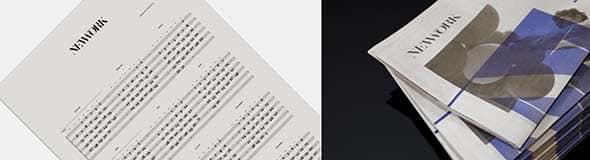
The use of horizontal bands in website design has been a growing trend over the last few years with results of a fantastic looking website layout. Not only does the use of these horizontal strips provide specific containers for each page area, but it also spans right the way across the user’s monitor.
This is especially handy when taking into consideration those with an exceptionally large monitor, helping prevent the main site content being lost in a sea of flat color.
Check out this collection of excellent websites that use horizontal bands or horizontal layouts to feature their content, and follow through to a quick walkthrough of how to create the effect yourself.
AndrewBradshaw.com
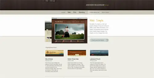
This site presents a web and graphic designer’s passion for creating clean and elegant designs. You will find projects, some pieces of advice and many tips and tricks.
akita.co.uk
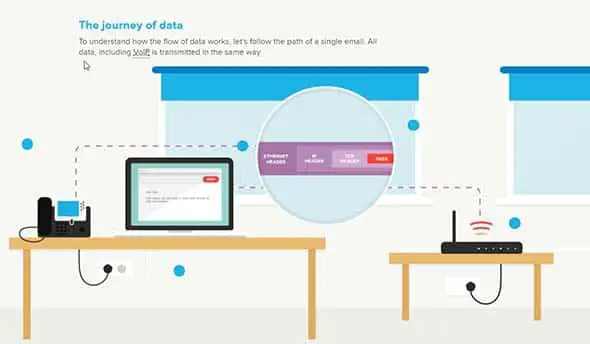
akita.co.uk is a nice example of a horizontal website that presents a vision about how internet data travels.
MailChimp.com

MailChimp.com comes in handy when you are trying to grow your business. Their presentation website makes use of the large, full screen, horizontal layouts trend.
CampaignMonitor.com
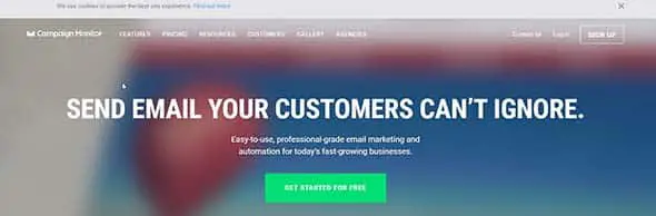
CampaignMonitor.com presents a professional-grade email marketing for growing businesses. They have a fullscreen presentation website with a mostly horizontal layout.
daydreamdesigns.co.uk
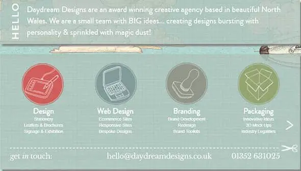
Daydream Designs is formed of a small team with great ideas and always keen on creating innovative designs. Check out their horizontal slider band in which they showcase their services.
EthixStudios.com
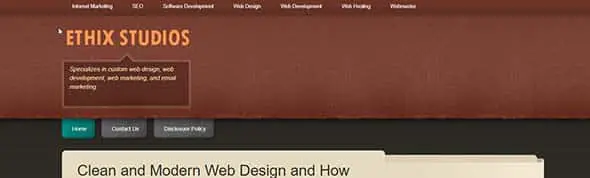
EthixStudios is the perfect example of how a horizontal band can be used in a website design. Check it out!
MediaTemple.net

MediaTemple.net design focuses on delivering its info through a horizontal slider and layout. The site also has beautiful transitions and effect.
Inhouse Designs
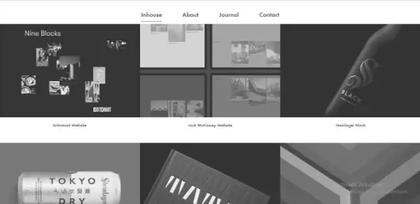
Inhouse Design is an online consulting service agency for graphic designs. Their website has used dark shades and horizontal bands in their layout.
MacaMontreal.com

MacaMontreal.com is the presentation website of a company formed of specialists who completed Apple training programs. The site’s design is simple and uses a horizontal layout.
UzairUsman.com
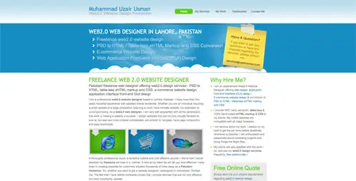
On this website, you’ll find options for web design services – PSD to HTML, PSD to WordPress and e-commerce. It uses an illustrated horizontal band on the homepage.
siscottstudio.com

This is the website of a tattoo artist who is looking forward to where his next inspiration will come from. It has a dark color palette and a horizontal navigation.
Wemakegames.co
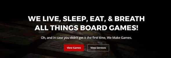
This website belongs to a team of excellent game makers and their aim is to be the coolest board game designers ever! They use a dark, horizontal layout with a simple CTA on their homepage.
giellesse.it
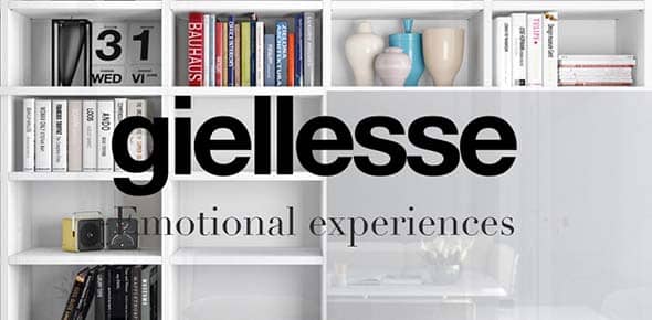
Giellesse is the website of an Italian leader in manufacturing furniture for over 90 years. They use both large typography and high-quality images combined with a horizontal layout.
rezo-zero.com

Rezo Zero is a creative studio focused on brand identity design and helping businesses evolve.
assets.wwf.org.uk
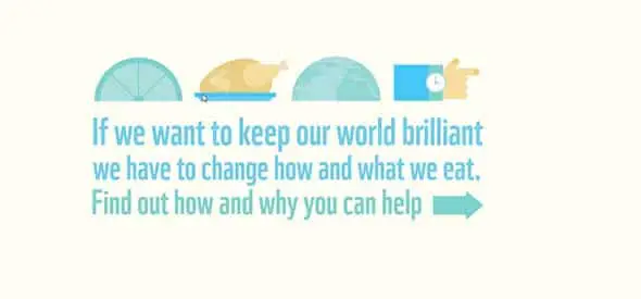
This is an organization whose aim is to raise awareness of what we eat and how we could help our planet. They use a smart horizontal navigation with a slideshow feature, on their homepage.
JunoWebdesign.com
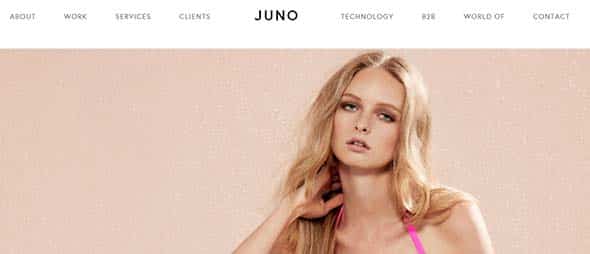
Juno is a business strategy and automation company focused on e-commerce platforms, brands and more. Their website design is mostly horizontally-focused.
Orangebus.co.uk

Orangebus has a simple website design with a horizontal layout and some cool transitions and effects. Check out how the content is displayed here.
outline2design.com
![]()
This is another web design agency’s website, this time with a black and white color palette and bright, yellow accents. It has a fullscreen layout and the content is displayed horizontally.
Ekklesia360.com

This website’s displays its content into blocks. It has a dark blue color palette and a nice combination of fonts.
Branded07.com
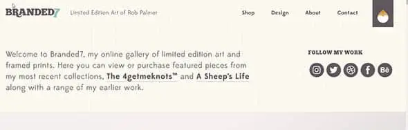
Branded7 is an artists’ online gallery of limited edition art. This website is both a good example of web design and a place where you can view or purchase featured art pieces.
TwiggleGraphics.com

TwiggleGraphics specializes in design, branding and other creative activities. Their website combines catchy geometric elements with large typography, on a horizontal layout.
OnWired.com

This is another great example of a website layout that has the content divided into horizontal strips, starting from the slideshow.
25-years-of-the-internet
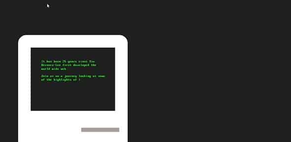
25-years-of-the-internet is a horizontal scrolling website that shares the story of the internet from the moment is was created to nowadays.
SureFireMedia.com

Having a horizontal layout on the homepage, especially in the above the fold section, alongside a catchy CTA is a popular trend nowadays. This is a great example of this technique.
WakeInteractive.com

WakeInteractive is a web design agency focused on creating modern designs. They use a fullscreen image with a blue overlay and a simple CTA button.
bartleboglehegarty.com
Here’s the website of a creative agency which provides good digital solutions for their clients. The content is divided into horizontal strips and content blocks.
hasrimy.com

hasrimy.com is a web design agency which specializes in web development and e-commercem and this is their presentation website.
Gridonic.ch

Gridonic is a company focused on creating beautiful and user-friendly solutions for the web. Check out their horizontal layout!
Norgram
Archidirectors
Buildinamsterdam

Studionewwork
Create Your Own Horizontal Bands
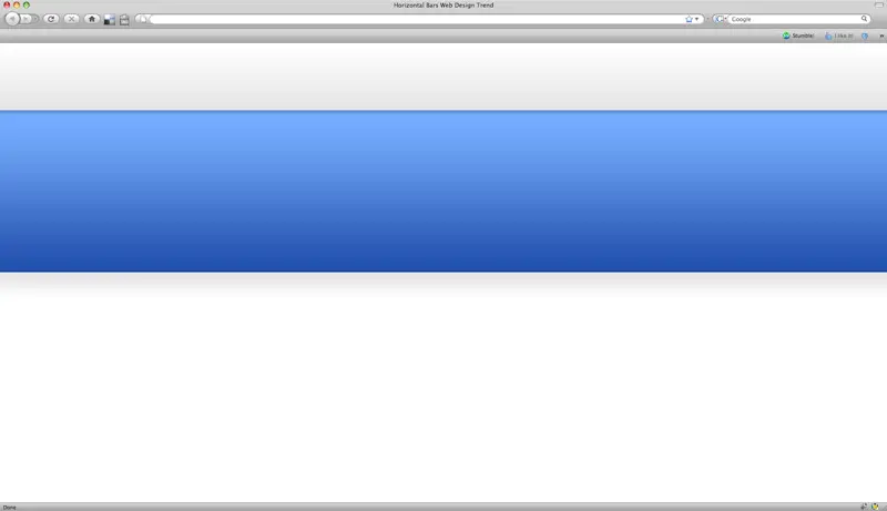
Let’s take a look at how to create and implement such design styles into your own website designs. We’ll be producing the initial graphics in Adobe Photoshop, exporting the relevant imagery then adding some simple CSS coding to bring the effect to life. This technique can be used not only on the page body but also on container divs and other elements.
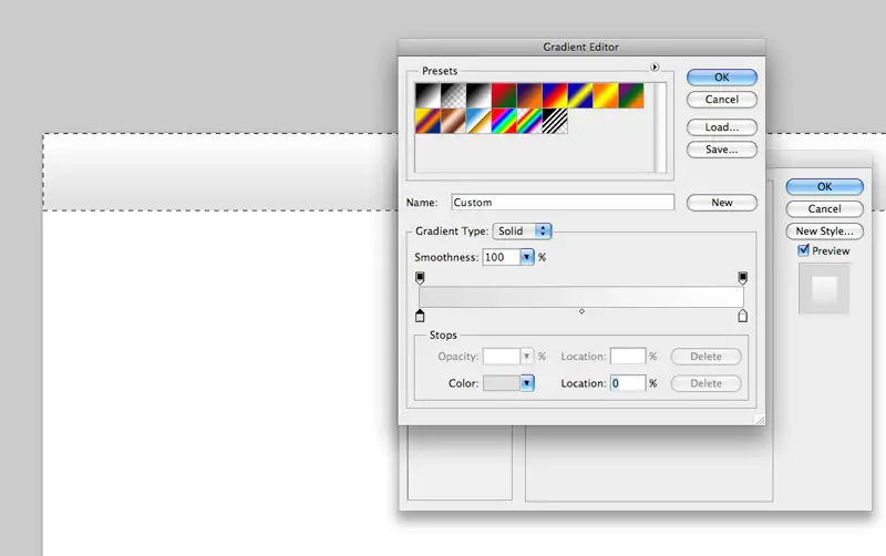
Create a new document in Adobe Photoshop, I tend to work at a resolution of 1680×1050 to give a good indication of the overall appearance of the website on an average sized widescreen monitor.
Create a selection across the width of the document, fill with white on a new layer and double click to access the layer styling properties. Click the Gradient Overlay tab and select two swatches to create a vertical linear gradient.
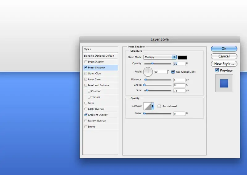
Repeat the process on a new layer, this time creating a larger blue gradient. To add an extra element of detail leave a 1px gap between the panels to provide the illusion of a highlight, also add a subtle Inner Shadow to the panel to give an impression of depth to the layout.
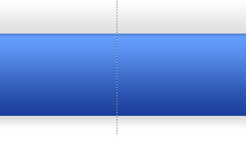
With the visual concept complete, draw a thin one to two-pixel selection vertically across each band of color. Go to Edit > Copy Merged and paste the thin strip into a new document
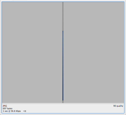
Go to File > Save for Web to export the strip, choose a suitable filetype and compression. Notice the considerably small file size of the graphic, making it an excellent technique which not only visually enhances the page but keeps overall weight to a minimum.
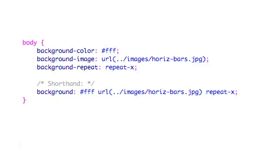
Add the CSS coding to style the web page. Here the image is being applied to the body tag and set to repeat horizontally using the repeat-x command. The CSS can also be condensed down to a single line by writing out the rule in shorthand.
With numerous instances of the image butted together it gives the impression of a continuous graphic when viewed in the browser. In this particular technique, we have used a single graphic to provide two panels of a specific height, to take the example further each colored strip could be attached to an individual div along with a background colour sampled from the image, this will allow the section to continuously expand depending on the length of the content.
thanks a lot for posting this, this is very useful for me, thanks again
Very nice designs if only all sites were this nice to get around.
Great horizontal bands List and with short tutorial to boot. I think MediaTemple.net is my favorite. Ive always like that design.
I must say, useful information for users especailly for website designers.
I must say, useful information for users especailly for website designers.
https://www.eluneart.com
Great collection. Thanks for sharing.
Dang you’re inspiring me a lot! I wonder how to achieve the spotlight on center effect for those bands. Might be just a couple of slices, one monotone for the oversized background and one (that gradually lit up and degrades) for the main content part?
Thank you so much for posting this. This gives me some ideas on how to create my own CSS-website.
Very smart. Thanks Chris! Would this work the same way doing vertical bands?
A popular technique, pleasing to the eye to give illusion of depth.
I think horizontal design is still a trend, just the bars are taller now… often filling the whole viewport.
Great article. Thanks for the mini tut at the end. Delightfully exquisite!
Great source of inspiration! Thanks!
You have a great new blog, Chris. Love the grid lines. Keep up the great work!
Thank you for featuring our website.
Too funny. Just last week I used at least six of these sites for inspiration.
Great post
Great inspiration source. Perfect post, thanks.
One remark on the How-To: i’d advise people to cut a 10px-wide slice, not a 1-2px-wide one. The image surface will be 5 or 10 times greater, but with little to no impact on the file size if done right.
Why a larger image? Because it makes maintenance easier, since when browsing the images for your website design it’s hard to figure out what this or that 1px-wide image is for.
Plus some older computers and older browsers have difficulties repeating one image thousands or tens of thousands of times (small performance hit).
Some great sites for inspiration, cheers!
Thanks for a nice inspirational list,.. and tutorial ;)
Thanks for mentioning us in your post Chris — very cool.
Tony of OnWired
Great post Chris! You should do a roundup of all the faux-3D stuff that’s floating around lately too, seems to be more and more of it every month! :)
I really like this kind of sites with horizontal bands, and it could be really helpfull as a tool, with a good and simple efect on the header you can have something extra..
I noticed how much I’d seen the technique lately only the other day! Great post.
Great examples of the trend. I like mini tutorial at the bottom of the post as well.
nice collections :) it helps me in finishing one of my current project.
My only advice would be to used html { blah } rather than body { blah }
It gives you an extra element to play with
I always seem to use these horizontal lines. Just be careful not to overdue it. nice post
Sweet collection, I actually really like this trend, & the examples you’ve shown show how done right they can look brilliant.
The horizontal band is a great design tool, but using too many of them can create a shelf appearance. They’re great for highlighting certain areas of content though.
great round up, it’s just putting the damn website content on it that I have a problem with! Know any good xhtml & css books?
Stylin’ CSS is pretty good, I think they also have a HTML book as well. Good luck
Have you seen concrete5? And if you don’t have access to php and mysql on your server, how about LightNeasy?
Both are opensource and free CMS (Content Management Systems) for which creating a template is as simple as using the html and then putting there (instead of the content) a tag.
The cms reads the tag and will put there the content you want.
BTW, by far, the best way to learn xhtml and css is by watching websites’ source code. You might want to use some firefox extensions (like Web Developer Toolbar) that let you edit the websites live and test stuff out.
Not heard of concrete, thanks for the heads up! sounds easier than joomla or wordpress way of themes for quick changes. Is it well supported?
I think horizontal backgrounds look cheesy on a widescreen.
Very awesome article – I’ll be recommending a lot of people view this.
Where was this post two months ago when I was looking for these? lol Thanks for the great collection.
One note, I’d recommend making your repeating background at least 10px wide, to give your browser a *itty-bitty* break.