Line25 is reader supported. At no cost to you a commission from sponsors may be earned when a purchase is made via links on the site. Learn more
Creating a stunning logo is an art in itself. Time and again, we come across such sports logos for design inspiration that leave a lasting impression on us. This is the very objective of the logo that it helps create a sustainable brand recall amongst the viewers.
Designers give in all their creativity to come up with meaningful and visually appealing logos. Some of the logos are way too abstract, while some are very clever. Let me share some of the awesome and creative logos:
1. Olympics
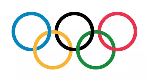
One of the most trending logos this year has been the Olympics. Baron Pierre de Coubertin designed this iconic logo in 1912. Each of the five rings in the logo represents the five continents that participate: Africa, Asia, America (both North & South), Australia, and Europe. The colors of the rings have been chosen so that they covered the flags of all the existing nations at that time. It would be hard to find a sports logo as inclusive as this Olympics logo. Because the logo is simple, designers can easily use it across different applications. Whenever the Olympics are held, the host city or nation uses the five-ring logo and combines it with new imagery to give each edition its unique identity.
2. Nike
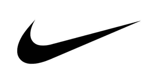
A hard-to-miss sports brand, Nike has a simple yet highly effective logo. It is believed that the initial logo that resembles more of a tick mark today was inspired by the wings of the Greek goddess of victory – Nike. The founders wanted a visual representation of their brand that depicts speed, motion and is also inspirational. In the 1990s, when Nike was flourishing, it used a color palette of red and white for its logo. Red was to inspire passion and energy, while white for nobility and charm. But by the late 2010s, they have switched to a simple black color pallet for their logo, termed Swoosh.
3. Manchester United FC
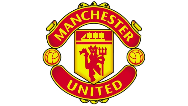
One of the most popular football clubs, Manchester United, has a logo that has evolved over a century. The Red Devil first appeared in the 1940s edition and has now become a prominent part of the club’s identity. The present logo also features a ship, symbolizing Manchester’s history as one of the biggest ports in the UK. The coat of arms colors red and yellow are used, along with two footballs to clearly identify with the sport. The words ‘football club’ were removed to give the logo a more generic, modern feel. Manchester United’s emblem is a prime example of sports logos for design inspiration, blending history, symbolism, and visual impact.
4. Adidas
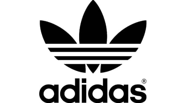
Walking very close to Nike is another sports brand, Adidas. In terms of visual identity, they have come a long way from their first logo – an ugly depiction of sports shoes over their brand name to the three variations of the logo that we see now. This has rather paid off well for them. The first logo with three stripes representing a mountain talks about overcoming challenges no matter how hard they are. The second logo with trefoil showed how they are expanding across the three continents. Finally, the round version is a depiction of globalization and the brand’s ability to change.
5. Tour de France
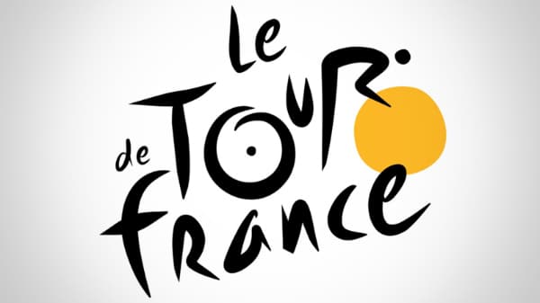
The logo of Tour de France is a highly thoughtful one given how it incorporates the name of the competition and, at the same time, showcases what the competition is all about. The biggest cycle race in the world would need one of the best brandings, and this logo does that exactly. French designer Joel Guenoun created the present Tour de France logo in 2002. This logo creates a very smart typography of the name, and the use of the word tour and the sun in the background creates a cyclist.
6. Premier League
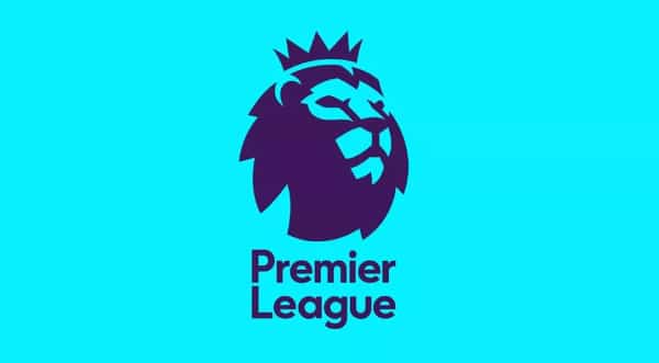
The English football league is considered one of the best in the world, showcasing top-tier players who continuously raise the level of the game. A lion has been a consistent element throughout the league’s logo redesigns, symbolizing power, courage, and strength. Early versions featured a lion playing with a football, while the latest design presents a fierce lion face. The logo is bold yet stylish, with strong visual appeal and versatile application. The purple color represents royalty and power. It stands out as one of the most compelling sports logos for design inspiration.
7. Chicago Bulls
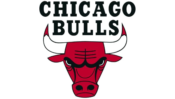
One of the most famous basketball teams globally, Chicago Bulls owes its naming to the famous slaughterhouse in Chicago. The team was propelled to glory and fame by Michael Jordan and other iconic players. The logo of the team has an angry-looking bull along with the team name in strong red fonts. The simplicity and direct connection of the logo made it easy to use in various applications and, at the same time, instilled a strong brand recall.
8. New York Yankees
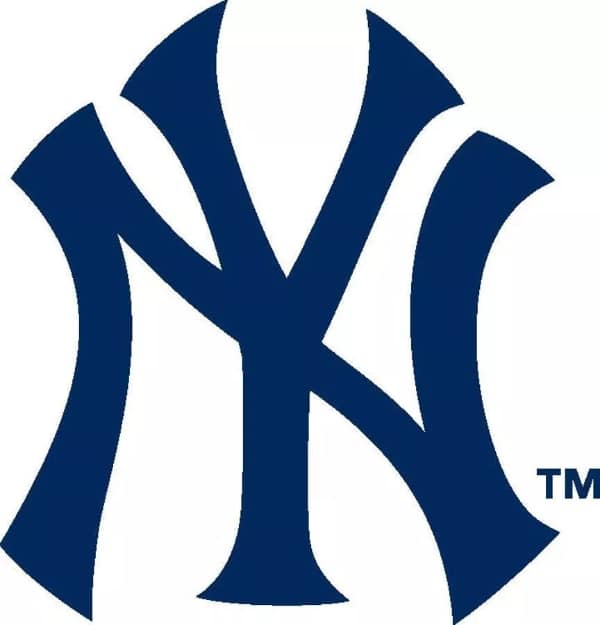
Moving from basketball to baseball, New York Yankees is a household name for all baseball fans. This most successful baseball franchise is 120 years old, and one can imagine the history and culture associated with it. The iconic lettered logo of N & Y made its first appearance in 1903, and over the years, they have seen a lot of varied use of it. By 1909 the letters were intertwined, setting the design foundation of the present visual identity. However, in 1968, the brand went for a logo that was a baseball ball consisting of a bat topped with a hat.
9. Dallas Cowboys
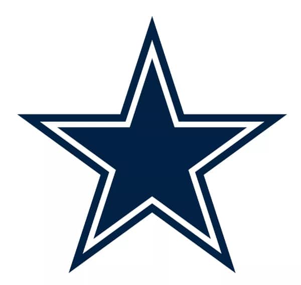
If a sports team beats the New York Yankees in terms of brand worth, then it is the Dallas Cowboys. This famous American Football club was founded in 1960, and the good part is that they have not altered much with their visual identity. Their first logo was of a simple star in dark blue color. The designer altered it with an outlined star in 1964 making the design look more appealing yet simple enough to be widely used. The designer also used the blue color and bold typeface to make the logo more prominent.
10. Arsenal FC
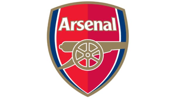
The English football club Arsenal was formed in 1886, and its first logo was based on the crest of the Metropolitan Borough of Woolwich. It featured three vertical cannons with lion heads placed on a shield. Across various redesigns, Arsenal has retained its military heritage by consistently using a cannon in its logo, earning the club the nickname ‘The Gunners.’ The current logo is sleek and modern, featuring a red and blue shield with a bold golden cannon at the center. It’s a great example of blending tradition and heritage with contemporary design making it one of the standout sports logos for design inspiration.
11. Chicago Blackhawks
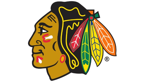
One of the original six NHL teams, the Chicago Blackhawks, has a logo deeply rooted in the history of the team’s location. Based out of Illinois – one of the prime spots of disputes between foreigners and native Americans, the team has chosen to pay tribute to the native Americans through its visual identity. Hence the use of the face of a native Indian. The logo was initially in black with a white face outline. But now, it has evolved into a classic smiling indigenous person with war paint on his face and multi-colored feathers.
12. Boston Red Sox
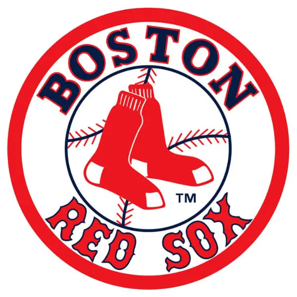
A famous team based out of Boston, USA, the Boston Red Sox, has audacious used socks in their visual identity. What might have started as a joke in the design studio has culminated into one of the strongest visual brandings in sports history? The red sock was first introduced in 1908. The present logo has two red socks with bright red color. The minimalistic logo is easy to be used in varied applications and provides a strong connection with the brand.
13. Los Angeles Lakers
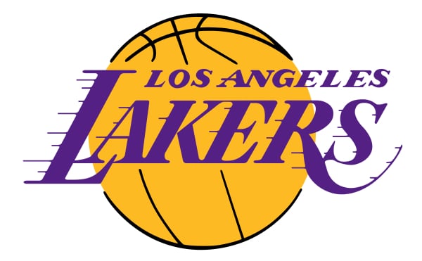
Founded in 1946, the Los Angeles Lakers are a highly successful basketball team. Its first logo had the map of Los Angeles on a basketball. It has now moved on to a really smart logo of the team name on a basketball from that ugly logo. The ball is of standard orange color, but the team name is in purple, lending it a touch of elegance, royalty, and strength. Apart from the logo, the team also uses a brand element of just L with the basketball behind it.
14. Boston Celtics
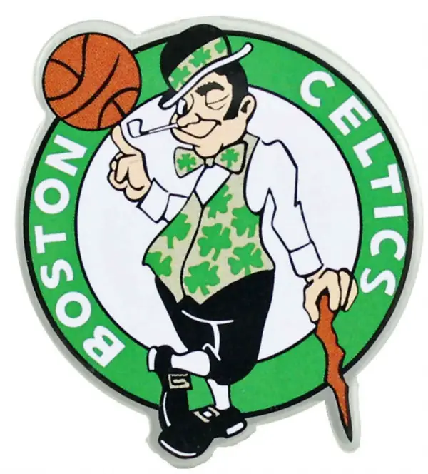
The Boston Celtics, a basketball team founded in 1946 and based in Boston, take their name from the city’s strong Irish and Celtic roots something clearly reflected in their visual identity. The logo features an Irish character dressed in black pants, a waistcoat, and holding a cane while spinning a basketball. This design effectively incorporates the team’s culture and history, using a mascot to create a strong and memorable brand image. The Celtics’ logo stands out as one of the most recognizable sports logos for design inspiration, thanks to its cultural relevance and unique character.
15. Real Madrid FC
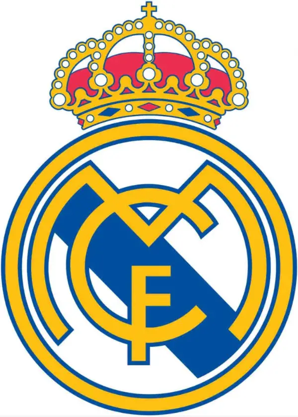
One of the most famous football clubs across the world, Real Madrid, was founded in 1902. Surprisingly, it used a letter-based logo back then, which is far ahead of its time. The famous crown made its appearance in the 1920 version. The present logo is a fine depiction of royalty and class. The designer used the letters M, F & C, denoting Madrid Football Club. Overall the logo is unique and gives a feeling of royalty with its golden and blue colors.
16. Philadelphia Eagles
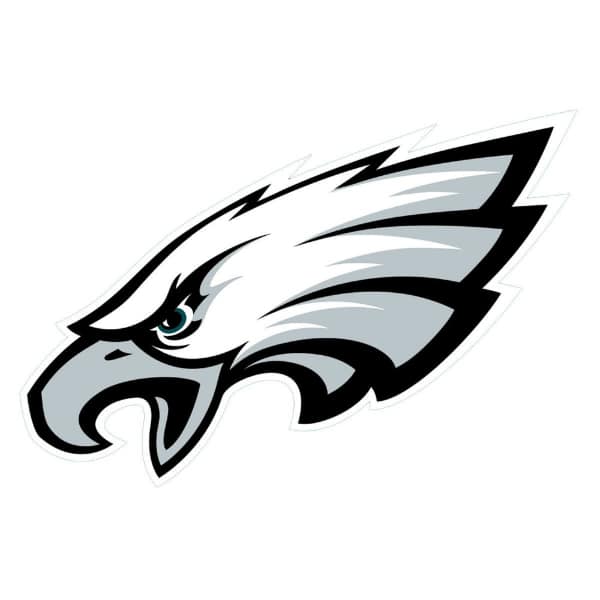
The famous American Football team from Philadelphia, Philadelphia Eagles, has a strong visual identity. Right from the start, they have chosen the Philadelphia Eagle as imagery to represent the team. The earlier versions showed the Eagle with the football, but the latest version is a more modern logo that only has the face of the Eagle. The white Eagles head represents the aggression and passion with which the team plays. The minimal detailing of the logo allows its application across various mediums.
17. Liverpool FC
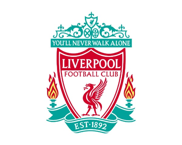
Established in 1892, Liverpool is one of the oldest thriving football clubs in the UK. Since its inception, it has been using the visual image of a Liverbird in its logo. The present logo is highly detailed, consisting of many elements like the bird itself at the center. In addition, the torches and scarves with establishment dates written on them depict the club’s rich history. On top, the logo also includes the club anthem: “You Will Never Walk Alone.”
18. Under Armour
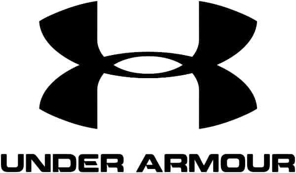
A recent sports brand company, Under Armour, has been making many inroads through its special branding. The present logo is a smart monogram consisting of two intersecting semicircles. The top one denotes the letter U and the bottom one denotes the letter A. Overall the strong fonts and the black theme gives a very masculine feel to the brand.
19. Lotto
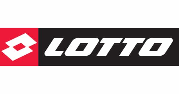
Lotto, a globally recognized sports brand, has experimented with its logos over time, but its current design with clean typography is arguably the most effective. The logo features a simple wordmark paired with an emblem that represents two overlapping sports fields, football and basketball creating a striking geometric design. The color palette of black, white, and red adds a sense of energy, class, and enthusiasm. Lotto’s logo is a strong example of modern branding and stands out among sports logos for design inspiration.
20. Fifa World Cup Qatar 2022
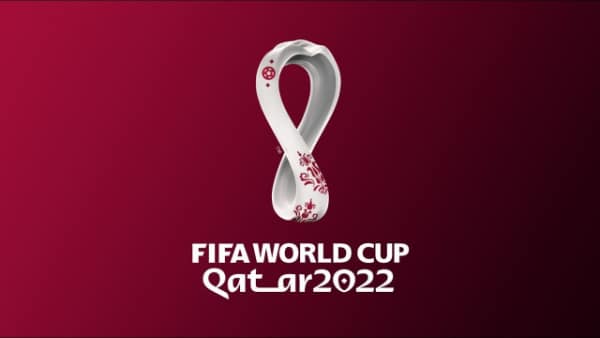
A special mention in this list of logos is the Fifa World Cup Qatar Logo for 2022. This time the designers have gone a long way away from the traditional trophy design. Instead, the designer made that trophy through an abstract figure representing the desert dunes and has Arab cultural depictions. The figure also resembles the number 8, representing the eight stadiums hosting the world cup.
Designing sports logos that stand the test of time requires a lot of skill, creativity, and passion for the brand and the sport. One common trait we noticed in the logos above is how they integrate history or culture into the design. By doing this, the logo becomes more than just a visual element it transforms into an icon that represents the values and identity of the team and its management. Hence always do a deep research of the brand history, values, and vision and use the right shapes, colors, and fonts to make highly creative and impactful logos.