Line25 is reader supported. At no cost to you a commission from sponsors may be earned when a purchase is made via links on the site. Learn more
Logos are important to any brand or any business out there – big or small. Logos help grab the customer’s attention and give your brand a chance to make a strong first impression. It also becomes the foundation of your brand’s identity, helps customers remember your brand, and differentiates you from your competitors. When we talk about the big players in any sphere, having an impressive logo becomes more important. All big brands and companies take their logos very seriously.
Think about the ‘swoosh’ by Nike, the ‘two-tailed mermaid’ of Starbucks, or even the ‘M’ of McDonald’s. They are instantly identifiable and indicators of their respective brands. Big companies and chains take pride in their logo. These symbols or any other form of logos aren’t created randomly. After thorough research and to make a psychological impact that connects with the audience’s minds to relate their want to your services and products, they are worked upon after thorough research.
One such big industry that doesn’t often get discussed in the design field is – the gaming industry. There are so many giants in the gaming industry that millions of people know about all across the globe. Their logos are iconic and etched on every gamer’s mind. They also are easy to recollect for non-gamers and are made with utmost care and perfection. Let us look at these fantastic video game logos for inspiration:
1. Tetris:
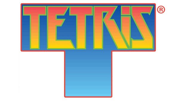
Tetris is an all-time classic video game that was created by Alexey Pajitnov during 1984. It is a top seller game of its time. This game helped Nintendo’s Game Boy console to become a huge success and also managed becoming the first game to make its way into this space. There is a ‘World Tetris Day’ – 6th June. Last year to celebrate their 35 years, the company introduced its brand new logo. The OG (original) logo was created and designed by Roger Dean during 1997. The initial logo used an iconic ‘T’ shape piece that looked like geometric puzzle pieces. These puzzle pieces were called Tetrominos.
The new logo has the same iconic shape and kept the essence of the previous logo intact. However, it straightened it out and added gloss to it to make it more time-relevant today. The color palette of the logo has changed to a deeper shade of blue with a bordered outline. The letters are also straightened out and have lost their gradient orange hue. Now we have rounder fonts and use of multiple colors that justify the aesthetics of the game and match the vibe of the present day gaming climate.
2. Pokemon:
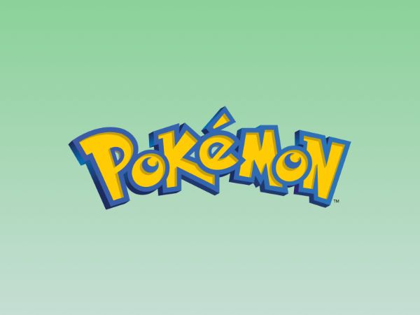
Pokemon has remained as one of the top 10 games at all times. Their yellow and blue wordmark logo is easily identifiable worldwide. Their Japanese logo has gone through several changes and morphed time and again. However, their English logo has remained untouched for over two decades.
Pokemon’s logo uses a playful typeface that is targeted to children. They have also used symbolic nostalgia as the typography design, and color choices match with the energy and look of the game’s famous character – Pikachu. This logo was created in 1996 by Satoshi Tajiri, who created a fanzine named Game Freak. He got the idea of Pokemon’s concept or ‘Pocket Monsters’ from his hobby of collecting insects as a kid.
3. Minecraft:
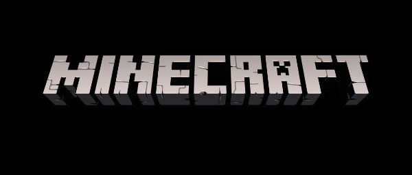
This game is unparalleled in terms of all-time sales figures. Its logo is also a very iconic wordmark designed in the game’s building bricks of cobblestone. Hayden Scott-Baron is the founder of Sweatdrop Studios. This is the largest Manga studio in the United Kingdom. They were the genius behind the infamous Minecraft logo. He was also the illustrator artist for Minecraft with Markus Persson. Markus was the sole developer of the game.
Hayden Scott parted ways with Minecraft after some years. However, they kept his core design elements the same. They changed the color scheme of its logo to a grey monochrome effect that is widely popular now. During 2011 the logo had its 3D effect enhanced.
4. League of Legends:
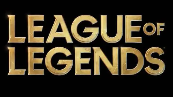
League of Legends is an intense competitive eSport game that fuels a multi-billion dollar industry alongside other such games. The company behind this amazing game is Riot Games. The original logo that was created in-house back in 2006, had a graffiti tag style. However, it got a recent facelift to be more apt and adaptable to the new digital interfaces that have emerged after its founding.
Rinker Design and the in-house team kept the fist in the logo but separated it from the wordmark. This allows the wordmark to be a standalone logo. The fonts were changed to more bold and legible fonts while still maintaining the aesthetics of a titian of eSports. However, League of Legend’s new logo seems to have disappointed the old fans. The previous logo had a shield background, and many more fantasy elements were omitted entirely in the new logo.
5. Nintendo:
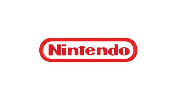
Nintendo is an utmost renowned video game companies in the world. Fusajiro Yamauchi founded Nintendo during the end 1800s. He is also the mastermind behind Mario Kart 8, Super Smash Bros. Ultimate, Ring Fit Adventure, and all top trending games. The legal name of the company is written in Kanji (a Japanese dialect). Still, its famous logo was initially designed during the 1960s for entering the global market.
The first English logo they created was in handwritten style font with cursive style. They experimented with style throughout the 60s and finally settled on the infamous ‘racetrack’ logo that appeared in 1972. This design of the logo was made within the team, and the designer’s identity got lost in time.
6. Pac-Man:
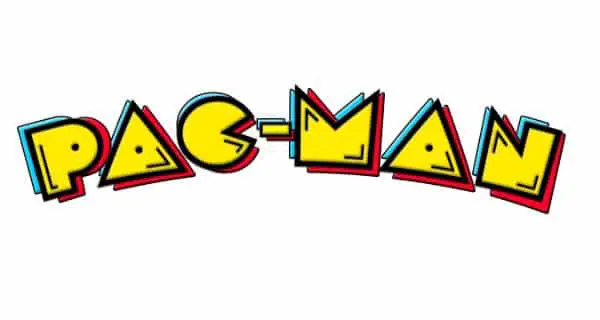
Pac-Man was one of the first few games to gain mainstream popularity. The symbol also shows this mainstream appeal. Their wordmark logo uses the color yellow, which reminds the users of this game’s main character. The strategically placed dots in the characters of the logo mimic simple eyes. The letters are thick to give it a bold impact and reflect the main character’s shape. Also, the red and blue shadowing makes the logo pop as well as make it feel high-tech.
7. Atari:
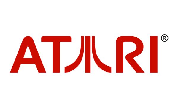
Atari’s logo is etched to many people’s minds and hearts today. The now-famous logo was made by their first in – house designer named George Opperman. When he was interviewed in 1983, he explained the thought process of this famous design. He said the logo represents a stylized letter ‘A,’ which matches the first letter of the company’s name (Atari).
Three lines in the second ‘A’ or Atari are supposed to be a tribute to the company’s first successful game – Pong. The outer lines denote two players, while the centerline is supposed to be the centerline that divides the Pong court. There is another logical explanation behind Atari’s famous logo: the representation of the Japanese Kanji. And another one relates the logo to Mount Fuji.
8. Assassin’s Creed:
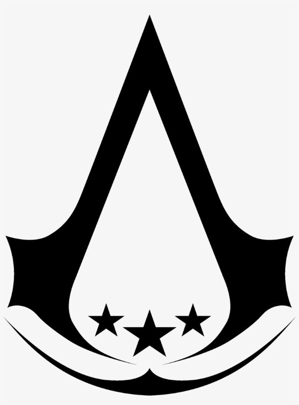
Assassin’s Creed made quite a lot of noise when it first entered the gaming industry. The first game of this franchise was launched in 2007, and it now has nine different games that are all fan favorites. Some of these nine games are console exclusives. However, the majority of them are playable on PCs.
The game’s storyline explains the logo or insignia (as called in the game) was initially used to mark entrances to essential locations such as Assassin Tombs, Assasin headquarters, and Assassin Bureaus. If you observe the logo shape, it represents the back of an eagle’s skull. The logo represents courage and freedom. The developers claim that using an eagle that is a bird of prey sits perfectly with the assassins’ predatory and aerial nature.
9. Skyrim:
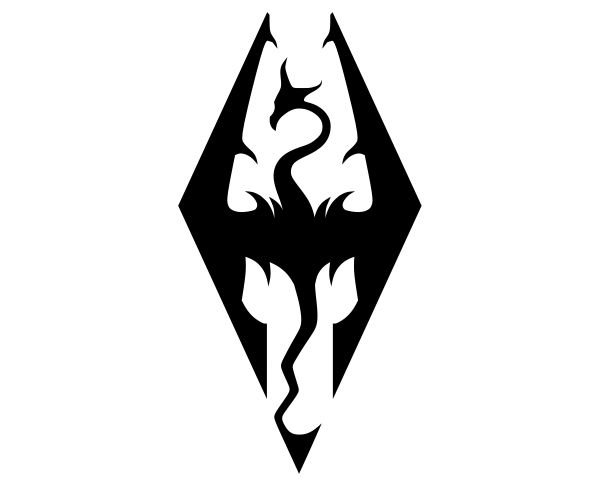
The infamous Skyrim logo has been in use ever since the game was initially released. The logo has a dragon who is in flight and has wide wings. The design of this dragon is very artistically styled. The dragon is almost symmetrical horizontally and vertically, which makes it a genius logo. The top of the logo features the dragons’ head, whereas the bottom half has its tail. Both head and tail are made using the same line yet aren’t forced to look precisely the same. Both the head and the wings are contained to the tips of the wings.
The logo is supposed to represent the dragon as invincible. There is a balance of beauty and power. Developers of Skyrim wanted the game to have a powerful impact on the customers. The logo is also related to the history of the Empire plot of the game. There are two official logos of Skyrim – one with the text underneath the emblem and one on the symbol’s right side. The book in both versions is written in serif fonts with all uppercase letters. The color scheme is monochromatic and makes use of gray, white, and black.
10. Half-Life:
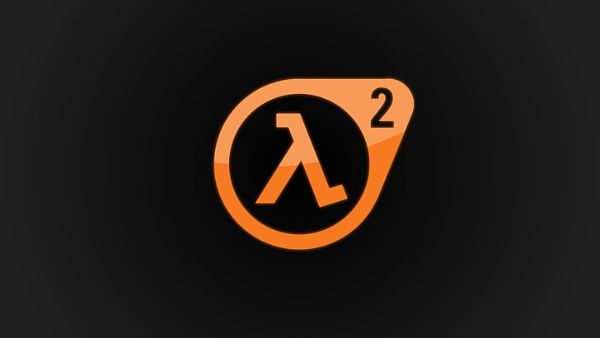
Half-Life is a treat for sci-fi and supernatural geeks. In the game, the player gets to control the main character – Gordon Freeman. He is a theoretical physicist working in the Black Messa Facility. The story begins with him accidentally causing a dimensional rift that leads to an alien invasion. The level of hold you get over the player is not something you get to experience with most games these days.
The logo for the half-life is very clever in denoting precisely what the game title means. It is a lowercase lambda letter that has been used to symbolize many things. One of those things lambda denotes is the symbol of the half-life of any given material. In science, lambda is known for measuring wavelengths too. In this game, lambda is taken differently, such as denoting the time taken for radioactive material to reach half inactivity.
11. X-Box:
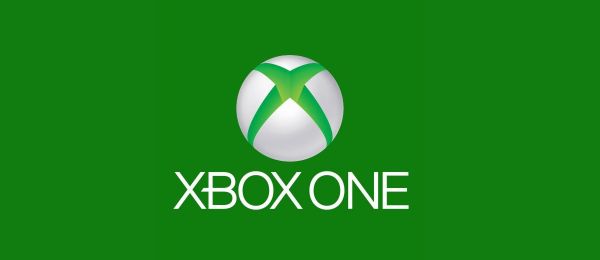
X-Box was a successful pilot project by Microsoft to enter the markets of video games outside their original business sphere. The first X-Box was released during 2001 and was at par with video game giants Sony’s Playstation and Sega’s Dreamcast. The iconic ‘X’ logo came from the first name that Microsoft used to label their console – ‘DirectX box.’ This is because the entire gaming idea came from Microsoft’s in house DirectX developers.
12. Roblox:
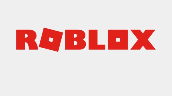
Roblox is a great online gaming platform. It creates a game system that allows users to program and play games made by others. Roblox was founded in 2004 by Erik Cassel and David Baszucki. It was released in 2006. The platform became a user-created game of multiple niches that were made using the programming language Lura. It is free to play casual games with in-game purchases that you can make using their virtual currency – Robux. If we consider their value until October 2020, they have already crossed 164 million monthly active users.
David Baszucki and Erik Cassel designed the original Roblox logo. A few months later, David’s relative had some other suggestions for a new logo. This logo had a stronger image and character. The letters got their heavy red outline and the phonetic mark above the ‘O.’ The mark was made to make people understand how the company name was meant to be pronounced. Their logo in 2006 made use of ‘dancing’ letters, which helped the brand reach its ‘Imagination Platform.’ This logo carried the company forward for more than 7 years.
The current logo of Roblox uses a typeface was created for absolute scratch. In this logo, the first ‘O’ feels like a tilted box. Even the subsequent ‘O’ has a strangely unique look, which also looks like a box. This helps break the monotony from the remaining letters of the logo that are written using solid sans-serif type that has a hint of retro style.
These were the 12 Amazing Video Game Logos for Inspiration. You can check out for designing your next video game logo. Video game logos are essential to selling your video game to the immense competition out there. A good logo attracts more eyeballs. Once you have their attention, make sure the game is valuable enough to live up to their expectations, and you would find yourself with some of the most loyal fan base customers.