Line25 is reader supported. At no cost to you a commission from sponsors may be earned when a purchase is made via links on the site. Learn more
You can never underestimate the importance of a well-designed, meaningful logo. Logos serve as the visual representation of the brand and therefore carry a lot of importance. The big brands put in a lot of investment in terms of time, resources, and creativity to develop visually appealing yet very meaningful logos.
Editors Note: If you’re a designer who focuses on Logo design and wants a little help, check out Adobe’s Free Logo Maker here. For some inspiration, it’s a great place to start if you’re stuck on a logo design.
The initiation of a logo design must be the message that needs to be communicated through it for the brand. This could be in the form of the brand services and products, or it can be in the form of organizational history that one wishes to narrate. Either way, the designers have to be smart to imbibe the message and come up with a creative logo.
When used by the brands, such logos inspire a sense of inspiration for its followers and other market players as well. It also becomes a fun game for other designers to decipher the hidden message of the logo and figure out the thinking process that would have gone in designing this logo. To help with this, we have compiled a list of 16 brand logos that have a hidden message in them:
1. Cisco:
One of the largest companies for internet networking, Cisco has a very minimal logo that would look something like a wavelength given that it looks like an abstract version of the Sin curve. But actually, these abstract design represents the Golden Gate Bridge a landmark of San Francisco which is also the origin and the headquarters of this company. So this is a good way of staying connected with the roots through your logo.
2. Beats:
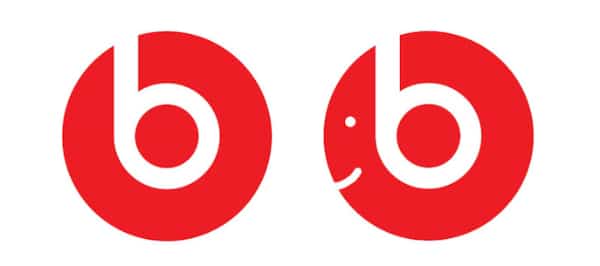
Beats is an upcoming company manufacturing sound devices with expertise in headphones. The company has thus decided to portray this on its logo as well. The logo of Beats consists of a circle with the letter b in the negative space followed by the name of the company in sharp sans serif fonts. If you observe the circle and the letter b closely, you will see that the circle represents the head of a person and the letter b is the headphones that person is wearing. This is a very subtle yet very effective way of putting out your products in the logo itself.
3. NBC:
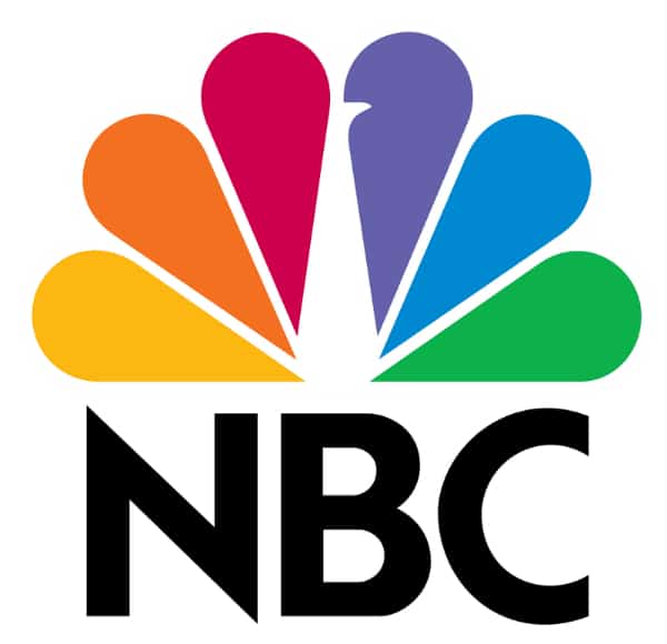
There would be hardly anyone who would not have heard of NBC or not have come across its vibrant logo. But this logo has a good history attached to it. NBC was pioneering the transition from black and white TV to color TV. In order to shout out this message, they choose this logo which has six different shades of color, and added white space that in a way forms a peacock. Their logo personified the adage ‘Pride as Peacock’, which was their spirit about pushing colored television. The six feathers of the peacock are of different colors, and they represent six unique divisions of NBC.
4. Amazon:

The hidden message in the world’s biggest brand is no longer a bit secret. But one has to appreciate the idea and execution of the same to deliver such an amazing logo. There are two hidden messages in this logo. The first is the yellow arrow going from the letter a to the letter z. This denotes that Amazon provides you with all the products from A to Z. This is actually true today as you can get almost anything that you want from Amazon’s e-commerce website. The second message is that this yellow arrow also represents a smile. That means that Amazon services its clients in a way that they are always happy.
5. Baskin Robbins:
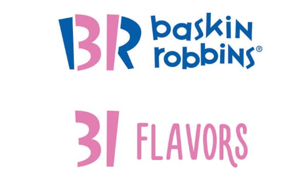
If the hidden message of Amazon was easy to guess, the hidden message of Baskin Robbins is going to be really hard. If you look at the logo, you observe that it is a nice round logo with the initial BR in it, followed by the brand name encircled with its logo colors. What strikes the most is the change of shade in the parts of letters B and R. if observed closely, then this represents the number 31. This is the exact number of ice cream flavors that Baskin Robbins provides. At the time of their inception, providing so many flavors was considered quite a feat, and hence they integrated that in their logo.
6. Vaio:
When this logo of Vaio was released, it raised a lot of speculation about its meaning. It took people a while to figure out how profound this logo design is. Vaio is a brand that deals with electronic devices and is an abbreviation for Visual Audio Intelligent Organizer. Born in an era of analog to digital conversion, the brand decided to embody this in its logo. Hence if you observe the first letters ‘va’, then they form a wave representing standard analog signals. But the letters ‘io’ is designed in such a way to represent ‘10’ for the binary of digital signals. Very technical, but their logo delivers the message about the proficiency of their brand.
7. Picasa:
A lot of people, especially designers, have used the services of Picasa on a regular basis. Their logo comes off as a nice vibrant design and a standard feature of Google. But one has to observe closely to see three hidden messages in the logo. The first one is the basic shape which represents the standard camera shutter which has relevance with photos. The second message is the colors used, which give a recall to its parent brand Google. The third and most hidden one is that the negative space inside the circle forms a home, which means that Picasa is the safe home to all your photos. Also, not to forget the fact that the word ‘casa’ in Spanish means a home.
8. My Fonts:
This is a special entry for the designers as they would be very frequently coming across the MyFonts website to fulfill their fonts needs. At first look, the logo seems like the name of the brand written in a nice calligraphic font. But on a closer look, we can see that the My in the logo also looks like a hand. The idea the logo conveys is that you can get your hands on any font that you want through My Fonts. This is a very nice way of expressing confidence in the brand and representing it visually. Once you know this, you will not be able to look at the logo in the same way.
9. Gamecube:
The majority of the gaming enthusiasts would have come across this interesting logo of Gamecube. It seems like a strong geometric design that presents an optical illusion of 3D cubes. One also needs to mention that they have used the color black in an apt manner. This color goes well with the gaming industry. It has used the negative space of white nicely to make the outer cube look like the letter ‘G.’ Likewise, the smaller inner cube looks more like the letter ‘C,’ thereby covering the initials of the brand within the logo itself.
10. FedEx:
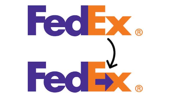
The list of logos with hidden messages would be incomplete without the mention of the super-smart logo of Fed-Ex. We come across this logo across so many applications across the world, be it on boxes or cargo planes. The choice of colors of purple and orange are unique in themselves. But what is more striking is that the negative space between the letter “E’ and ‘x’ forming an arrow. This represents the idea of moving things forward, which is what FedEx does. This is a very subtle way of branding and propagating your companies philosophy in the logo itself.
11. Unilever:
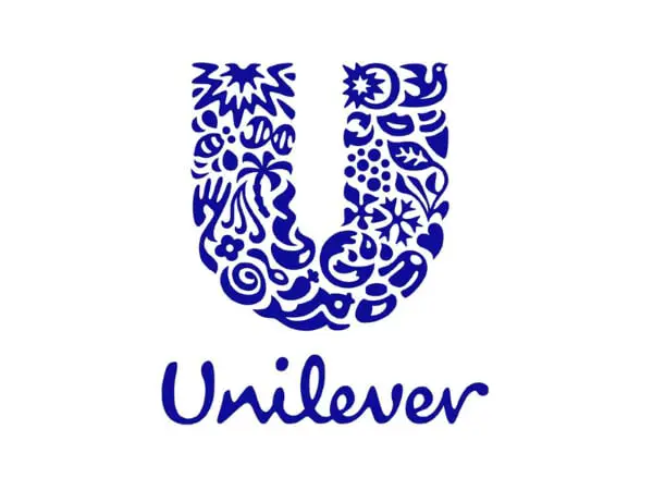
Unilever is one of the major retail brands that have a presence in almost all sectors. Because it sells its products under different brands names, people may not have seen its beautiful logo. Their logo consists of a huge “U’ which is their initial, and this U is made up of a variety of products that it manufacturers. At the same time, they have made them look abstract in such a way that they also represent various elements of nature. They are trying to convey the idea of living with goodness through their logo.
12. Toblerone:
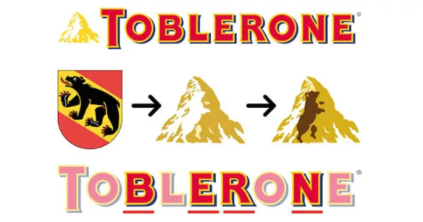
We all have had relished the delicious chocolates of Toblerone at some point in our lives. The present logo of this chocolate brand consists of its name in strong, bold fonts and a mountain. The mountain imagery is inspired by the Matterhorn Mountain located in Switzerland, which is the origin of the brand. If one looks closely, they will also observe the letters BERN, the town from which the brand originated. Also hidden in the mountain in negative space is a bear which is found in the coat of arms of Bern. A fantastic way of representing the culture of your original on the logo.
13. Pinterest:
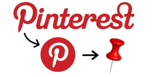
Another favorite of designers, Pinterest, has been enjoying a huge following given its creative outlook and its own design. Even its logo is very interesting. Apart from the interesting typography of its name, it has one imagery of a red circle with the letter ‘p’ written in it. This letter looks a lot like a pin. The whole concept o Pinterest is to allow users to pin designs that they like. The logo has been inspired by this and very well captures the essence of the brand. A shoutout to the choice of color as it invokes the emotions of passion.
14. Toyota:
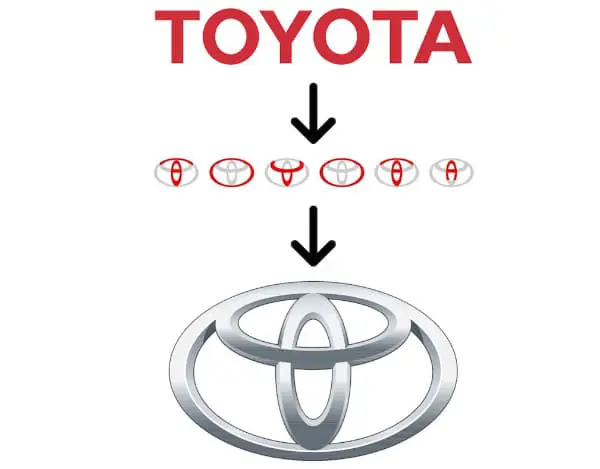
The logo for Toyota has to be in the study books for designers as it nicely brings together a lot of design aspects into one logo but is still able to come out as a visually appealing logo. The hidden message behind this logo is that it covers all the letters of the brand Toyota. If we put the logo and start observing the various parts of it, they all spell out the brand name in some form or the other. To achieve this, the designers have used circular curves to visually mean different letters.
15. Hyundai:
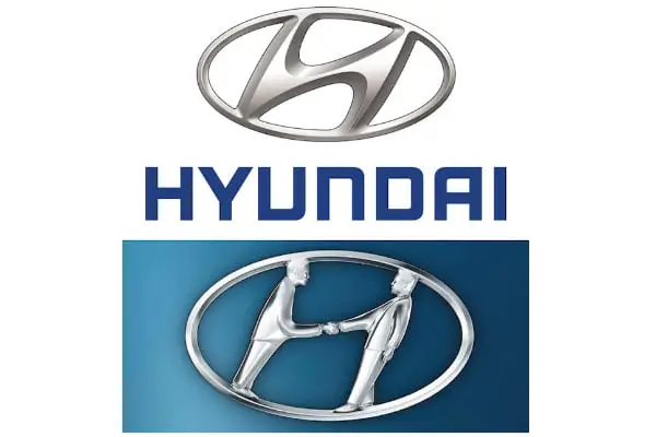
Following on the heels of Toyota is another automobile company – Hyundai. This brand has a simple logo that looks like the letter “H” inside an oval. Below this imagery is the brand name written in crisp typography, which cuts and curves, making it stand out nicely. But the hidden message lies in the image above it. The letter “H” is designed in such a way that it can represent two persons shaking hands. This symbolizes trust, relationship, and customer relationship, something that the company truly believes in.
16. LG:
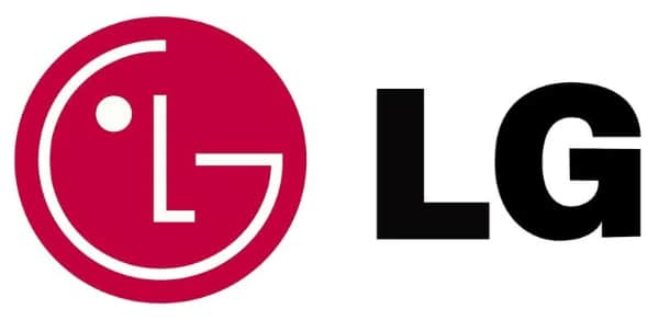
The last entry in the list is not very enigmatic. The logo of LG has been there for a while, and smart people have already figured out what it is trying to communicate. Design-wise the logo is quite simple as it has imagery of red color followed by the name LG in strong black text. The red circle has been created in such a way that the letters “L” and “G” are embedded in it. These letters create the front view of a human face, with the letter “G” providing the circumference of the face and the letter “L” serving as the nose of the human face. To reinforce the visual, they have added one dot before the letter “L” which looks like the eye. All of these together make a clear presentation of a happy human face. This way, the brand has been able to add the human quotient in its logo and make it look more approachable.
Conclusion
After going through the above list, one would realize that logo designing is truly an art. A lot of thought and creativity is pushed in this process so that the final logo is a true representation of the brand. Companies have used their logo to showcase their products, services or origins, or even value system. This way, they are able to establish a better connection with people and position themselves in a better way in the market.

