Line25 is reader supported. At no cost to you a commission from sponsors may be earned when a purchase is made via links on the site. Learn more
The significance of Letter Spacing is one of the vital aspects when it comes to web designing. As a web designer, if you get the hand over typography, you are bound to develop revolutionary web designs.
It is observed usually that despite having the great significance of typography in web design, it has been ignored by most designers. The significance of the letter spacing affects everything, the user interface, the user-friendliness, visual design, content strategy as well branding.
So let’s begin the journey of web typography that will capture the essence of web typography norms, ideas, ethics, language, and tips on deciding the best fonts, using white space as well as tracking and kerning.
What is typography?
Web typography is the technique of arranging and ordering type (fonts) in an artistic manner in web design. Well, the typography in web design is not just limited to punching the letters and characters on web design. The significance lies in building a comprehensive visual character of the website and the communication it establishes with the viewers. In nutshell, typography is the primary element of branding in the website.
What is tracking in typography?
When a typographer, during the typography process, manages the letter spacing is called tracking. Tracking brings uniformity to the spacing between the letter in the web design. Tracking is a process that impacts the word density, life spacing, white space as well as combination of fonts.
If a web designer is looking to build an airy design, he would choose to increase the tracking. On the contrary, if a web designer wishes to create a compact design, he would reduce the tracking. However, novice designers have often been seen confused between tracking and kerning.
Kerning is basically micromanagement of space between two individual letters or characters. Often overlooked, kerning holds a very vital role when it comes to headlines and the use of large alphabets or characters in the design.
The purpose of tracking:
Ever wondered why letter spacing is so important for web designers when almost all web design tools provide in-built text formatting tools? Secondly, why web designers spend a lot of time arranging and rearranging letters and while space on the website design?
The theory:
There is no rocket science in having more space between the character when the text letters are small. The problem began when digital fonts, which, unlike traditional typesetting fonts, come in various sizes and do not offer corresponding space as traditional typesetting used to provide. The reason being, at least theoretically, the web designer should make some adjustments and corrections.
The practicality:
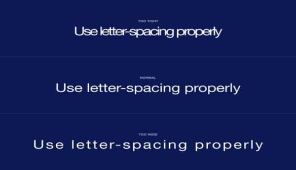
In principle, if the tracking (space between the letters) is increased, it provides readability as well as legibility elements to the text. Letters, characters, and symbols are more visually visible, which allows eyes to recognize and distinguish them in a much better way. The fun fact is web designers carry out this task for readers and readers don’t even know this fact.
There is no alternative to improving the typeset and almost all designers know this fact. Increasing and decreasing letter spacing is a power that typographers hold to manage the widows and orphans in the text to ensure there is no hyphenation in the text to improve the readability.
How to Apply Letter Spacing?
“Anyone who would letter-space lower case would steal sheep.” famous type designer Frederic Goudy once said. In the hindsight, the line is usually carried out with some manipulation of space between the fonts. However, the purpose of Mr. Guody was to suggest that those who have no idea of the purpose of manipulation, shouldn’t do manipulation of space.
So, basically, applying space between the chargers and letters requires thorough knowledge of space management and manipulation in typography.
The Challenges of Web Typography:
Screen Vs Print Reading
The experience of the visual process is different on screen and on paper. It also differs against the background fonts are placed. Rationally, the basic difference between the two is the physical appearance of the content, which is either static or lucid. One requires to adapt to on-screen content, which constantly changes with font size and resolution.
Diverse Screen sizes:
“Responsive design” is the first word that hits the mind of the web designer, when they are asked to design a website that is suitable for various screen sizes. However, it does not mean the website should look awesome on both desktops as well as on mobile screens. Developing a responsive design that generates the same readability as on a desktop is very critical, especially after Google announced the “mobile-first indexing” initiative. That means web designers have their tasks cut out to develop a design that is not only responsive but flexible with typography schemes.
Screen Resolution calibration:
With regards to the typography, the designer demotes a huge significance to screen resolution as low resolution showcases web design elements in large size, which in turn outsizes the screen. On the other hand, high resolution compacts the webpage in order to fit a web page in one screen reducing the readability.
Keeping in mind the optical weight of the fonts that suit the average eyes and improve the readability on every screen size is a challenge that every web designer addresses. Since font sizes have fixed pixels, keeping higher resolution will keep fonts bigger, while lower resolution will reduce the size of the fonts.
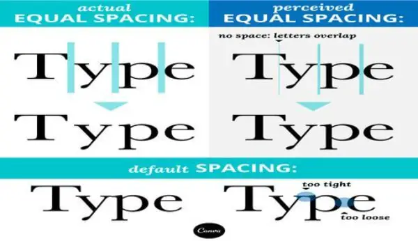
How does Letter Spacing work?
Capital Letters:
It is for everyone to see that capital fonts when are placed adjacent to each other, the readability reduces as distinguishing letters in quick seconds becomes difficult. However, when capital letters are placed close to small letters, it improves the readability and the white space looks more legit.
Therefore, in order to develop web design with enough readability, web designers often manipulate the space between capital letters. The space application usually applies to both capital letters as well as small letters.
Headline:
Theoretically, it is believed that the selection of fonts usually takes care of the readability as the fonts are self-calibrated and leave no margins for adjustments. Notwithstanding the fact, headlines produce the bigger problem. On a greater scale, the space among letters in headlines always looks lopsided and top-heavy.
However, one needs to understand as a web designer that there is no specific rule to manipulation of space between the letters. But at the same type, the web developer should keep in mind that the font types and typesets that are part of overall branding must develop a unified format. Therefore, given the diverse array of typefaces, a web designer requires lots of manipulation to do in order to adjust fonts corresponding to the while space and related images.
Oftentimes, headlines between 16 to 44 pixels have letter margins with built-in formats. However, if the font size is bigger than that, it usually results in negative margins. With dynamic resolution, the fonts look entangled with each other on mobile or tab screens. There are numerous guidelines for letter spacing.
The ideal guide that is usually practiced is:
H1 — 96px — -1.5%
H2 — 60px — -0.5%
H3 — 48px — 0%
H4 — 34px — 0.25%
H5 — 24px — 0%
H6 — 20px — 0.15%
Subtitle — 16px — 0.15%
However, if you a web app designer or mobile app designer, you should look for default material design for android and Apple format guidelines for iOS apps. Usually, the format provided by the app stores are well equipped to address these challenges and provide the unified format that takes care of letter spacing on web and mobile apps.
Body Text:
When we discuss the letter spacing in body text, we should go back to Frederic Goudy’s famous quote that is mentioned above. When he referred to stealing a sheep, he meant blackletter fonts only and not the overall text. When we design a website, we often use dark backgrounds and light colors, which essentially are not black letters. However, web designers and typographers literally stopped managing the space between small letters in body texts.
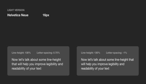
The local aspect of letter spacing suggests that small space adjustments between letters in body text add massive performance enhancement and transform the look of the web page. Often it is seen that just by sticking to the standard formatting, legibility is often compromised by designers. On the contrary, if space is increased by a marginal 1.5%, the readability increasing many folds for an average visitor.
Moreover, as we discussed earlier, the number of typefaces are many for a designer to maneuver, and therefore, applying the same rule to every font type may not be a wise thing to do. Nonetheless, it is essential to experiment with letter spacing and do the needful to improve the readability as well as looks.
There is a guideline for everything if a designer would love to stick and develop a transformative design.
Line Height Format:
If you are using line-height with 100% space between the two lines, you may have hit the right cord. However, if the line-height is more than 120%, it reduces the space between the letters and demands a little adjustment.
Text Background:
As mentioned earlier, web design is after all art of graphics, and therefore, good looks matter. In order to create looks and to segregate one text from another, the use of backgrounds is standard practice. That’s why using light color fonts in a dark background increases readability.
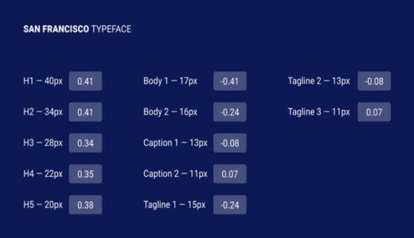
General Value:
There are define sets of guidelines for proper formatting. When we discuss the body text in web design, we can use these guidelines, which have been reviewed for a number of font types.
Body 1 — 16px — 0.5%
Body 2 — 14px — 0.25%
Captions:
Only when designers use heavy fonts and apply big font size, there is no much margin for letter spacing between small letters and characters. There are customs and practices to follow as developing a guideline may not be a feasible proposition.
It is believed that when the web designer uses a font size that is smaller than 13 pixels, letter-spacing adjustments should be put in place to improve the readability. Since there are no rules, some designers manage the letter space only when the font size is 11 or below.
In the ideal world, we can follow the below-mentioned aspects of fonts while using small fonts for captions and overlines.
Caption — 12px — 0.5%
Overline — 10px — 1.5%
Choosing the right fonts:
As we see, in typography, selecting the right font is as important as space between the two letters. However, selecting the rightmost font is not an easy task. In fact, there is a number of elements that need to be considered before we select the right font or a combination of fonts for web designing. Below are the aspects:
- Think of developing a brand through fonts
- Decide on choosing the right font family
- Combination of fonts for greater readability
- Font weight, line height, and font size
- Pay attention to visual hierarchy
- Get used to CSS stylesheets
Pro Tips:
Tracking or letter spacing is a very fundamental thing that web designers apply during the initial stage of web design. Nonetheless, there are a few more techniques available for web designers to maneuver with the fonts, white space as well as letter spacing.
- Tracking is the first thing a web designer would apply, but further manipulation would require kerning, which ensures altogether a different charm of the website and enhanced readability that catches the viewers’ attention. Applying both would set a designer into a different league.
- Line spacing and letter spacing are cousins in web designing terms. One can’t be achieved without the other. Neither one can look good without adjusting another. Therefore leading and tracking works perpetually. An effective tracking must be complemented with efficient leading. If you don’t want to create content that looks imbalanced and distorted, managing both letter spacing and line spacing is crucial.
- Optical margin alignment is another technique web designers use when they want to avoid applying negative spacing to letters in order to ensure paragraphs do not look squeezed. However, when the content is having too many widows and orphans and hyphenation must be avoided at any cost, optical margin alignment is often proved an effective technique.
As you gain experience in web designing, you would realize that keenly observing the web designs of other designers help you gain much insight into the skills, and sharp scrutiny will lead you to learn a few tricks of the trade. Indulging a bit deeper into type foundries and dissecting the others’ designs would enable you to get through some nuances of typography that will totally teleport your designs.