Line25 is reader supported. At no cost to you a commission from sponsors may be earned when a purchase is made via links on the site. Learn more
Websites serve as the foundational digital identity of businesses or brands. Hence they must be designed and maintained in the best possible manner. Over the years, the importance of having a visually appealing and highly functional website has increased multifold. At the same time, the tools to develop websites have also increased, which supports this rising demand. Starting from the menu to the hero images to fonts used, every website component is designed and executed in a well-planned manner.
The most crucial aspect for websites today is their ability to run smoothly across all devices. Gone are the days when websites were designed just for desktops. With a massive array of mobile devices like mobile phones, Ipads, tablets, and more being widely used by people, developers need to ensure that the website opens and functions well on all these devices. This has given rise to the importance of responsive website design. This blog takes a deep dive into all the aspects of responsive web design and helps you grasp its foundation, key terms, and the steps to follow to ensure that your website is fully responsive.
What is Responsive Web Design?
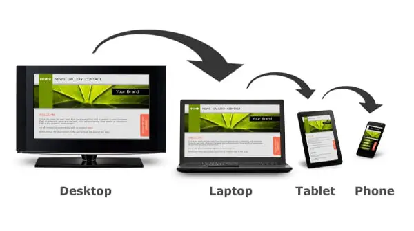
Responsive design is a website development approach that fundamentally deals with how your website looks and functions across all devices. The base point here is that you cannot have the same website for desktop and mobile devices. This is because the screen resolution of the devices will vary, and with that, you need to vary the website’s response. At the same time, you cannot also create multiple versions of websites that open after checking the user device. This is a cumbersome approach.
Responsive web design adjusts the layout and content of your website based on the device the user is using. This provides a smooth user experience. On desktops, it can allow your layout to be in multiple columns. The same content on a mobile device gets converted into a single column. It empowers developers to showcase essential content pieces in a customized manner. Hence you can tailor your website for each device and provide a highly personalized website experience. One good analogy is about how water takes the shape of the object that holds it. In the website world, content is water, and responsive web design ensures that it takes the shape of whatever device it is opened in.

The term – ‘Responsive Design’ was coined by Ethan Marcotte in 2010, inspired by architecture that responds to the people’s presence or interaction. This approach works on three foundation blocks:
- Fluid Grids: Grids serve as the foundational blocks in website design. But adding fluidity to these grids is what helps in making the website responsive. In responsive web design, the components of the grid are expressed as a proportion of the container. Hence every time the size of the container changes, the gride readjusts itself in terms of its columns and rows to display the content.
- Relative Units: This is an absolute necessity to achieve responsiveness. All the web page elements to the extent possible are sized in relative units like percentages. This allows them to resize themselves quickly.
- Media Queries: Integrated into the CSS, media queries can be helpful in altering the page’s overall styling based on the size of the viewport. The screen resolution or browser window size serves as the input, and consequently, the page styling is changed so as to display a responsive website.
The Need for Responsive Web Design

In the last decade, the prominence of mobile devices has increased exponentially. As per Statcounter, web traffic through mobile devices has taken over desktops and is presently over 51% of the overall traffic. This means that more than half of your website visitors will view the website on mobile devices – that too with varied screen resolutions. Hence, you cannot afford a website that runs smoothly on desktop but looks bad on mobile devices.
Another key trend is regarding how people get to your website. With good internet speeds and fancy smartphones, people want to quickly open their phones and search for what they want. Mobile devices also dominate search engine usage by a good margin. No wonder these search engines would like websites that open well on mobile phones; otherwise, their own efficiency and brand value will be questioned. Hence responsive web design is a very important factor for SEO.
Mobile advertising has catapulted into a huge market. According to emarketer, mobile ad spending has grown by 5% to become a $100bn industry. People are setting up ads on social media, YouTube, and almost anywhere possible to attract potential buyers. Through an effective call to action, all these buyers would be lured to the brand landing page. Now, if this page is not responsive, then there are very good chances that the potential buyer would exit the website. Therefore, highly responsive websites are a prerequisite if you wish to sell anything on them and aim to profit.
Key Responsive Web Design Terms
While working on responsive web design, you will come across many jargons time and again. Therefore, it is important that you get familiarized with these terms:
- Viewport — This is the area that is visible in the user’s device, and it holds a lot of significance as the content needs to be set in the best possible manner in this area.
- Overflow — At times, there will be elements that will be too large for their set container and will be seen only in part in the viewport. Such website elements are termed overflow.
- Fixed sizing — When web elements are given absolute sizes like image size of 500 pixels or paddings of 20 pixels, then they are said to be in fixed sizing and are not relative to other web element sizes or placements.
- Relative sizing — This is what drives responsive website design. Website elements are given sizes in comparison to other website elements in terms of % or viewport height or width.
- Flexible images — A new trend in website image use, flexible images are the ones that get displayed differently based on the browser size. This ensures that the image does not get cut or overflow, or look pixelated.
- Breakpoints — Different devices have different viewport sizes, and this is communicated to the CSS styling based on breakpoints so as to adjust the layout and content flow accordingly.
- Mobile-first — Given the importance of mobile website design, developers have started this approach for designing the website for mobile-first and then scaling it up for desktop; this way, mobile compatibility is prioritized.
- Hamburger menu — A menu design looking like three parallel lines and resembling a hamburger, this design option provides a dropdown menu navigation, thereby saving a lot of space.
Now that we have covered the foundational knowledge of responsive website design, we can move towards figuring out how to make a highly responsive website:
Always Start with Wireframes:
The first step of website design has to be creating the layout. This can be done using pen and paper or many good tools that are available on the internet. This step will help you plan the entire website better, be it content flow, user interface, or website functionalities. Unfortunately, many websites miss out on responsiveness because either the developer or the client deviates from this set wireframe.
One good way to mitigate is to create fluid wireframes. Make them flexible enough to accommodate any changes going forward. Focus more on the information flow and functionalities at the start and worry about the visual form at a later stage. Also, create separate wireframes for different devices – desktops, tablets, and mobile devices. This way, you can ensure the responsiveness of the website from the wireframe level.
Work with a Fluid Grid:
Building a website through grids is a paramount requirement if you want a proper structure for the website. Usually, website designers have been working with a fixed grid. Here the number of columns is defined, and the size of each cell is also defined through a set of pixels. But this becomes a deterrent for the website’s mobile compatibility.
For responsive web design, the grids need to be fluid. For this, then need to be set relative to the viewport. Furthermore, they should not be defined in absolute numbers but should be in the form of a percentage; this way, the cells will automatically fill up the space in the viewport and showcase the content.
Be Precise with Breakpoints:
The way you handle the breakpoints can make or break the responsiveness of your website. Breakpoints are the screen sizes for which you want the website layout to be altered. You can ensure that the user can see the best form of your website content on their viewport by getting them right. There are no universal set of breakpoints, but you should at least do it for the following:
- Mobile: 360 x 640
- Mobile: 360 x 720
- iPhone X: 375 x 812
- Pixel 2: 411 x 731
- Tablet: 768 x 1024
- Laptop: 1366 x 768
- High-res laptop or desktop: 1920 x 1080
You must review your design for all the above breakpoints. Depending on your website layout and design, it is possible that there may not be many alterations in mobile screens. However, it is still a good practice to review all website pages for these breakpoints and ensure that the user experience is good across all of them.
Properly Optimize Images:
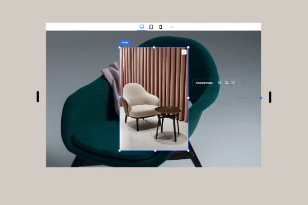
Images play a vital role in ensuring a strong visual feel of the website. For responsive web design, you need to ensure that the best image is displayed at the right place at the right time. Hence either you need to use responsive images or resize them in your code. A large image that looks good on a desktop may not look good on mobile. At the same time, a smaller image may look pixelated in desktop view.
A good idea to overcome this is to use .svg files wherever possible. Scalar Vector Graphics are created with the very purpose of scaling up or down without compromising on the quality. By using SVG files, the images will be resized as per need. You can achieve the same outcome by resizing your images as per breakpoints through the CSS code. Apart from this, there are many good online tools available that can help you with this task.
Take Care of the Fonts:
Just like images, typography is also an important visual element of the website. But the good part is that text is relatively easier to deal with in terms of making the website responsive. Unfortunately, because of this, many developers do not pay attention to them, which negatively impacts the outcome of the website.
While the basic rules of font designs, such as legibility, apply to responsive web design, it is also good to use universally available web fonts. Also, go for fonts that are easy to scale up and down, avoid highly cursive or creative fonts if not needed. Another requirement is that you define the font size as a percentage and not as an absolute value. This will allow the typography to resize itself based on the user viewport.
Start with Small Screens First:
The best way to accomplish any major task is to tackle the most complex thing first. This is true even for responsive web design. By adopting a Mobile First approach, you can focus first on how the website will look and function on mobile devices. The majority of developers first create websites for desktops. They make it visually appealing and load it with all requisite functionalities. Then when they start to make the website compatible with mobile devices, they start facing challenges and create an unpleasant mobile website.
The key to the Mobile First approach is to focus on content. Showcase whatever is important first on the device and support them with the needed call to action. Keep in mind the touchscreen feature of phones and ensure the user interface is suited to that. Also, it is a good practice to test the website on actual mobile devices. This way, you will get a better feel of how the website will look and function.
The above tips can serve as a good helping handing in your journey of making your website responsive. Contrary to popular belief, responsive web design is a vast subject and has become very important given the huge volume of mobile traffic. If you are not confident about designing good, responsive websites, it can be good to opt for some amazing third-party tools that help you out with this. However, you need to keep in mind that your website needs to look visually appealing, be easy to operate and create a good user experience at the end of the day.