Line25 is reader supported. At no cost to you a commission from sponsors may be earned when a purchase is made via links on the site. Learn more
Websites are not simply a trend which should be followed. They are the first interrelation between vendors and customers; the visual story of one company; and the basic source of information. Every vendor who wants to be successful needs a well-designed website to assist its efforts; and to liberate users from all confusion or concerns. Attractive and functional websites are the shortcut to successful communication. The outstanding ones among them can certainly teach us how to become unique, interesting, and how to provide a rich visual experience for our online shoppers and users.
People enjoy eye-pleasant sceneries. It is a rule which is equally applicable in both the real world and the virtual one.
They may equally love the way you present the new collection in your clothes store; or the new service on your mobile app. If the design is attractive and nicely wrapped, it is very likely to become popular and to bring you profit.
Deciding on how to design an online shop is essential for generating sales. A good choice is likely to increase a product’s perceived value and to inspire trust among customers. Therefore, consider designing an online shop as your new challenge!
Designing an eCommerce website
The first step towards grabbing attention and generating sales is the creation of a beautiful, but also functional and user-friendly eCommerce website – whether you are using one of the popular eCommerce platforms or creating a completely custom solution.

However, ecommerce is not a field of unlimited possibilities. In fact, it is a highly competitive area since it takes almost no time (or effort) for a customer to change the vendor. You have to give customers what they expect. Otherwise, they will have no second thought on whether to buy products from someone else.
In online sales, price and priority don’t really matter. What matters is whether navigation is simple and unlikely to confuse users.
You can provide the cheapest/best product on the market – if users are not able to locate it, you’ve already failed to generate sales.
Providing usability means you’re facilitating the purchase. It will take nothing more than few clicks for users to buy your product.
We gathered a list of tips and tricks which can explain to you how to design an eCommerce website which will be usable enough to provide significant conversion rates.
Ecommerce is the future of business. It started like a suspicious trade concept, but it became an inclusive part of our online presence, just like checking our emails.
Obviously, not everyone likes doing shopping online, but most people find it convenient and more affordable. Very soon, there will be no person without a single online purchase.
An overview on eCommerce design
It sounds challenging, but in fact, ecommerce design is not so different than any other web design you could think of.
However, there are certain principles which ought to be considered and determined before ‘jumping’ on the design process.
Ecommerce websites should be approached with special care, since they require sensitive information from users (their credit card data and the personal information accompanying it). Designers are therefore challenged to produce a beautiful site which is worth of their customers’ trust.
Design is somehow easier for already established brands, whose products/services are known to the audience. At the same time, there is the burden of reconfirming the reputation through expected design constructs.
However, it is up to the designer to decide whether he’s going to stick to that perception, or go for a completely new solution (new slogans, logos, images, etc). The decision will most probably depend on the budget.
Another consideration which is essentially important is the length of the checkout procedure. You need to have as little pages between the homepage and the checkout as possible, and you should highlight this advantage from the very beginning.
Trying to design the perfect ecommerce website? Make sure you have the answers of the following questions:
1) Is the type of products I offer known to the visitors in the first five seconds?
2) Would I trust this website enough to insert credit card information?
3) Is my site purpose-friendly? Is 30 seconds enough for customers to find the information they need?
4) Do I provide enough suggestions/options for random visitors?
5) Is the content original and attractive for the visitors?
A single negative answer to these questions is enough to indicate a serious design problem which could chase shoppers away and affect the conversion rates. Therefore, deal with these questions in the best possible manner and ensure that users will return to your website.
The three essential elements of every online store
1. Trust: eCommerce websites cannot be successful, unless they gain users’ confidence. The issue is so sensitive that it takes a single distraction for users to move away and to shop on another website. That is is why it is of utmost importance that every single elements of your eCommerce store conveys trust to the user.
2. Simplicity and usability: simplicity doesn’t refer so much to design, as it does to technical operations. The purchase should be intuitive and there should be absolutely no confusion from the customer’s side. Once again, any sort of distraction here can result in abandoned shopping cart and lost sales.
3. Transparency: remember that online communication is a two-way road. You need to be there for your customers and to convince them they can contact you at any moment. Some of the most popular ways to do that include online chat, phone number clearly visible in the top right corner and a visible “contact us” button. You also need to provide information about your store / business so that your online shoppers know that you are a real business and not some sort of scam.
Provide your data in a clear and concise way and highlight shipping and returning options. If nothing else, such behavior can bring recommendations and positive feedback, and it can increase the popularity of your website.
Suggestions and recommended practices for eCommerce websites
As you probably concluded, designing an eCommerce site can turn into the most complicated part of your marketing agenda.
However, there are piles of excellent practices which apply to each eCommerce site and almost every product available for online purchasing. Let’s check few of them:
Leave no space for second thoughts on providing personal information
Walk a bit in your customer’s shoes.
Would you be confident to provide confidential information on a relatively new, unfamiliar and questionable website, and a clerk on the other side of the desk who offers only words in exchange for your cash? Would you register and pay?
Indeed, it is a shady procedure. It is absolutely natural for a visitor to feel scared and to look even for the tiniest inconsistencies to justify his or her suspicion.
It is also normal for them to browse contact information and to spend time checking the images to see whether they are available on some other sites.
We recommend designers to be as detailed and clear with introduction as they possibly can, so that users will have no problem jumping straight on the purchase.
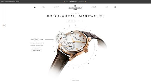
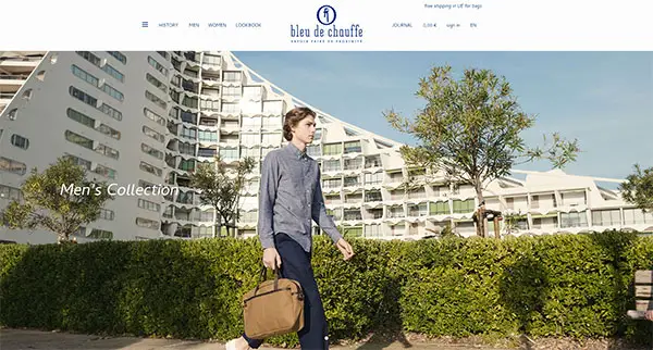
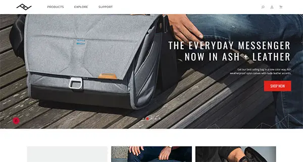
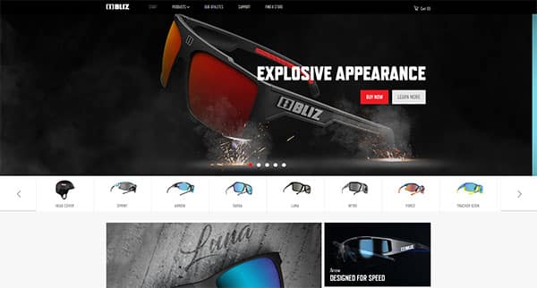
Go big with images
Yes, you need piles of large, great quality images to present to your potential customers.
Have in mind they have no chance to see the product they’re buying, and photos are a great strategy for bringing the product closer to them.
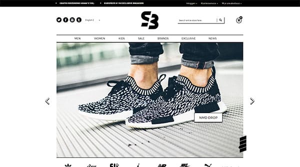
As for all other things, people can hardly resist beautiful and attractive sceneries, so make sure you provide the best possible photos.
Be detailed. Photograph the product from every angle and make sure the photos are zoom-friendly. Create an entire gallery and make it accessible from every page of the purchase process.
Save your users’ time
As you know from personal experience, almost 90% of users browse with no purpose. What really matters to you as a producer are those 10% that ‘land’ on your homepage with a clear idea of what they want.
The least you can do is to facilitate navigation and to help them locate their information in less than 30 seconds.
Also your website’s header should be flawless and answer the questions that the visitors might have when they arrive on your site: What is this site selling? Who are they? Why should I trust them? Of course, there may be more or other questions, depending on your audience.
This obligation should never be compromised for uniqueness and beautiful appearances. Even the coolest, most sophisticated site will be abandoned if it failed to deliver the necessary information.
Unless you’re specializing in one product/service, link the product pages with related ones (shoes with handbags; earrings with necklaces, etc).
Beware that the relationship needs to seem natural and default, rather than representing an ‘out-of the-blue’ link on the bottom of the page.
Uniqueness comes with relevance
On average, the bounce rate of visitors ‘landing’ on recently introduced websites is no more than 40%.
Translated in a designer’s terms, 40% of people are likely to leave your site at the same moment they check it. The crucial question is: How to keep them on the website?
Be unique when describing your products. Descriptions seem cliché, but it doesn’t mean they have lost their power.
Instead of applying standardized manufacturer’s descriptions, be creative and write original ones which solidify the relation with your brand. This tactic will certainly help you stand out from the crowd, and it will enable users to enjoy the purchase.
Last, but not least – checkout
The simplicity rule also applies to the checkout. In the perfect case, checkout should take no more than a single page, filled with reviews, cart and billing information, or shipping details. It is also important to include an additional confirmation button, so that there will be no feeling that the purchase happened too fast.
Large checkout funnels are one of the most common mistakes of ecommerce websites. They usually consist of too many pages, redirecting users to billing, shipping, or cart information before placing their final orders. Such procedures scare users.
They lead them from one complication to the other, and they are therefore likely to quit their purchase.
As short as you intend to make the checkout process, don’t forget to include a review section, where the customer can check their order before placing it. Practice shows that the lack of reviewing options is very likely to de-motivate users.
Test your website first
Here are few easy and relevant tests you could use before launching an ecommerce website:
1) Test the ‘Add to cart’ button, especially in terms of size, color or placement;
2) Test each of the product categories which appear while a user is navigating the website, and try to add a new one and see how it looks;
3) Choose a bestseller and promote it on the homepage;
4) Introduce a special: offer subscription and invite people to try it;
5) Try using coupons and estimate their effect on your conversion rates.
Call to action
Calls to action are vital to the success of any ecommerce website. If they are not efficient, the toll will most likely be taken from sales and conversions.
Most generally, ecommerce web design employs two basic types of action calls: specific ones for each product (when the site is selling more than one product); or a unified action call for all products, available on each browse/result page.
Both types look similar and involve terminology such as ‘Add to cart’. Websites which opt for originality choose specific wording, such as ‘buy now’; ‘make an order’, etc.
Final thoughts
The most important and memorable interaction with users is their first impression of your website. It consumes around two seconds of their time; and it lasts forever.
Yes, it’s not fair. As an eCommerce web designer, you have nothing more than two seconds to grab attention and to increase conversions. Those two seconds are the only time at your disposal to show something beautiful, functional, and affordable.
This challenging task leaves no space for errors to introduce your online store and make a great first impression.
Again – it is cruel, but the success of your design and users’ shopping decisions rely almost completely on visuals and appearance.
In order to obtain this ‘wow’ effect, you need to familiarize with the essential elements of eCommerce design and to come up with original ideas at the same time. Overlooking basic rules and principles will not lead to satisfying results, but may instead disappoint customers rushing to find a decent substitute.
Comments are closed.